Our Curated Styles

Contact us

Contact us

Theme Installation

Follow the steps below to install the theme on your Online Store

  1. Log in to your Shopify admin.
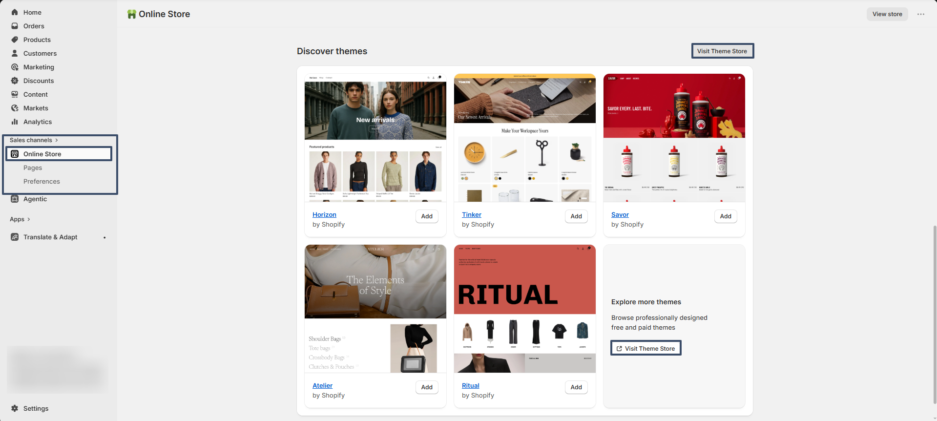
  2. Go to Online Store from the left sidebar.
  3. Scroll down to the Discover Themes section.
  4. Click on Visit Theme Store.
  5. In the Shopify Theme Store, search for Breeze theme.
  6. Open the theme and click Try theme to add it to your store.
  7. The theme will be added to your store.
  8. Click Customize to start editing and setting up your store design.
getting-started-theme

Try Breeze for free from the Shopify Theme Store

Breeze, like all premium themes in the Shopify Theme Store, offers a trial period, allowing you to explore its user-friendly design and quick setup features. During the trial, you can fully customize and configure the theme to create your ideal storefront. When you're ready to launch, purchase the theme to activate it on your live store., like all premium themes in the Shopify Theme Store, offers an trial period, allowing you to explore its user-friendly design and quick setup features. During the trial, you can fully customize and configure the theme to create your ideal storefront. When you're ready to launch, purchase the theme to activate it on your live store.

Steps

  • Visit the Shopify Theme Store and choose Breeze.
  • Click Try theme to add the theme to your online store.
  • In your Shopify admin, go to Online Store > Themes.
  • In the Theme library section, click the Customize button to open the theme editor or, to preview, use the ... button to open the actions menu, then click Preview.

How to Change Language Settings in Shopify

1. Change Storefront Language

  1. Go to Online Store > Themes
  2. Click “Actions” on your live theme → Select Edit default theme content
  3. In the top-left corner, use the language dropdown to change the language
  4. You can also manually translate text in each field if needed

2. Add Multiple Languages (for international stores)

  1. Go to Settings > Languages
  2. Click Add language
  3. Select the language you want to add
  4. Translate your content using the Translate & Adapt app or a third-party translation app
  5. Publish the language when translations are ready

3. Change Checkout Language

  1. Go to Settings > Checkout
  2. Scroll to “Checkout language” → Click Manage checkout language
  3. Edit or change the text used in the checkout process

4. Change Admin Language

  1. Click your account name (bottom-left corner)
  2. Go to Manage account > Preferences
  3. Choose your preferred admin language

Cart

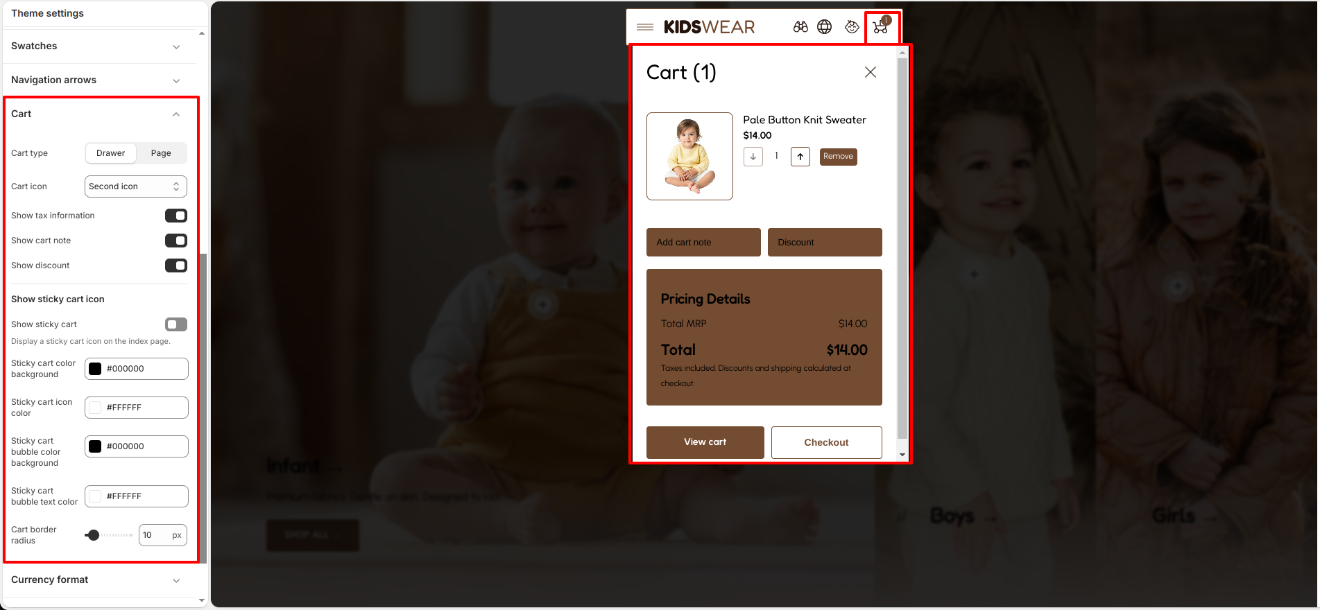
Breeze provides two cart layouts: Cart Drawer and Cart Page. Both options allow customers to review cart items, update quantities, apply discounts, add order notes, and proceed to checkout.

To configure cart functionality, navigate to: Theme Settings → Cart.

Cart Settings

The Cart settings control how the cart behaves throughout your store.

  • Cart Type – Choose how the cart is displayed: Cart Drawer or Cart Page.
  • Cart Icon – Select the cart icon style displayed in the header.
  • Show Cart Note – Allows customers to add special instructions or notes to their order.
  • Show Tax Information – Displays tax-related information within the cart.
  • Show Discount – Displays discount information and allows customers to apply coupon codes when available.

Cart Drawer

The Cart Drawer provides a quick shopping experience by allowing customers to manage their cart without leaving the current page.

Customers can:

  • View products added to the cart.
  • Update item quantities.
  • Remove products from the cart.
  • Add order notes.
  • Apply coupon or discount codes.
  • Review pricing details and order totals.
  • Proceed directly to checkout.
  • Open the full cart page when required.
Cart Drawer

Cart Page

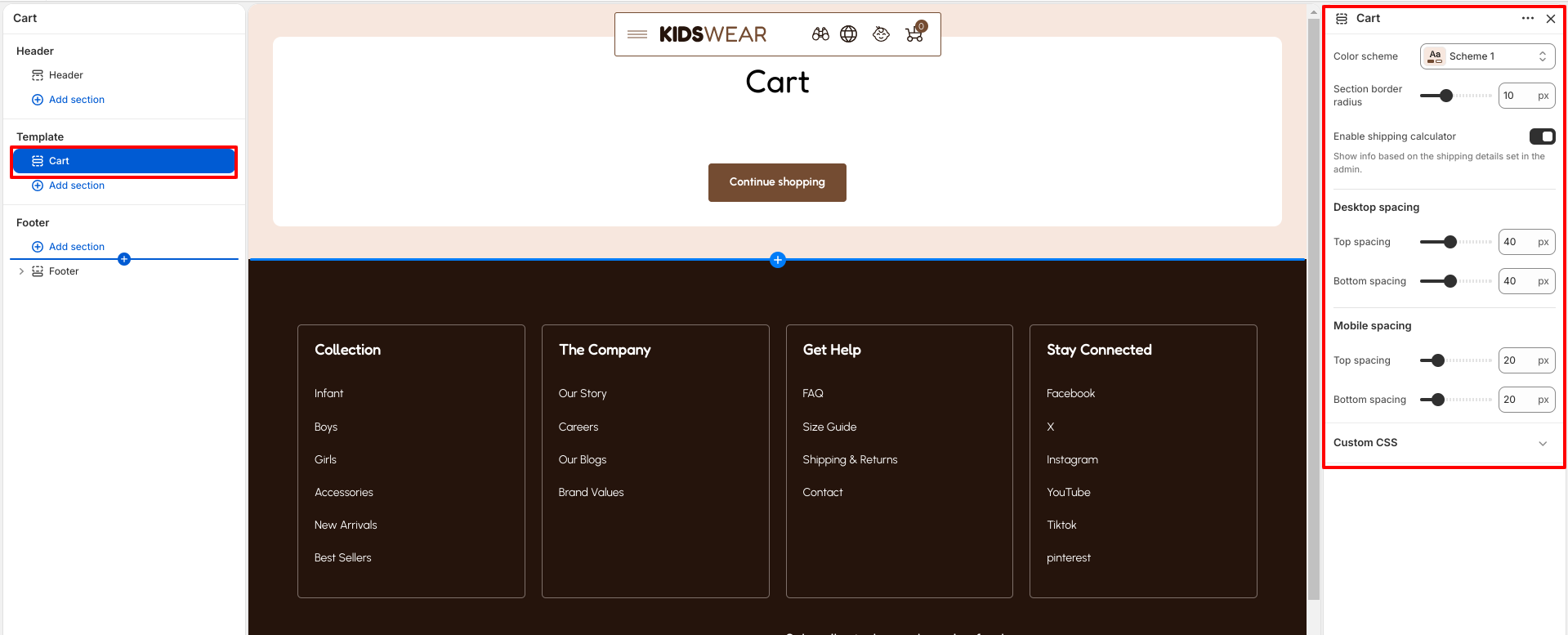
The Cart Page provides a complete overview of the customer's order before checkout. Customers can review all cart items, update quantities, remove products, apply discounts, add order notes, continue shopping, or proceed to checkout.

The Cart section includes additional customization options to match your store design.

  • Color Scheme – Controls the overall color style of the cart page.
  • Shipping Estimator: When enabled, customers can calculate estimated shipping costs directly from the cart page. The estimator uses the shipping rates configured in your Shopify store and displays the estimated shipping amount based on the customer's selected country and ZIP/Postal Code.
  • Section Border Radius – Adjusts the corner radius of cart containers and elements.
  • Desktop Spacing – Controls the top and bottom spacing on desktop devices.
  • Mobile Spacing – Controls the top and bottom spacing on mobile devices.
Cart Page

Sticky Cart

Breeze includes a Sticky Cart feature that keeps the cart easily accessible while customers browse the store.

When enabled, a floating cart icon appears on collection and product pages, allowing customers to quickly access their cart from anywhere on the storefront.

Note: The Sticky Cart is visible only when the Cart Type is set to Drawer.

  • Show Sticky Cart – Enables or disables the floating cart icon.
  • Sticky Cart Color – Sets the background color of the sticky cart button.
  • Sticky Cart Icon Color – Sets the cart icon color.
  • Sticky Cart Bubble Background – Controls the background color of the cart quantity badge.
  • Sticky Cart Bubble Text Color – Controls the text color of the cart quantity badge.
  • Cart Border Radius – Adjusts the corner radius of the sticky cart button.
Sticky Cart

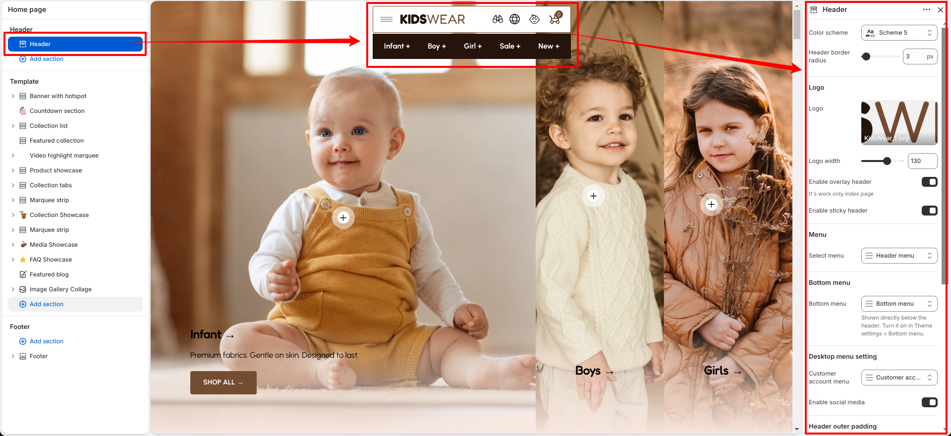
The Breeze header includes settings to configure logo image, logo width/position, sticky/overlay header, category navigation menu, mobile drawer contact info & promo banner, and layout/spacing settings.


Dropdown Menu Preview

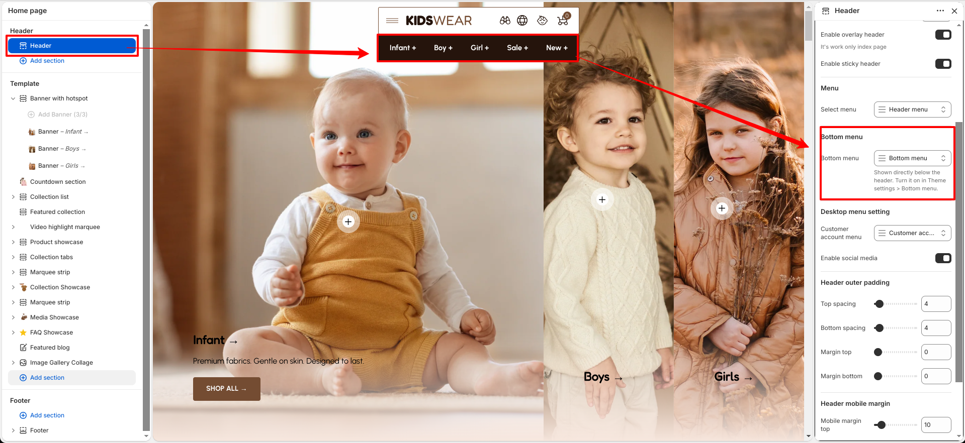
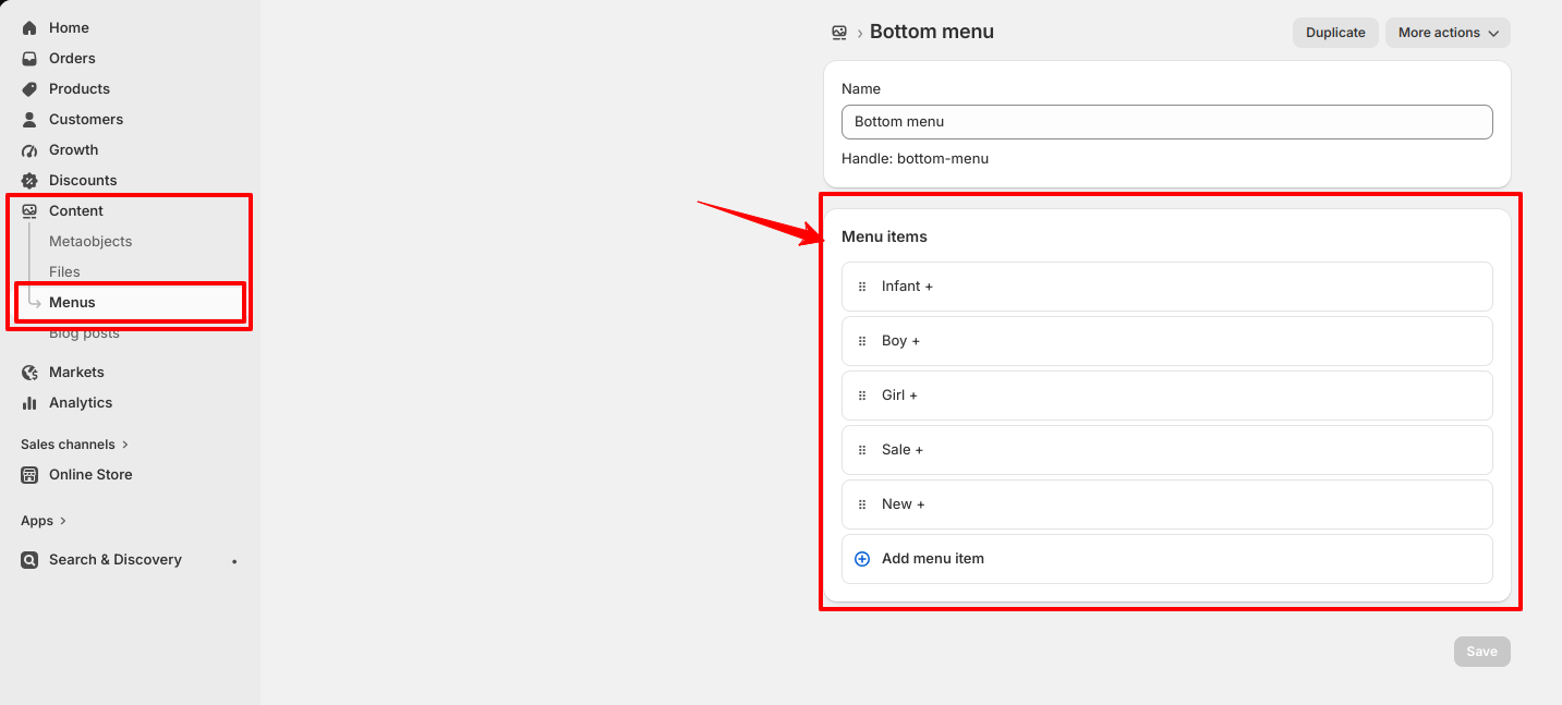
The Bottom Menu provides quick access to important links at the bottom of your store. It is commonly used to display navigation links such as About Us, Contact, Policies, FAQs, Collections, and other useful pages. Organizing these links in the bottom menu helps customers easily find important information while keeping the main navigation clean and user-friendly.

Follow these steps to configure your theme Bottom Menu

Steps

  • Open the Customizer: Go to Online Store > Themes > Customize.
  • Navigate to the Header section.
  • Select a Menu: Choose an existing navigation menu or create a new one.
  • To create or edit a menu, go to Online Store > Navigation > Menus, add your menu items, save the menu, and assign it to the Bottom Menu in the theme customizer.
Header Settings
Dropdown Menu Setup

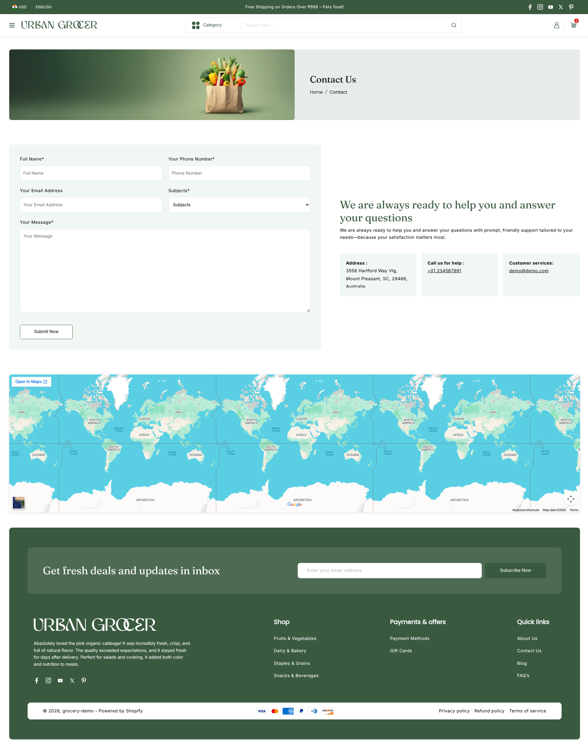
What is the contact page?

The contact page allows customers to send a message directly to you and allows you to engage with your customers and answer their queries.

Contact Us

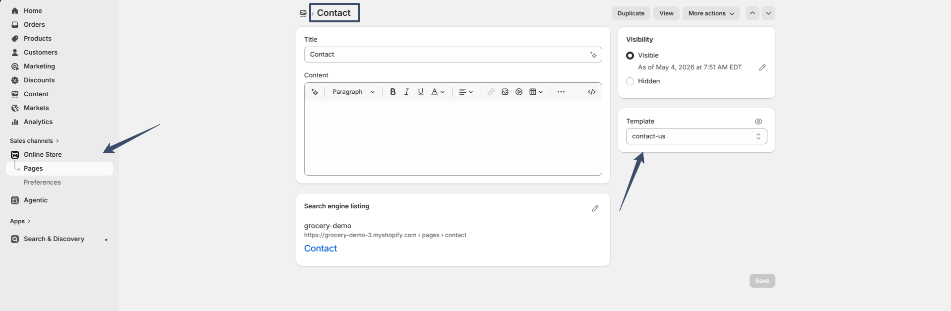
How to set up the contact page

Steps

  1. Open the Theme Editor.
  2. Select Pages > Contact from the dropdown at the top.
  3. This page comes prebuilt with several blocks, listed in the Template section of the left-hand side of the screen. Select Add block or use the existing blocks available.
  4. The Email input block is required for the contact form to work.
  5. It is important to ensure that all blocks have unique labels.
  6. Click Add section to insert a section either above or below the page content..
Contact Us
Contact Us

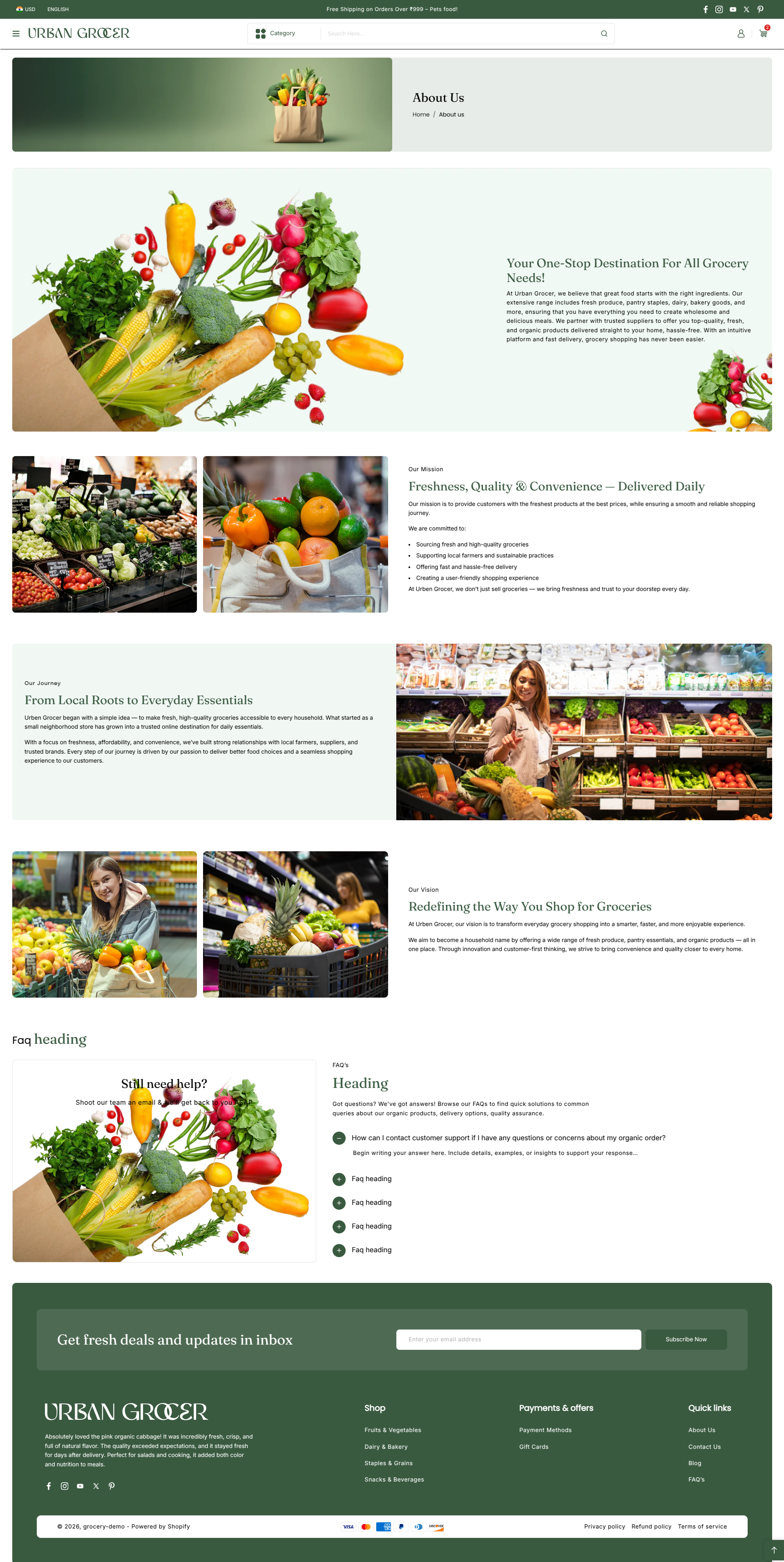
About Us

An "About Us" page introduces your brand’s story, mission, and values to customers. It builds trust and connects emotionally with visitors.

About Us

Create a Basic About Us Page (Quick Setup)

Steps

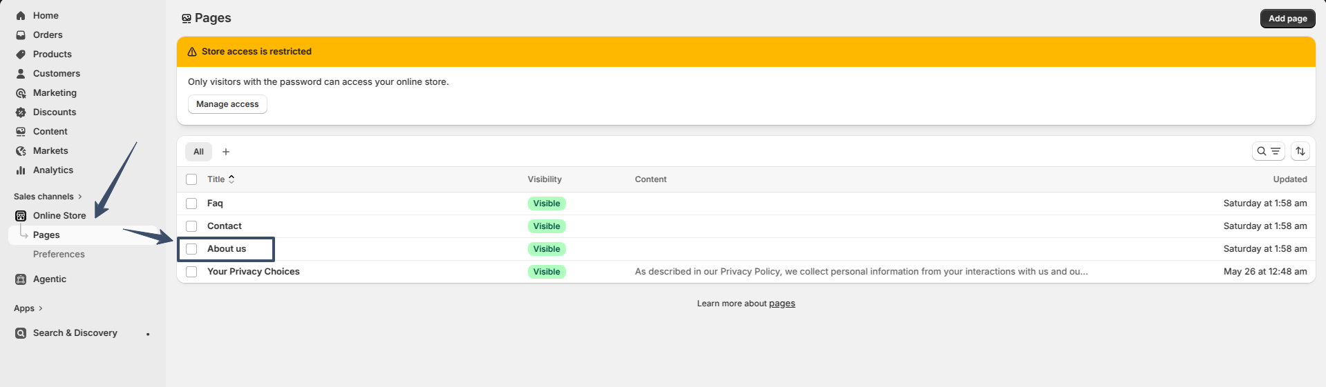
  • Go to Shopify Admin → Online Store → Pages.
  • Click "Add page".
  • Title: Enter "About Us" (or similar).
  • Content: Write your brand story, mission, and team info.
  • Visibility: Set to "Visible".
  • Save.

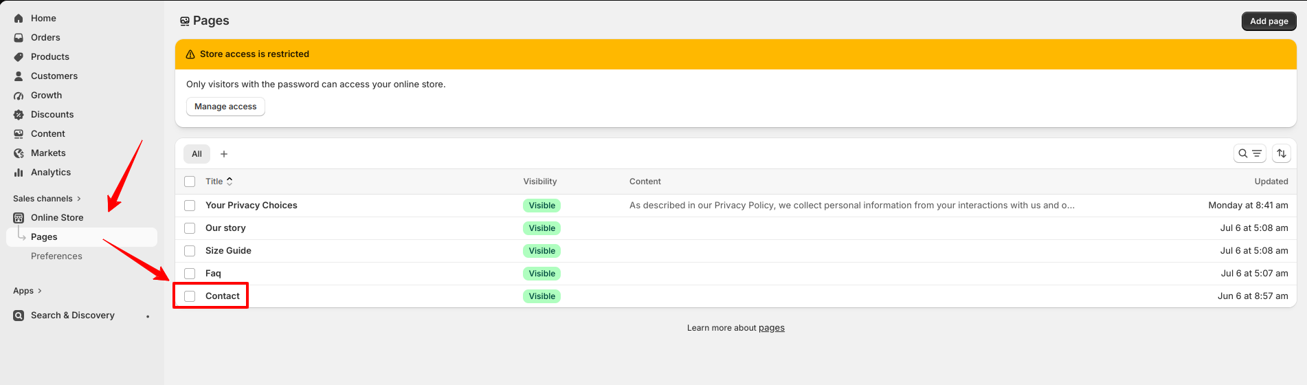
How to Set Up Pages in Shopify

Setting up pages in Shopify is a straightforward process that allows you to add important informational content—such as About Us, Contact, FAQ, and policy pages—to your online store.

Set Pages

Steps

  • 1. Access Admin Online Store > Pages
  • 2. Add Page Click "Add page"
  • 3. Enter Details Title, content, select template (optional)
  • 4. Set Visibility Choose Visible/Hidden, set publish date if desired
  • 5. Save Click "Save"

Favicon

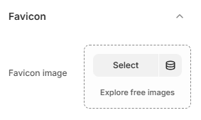
A favicon is the small icon shown in the browser tab that represents your store.

Favicon Image: Upload a small square logo or icon (recommended 32x32).

favicon setting

Typography

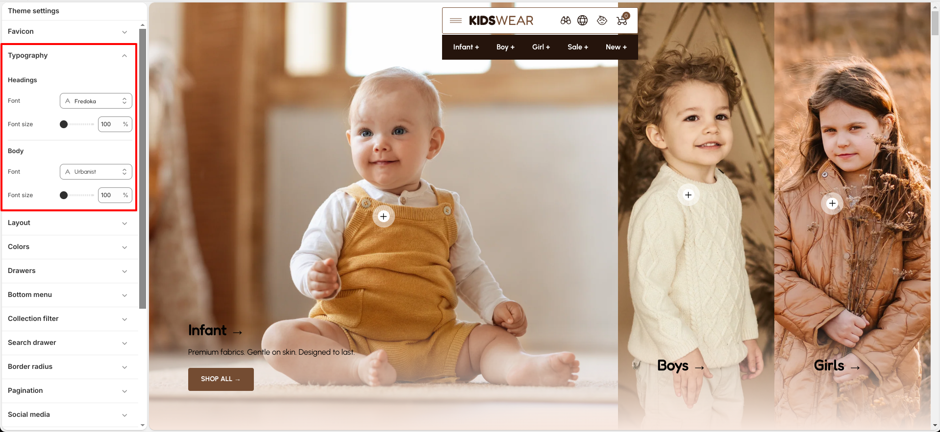
Customize your store’s typography to create a consistent brand identity and improve readability across your storefront. The theme allows you to configure fonts and font sizes for headings, body text, and highlighted content.

Settings

  • Headings — Select a font family and adjust the font size used for section titles, page headings, and prominent text elements.
  • Body — Choose the font family and font size for product descriptions, paragraphs, navigation links, and other standard content.
  • Highlight — Configure the font family and size for highlighted text elements used throughout the theme to create visual emphasis and enhance branding.
typography setting

Customize Your Typography to Match Your Brand

Steps

  • Open the Customizer.
  • Click on the "General Settings" icon.
  • Select the "Typography" option.

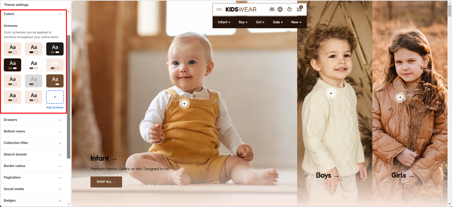
Colors

One of the most important components of designing a visually appealing, functional, and accessible theme is color.
Not only does a well-designed color system reinforce a merchant’s branding, but it also has the power to enhance and improve user experiences.
Configure your brand colors in the color settings. These color elements are used in all the general sections, header, and footer.

Color setting

Customize Your Colors to Match Your Brand

Personalizing your theme’s colors is a breeze with Breeze! Tailor your site to reflect your brand identity effortlessly.

Steps

  • Open the Customizer.
  • Click on the "General Settings" icon.
  • Select the "Colors" option.

Layout & Border radius

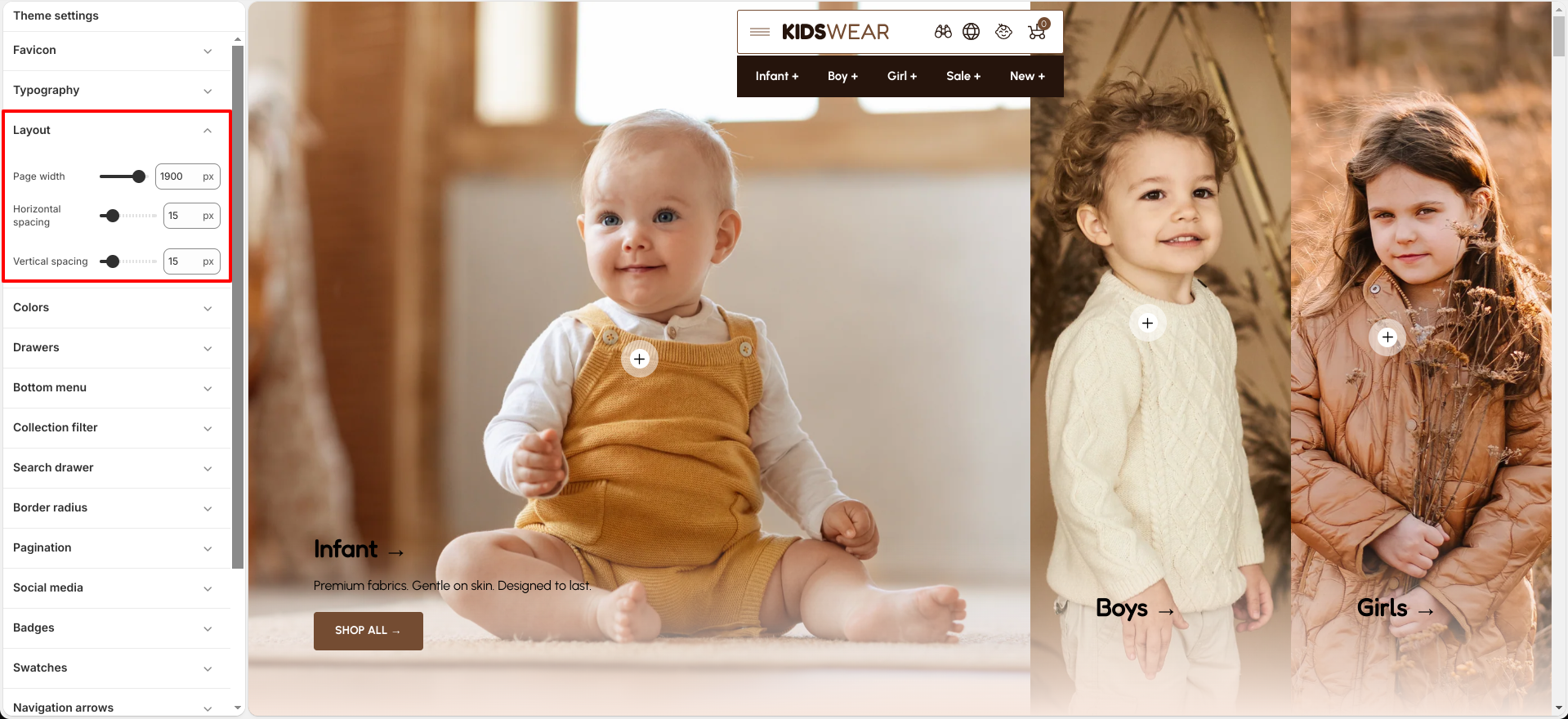
Layout settings

Breeze provides flexible layout settings.

layout setting

Steps

  • Page width — adjust the maximum width of the page
  • Horizontal spacing — set spacing between elements side-to-side
  • Vertical spacing — set spacing between elements top-to-bottom

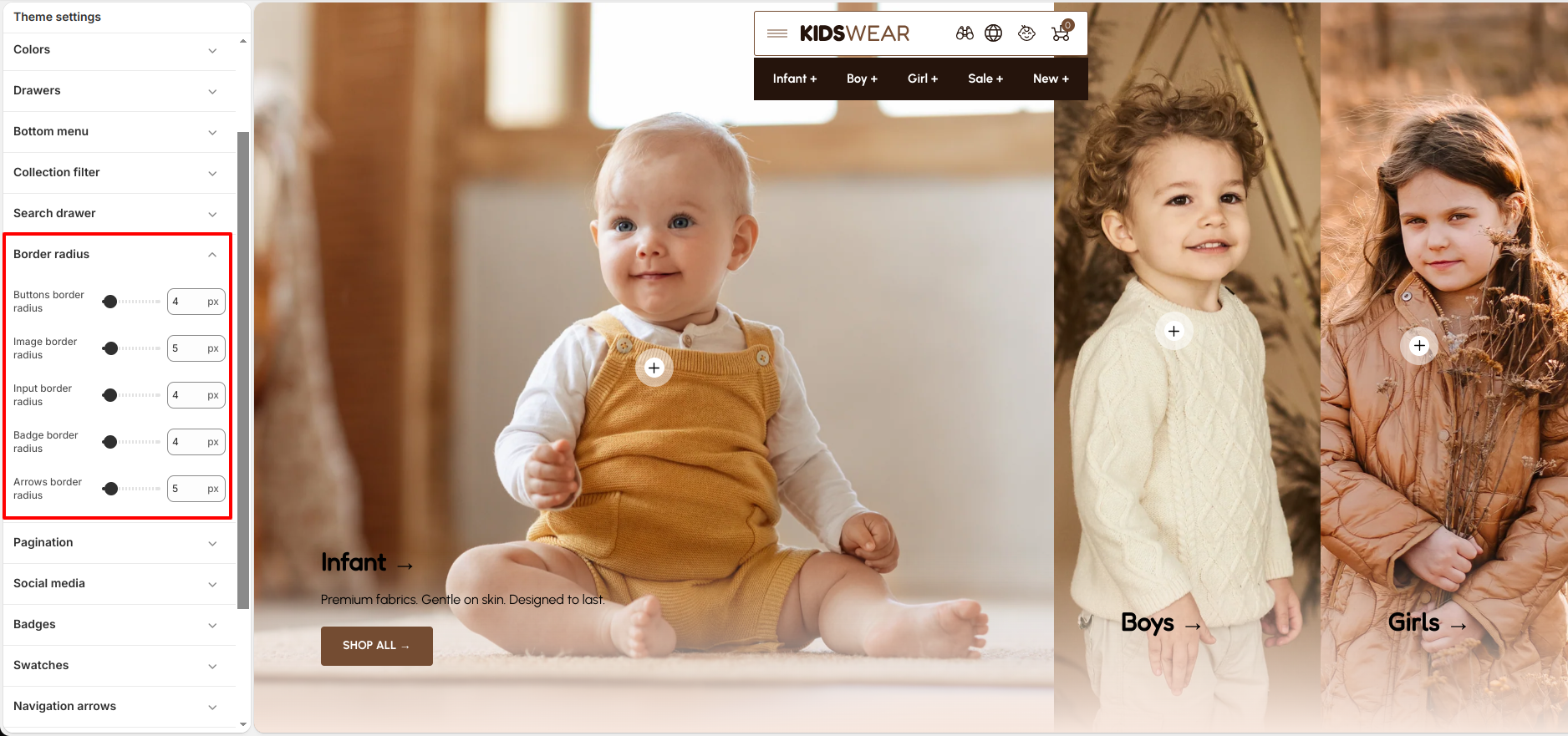
Border radius

Breeze includes customizable border-radius settings for : Buttons, Images, Input fields, Badges, Arrows.

border setting

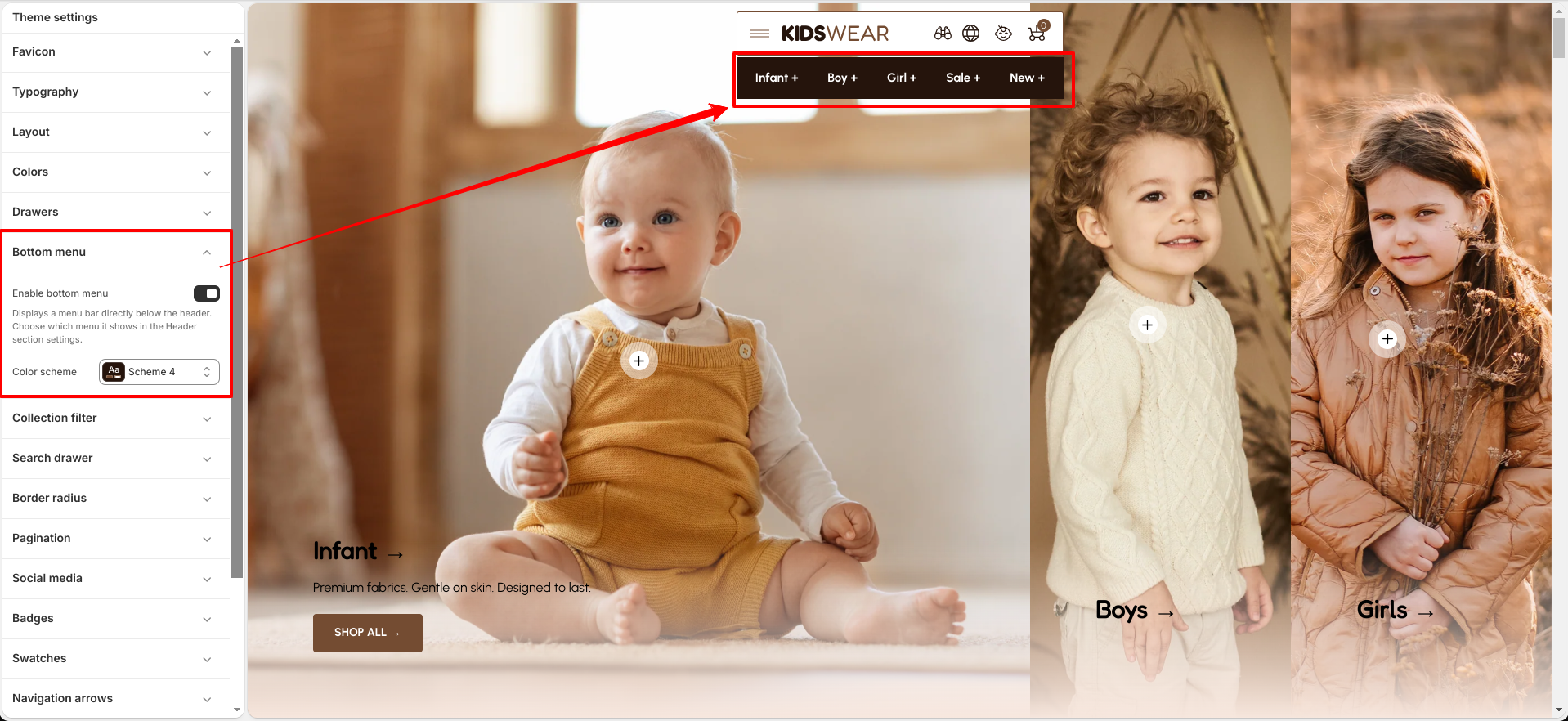
Bottom Menu

Breeze provides flexible settings to customize the appearance and behavior of the Bottom Menu.

Bottom Menu Settings

Settings

  • Enable Bottom Menu — Displays a menu bar directly below the header. Choose which menu it displays from the Header section settings.
  • Color Scheme — Select a predefined color scheme for the Bottom Menu to match your store's design.

Collection Filter

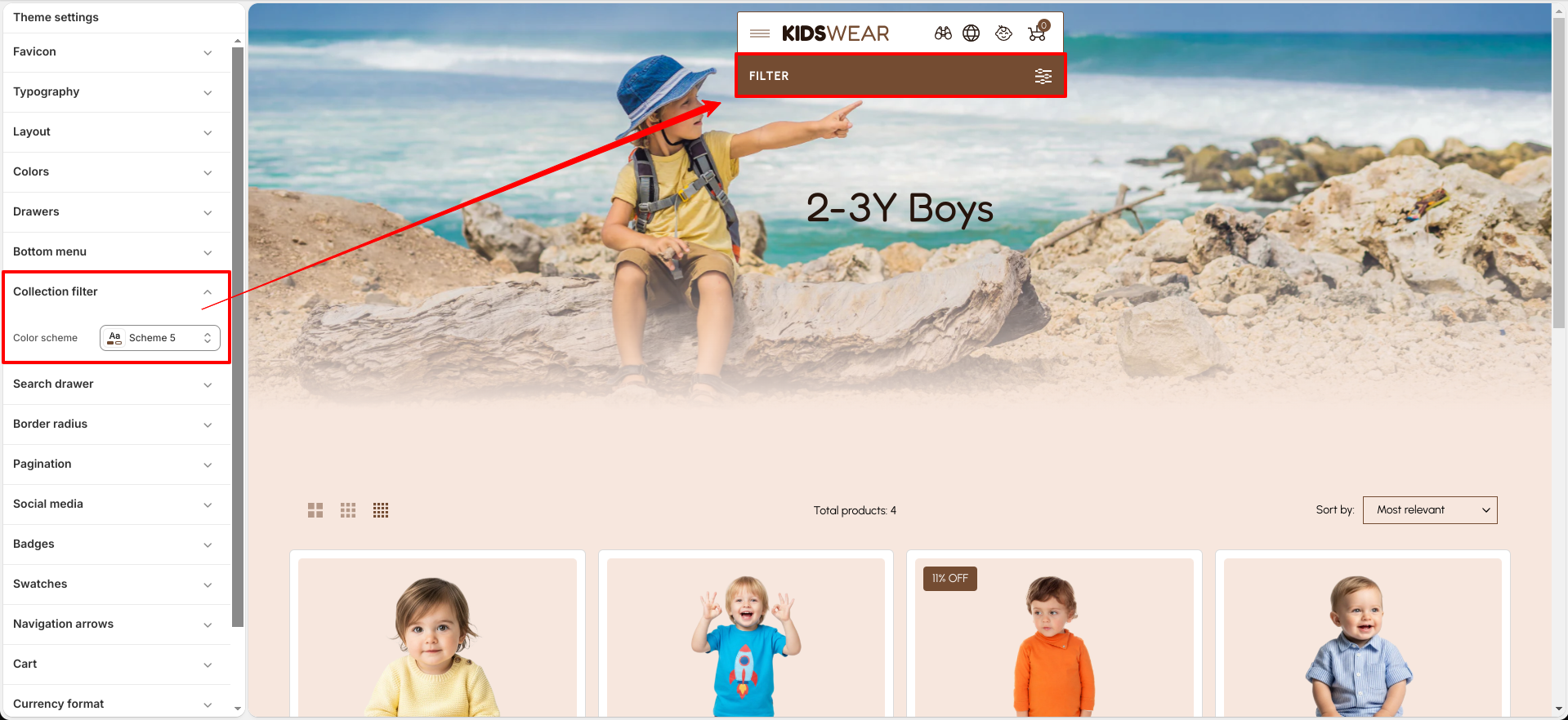
The Collection Filter helps customers quickly narrow down products within a collection by using available filter options. It provides a more convenient shopping experience by allowing customers to refine products based on attributes such as vendor, product type, availability, price, and other supported filters.

Customize Collection Filter
The Collection Filter includes the following customization option:

  • Color Scheme — Select a predefined color scheme for the collection filter to match your store's branding and design.
Collection Filter Settings

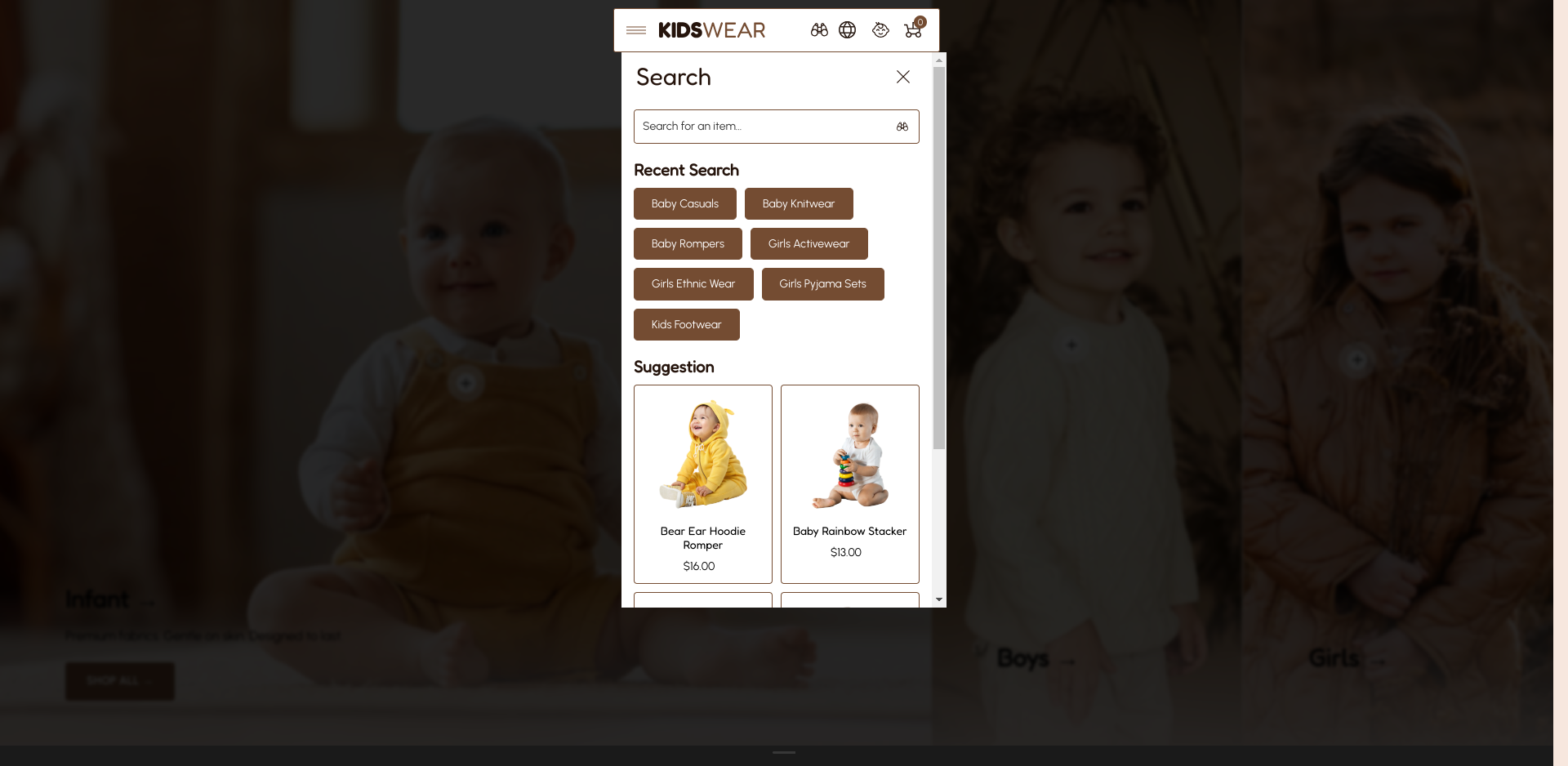
Search Drawer

The Search Drawer provides customers with a quick and convenient way to search your store. You can customize its appearance, display featured collections or products, and highlight popular search suggestions to improve the shopping experience.

Search Drawer Preview

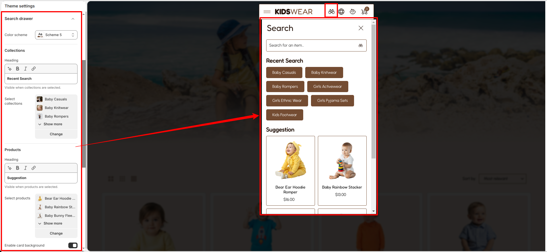
Search Drawer Settings
Customize the Search Drawer directly from the Theme Editor.

How To Configure Search Drawer

  • From your Shopify admin, go to Online Store → Themes.
  • Click Customize on the Breeze theme.
  • Navigate to Theme Settings → Search Drawer.
  • Configure the available settings according to your store's requirements.
  • Click Save to apply the changes.

Customize Search Drawer
The Search Drawer includes the following customization options:

  • Color Scheme — Select a predefined color scheme for the Search Drawer.
  • Collections Heading — Customize the heading displayed above the featured collections.
  • Select Collections Choose the collections to display in the Search Drawer. The recent search section is shown when collections are selected.
  • Products Heading — Customize the heading displayed above the featured products.
  • Select Products — Choose the products to display as search suggestions.
  • Enable Card Background — Display a background behind the collection and product cards.
  • Card Background Color — Choose the background color for the cards.
  • Card Info Text Alignment — Set the text alignment to Left, Center, or Right.
Search Drawer Settings

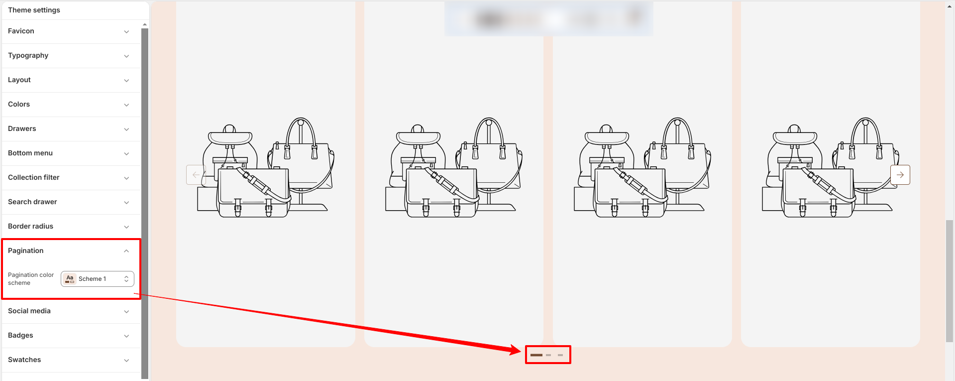
Pagination

Breeze’s Pagination setting allows you to customize the appearance of pagination elements to match your store design.

  • Select Color Scheme to apply the color scheme.
  • Scheme updates the pagination background, text, and active state colors.
  • Ensure the selected scheme matches your overall theme color settings.
Pagination Color Scheme 3

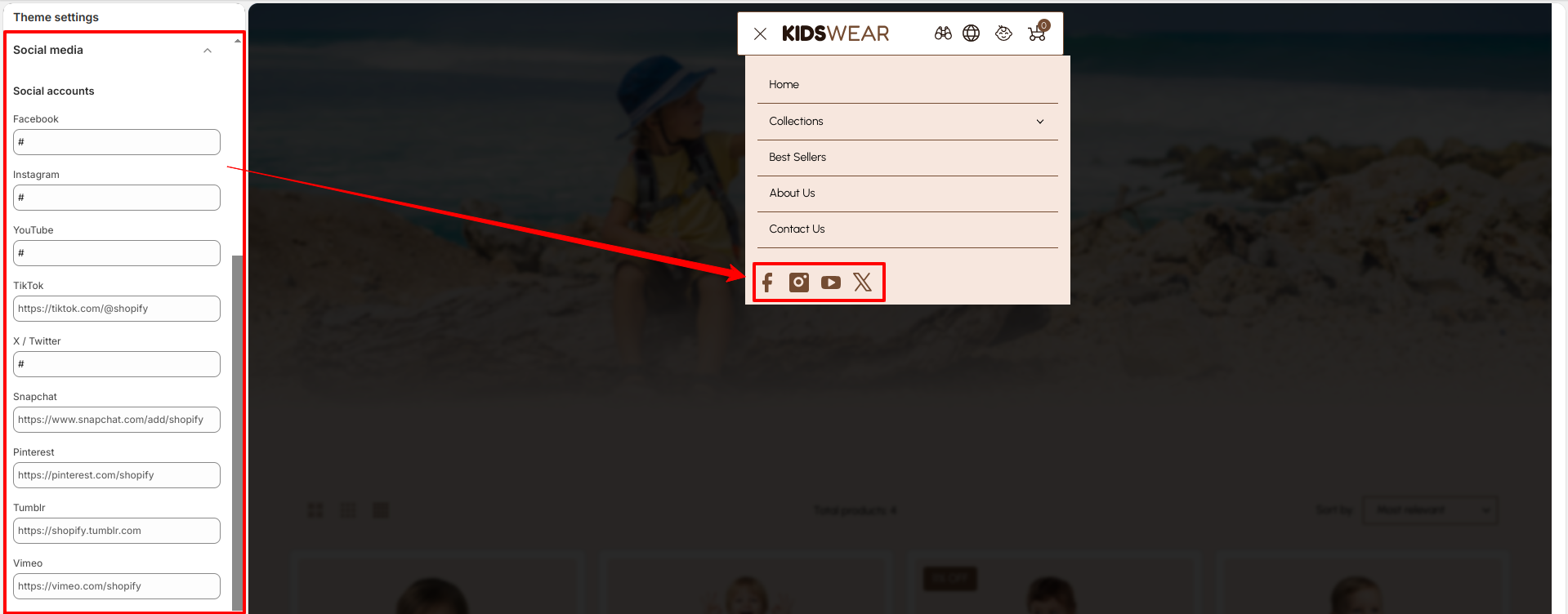
Social Media

Breeze’s Social Media feature allows you to connect your store with popular social platforms to increase engagement and brand visibility.

  • Add links to your social media profiles.
  • Display social icons in the header or footer.
  • Improve brand presence and customer engagement.
  • Allow customers to easily follow and share your store.
Social Media Settings

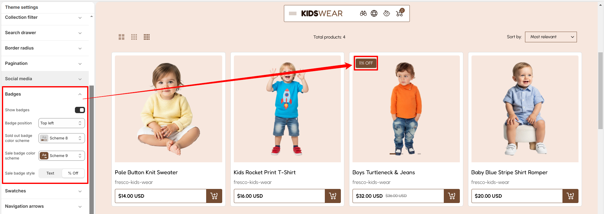
Badges

Breeze Product Badges feature allows you to highlight special product statuses such as Sale, New, or Sold Out to attract customer attention and boost conversions.

How to Enable Badges

  • From your Shopify admin, go to Online Store → Themes.
  • Click Customize on the Breeze theme.
  • In the Theme Editor, open Theme Settings (bottom-left corner).
  • Select the Badges option.
  • Enable the Show badges option.
  • Click Save.
How to Enable Badges in Breeze Theme

Swatches

The Product Swatches feature in the Breeze theme transforms product options like colors into interactive visual swatches. Instead of relying on text-based selections, customers can easily view and choose options through intuitive, clickable samples.

Step 1: Assign a Product Category

Shopify enables native color swatches only when a product category is assigned. Categories provide access to Shopify's standard metafields such as Color and Size.

  • From your Shopify admin, go to Products.
  • Click the product you want to edit.
  • In the Category section, click Select category.
  • Choose a category that supports color metafields, for example: Apparel & Accessories > Clothing > Shirts.
  • Click Save.

Note: Shopify category metafields will not appear until a valid category is assigned.

Step 2: Add Color Values

After assigning a category, Shopify automatically provides the Color category metafield.

  • Open the same product from the Products section.
  • Scroll down to the Category metafields section.
  • Locate the Color metafield.
  • Click inside the Color field to add available color values.
  • Select existing standard colors such as: Black, Blue, Red
  • To create a custom color:
    • Type the custom color name such as Ivory or Graphite.
    • Click Add new entry when the option appears.
    • In the popup window, configure the color details:
      • Add the color label/name.
      • Optionally upload a swatch image.
      • Optionally add a hex color code.
    • Click Save to create the color entry.
  • After adding all required colors, click Save on the product.

Step 3: Connect Color Values to Variants

Connect the Shopify Color metafield to your product variants to display swatches properly.

  • Open your product in the Products section.
  • Scroll to the Variants section.
  • Click Add options like size or color.
  • Select the suggested Color option.
  • Shopify automatically fills the available color values.
  • Assign the correct color to each variant.
  • Click Save.

Refer to Shopify's Color option with swatches documentation for more.

Also, refer to the Adding color swatches using category metafields

Step 4: Set Up Swatch Shape

You can configure the global swatch shape for product swatches across your store.

  • From your Shopify admin, go to Online Store → Themes.
  • Click Customize on the Breeze theme.
  • In the Theme Editor, navigate to Theme Settings → Color Swatches Selectors.
  • Select your desired swatch shape from the available options:
    • Circle Circular swatch.
    • Square — Perfect square swatch.
    • Default — Uses the theme's default swatch styling.
  • Click Save to apply your changes.

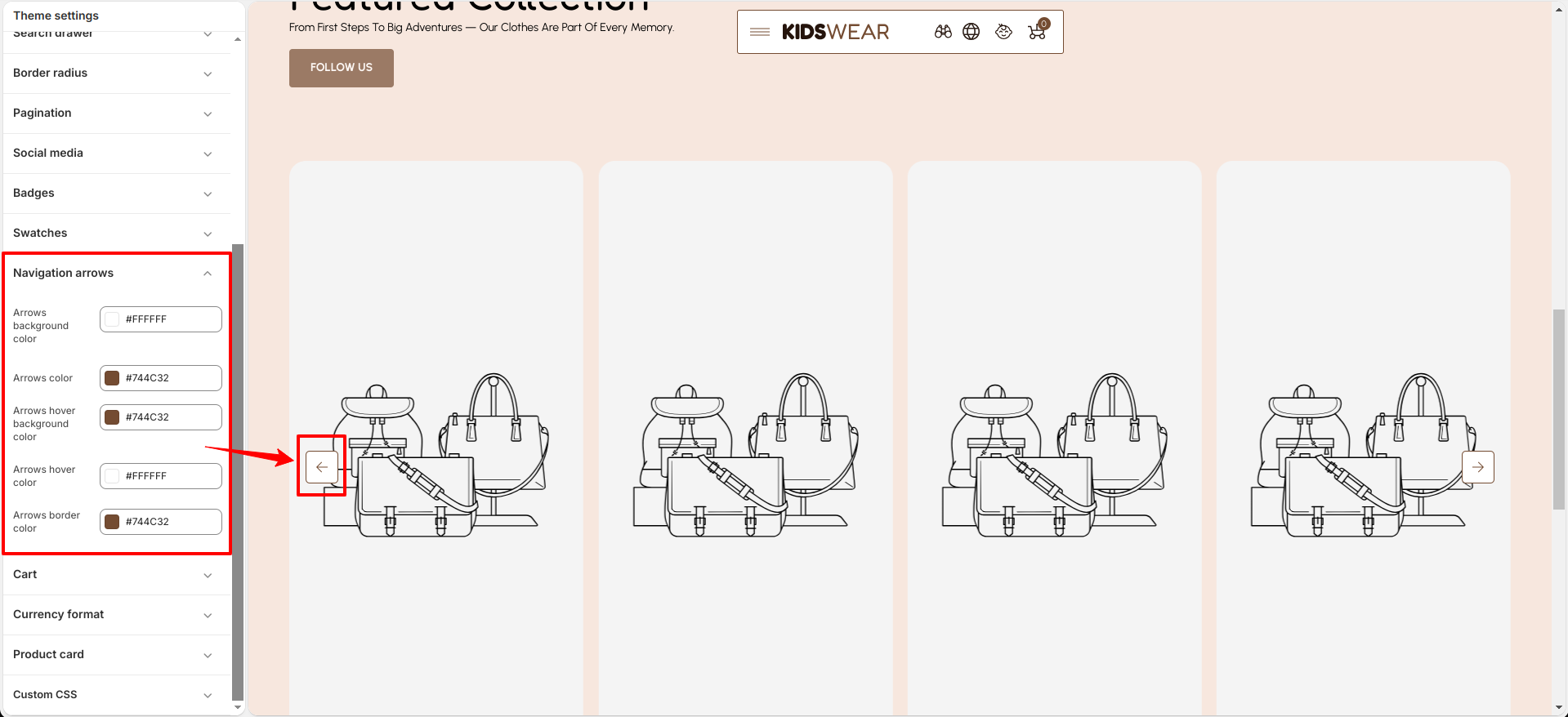
Navigation Arrow

Breeze’s Navigation Arrow allow you to customize the appearance of pagination arrows for normal and hover states.

  • Arrow Background Color
  • Arrow Color
  • Arrow Hover Background Color
  • Arrow Hover Color
  • Arrow Border Color
Navigation Arrow Color Settings

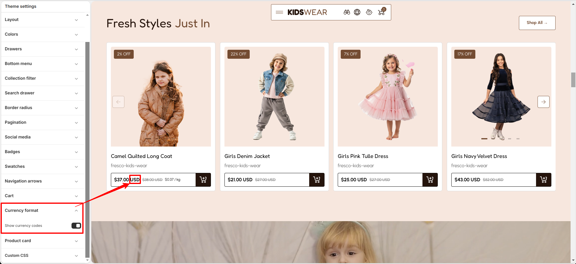
Currency Format

Breeze’s Currency Format feature allows you to control how currency is displayed in your store.

  • Enable the currency format option to display customized price formatting.
  • Disable the option to use the default store currency format.
Enable or Disable Currency Format

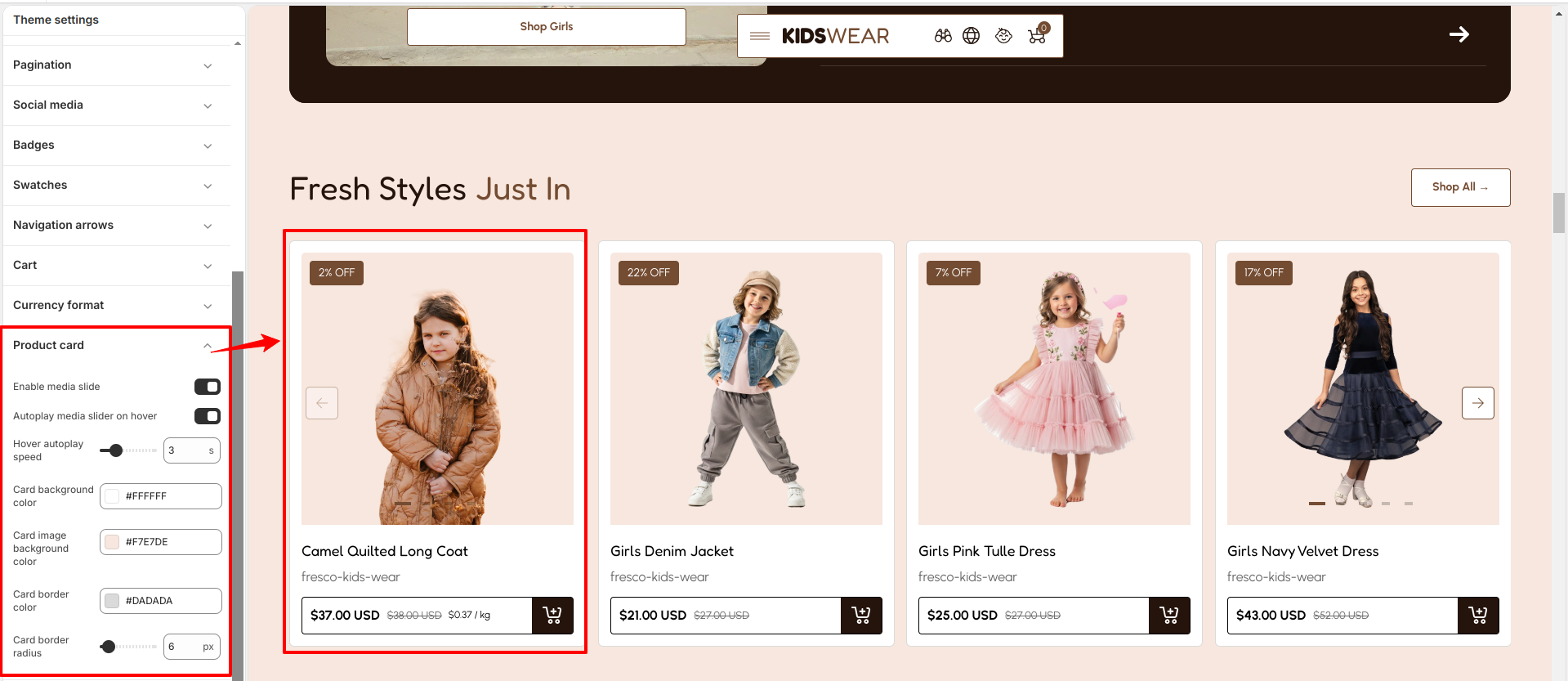
Product Card

The Product Card settings allow you to customize the appearance and interactive behavior of product cards throughout your store, creating a consistent and engaging shopping experience.

Product Card Settings
Customize the Product Card directly from the Theme Editor.

How To Configure Product Card

  • From your Shopify admin, go to Online Store → Themes.
  • Click Customize on the Breeze theme.
  • Navigate to Theme Settings → Product Card.
  • Configure the available settings according to your store's requirements.
  • Click Save to apply the changes.

Customize Product Card
The Product Card includes the following customization options:

  • Enable Media Slide — Allows customers to view multiple product images directly from the product card.
  • Autoplay Media Slider on Hover — Automatically plays the product media slider when customers hover over a product card.
  • Hover Autoplay Speed — Adjust the autoplay speed for the media slider during hover.
  • Card Background Color — Select the background color of the product card.
  • Card Image Background Color — Choose the background color displayed behind product images.
  • Card Border Color — Customize the border color of product cards.
  • Card Border Radius — Adjust the roundness of the product card corners.
Product Card Settings

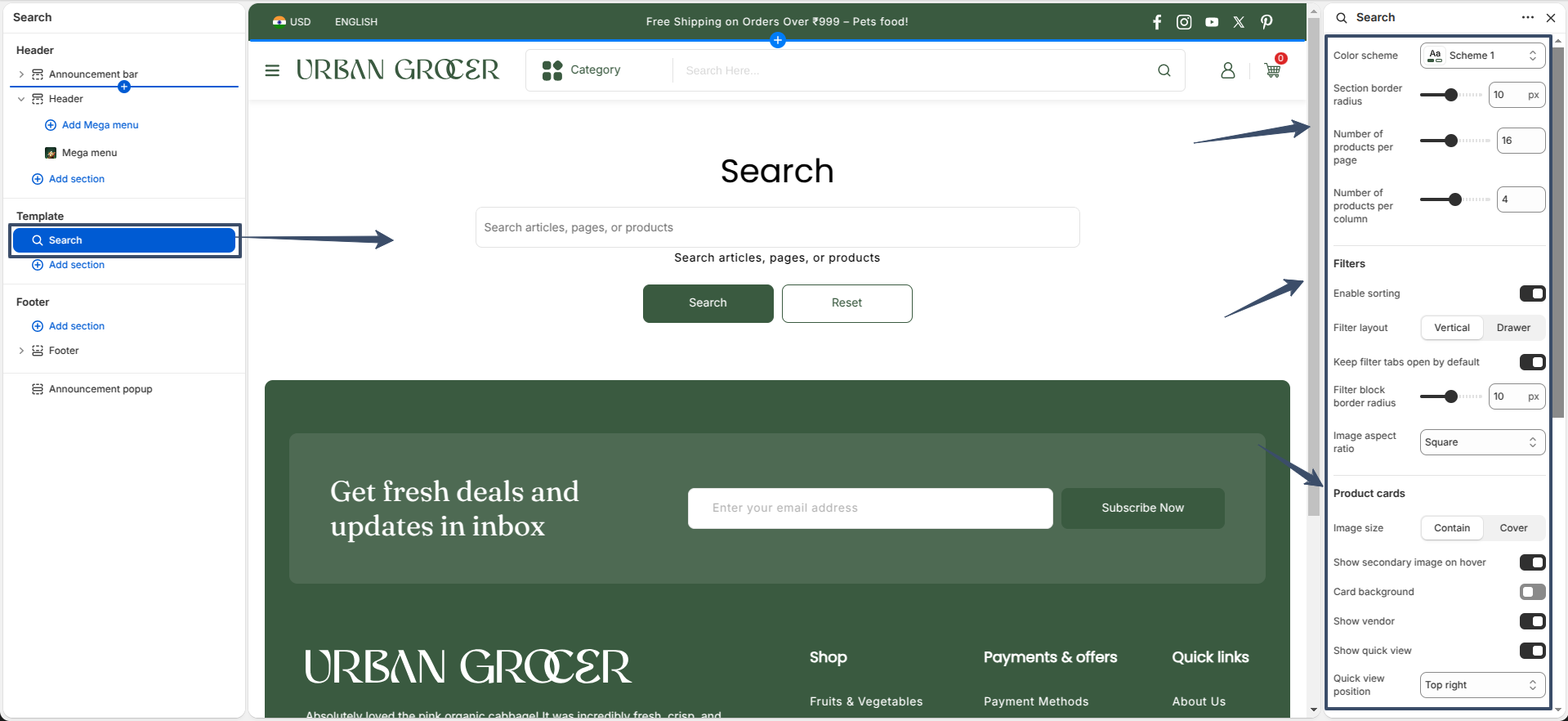
Search Page

Breeze’s Search page lets you control the number of products per page and the number of products per column.
You can also configure filters, filter layout, product card settings, quick view, and quick view position.

Searchpage

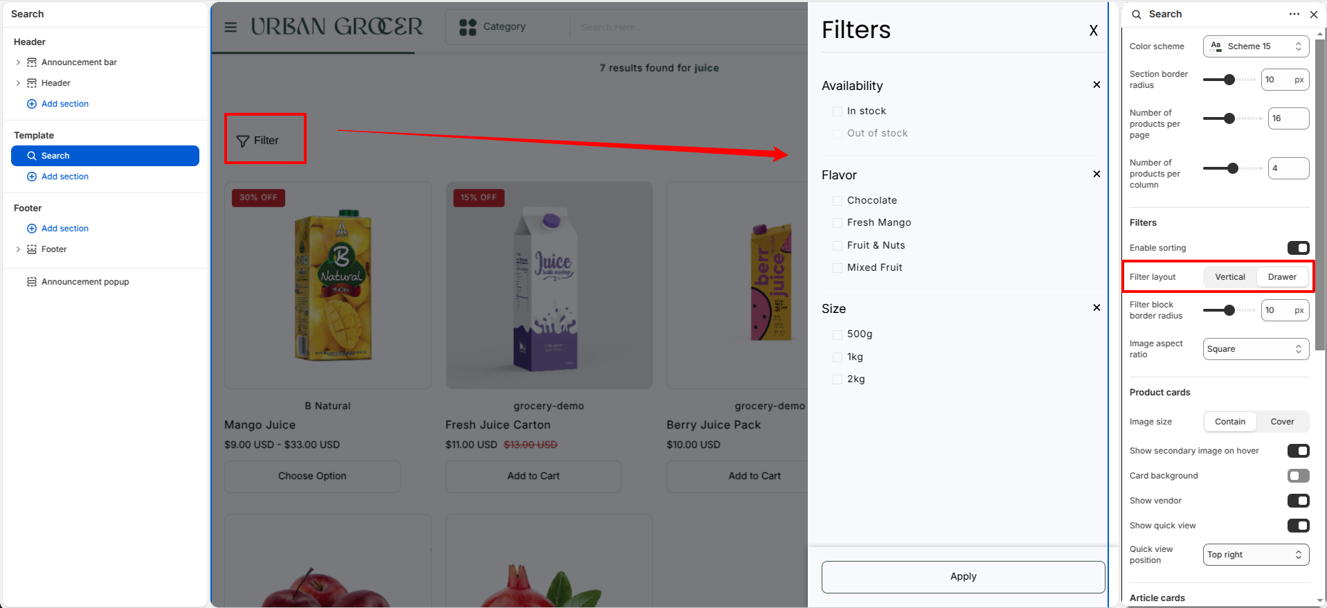
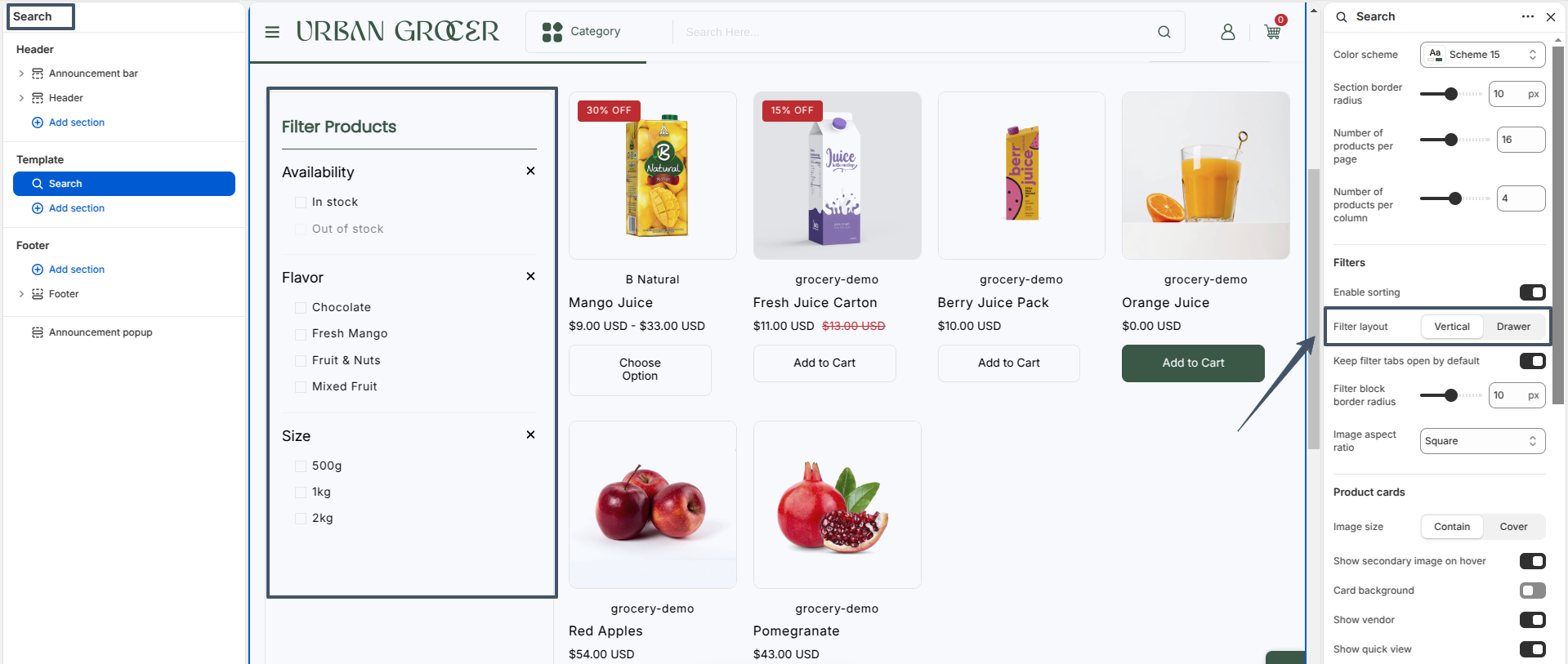
The Filter Layout setting on the search page allows you to adjust the product filter layout. You can set it to vertical or drawer.
Click on the Filter button to open filter drawer

Searchpage

Vertical filter layout

filter vertical

Collection Page

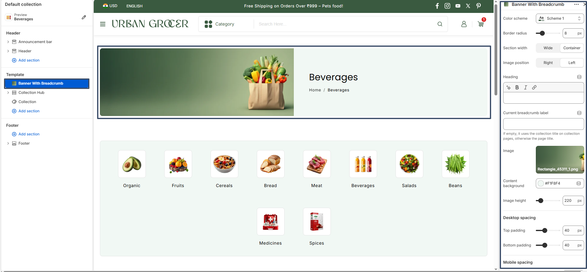
Breeze's Collection Page consists of three major sections: Banner With Breadcrumb, Collection Hub, and Collection. These sections work together to provide a complete shopping experience by helping customers navigate collections, browse categories, and discover products efficiently.

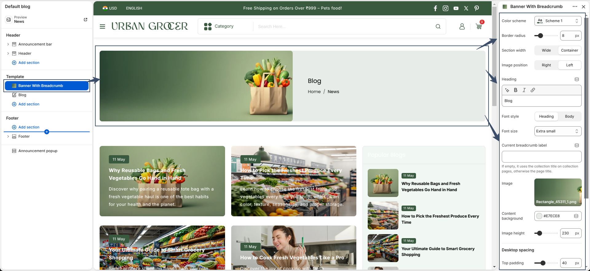
Banner With Breadcrumb

Banner With Breadcrumb section displays the collection title, breadcrumb navigation, and collection banner image. It helps visitors identify their current location within the store and creates an attractive introduction for the collection page.

Available settings include:

  • Color Scheme Select the section color palette.
  • Border Radius – Control the corner radius of the banner.
  • Section Width – Choose between wide and container layouts.
  • Image Position – Display the banner image on the left or right side.
  • Heading – Customize the collection heading content.
  • Current Breadcrumb Label – Define a custom breadcrumb title.
  • Image – Upload a custom banner image.
  • Content Background – Set the content area background color.
  • Image Height – Adjust the banner image height.
  • Desktop & Mobile Spacing – Configure top and bottom spacing.
banner with breadcrumb

Collection Hub

Collection Hub section allows merchants to showcase featured collections using custom collection cards. Customers can quickly navigate between popular product categories directly from the collection page.

Section settings include:

  • Color Scheme – Choose the section color style.
  • Section Border Radius Customize corner rounding.
  • Heading – Add and style the section heading.
  • Font Style – Select heading or body typography.
  • Font Size – Control heading size.
  • Heading Alignment – Align heading left, center, or right.
  • Column Limit – Set the maximum number of collection items.
  • Enable Slider – Display collection cards in a slider layout.
  • Columns Per Row – Configure the number of items displayed per row.
  • Desktop & Mobile Padding – Adjust spacing for all devices.
collection hub settings

Collection Hub Block Settings include:

  • Select Collection – Choose the collection to display.
  • Custom Collection Image – Upload a custom image instead of the collection image.
  • Custom Collection Title – Override the collection title with custom text.
collection hub block settings

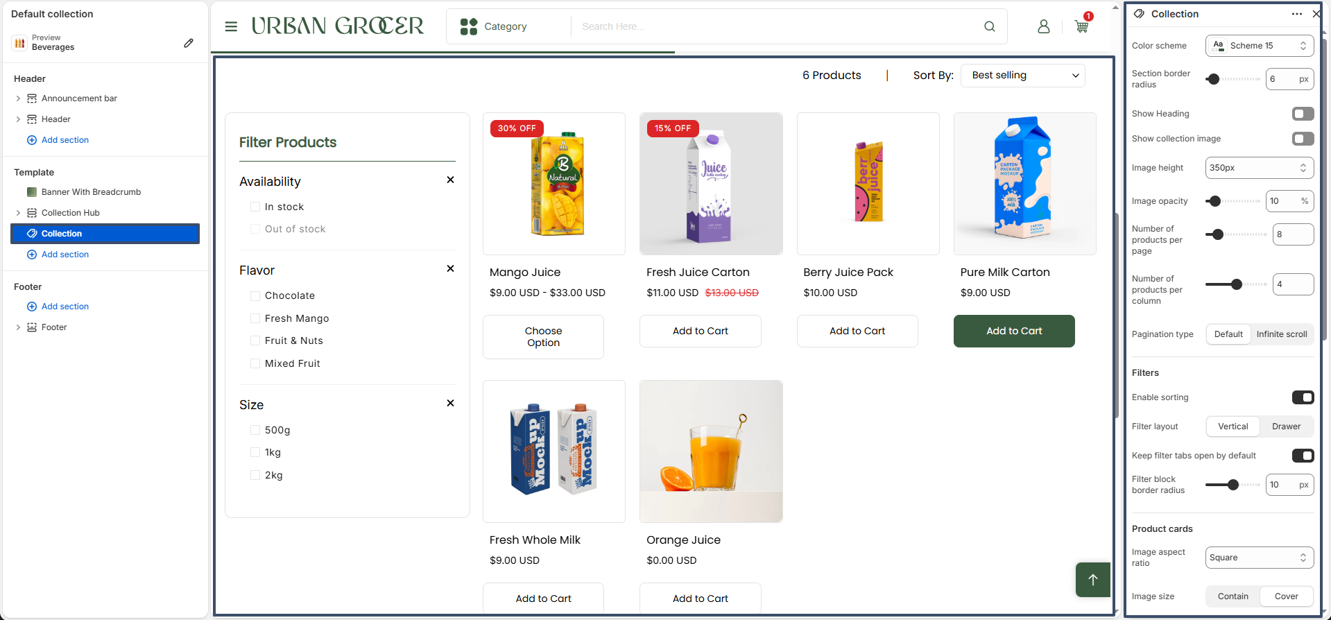
Collection

Collection section displays products from the current collection and provides powerful filtering, sorting, and product card customization options to improve the shopping experience.

  • Color Scheme – Select the collection section style.
  • Section Border Radius – Configure section corner rounding.
  • Show Heading – Enable or disable the collection heading.
  • Show Collection Image – Display the collection banner image.
  • Image Height – Set the collection image height.
  • Image Opacity – Adjust collection image transparency.
  • Number of Products Per Page – Control products shown per page.
  • Number of Products Per Column – Define products displayed in each row.
  • Pagination Type – Choose between default pagination and infinite scroll.

Filter & Sorting Settings include:

  • Enable Sorting – Allow customers to sort products.
  • Filter Layout – Choose between vertical sidebar and drawer layout.
  • Keep Filter Tabs Open by Default – Expand filter groups automatically.
  • Filter Block Border Radius – Customize filter panel appearance.

Product Card Settings include:

  • Image Aspect Ratio – Configure product image proportions.
  • Image Size – Choose contain or cover image display mode.
  • Show Secondary Image on Hover – Display alternate product image on hover.
  • Card Background – Enable product card background styling.
  • Title Uppercase – Display product titles in uppercase.
  • Show Vendor – Display vendor information.
  • Show Quick View – Enable quick product preview.
  • Product Content Alignment – Align product details left, center, or right.
  • Mobile Columns – Control the number of products displayed on mobile devices.
collection section

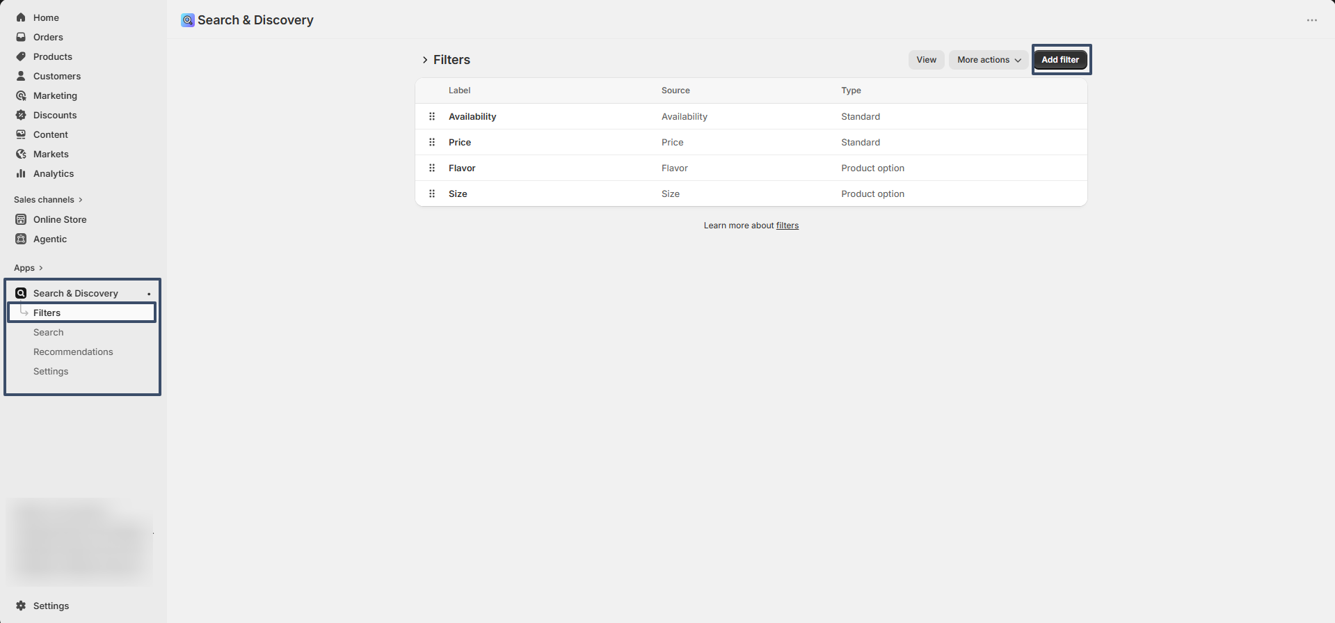
Setting Up Product Filters

Product filtering is powered by Shopify's Search & Discovery app. Before filters appear on the collection page, they must be configured within Shopify.

  1. From your Shopify Admin, go to Apps → Search & Discovery.
  2. Open Filters and click Add Filters.
  3. Select the filters you want to display, such as Availability, Price, Product Type, Vendor, Variant Options, or Metafields.
  4. Save your changes.
  5. Return to the theme editor and enable filtering in the Collection section settings.

Once configured, customers can use these filters on collection pages to quickly narrow down products and find relevant items.

collection section

Customers can browse products using advanced filtering and sorting options such as availability, price, size, color, category, and other Shopify-supported filters. Combined with sorting options like Best Selling, Featured, Price, and Newest, the Collection page helps shoppers quickly find the products they need.

Product Page

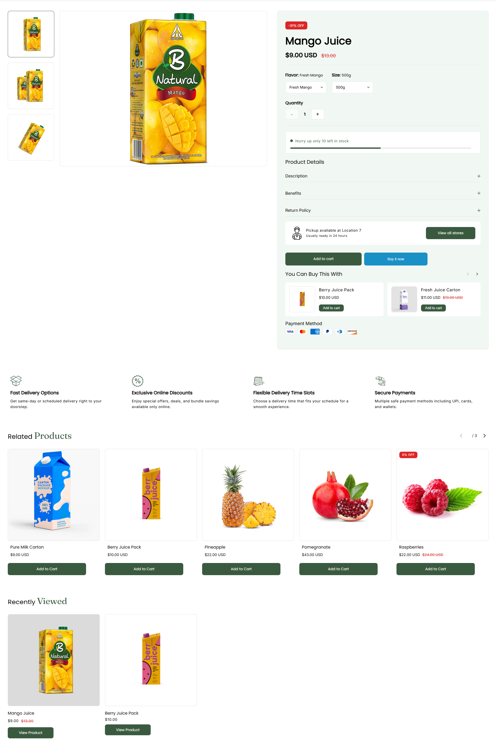
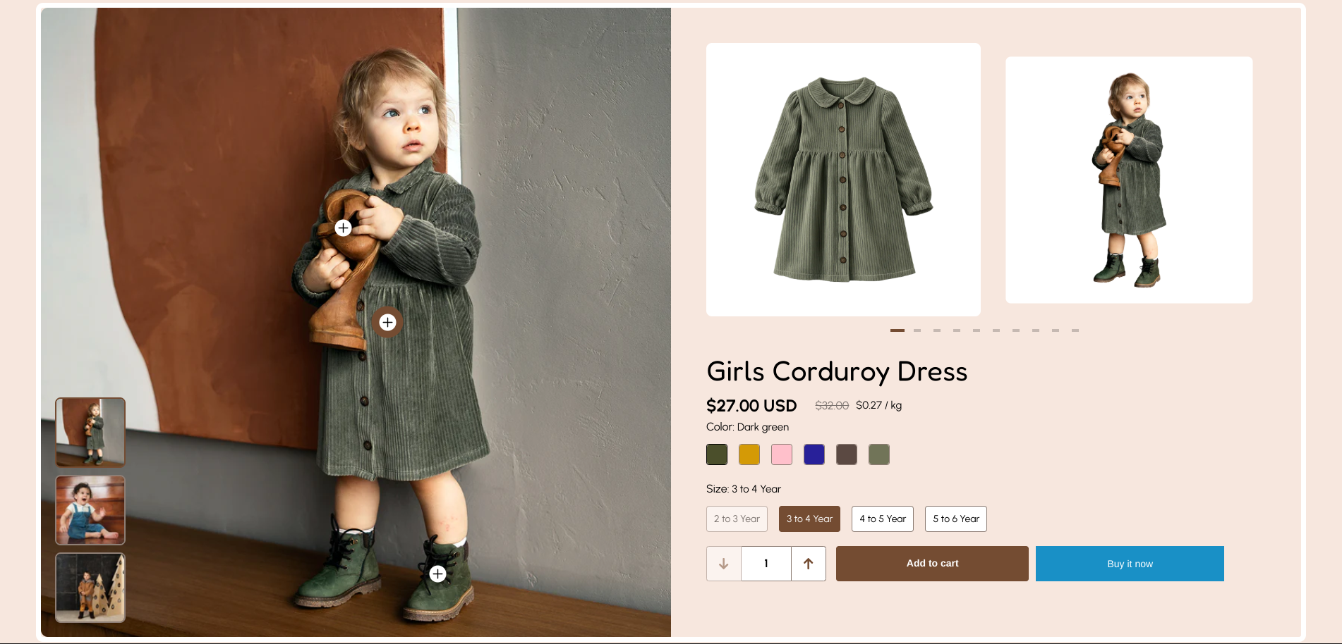
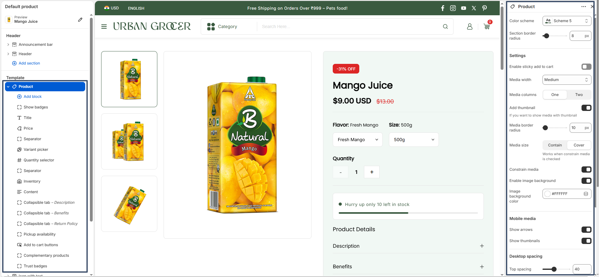
The Breeze product page offers flexible settings for media, spacing, and color schemes, and provides a variety of blocks within section. These blocks include the variant picker, title, price, inventory status, quantity selector, add-to-cart buttons, collapsible content, and more. The product page also includes a Recently viewed section and Related products section.

Product Page
  • Color Scheme: Select the color scheme applied to the product section to match your store's branding and design.
  • Section Border Radius: Adjust the corner roundness of the product section container for a softer or more modern appearance.
  • Enable Sticky Add to Cart: Display a sticky add-to-cart bar while customers scroll through the product page, making it easier to purchase products at any time.
  • Media Width: Choose the width of the product media area relative to the product information area.
  • Media Columns: Configure whether product media is displayed in one or two columns for the desktop layout.
  • Add Thumbnail: Enable thumbnail navigation below or beside the main product image, allowing customers to quickly browse product media.
  • Media Border Radius: Customize the corner radius applied to product images and media items.
  • Media Size: Select how product images are displayed within their containers: Contain keeps the entire image visible, while Cover fills the container area.
  • Constrain Media: Restrict media dimensions to maintain a consistent image presentation across products.
  • Enable Image Background: Add a background behind product images to improve visibility and presentation.
  • Image Background Color: Choose the background color displayed behind product images when the image background option is enabled.
  • Show Arrows (Mobile): Display navigation arrows on mobile devices for easier image browsing.
  • Show Thumbnails (Mobile): Display product image thumbnails on mobile devices to help customers navigate product media.
  • Desktop Spacing: Adjust the top and bottom spacing of the product section on desktop devices to create a balanced layout.
Product Page

Product Page Blocks

Product Page

1. Show Badges : Displays product badges that help highlight important product statuses such as sale offers, discounts, sold-out products, or other promotional labels. These badges improve product visibility and draw customer attention to key product information.

2. Title : Displays the product title on the product page. This block helps customers quickly identify the product they are viewing and serves as the primary product heading.

3. Price : Displays the product price along with compare-at prices, discounts, and sale pricing when applicable. This block ensures customers can clearly see product pricing information before purchasing.

4. Separator : A horizontal line or separator element used to visually divide content sections on the product page. This block helps organize the layout and improve readability by creating distinct visual separation between different content blocks.

  • Separator opacity : Separator opacity controls the transparency level of the separator, allowing you to adjust its visibility and visual prominence on the product page.
  • Separator color : Select the color of the separator line.

5. Variant Picker : Allows customers to select available product variants such as size, color, flavor, material, or style. Variants can be displayed using buttons, dropdowns, or a mixed layout depending on the selected settings.

  • Options type – Controls how product variants are displayed.
    • Dropdown – Displays all variant options as dropdown selectors.
    • Button – Displays all variant options as clickable buttons/swatches.
    • Mixed – Displays color options as swatches and all other options as dropdown selectors.
  • Variants style – Determines the layout of variant options.
    • Stack – Displays variant options on separate lines.
    • Inline – Displays variant options in a single row where space permits.
  • Border radius – Adjusts the roundness of the variant picker container corners.
Read more about adding color swatches using category metafields

6. Quantity Selector : Provides controls for customers to increase or decrease the quantity of the product before adding it to the cart. This makes it easy to purchase multiple units of the same item.

7. Inventory : Displays the product's stock status and inventory availability. This block can be used to inform customers about product availability and low-stock situations, helping create urgency and improve purchasing decisions.

  • Inventory Threshold : Defines the stock quantity limit used to determine when inventory is considered low. In this example, the threshold is set to 10.
  • Inventory Layout : Controls how inventory information is displayed. Available options are:
    • Default: Shows inventory using the standard display format.
    • Progress Bar : Displays stock levels visually using a progress bar.
  • In Stock Color : Sets the color used when inventory is above the threshold and available in stock. Current color : #178D2B (green).
  • Out of Stock Color : Sets the color used when inventory reaches zero or is unavailable. Current color : #FF0000 (red).
  • Threshold Color : Sets the color used when inventory falls at or below the defined threshold. Current color : #3A5A40 (dark green).

8. Custom Content : Allows you to add custom content directly to the product page. This can be used to display additional information, promotional messages, product highlights, specifications, or any other relevant content.

9. Collapsible Tab : Displays content inside expandable and collapsible sections. This block is useful for organizing information such as product descriptions, benefits, ingredients, care instructions, FAQs, shipping information, return policies, or other detailed content without overcrowding the page.

  • Title Specifies the heading displayed for the collapsible tab. In this example, the title is "Description".
  • Content – Contains the information shown when the tab is expanded. The rich text editor allows formatting such as headings, bold text, italics, links, and lists.
  • Show Description – When enabled, the tab's description is displayed alongside or below the title.
  • Enable Border Top – Adds a border line to the top of the collapsible tab for visual separation.
  • Enable Border Bottom – Adds a border line to the bottom of the collapsible tab for visual separation.
  • Keep Tab Open by Default – When enabled, the tab content is expanded and visible when the page first loads.
  • Show Background in Content – Applies the secondary background color to the content area, making it visually distinct from the surrounding page content.

10. Pickup Availability : Shows whether a product is available for local pickup at store locations. Customers can view pickup availability and location details directly from the product page when local pickup is enabled.

11. Add to Cart Button : Displays the Add to Cart button and dynamic checkout options. This block allows customers to add products to their cart and proceed with the purchase process quickly and efficiently.

  • Show Dynamic Checkout Button : – When enabled, a dynamic checkout button (such as "Buy Now") is displayed alongside the Add to Cart button, allowing customers to skip the cart and proceed directly to checkout using their preferred payment method.
  • Show gift card recipient form : – When enabled, displays a form for collecting gift card recipient information.

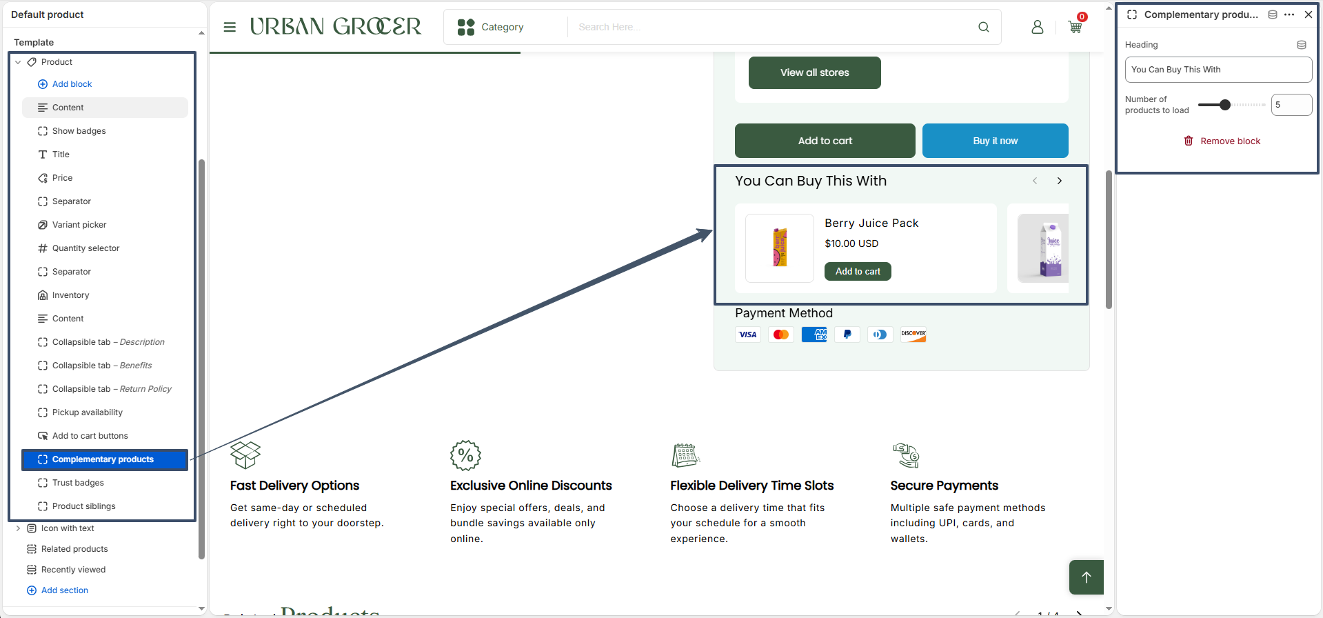
12. Complementary Products : This block displays recommended products that can be purchased together with the current product. The section appears on the product page as a product slider (for example, "You Can Buy This With"), helping customers discover related items and encouraging additional purchases.

  • Heading : Customize the title displayed above the complementary products section.
  • Number of products to load : Control how many complementary products are displayed in the slider.
Button

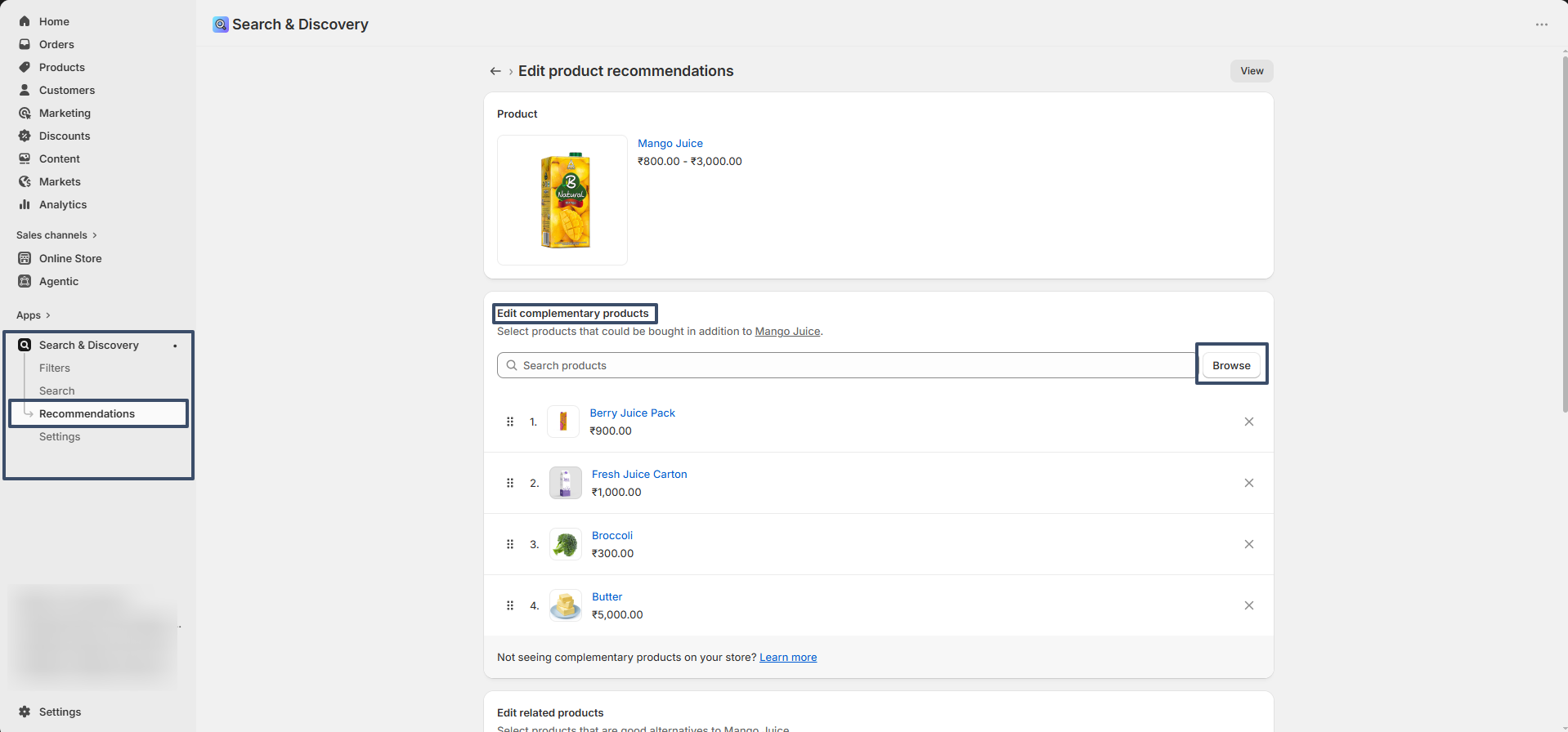
How to Configure Complementary Products:

  1. Open Shopify Admin.
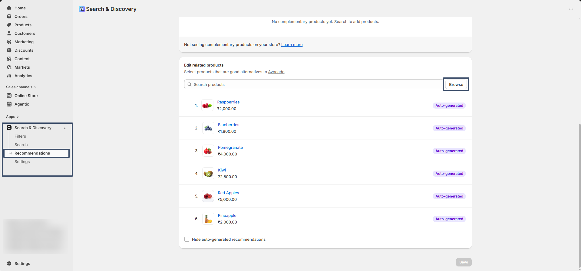
  2. Go to Apps → Search & Discovery.
  3. Select the product for which you want to add recommendations.
  4. Locate the Complementary Products section.
  5. Add the products you want to recommend together.
  6. Save your changes.
  7. Return to the theme editor and ensure the Complementary Products block is enabled.

Once configured, the selected products will automatically appear in this section on the product page.

Button

13. Trust Badges : Displays trust-building icons or badges such as secure payment, fast shipping, quality assurance, money-back guarantees, or other customer confidence indicators. These badges help improve trust and conversion rates.

  • Heading – Customize the title displayed above the trust badge section.
  • Heading alignment – Adjust the horizontal alignment of the heading and icons.

14. Product Siblings : Allows you to connect related products, such as different colors, styles, or versions of the same item. Linked products can be displayed as color swatches or product image swatches, enabling customers to switch between related products easily.
Follow the link to to know more about the Product Siblings setup

15.Vendor : Displays the product vendor, brand, manufacturer, or supplier name associated with the product. This can be useful for stores that sell products from multiple brands or vendors.

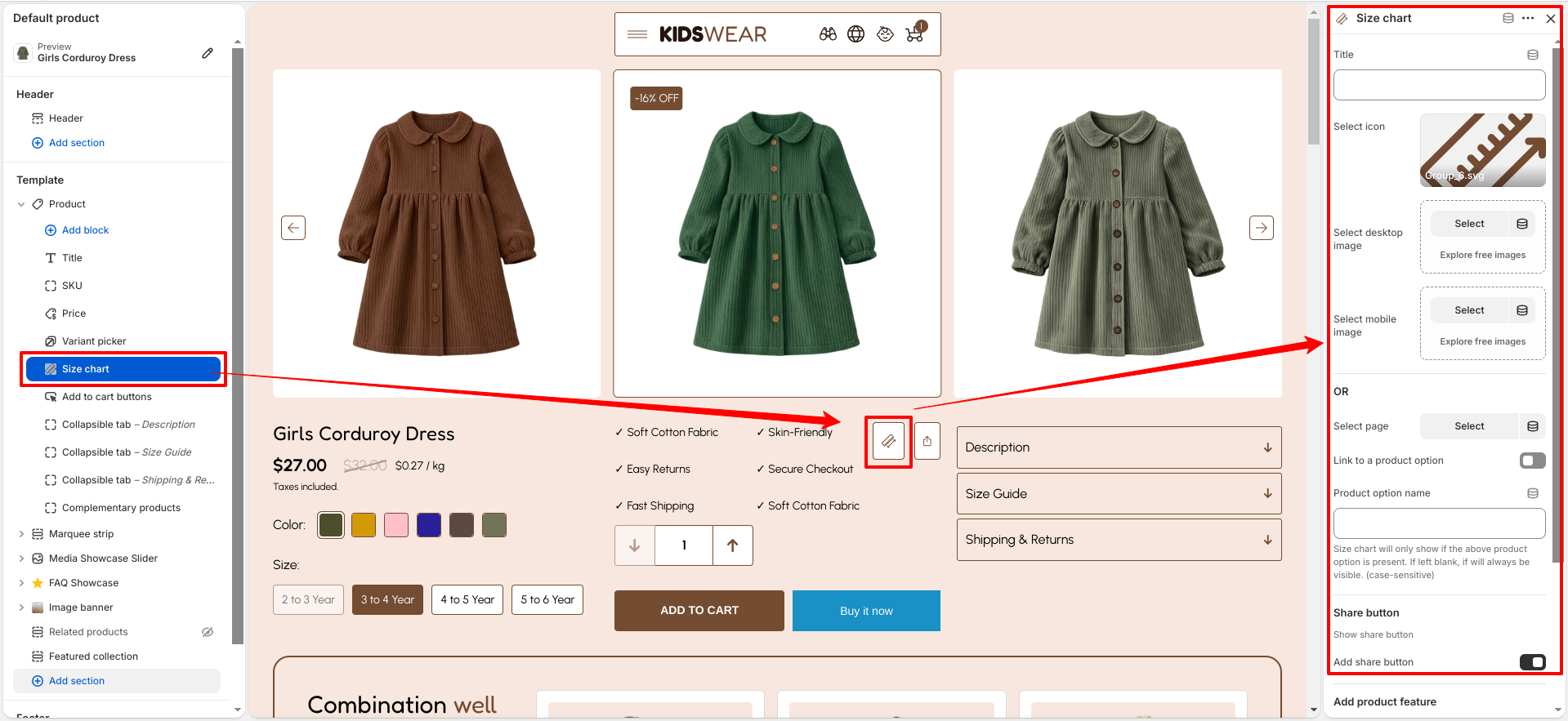
16.Size Chart : Displays a size guide or size chart to help customers choose the correct product size. This feature is particularly useful for clothing, footwear, accessories, and other size-dependent products.

  • Title – Defines the text displayed for the size chart.
  • Select icon – Choose an icon to display alongside the size chart title.
  • Select desktop image – Upload or select the size chart image for desktop devices.
  • Select mobile image – Upload or select the size chart image for mobile devices.
  • Select page – Choose a Shopify page to display as the size chart content instead of images.
  • Link to a product option – Restricts the size chart to products containing a specific option.
  • Product option name – Enter the exact product option name (case-sensitive). If left blank, the size chart will be displayed for all products.

17. SKU : Displays the product SKU (Stock Keeping Unit). The SKU helps identify specific products or variants and can be useful for inventory management and customer reference.

18. Description : Displays the product's main description content. This block provides customers with detailed information about the product, including features, specifications, usage details, and other important information entered in the product description field.

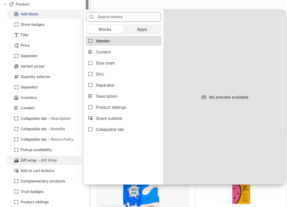
19. Gift Wrap : Provides customers with an option to add gift wrapping to their order directly from the product page. This feature enhances the shopping experience by allowing products to be prepared for gifting before checkout.

Follow the link to to know more about the Gift Wrap setup

20. Share Buttons : Displays social sharing options that allow customers to share the product page through social media platforms or by copying the product link. This can help increase product visibility and customer engagement.

Gift Wrapping

The Gift Wrapping feature allows customers to add a special wrapping option directly from the product page. This enhances the shopping experience by offering a personalized touch for occasions.

Steps to Enable Gift Wrapping

Follow the steps below to enable the Gift Wrap option on the product page:

  • Create Gift Wrap Product: Go to Shopify Admin >> Products >> Add Product.
  • Add Product Details: Create a product named Gift Wrapping (URL handle: gift-wrapping) and set the price you want to charge for this service.
  • Set Visibility: Make sure the product is not available in online store collections so it does not appear as a regular product.
  • Save Product: Click Save to create the gift wrap product.
  • Add Gift Wrap Block: Go to Online Store >> Themes >> Customize and open the Product Page.
  • Insert Block: Add the block named Gift wrap in the product template as shown in the image below.
  • Select Gift Wrap Product: Inside the Gift Wrap block settings, select the previously created Gift Wrapping product.
  • Enable Feature: Once selected, the Gift Wrap checkbox will appear on the product page, allowing customers to add gift wrapping before adding the product to cart.
gift wrap block

Recently Viewed Section

The Recently Viewed section automatically displays products that a customer has previously viewed while browsing your store. This feature requires no manual product selection, as the section dynamically updates based on each customer's browsing activity. By showcasing recently visited products, it helps customers quickly return to items they have shown interest in, improves product discovery, and creates a more personalized shopping experience.

Available Settings:

  • Color Scheme: Select the color scheme used for the section to match your store's overall design.
  • Heading: Customize the title displayed for the Recently Viewed section.
  • Font Style: Choose the font style for the section heading.
  • Font Size: Adjust the heading size to control its appearance and visibility.
  • Heading Alignment: Set the heading alignment to left, center, or right.
  • Number of Columns per Row: Control how many recently viewed products are displayed in each row on desktop devices.
  • Image Aspect Ratio: Choose the aspect ratio for product images to maintain a consistent layout.
  • Product Content Alignment: Adjust the alignment of product information such as titles, prices, and action buttons.
  • Mobile Layout: Configure whether one or two product columns are displayed on mobile devices.
  • Section Spacing: Customize the top and bottom padding to control the spacing around the section.
Recently viewed products section settings

Related Products Section

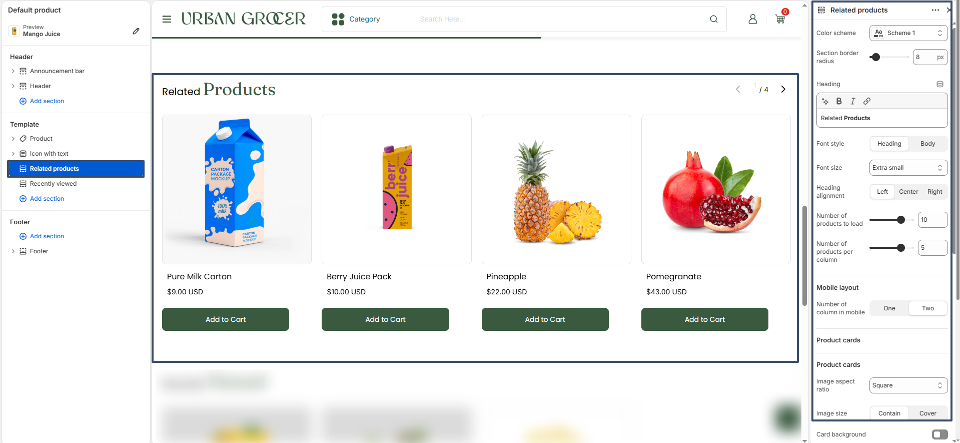
The Related Products section displays product recommendations on the product page to help customers discover items similar or complementary to the product they are viewing. This improves product discovery and encourages additional purchases.

Related products are powered by Shopify's Search & Discovery app. Shopify can automatically generate recommendations based on product relevance, or merchants can manually select and customize the products shown for each product page.

Available Settings

  • Color Scheme: Choose the color style for the Related Products section.
  • Heading: Set the title displayed above the related products.
  • Number of Products to Load: Define how many recommended products will be displayed.
  • Products Per Row: Control how many product cards appear in each row on desktop.
  • Mobile Layout: Choose between one or two product columns on mobile devices.
  • Show Vendor: Enable or disable the product vendor name on product cards.
  • Image Aspect Ratio: Set how product images are displayed inside cards.
  • Image Size: Choose between Contain or Cover image display mode.
  • Product Content Alignment: Align product title, price, and content inside the card.
  • Section Spacing: Adjust top and bottom spacing for desktop and mobile devices.
Recently viewed products section settings

How It Works

  • Related products are automatically generated by Shopify based on product data.
  • Merchants can override automatic recommendations using the Shopify Search & Discovery app.
  • Each product can have its own unique set of related products.
  • Any updates made in the Search & Discovery app are reflected automatically on the storefront.
Recently viewed products section settings

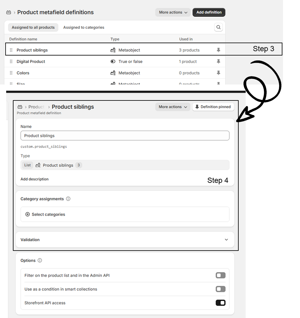
Product Siblings Feature

The Product Siblings feature allows you to link related products (such as different color variants) on the product page. These linked products are displayed as swatches, making it easy for customers to switch between sibling products. Swatches can be shown as colors or product images, and their shape can be customized globally.

Steps to Enable Product Siblings

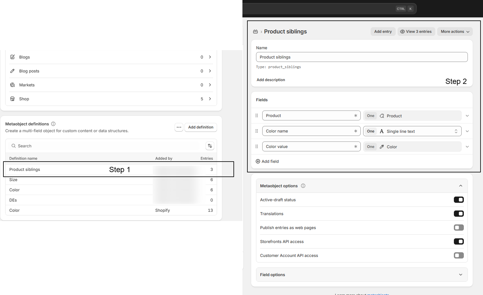
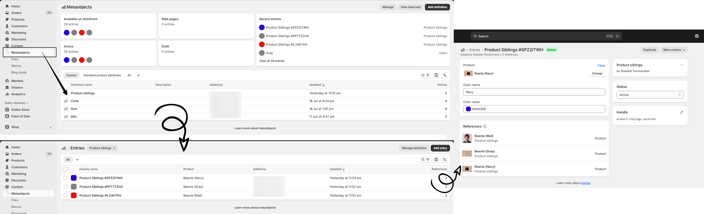
Go to Admin Panel >> Content >> Metaobjects

  • Create Metaobject: Create a metaobject named Product siblings.
  • Add Fields: Add the following fields inside the metaobject:
    • Product: Type – Product (Single value)
    • Color name: Type – Single line text (Single value)
    • Color value: Type – Color product sibling img
  • Create Metafield: Go to Settings >> Custom data >> Products and create a metafield named Product siblings. Connect it with the Product siblings metaobject and set it as a List of values. product sibling img
  • Add Metaobject Entries: Go to Content >> Metaobjects >> Product siblings, click Add entry, and fill in the product, color name, and color value. product sibling img
  • Assign to Products: Open each product and add the relevant Product siblings entries in the metafield.

Customization Options:

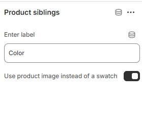
  • Add Product Siblings block on Product Page: Go to the Theme Customizer and navigate to the Product page. In the Product page section, add the Product Siblings block
  • Product Image Swatches: Enable the checkbox in the Theme Customizer to replace color swatches with product images.
  • Swatch Shape: Change the global swatch shape (circle, square, etc.) from theme settings. product sibling img
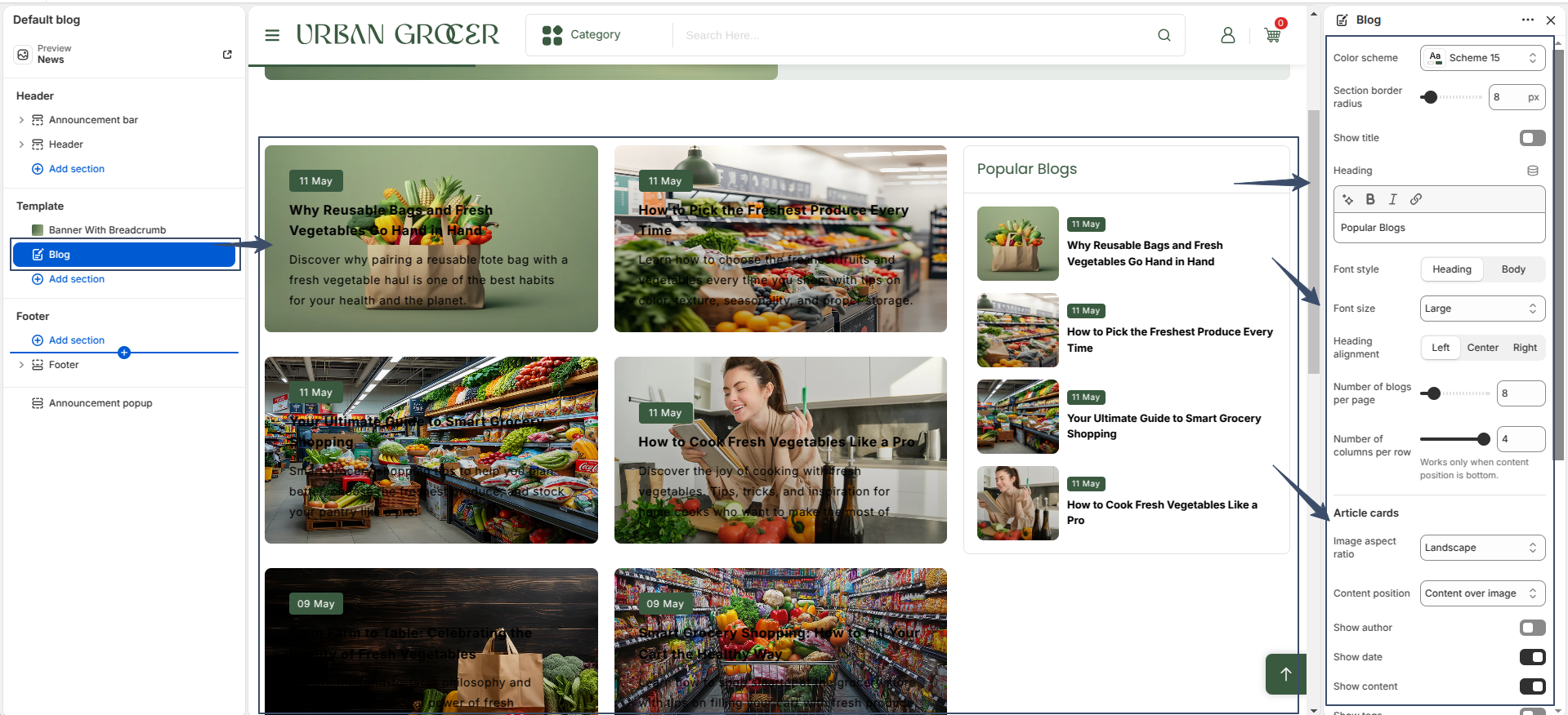
Blog Setting

A Blog is your brand’s storytelling powerhouse. a dynamic space on your website where you share exciting articles, helpful tips, behind-the-scenes stories, and the latest updates.
The blog article card includes a content position setting, allowing you to place the content either to the right or at the bottom of the image.

The blog page includes a Banner with Breadcrumb section at the top, followed by the Blog content section.

BLog
BLog

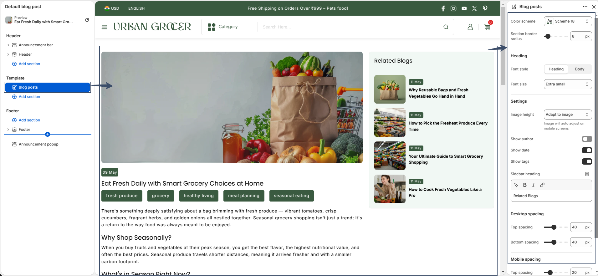
Blog Post

Blog post is a unique story you share with your audience, brought to life through an article template that shapes how your content appears on your site. This article template beautifully organizes every blog post page by showcasing:

  1. The eye-catching title and publication date
  2. A striking featured image or other media to draw readers in
  3. An optional comments section for engaging with your readers
Blog Post

Home Page Layout

A powerful homepage grabs attention, builds trust, and guides shoppers effortlessly to what they’re looking for. It sets the tone, showcases your brand, and drives conversions. The homepage typically consists of the following sections:
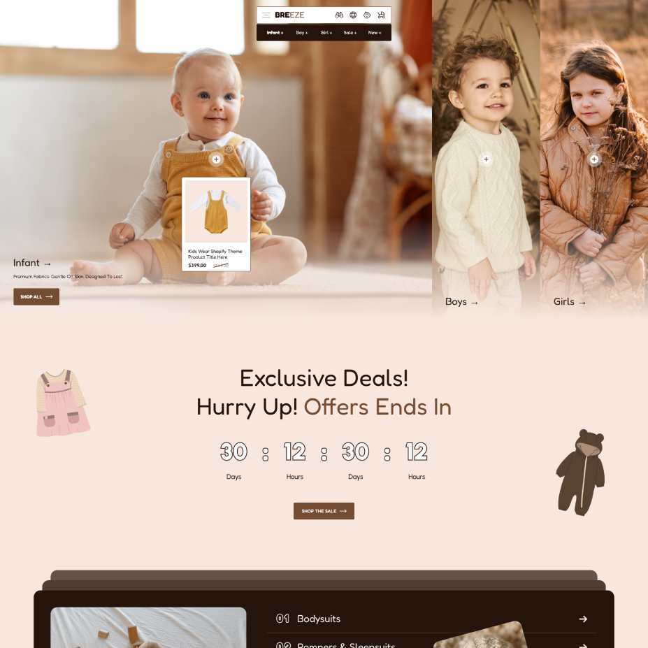
Header & Banner with hotspot

sections 1

Countdown section

sections 2

Collection list

sections 3

Featured collection

sections 4

Video highlight marquee

sections 5

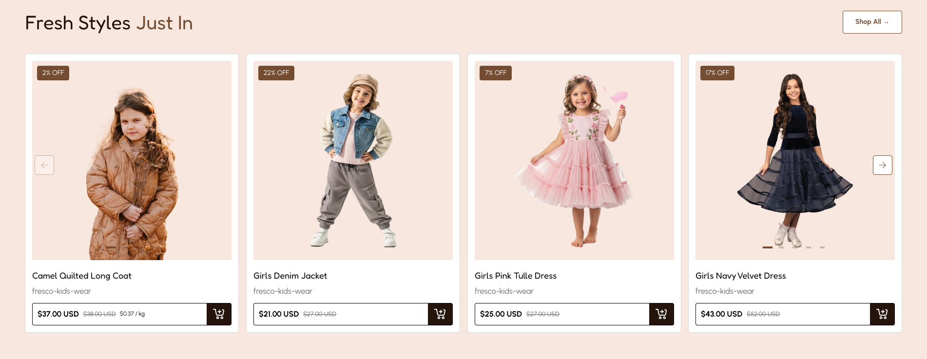
Product showcase

sections 6

Collection tabs

sections 7

Marquee strip

sections 8

Collection Showcase

sections 8

Marquee strip

section 10

Media Showcase

section 11

FAQ Showcase

section 12

Featured blog

section 13

Image Gallery Collage

section 14

Banner with Hotspot

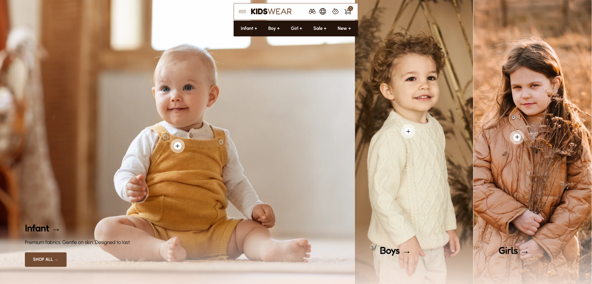
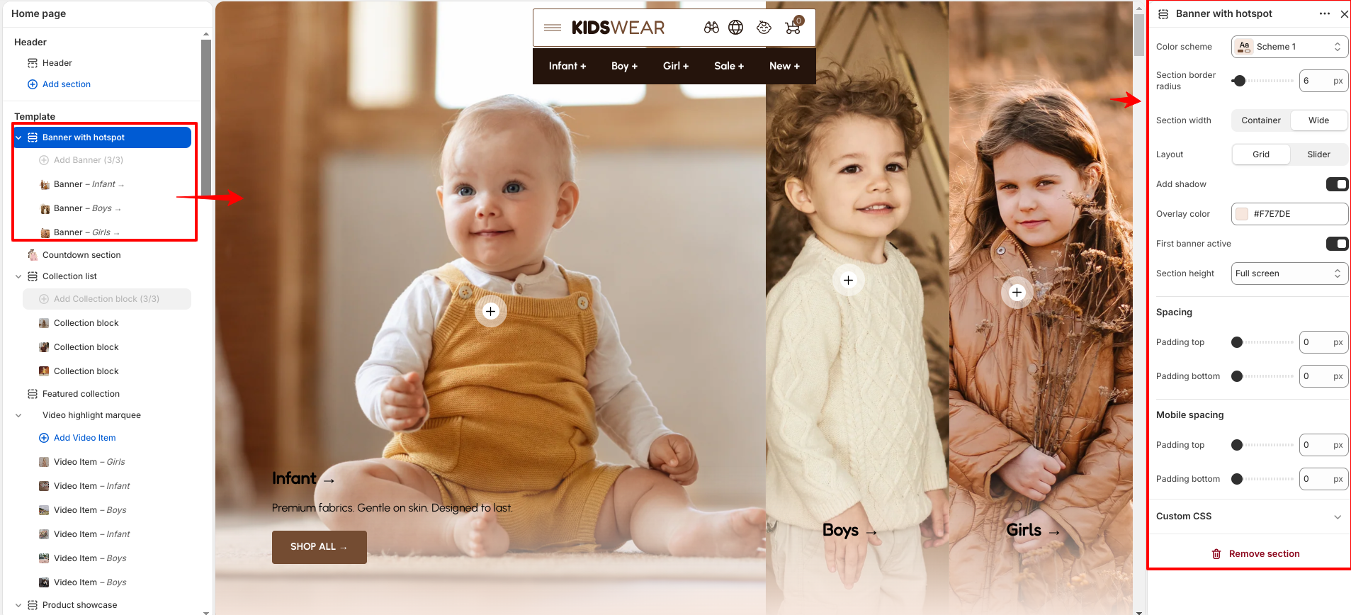
The Banner with Hotspot section allows you to display interactive banners with clickable hotspots to highlight featured products. The section includes various customization options such as color scheme, section border radius, section width, layout type, shadow effect, overlay color, banner height, and spacing controls. You can choose between grid or slider layouts, enable the first banner as active, and adjust desktop and mobile spacing to create a flexible banner experience.

Banner promo slider

Banner(Block)

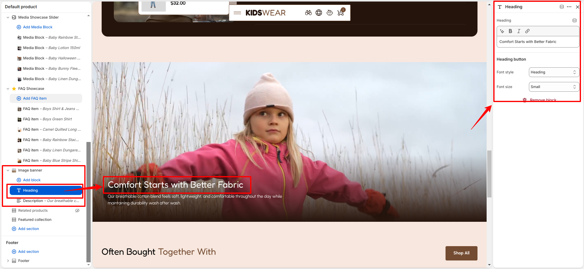
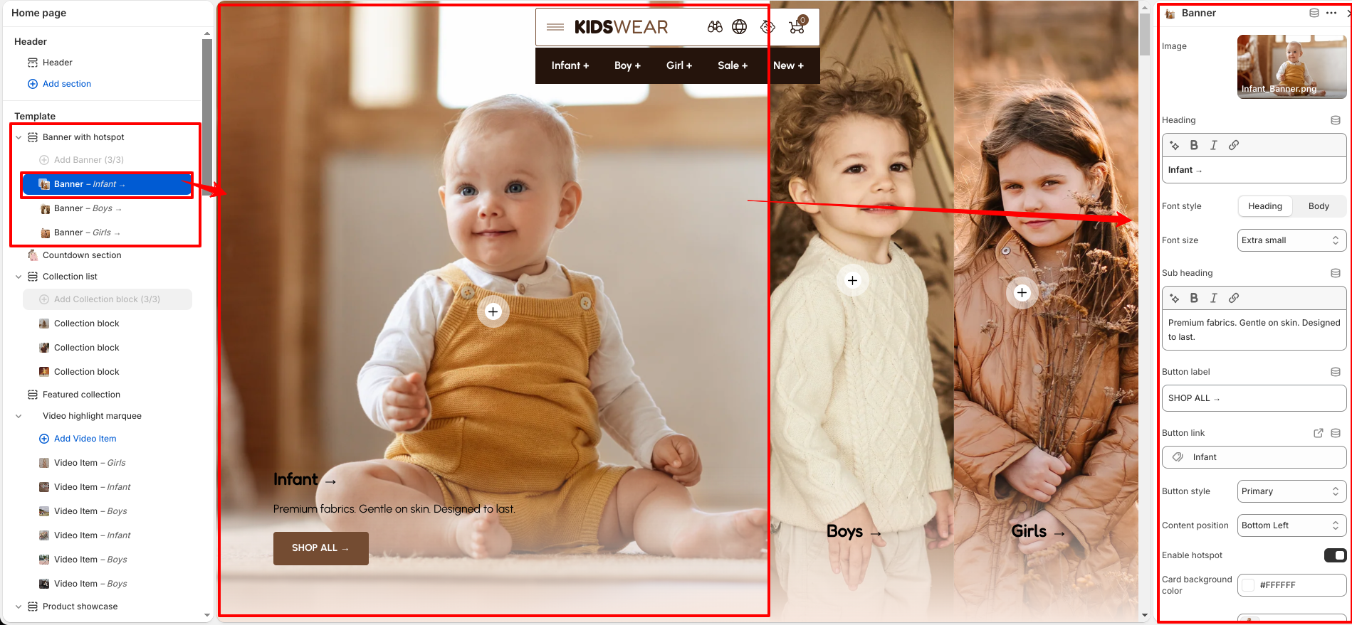
The Banner block contains the individual banner content displayed within the Banner with Hotspot section. You can upload a banner image, add heading and subheading text, customize font style and size, and configure a button with a selected link. The block also provides content position and styling options to control the banner appearance according to your design requirements.

Banner promo slider 2

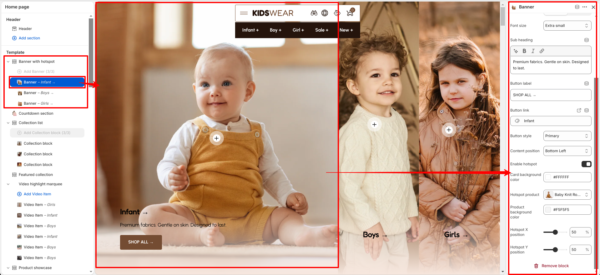
The Banner block also supports interactive hotspot settings, allowing you to highlight specific products on the banner image. You can enable the hotspot, select a product to display, customize the hotspot card background, product background color, and adjust the hotspot position using X and Y position controls.

Banner promo slider 3

Countdown

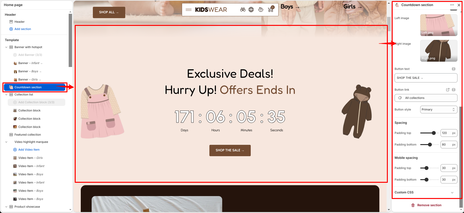
The Countdown section is designed to showcase promotional offers with an attractive countdown timer. It includes customization options such as color scheme, section border radius, heading and subheading text with font style and size controls, end date configuration, countdown separator, and countdown stroke visibility. You can also add left and right images, customize the button text, link, and style, along with desktop and mobile spacing settings to create an engaging promotional section.

Countdown section

The Countdown section helps create urgency for special offers by displaying a timer along with promotional content, images, and a call-to-action button.

Collection list

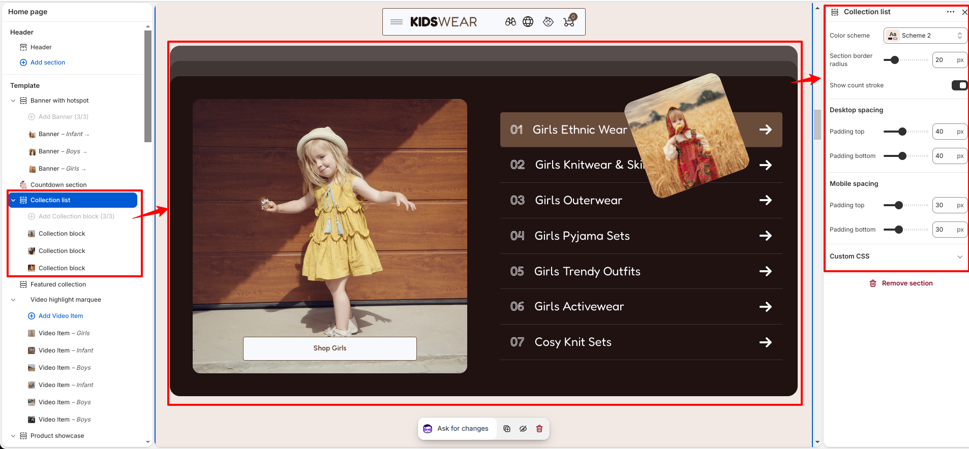
The Collection List section displays multiple collections in a structured layout, allowing users to browse different product groups easily. It includes customization options such as color scheme, section border radius, count stroke visibility, and desktop and mobile spacing controls. You can also add and manage collection content using blocks.

collection-list

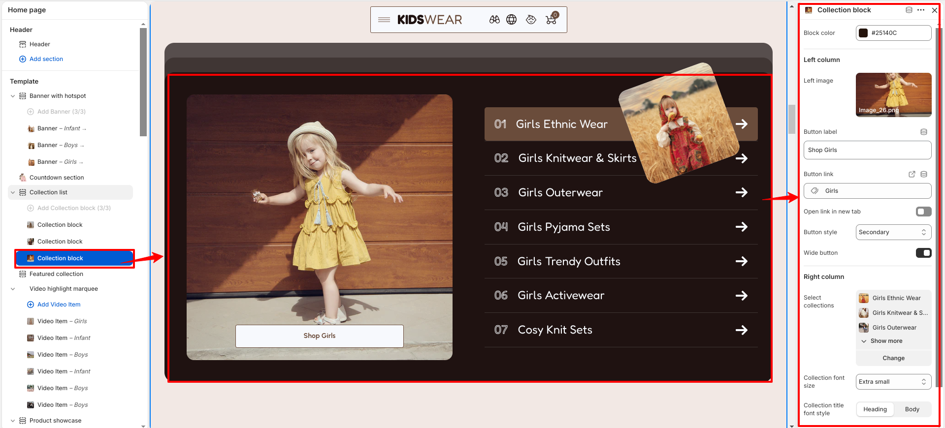
The Collection Item block is used to display individual collection content within the Collection List section. It includes settings to customize block color, add a left-side image, configure a button with link and style options, select collections for the right column, adjust collection font size and font style, and set hover color for collection items.

collection-list

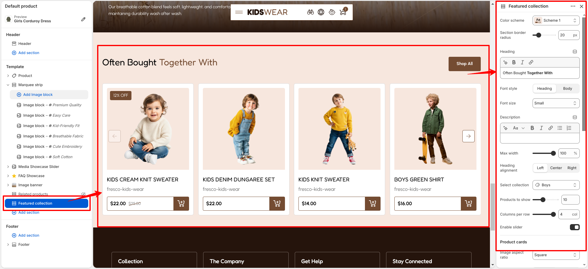
Featured Collection

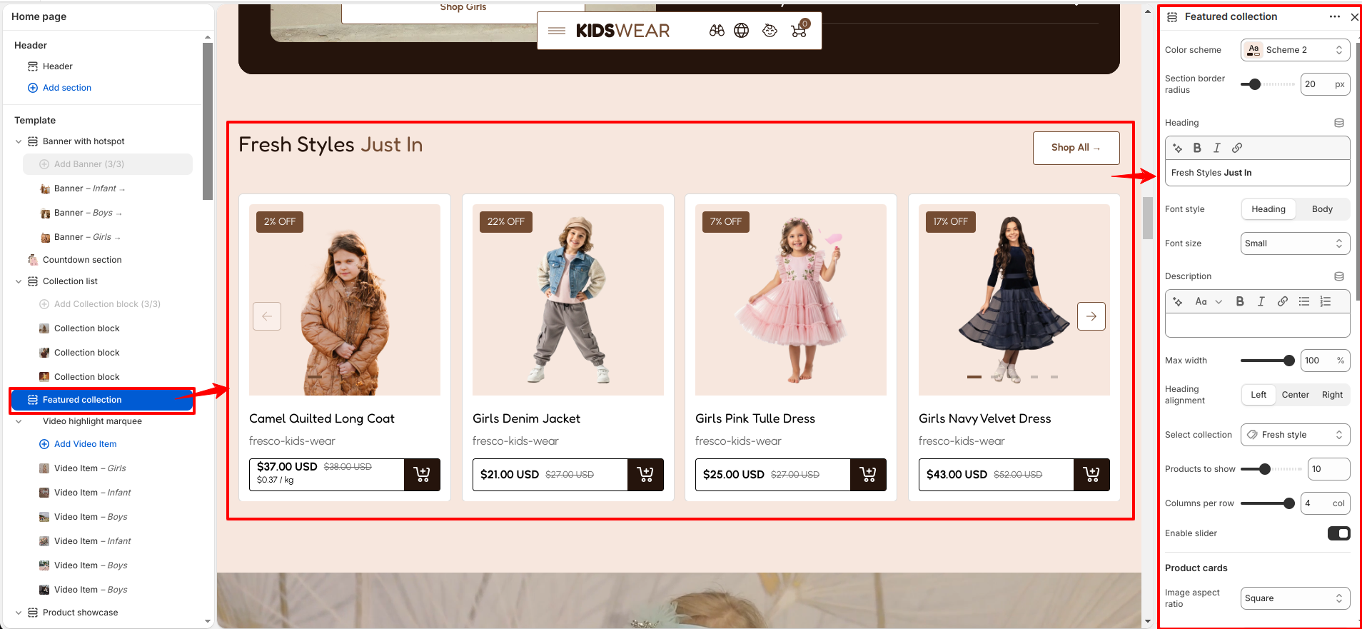
The Featured Collection section is designed to showcase selected products from a specific collection in an attractive layout. It includes customization options such as color scheme, section border radius, heading and description styling, collection selection, product display settings, product card appearance, button options, and desktop and mobile spacing controls.

Featured Collection

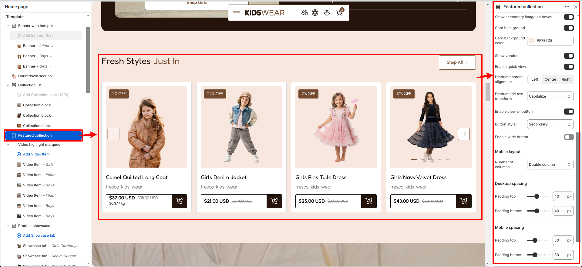
The Featured Collection section allows you to highlight products from a selected collection with customizable content and layout settings. You can configure the heading, description, text alignment, number of products to display, columns per row, slider option, product image settings, card background, vendor visibility, quick view, product content alignment, product title style, and view all button options.

Featured Collection Settings

Video Highlight Marquee

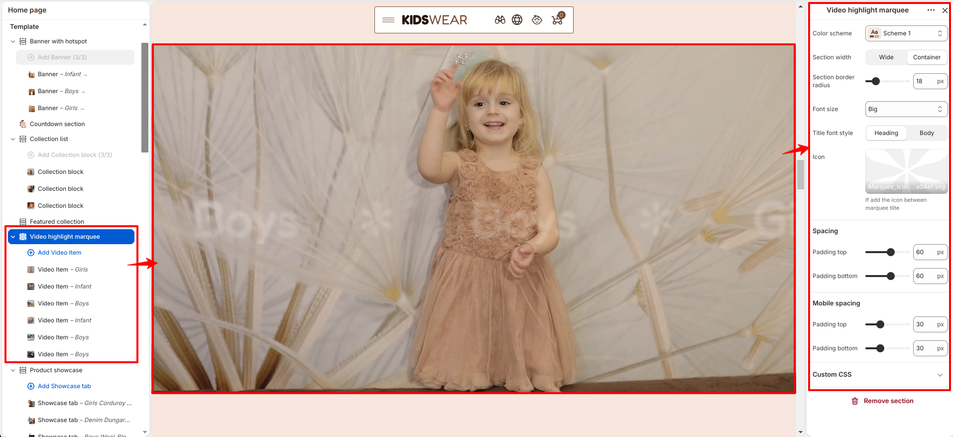
The Video Highlight Marquee section is designed to display scrolling highlighted content with video highlights. It includes customization options such as color scheme, section width, section border radius, title font size, title font style, icon display, and desktop and mobile spacing controls. You can also add and manage video content using blocks.

Video Highlight Marquee

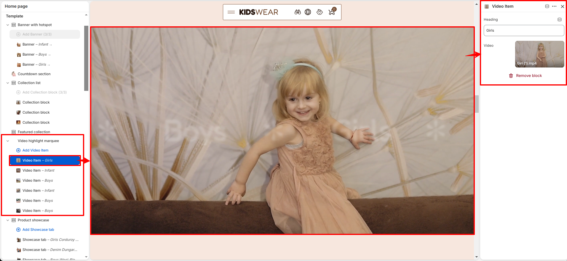
The Video Highlight Marquee block is used to add individual video highlights within the section. It includes settings to add a heading and upload a video to display in the marquee.

Video Highlight Marquee block

Product showcase

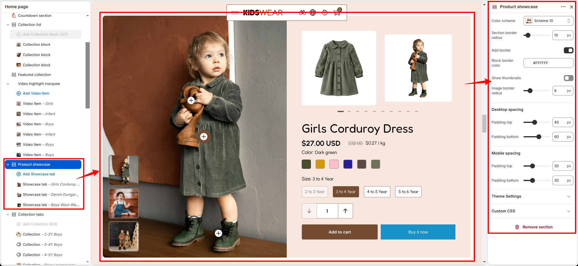
The Product Showcase section is designed to highlight featured products using an interactive showcase layout. It includes customization options such as color scheme, section border radius, border settings, thumbnail visibility, image border radius, and desktop and mobile spacing controls. You can also add and manage showcase content using blocks.

Product showcase

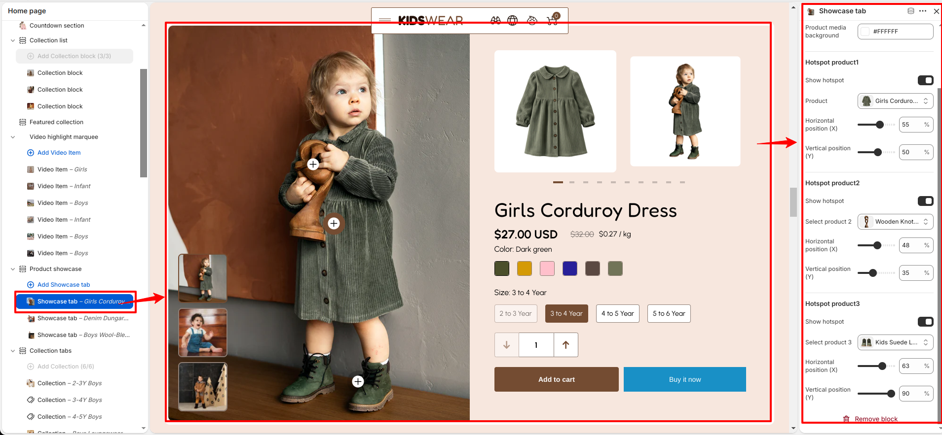
The Showcase Tab block allows you to create individual product showcase tabs with a tab heading and main image. It includes settings to customize product media background and add multiple product hotspots. Each hotspot can be linked with a product and positioned using horizontal and vertical position controls.

Product showcase block

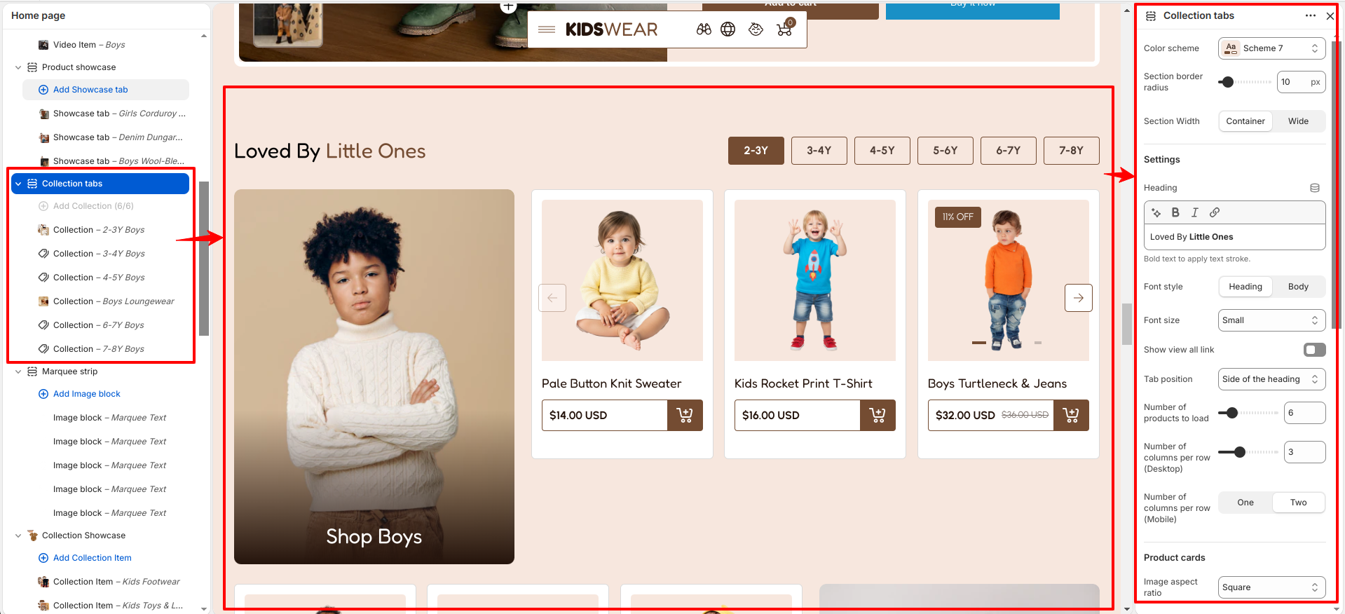
Collection tabs

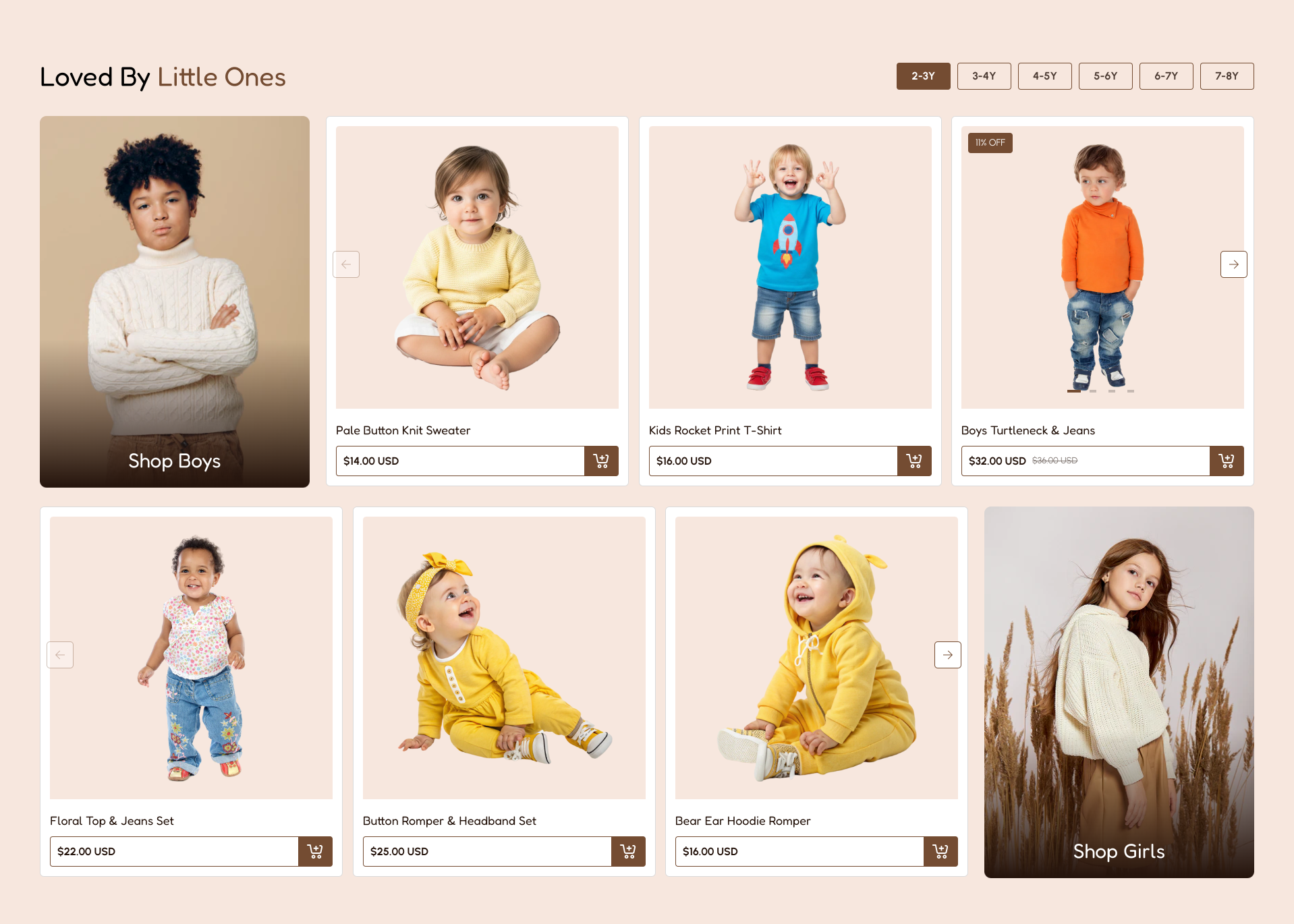
The Collection Tabs section displays products from multiple collections using clickable tabs, allowing customers to browse different product groups easily. It includes customization options such as color scheme, section border radius, section width, heading settings, typography controls, tab position, product display settings, product card styling, and desktop and mobile spacing options. You can also add and manage collection content using blocks.

Collection tabs

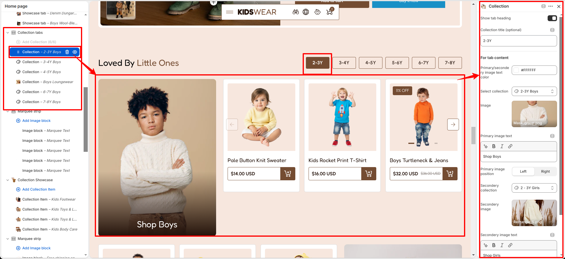
The Collection block is used to add individual collections within the Collection Tabs section. It includes settings to display a tab heading, select collections, upload primary and secondary images, add image text, customize text colors, set image positions, and control the display of side images for creating a visually engaging collection layout.

Collection tabs block

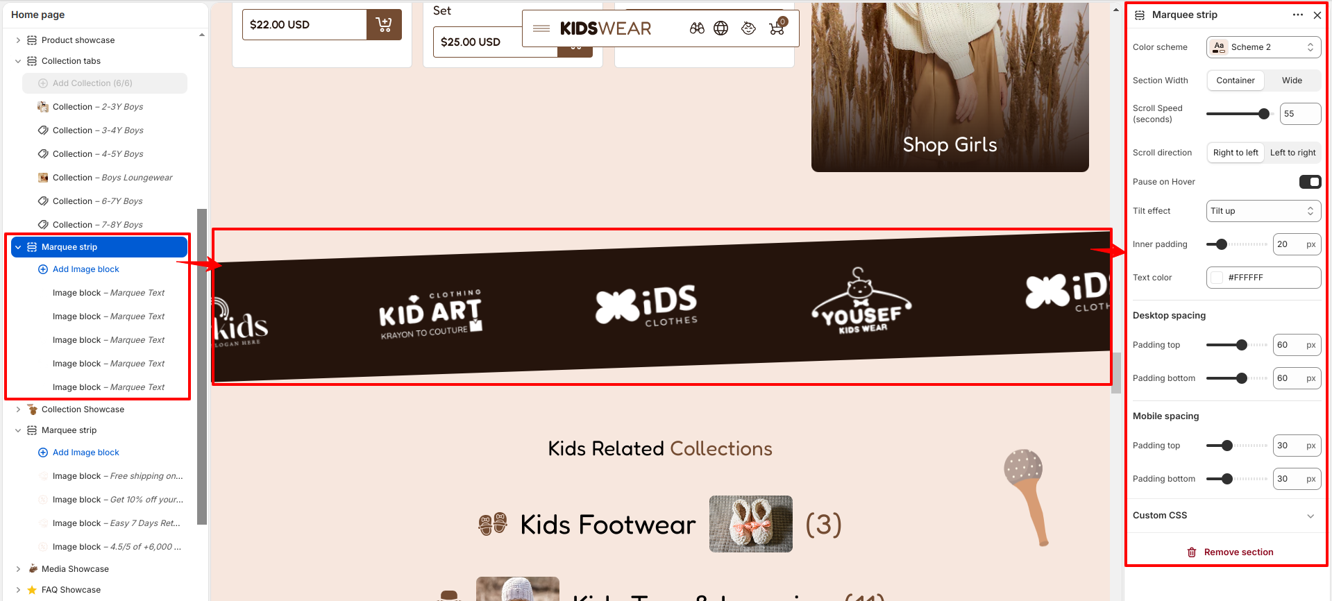
Marquee Strip

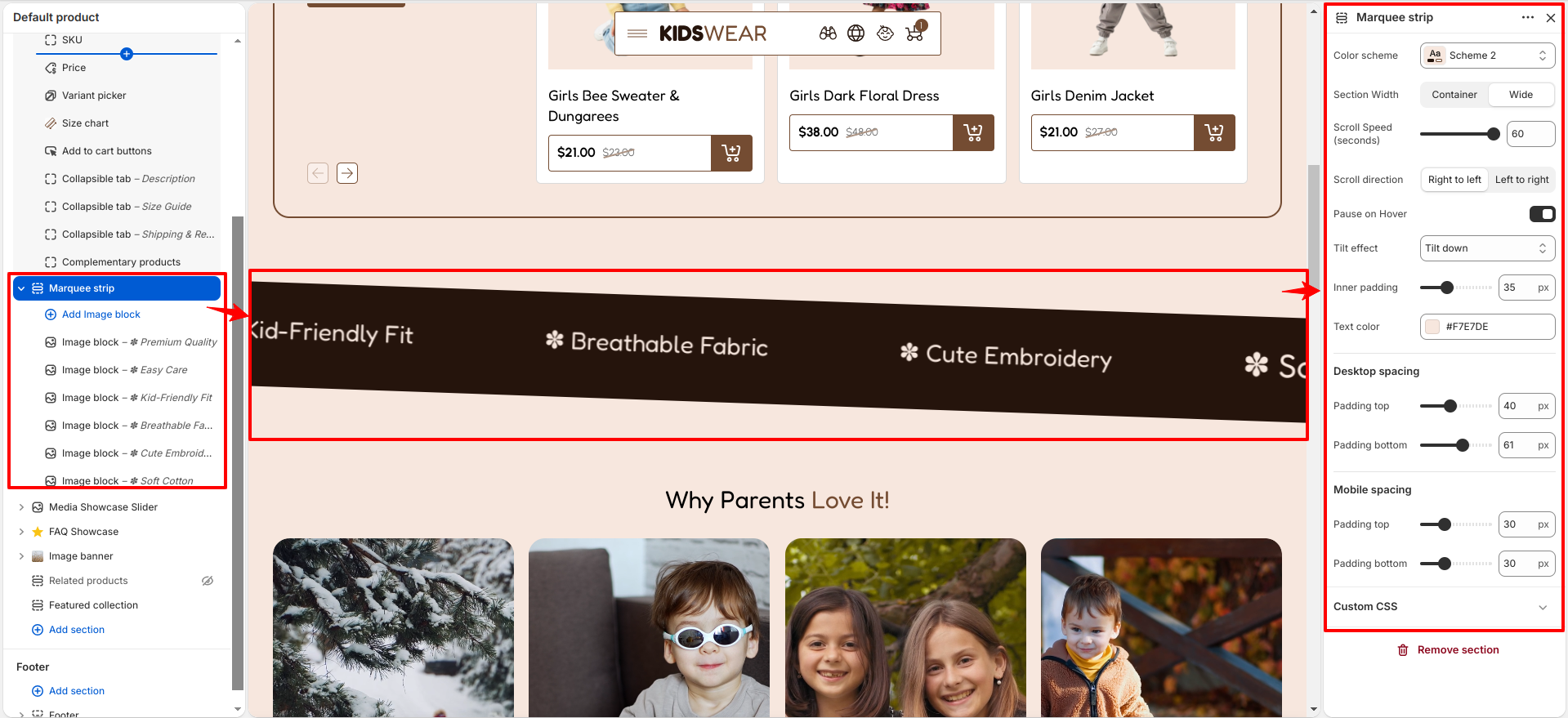
The Marquee Strip section displays a continuously scrolling strip of images or icons, making it ideal for showcasing brand logos, featured icons, partners, or promotional content. It includes settings such as color scheme, section width, scroll speed, scroll direction, pause on hover, tilt effect, inner padding, text color, and desktop/mobile spacing, allowing you to customize the appearance and scrolling behavior to match your store's design.

Marquee Strip

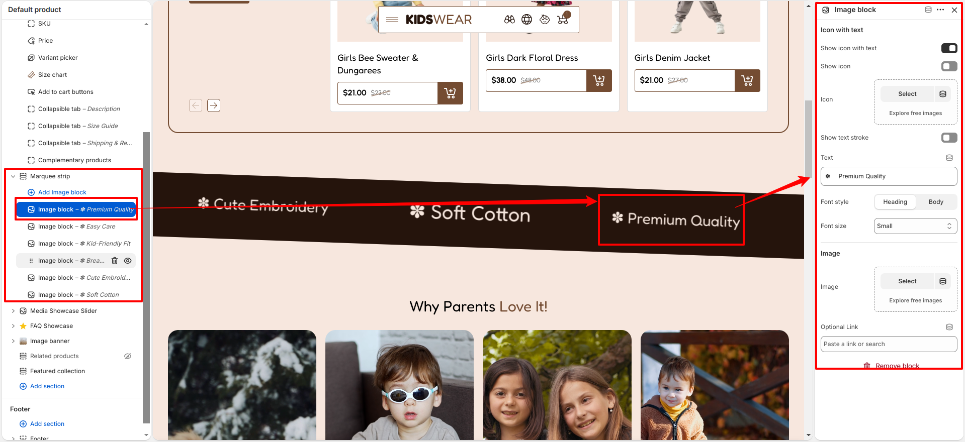
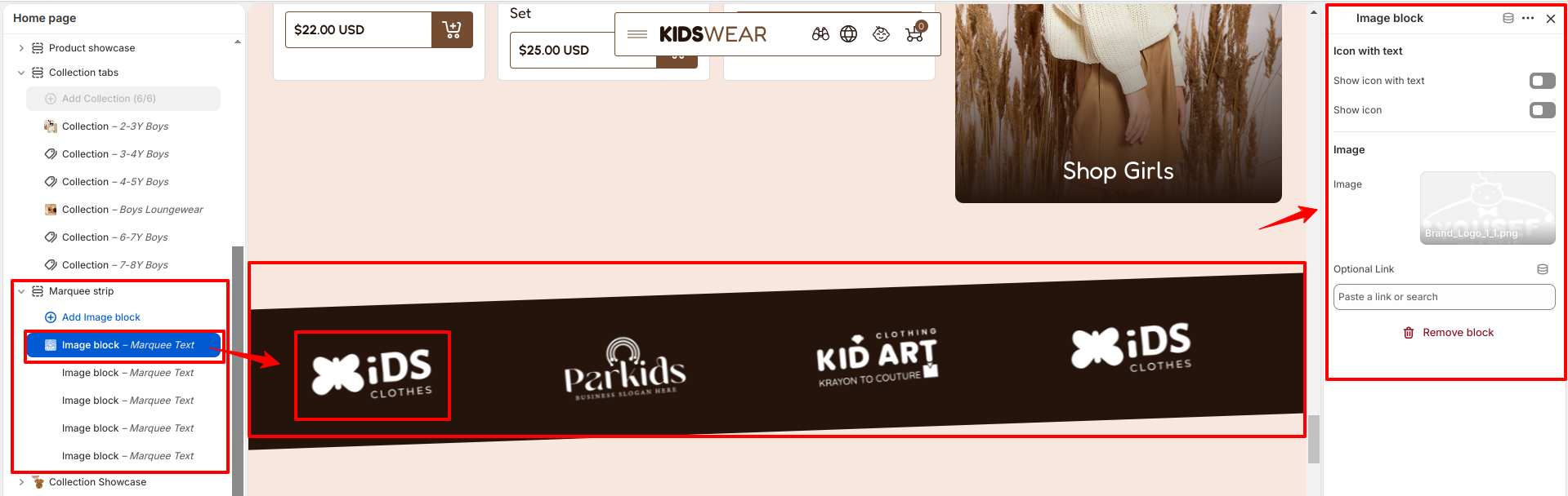
The Marquee Strip section includes an Image block, where you can upload an image, optionally display it with accompanying text, enable or disable the icon display, and assign an optional link to make the image clickable.

Marquee Strip Image Block

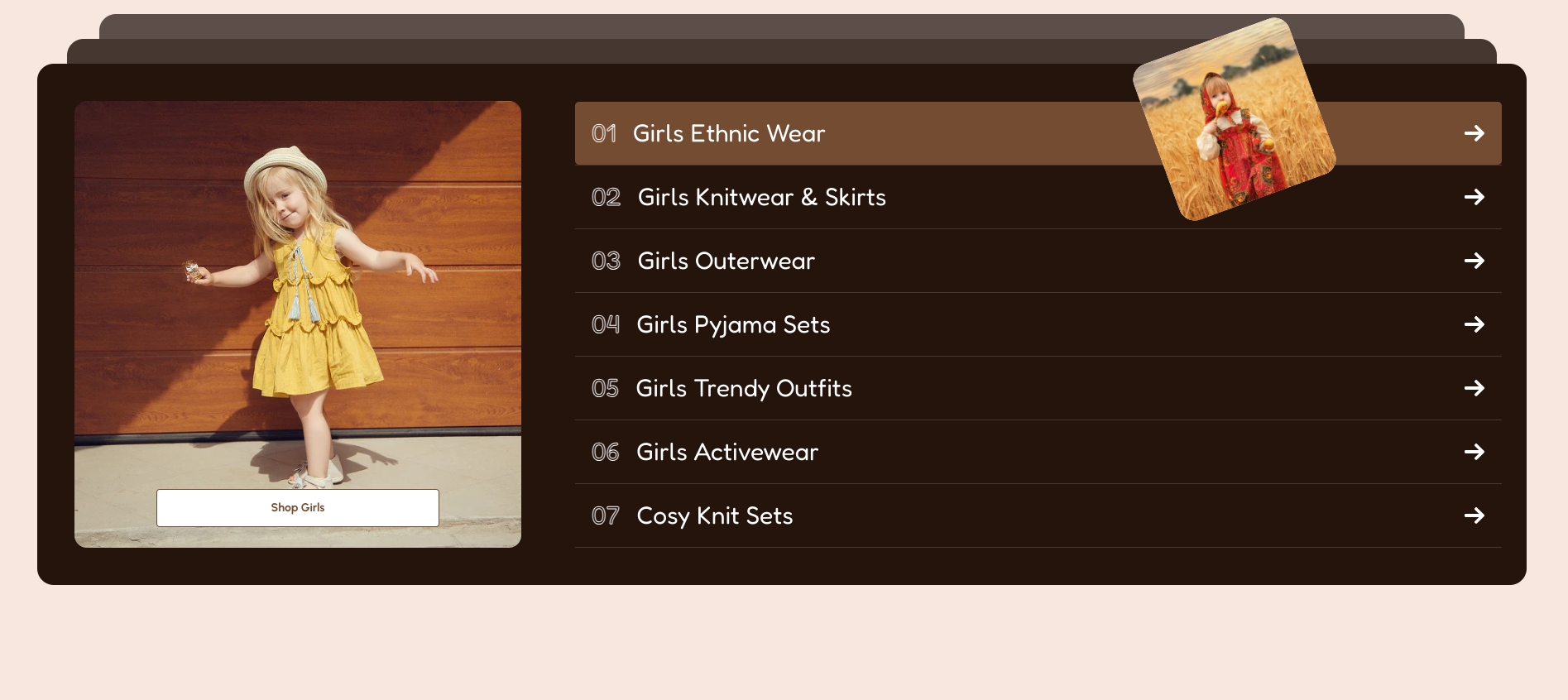
Collection Showcase

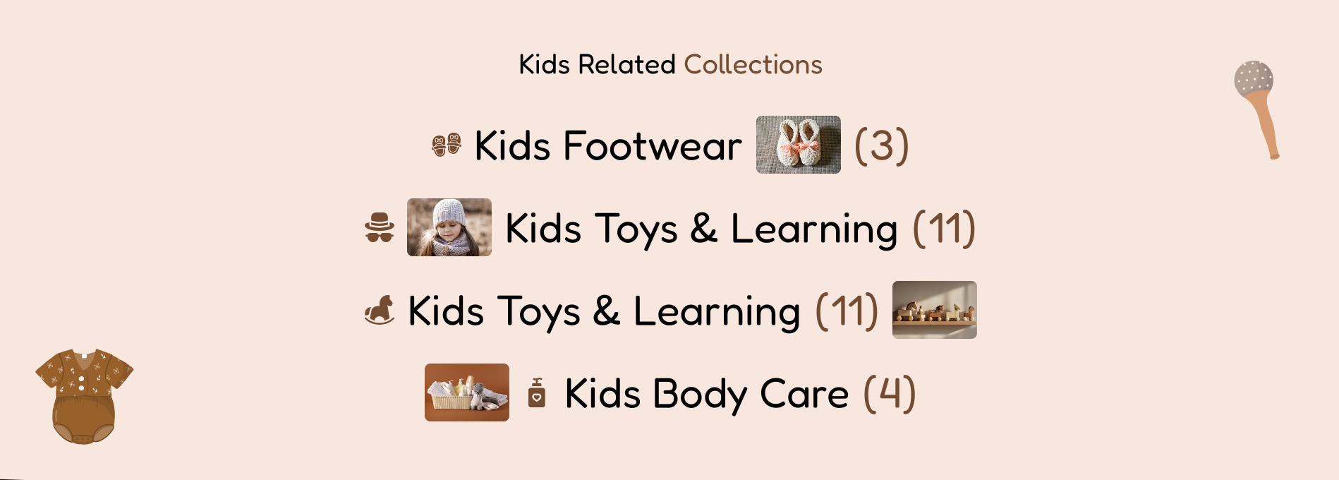
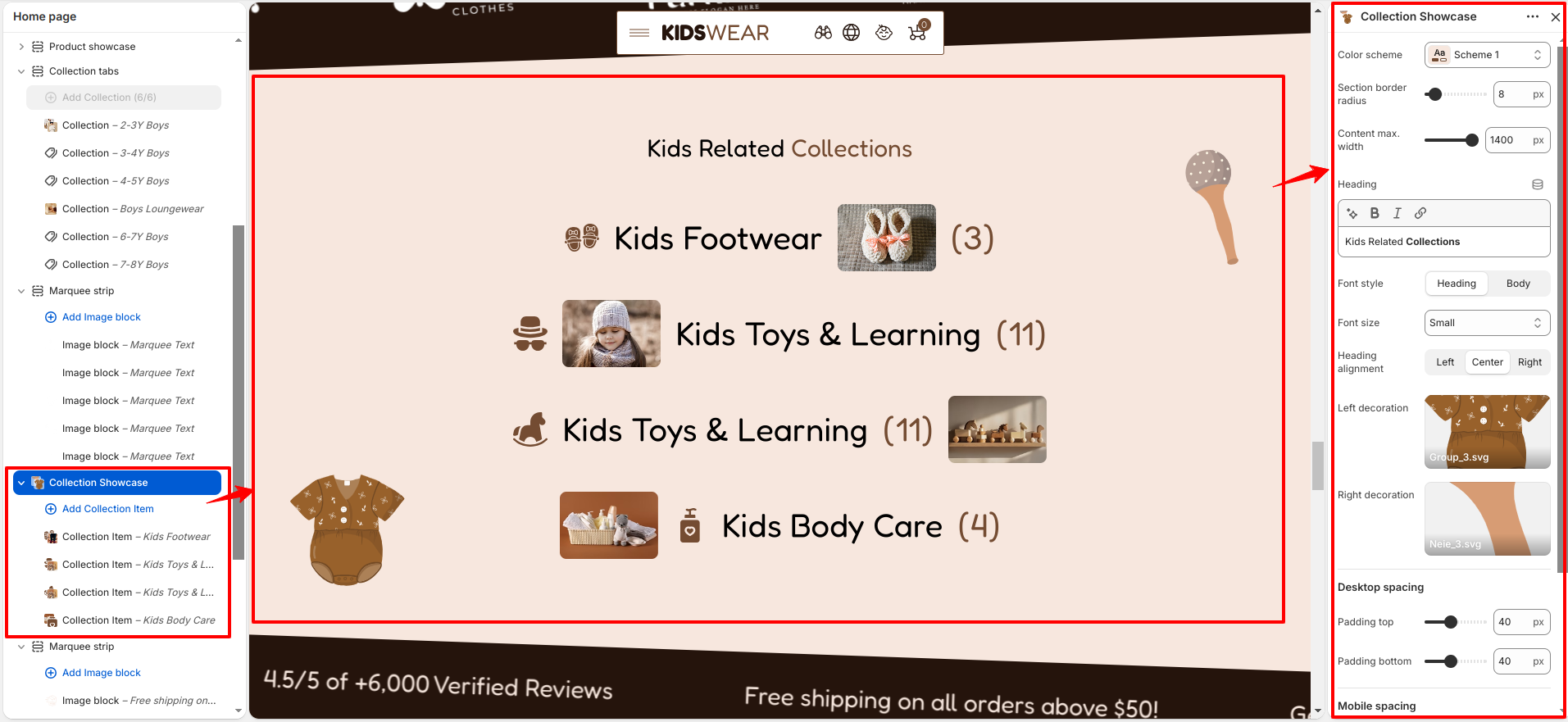
The Collection Showcase section highlights multiple product collections in an engaging and visually appealing layout. It helps customers quickly browse featured collections and improves store navigation. The section includes settings such as color scheme, section border radius, content maximum width, heading, font style, font size, heading alignment, left and right decorative images, and desktop/mobile spacing, allowing you to customize the section to match your store's design.

Collection Showcase

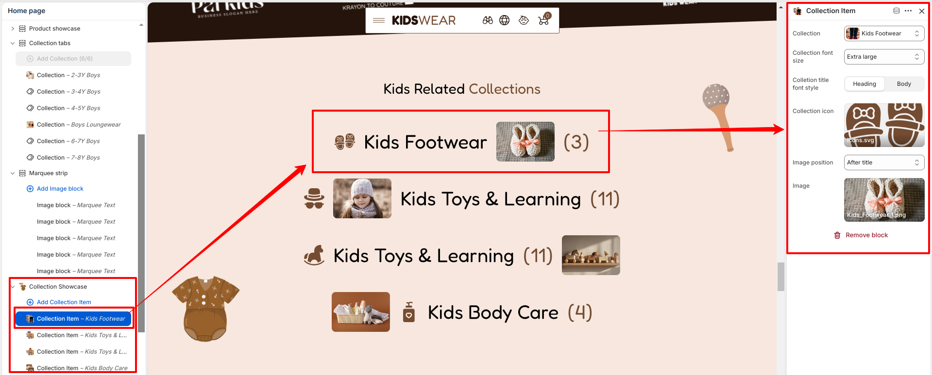
The Collection Showcase section includes Collection Item blocks. Each block allows you to select a collection, customize the collection title font size and font style, upload a collection icon, choose the icon position, and upload a featured image for the collection. These options make it easy to create visually appealing collection cards that encourage customers to explore your products.

Collection Showcase

Media Showcase

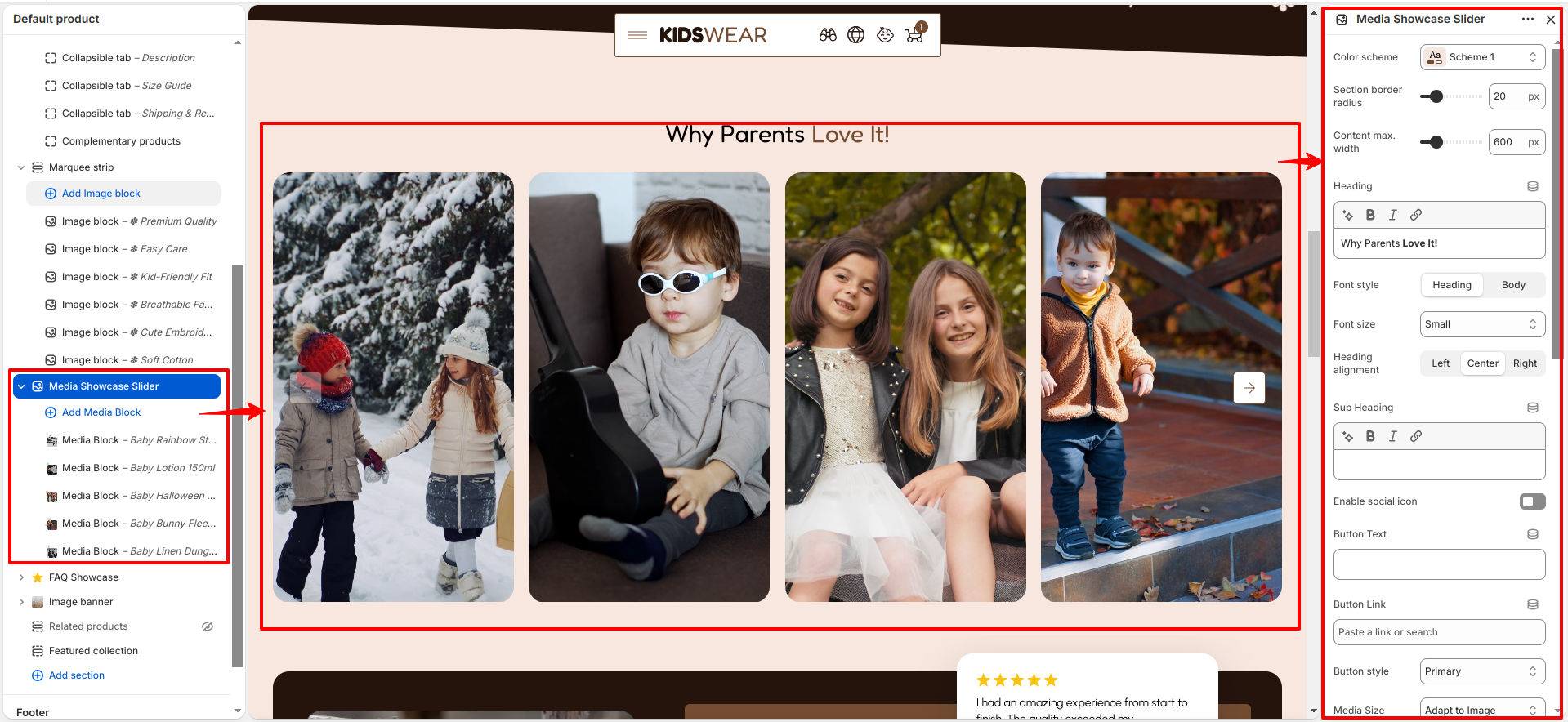
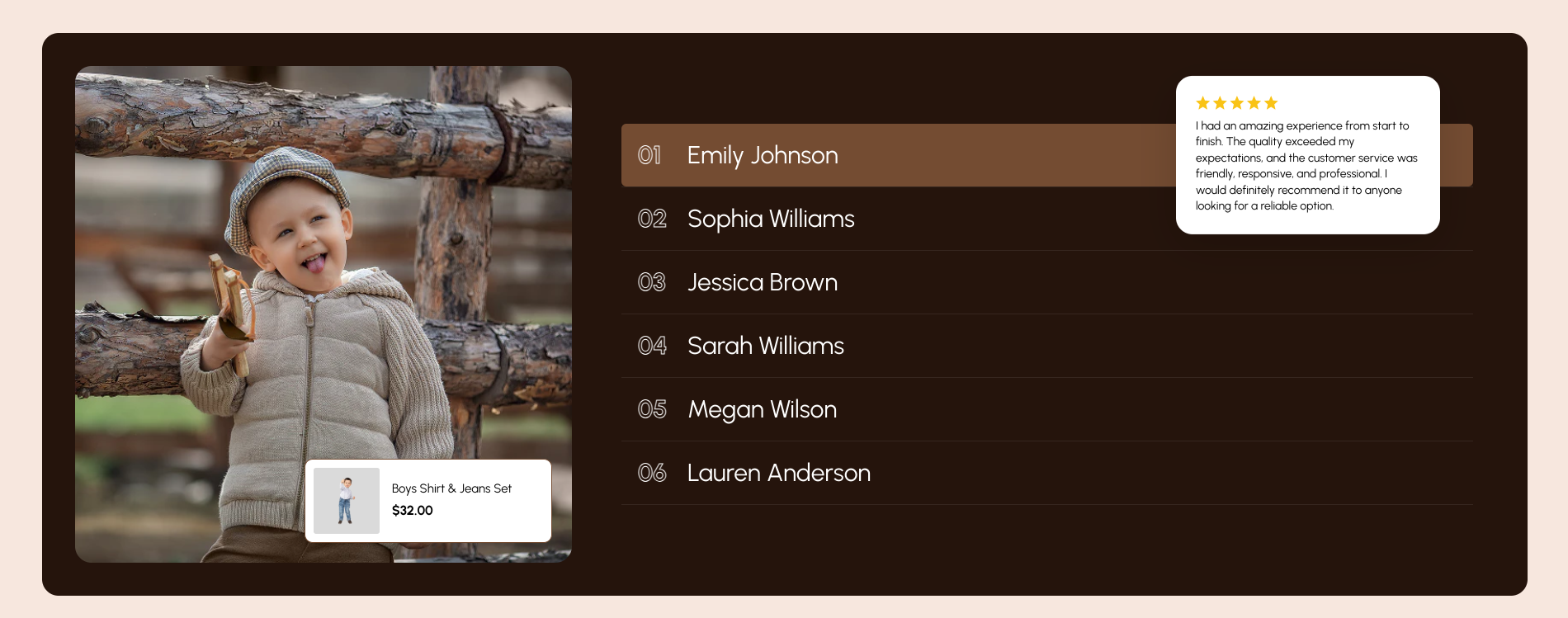
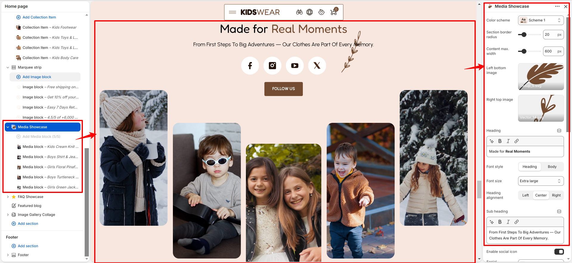
The Media Showcase section is designed to display engaging images and videos alongside featured products, creating an interactive shopping experience. It includes settings such as color scheme, section border radius, content maximum width, decorative images, heading, font style, font size, heading alignment, sub heading, social icon, social background color, social icon color, button text, button link, button style, media size, product card visibility, card image background color, and desktop/mobile spacing, allowing you to customize the section to match your store's branding.

Media Showcase

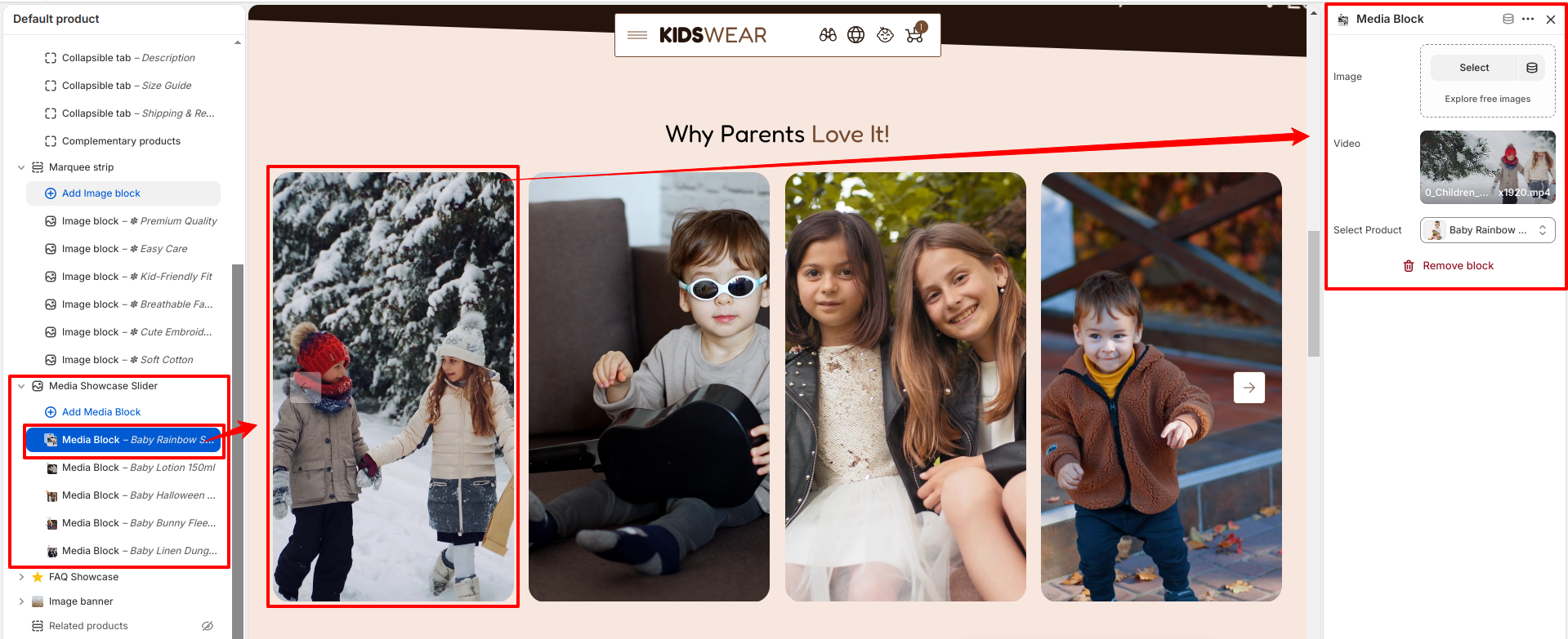
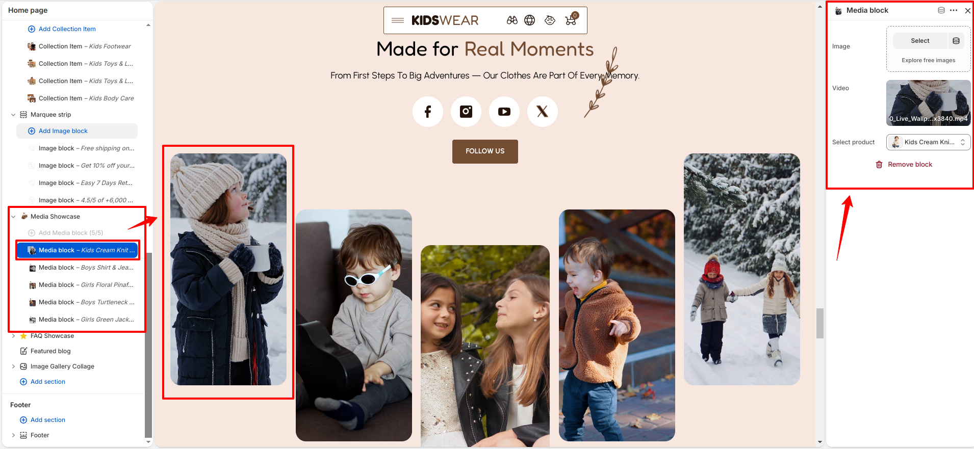
The Media Showcase section includes Media blocks. Each block allows you to upload an image, add a video, and select a product to display alongside the media. These blocks work together to create an engaging visual gallery that helps customers discover and explore featured products.

Media Showcase

FAQ Showcase

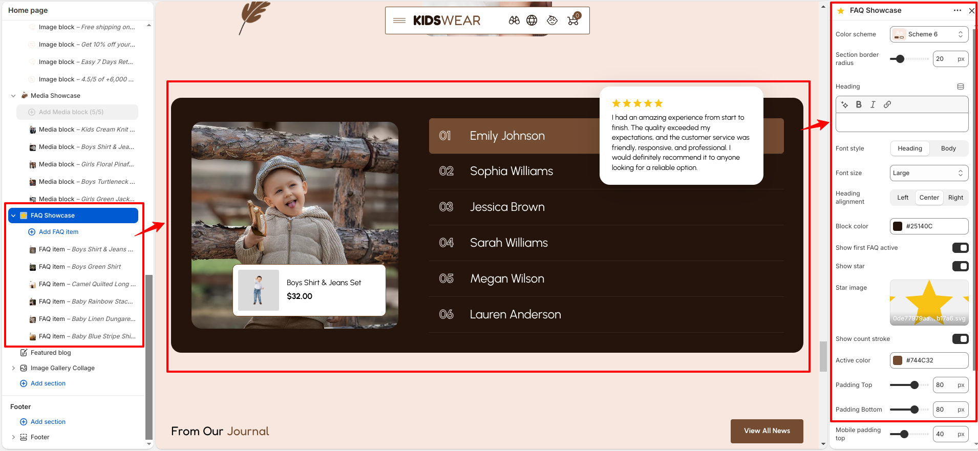
The FAQ Showcase section helps you organize and display frequently asked questions in an attractive accordion layout, making it easy for customers to find answers. It includes settings such as color scheme, section border radius, heading, font style, font size, heading alignment, block color, first FAQ active state, star display, star image, count stroke, active color, and desktop/mobile spacing, allowing you to customize the appearance to match your store's branding.

FAQ Showcase

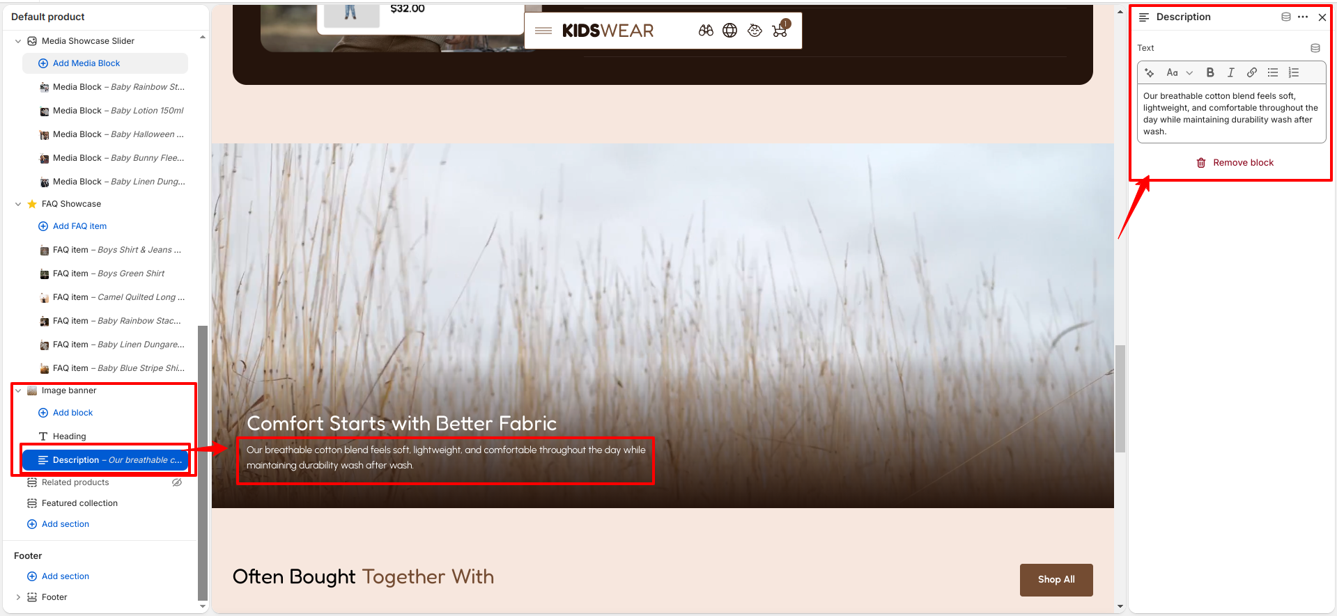
The FAQ Showcase section includes FAQ Item blocks. Each block allows you to add a question and answer, customize the title font size and font style, upload a left image, select a featured product, and choose a card image background color. These blocks work together to provide helpful information while promoting related products.

FAQ Showcase

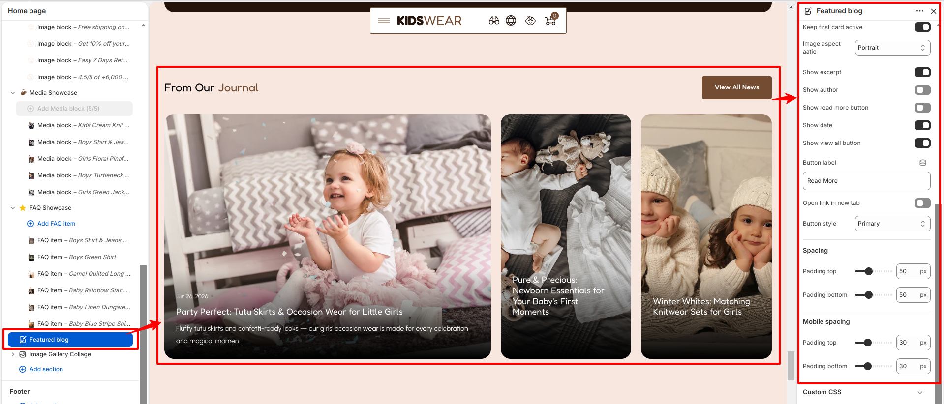
Featured Blog

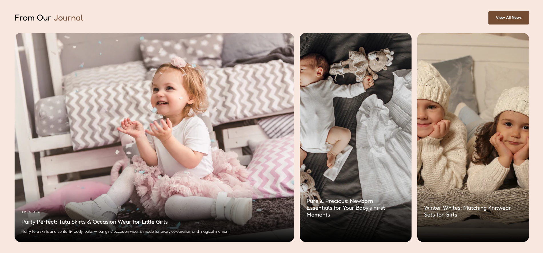
The Featured Blog section showcases your latest or featured blog posts in a visually engaging layout, helping customers discover news, stories, and helpful articles. It includes settings such as color scheme, section border radius, heading, font style, font size, heading alignment, blog selection, number of posts, blogs per row, overlay opacity, overlay color, article display settings, image aspect ratio, and desktop/mobile spacing, allowing you to customize the section to suit your store's design.

Featured Blog

You can further customize the article cards by enabling the first active card, choosing whether to display the excerpt, author, publication date, read more button, and view all button. You can also customize the button label, choose whether links open in a new tab, and select a button style to create an engaging and user-friendly blog browsing experience.

Image Gallery Collage

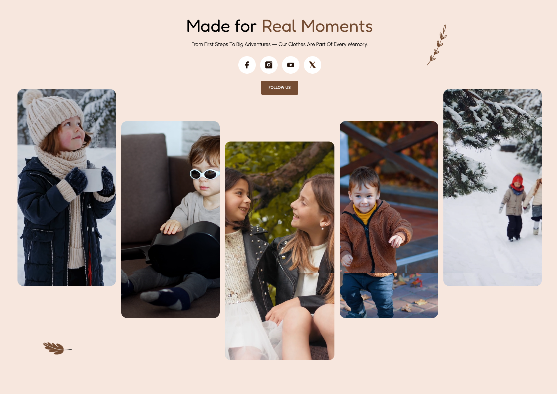
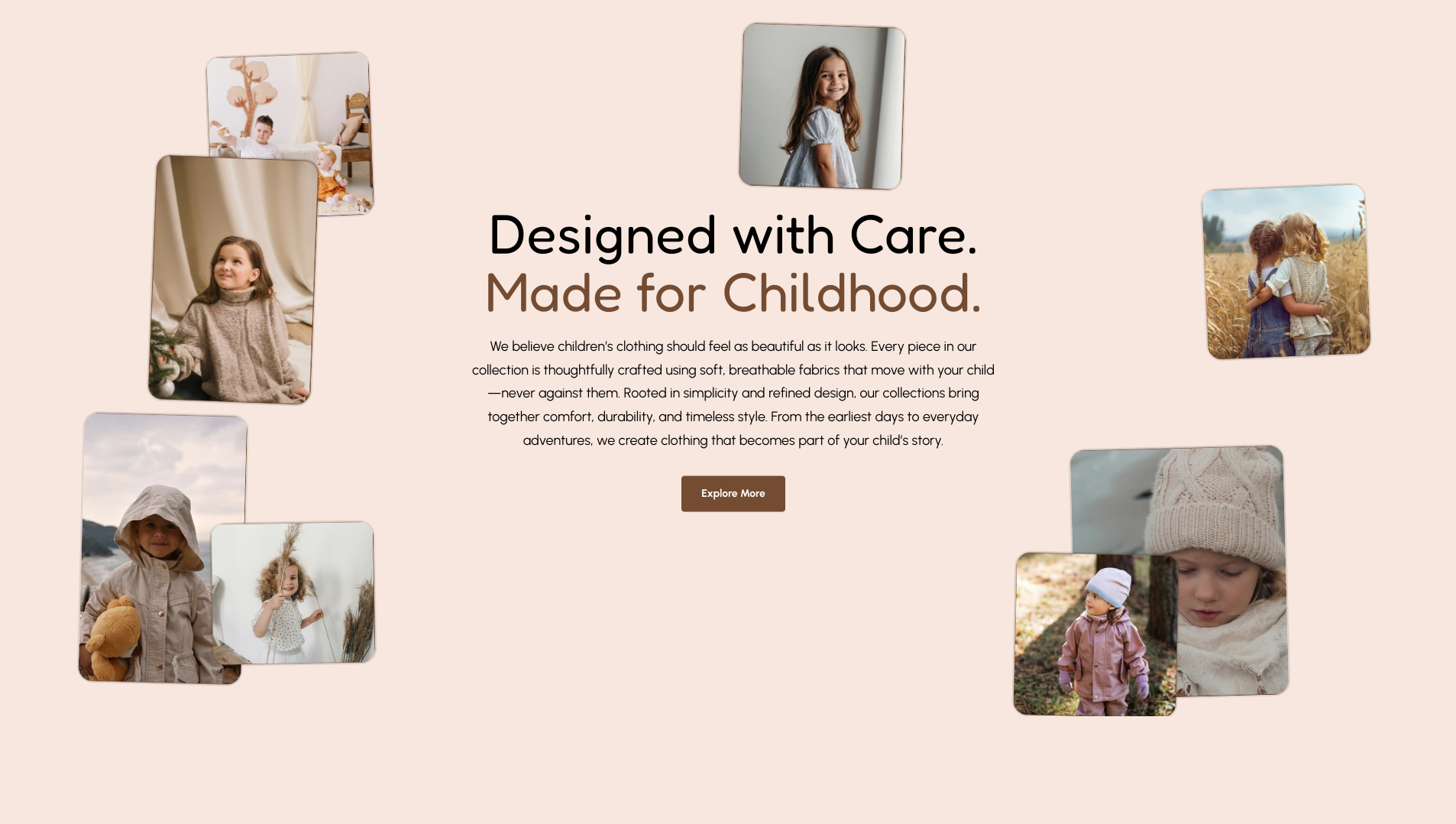
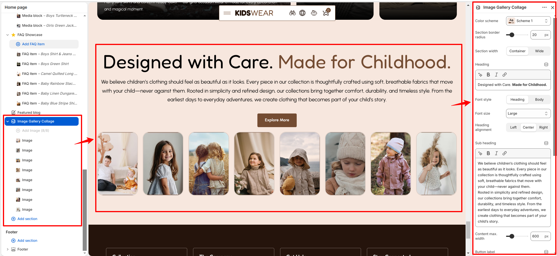
The Image Gallery Collage section displays a collection of images in a visually appealing collage layout, making it ideal for showcasing your brand, products, or lifestyle photography. It includes settings such as color scheme, section border radius, section width, heading, font style, font size, heading alignment, sub heading, content maximum width, button label, button link, button style, and desktop/mobile spacing, allowing you to create a unique and engaging gallery that complements your store's design.

Image Gallery Collage

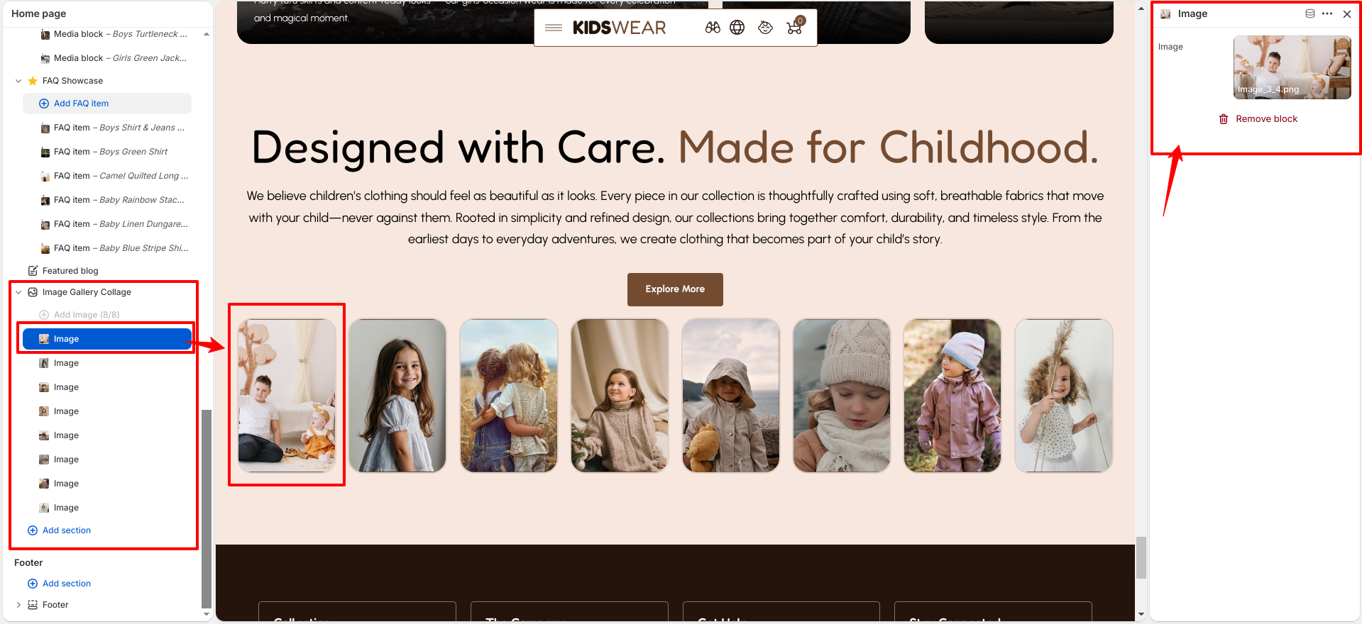
The Image Gallery Collage section includes Image blocks. Each block allows you to upload an image that is displayed as part of the collage, helping you build an attractive gallery to showcase your products, collections, or brand imagery.

Image Gallery Collage

Theme Update

What is a Theme Update?

A theme update involves upgrading your Shopify store’s theme to its latest version. Updates for the Breeze theme are released regularly to introduce new features, enhance performance, and improve overall functionality and design.

How to Update the Theme

At Breeze, we frequently release updates to introduce new features, boost performance, and enhance the functionality and design of your store. To ensure a smooth update process, we recommend reviewing the Shopify guide on updating themes. This guide provides step-by-step instructions to help you effortlessly integrate the latest improvements and keep your online store running at its best with the newest enhancements.