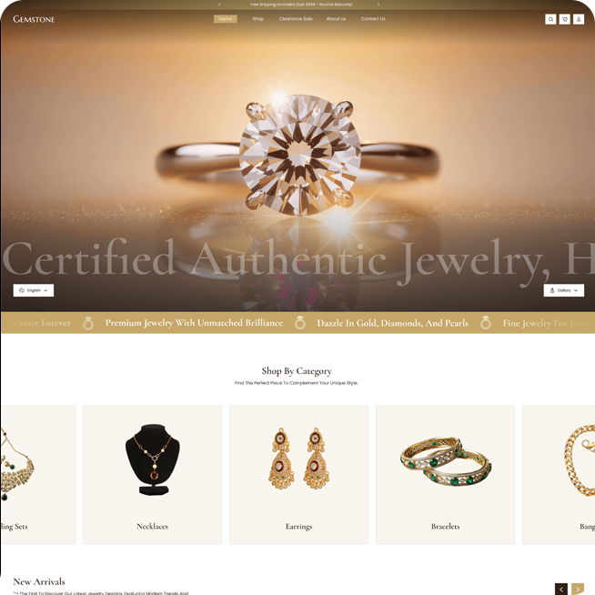
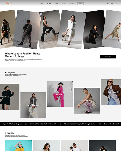
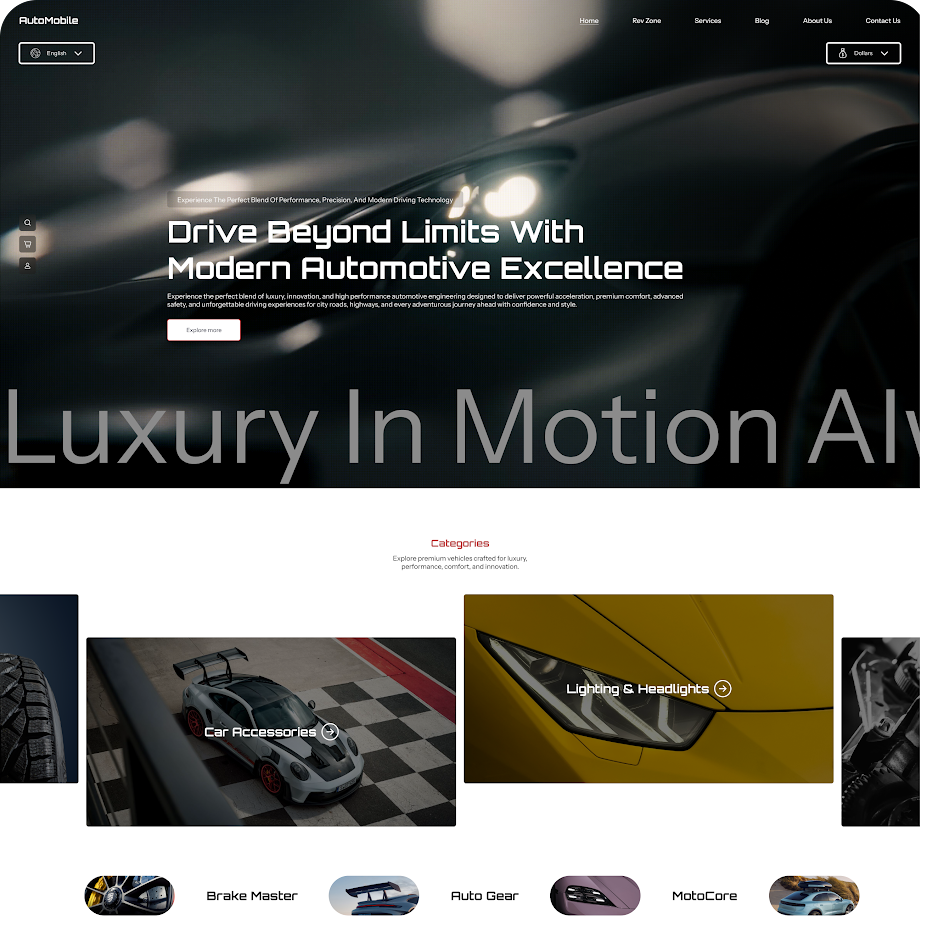
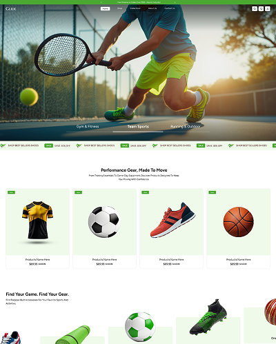
Our Curated Styles

Contact us

Contact us

Theme Installation

Follow the steps below to install the theme on your Online Store

  1. Log in to your Shopify admin.
  2. Go to Online Store from the left sidebar.
  3. Scroll down to the Discover Themes section.
  4. Click on Visit Theme Store.
  5. In the Shopify Theme Store, search for Noble theme.
  6. Open the theme and click Try theme to add it to your store.
  7. The theme will be added to your store.
  8. Click Customize to start editing and setting up your store design.
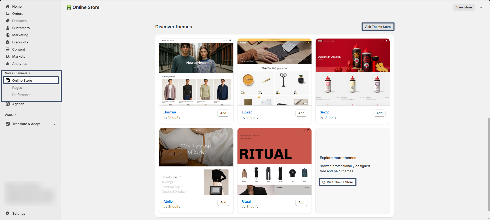
getting-started-theme

Try Noble for free from the Shopify Theme Store

Noble, like all premium themes in the Shopify Theme Store, offers an trial period, allowing you to explore its user-friendly design and quick setup features. During the trial, you can fully customize and configure the theme to create your ideal storefront. When you're ready to launch, purchase the theme to activate it on your live store., like all premium themes in the Shopify Theme Store, offers an trial period, allowing you to explore its user-friendly design and quick setup features. During the trial, you can fully customize and configure the theme to create your ideal storefront. When you're ready to launch, purchase the theme to activate it on your live store.

Steps

  • Visit the Shopify Theme Store and choose Noble.
  • Click Try theme to add the theme to your online store.
  • In your Shopify admin, go to Online Store > Themes.
  • In the Theme library section, click the Customize button to open the theme editor or, to preview, use the ... button to open the actions menu, then click Preview.
Enable Customer Accounts

  1. Go to Shopify Admin – Log in to your Shopify admin panel
  2. Navigate to Settings – Bottom-left corner → Click "Settings"
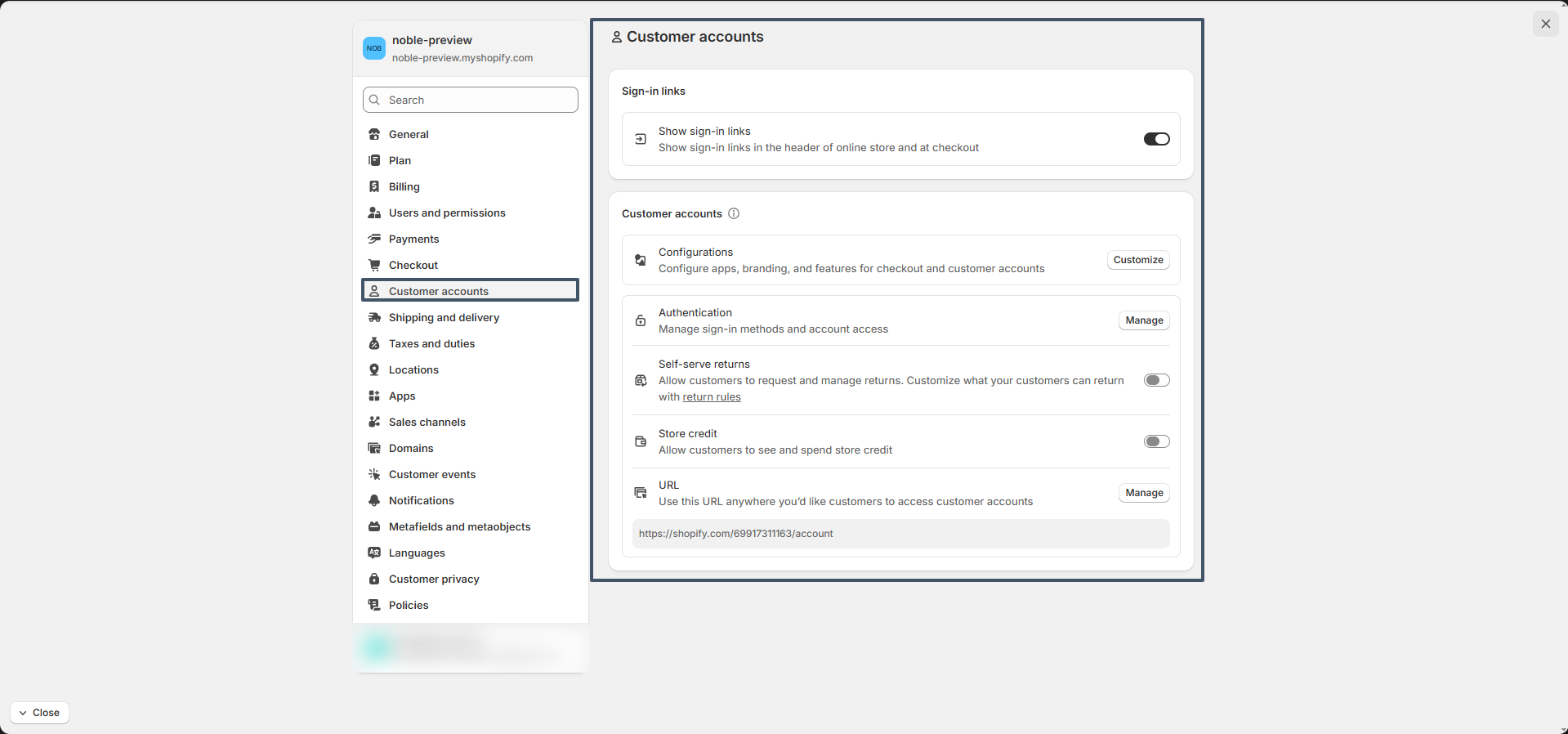
  3. Select ‘Customer accounts’ – From the settings menu, click on “Customer accounts”
  4. Enable Customer Accounts – Turn on customer accounts for your store
  5. Understand the New Customer Experience
    • Customers sign in using a one-time verification code sent to their email
    • No passwords are required (passwordless login system)
    • Supports both D2C and B2B experiences
  6. Optional Settings
    • Require customers to log in before checkout (optional)
    • Customize account experience through apps if needed
  7. Click Save
    Don’t forget to hit “Save” at the top or bottom of the page
customer accounts settings

How to Change Language Settings in Shopify

1. Change Storefront Language

  1. Go to Online Store > Themes
  2. Click “Actions” on your live theme → Select Edit default theme content
  3. In the top-left corner, use the language dropdown to change the language
  4. You can also manually translate text in each field if needed

2. Add Multiple Languages (for international stores)

  1. Go to Settings > Languages
  2. Click Add language
  3. Shopify will duplicate your content, which you can translate using:
    Shopify Translate & Adapt app (recommended)
    or Third-party translation apps
  4. You can also manually translate text in each field if needed

3. Change Checkout Language

  1. Go to Settings > Checkout
  2. Scroll to “Checkout language” → Click Manage checkout language
  3. Edit or change the text used in the checkout process

4. Change Admin Language

  1. Click your account name (bottom-left corner)
  2. Go to Manage account > Preferences
  3. Choose your preferred admin language

Cart Drawer

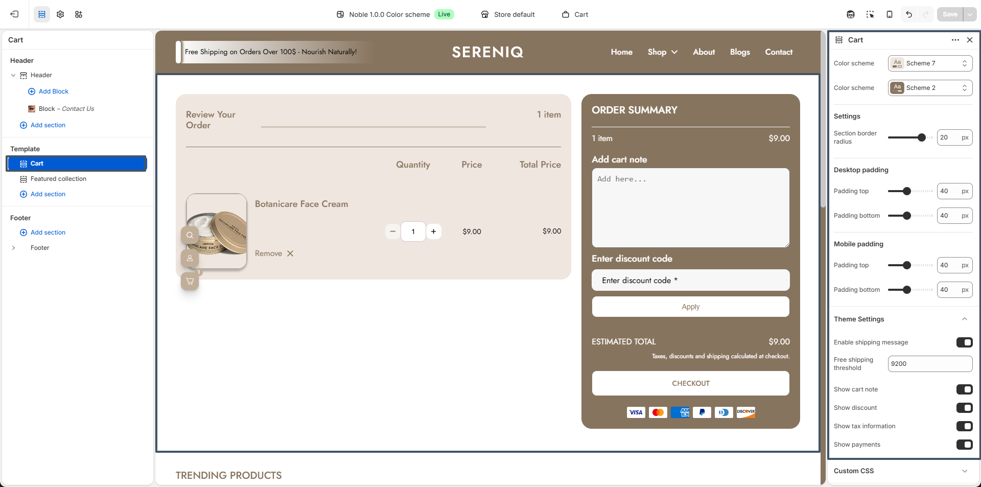
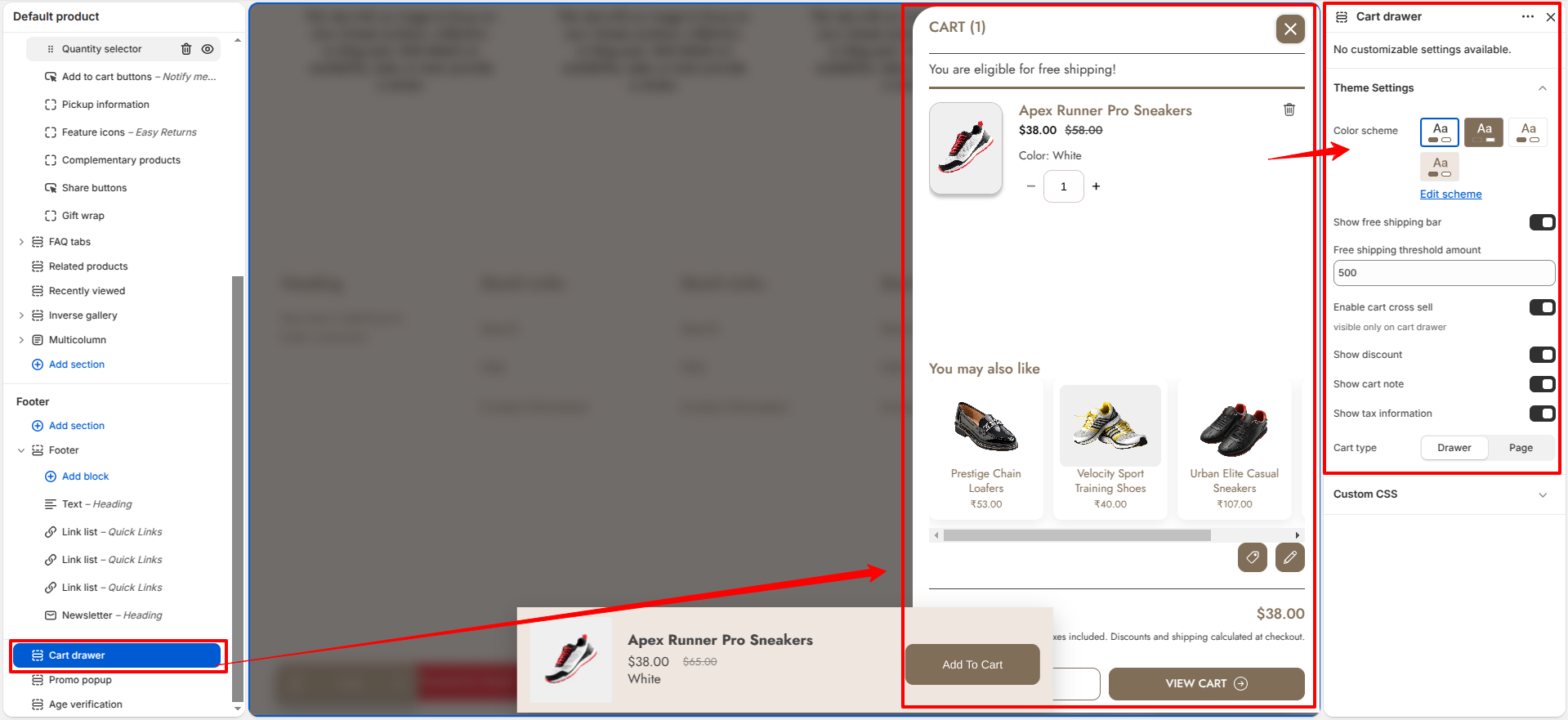
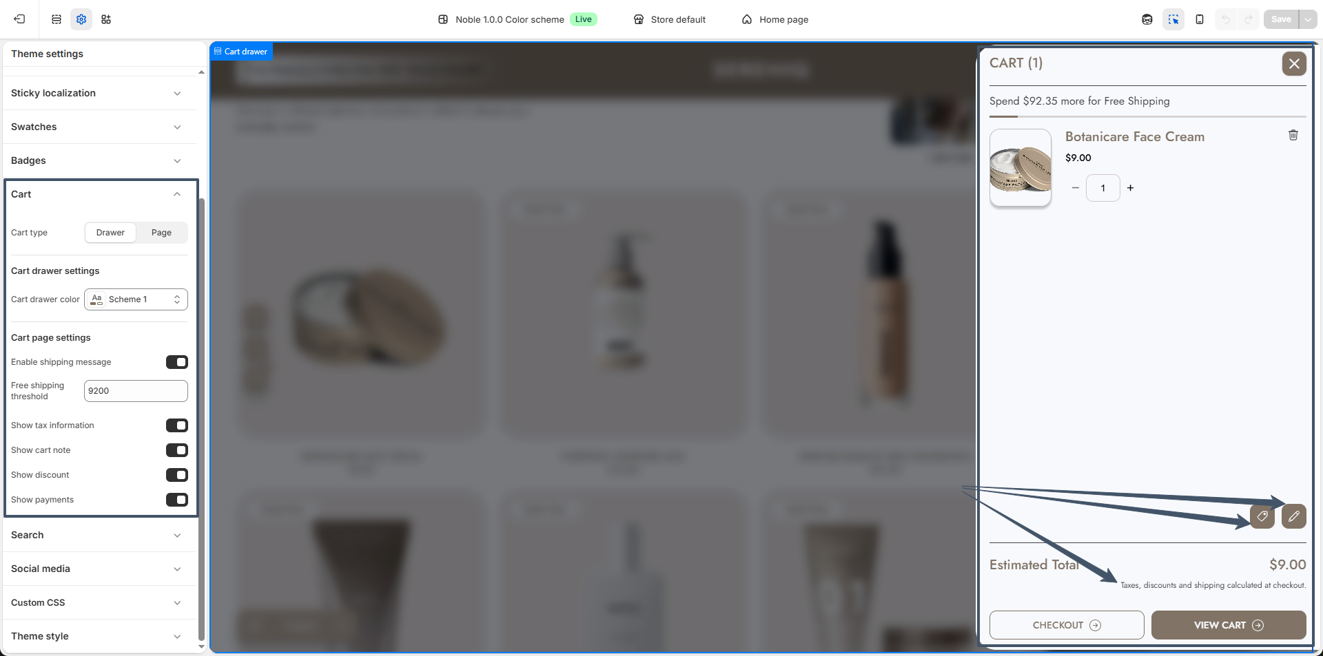
Noble offers two cart types: cart drawer and cart page. Both the cart drawer and cart page include settings to set free shipping threshold(The minimum cart value required for customers to qualify for free shipping. For example, if set to ₹1000, customers will receive free shipping only when their cart total is ₹1000 or more.), show tax information, cart notes, and discounts,show payment helping create a smooth and transparent shopping experience.

The cart drawer allows customers to quickly review and manage the items they’ve added without leaving the current page.

cart

Cart page

Noble's cart page includes flexible settings for colors, section border radius, and spacing on both desktop and mobile, helping create a smooth and user-friendly shopping experience by allowing customers to review their items before checkout.

cart

Cart items

Steps

  • Enable Shipping Message which permits customers to view the free shipping threshold on the cart.
  • Free Shipping Threshold which permits customers to set the minimum cart value required for customers to qualify for free shipping. For example, if set to ₹1000, customers will receive free shipping only when their cart total is ₹1000 or more.
  • Show cart note which permits customers to attach notes on the cart.
  • Show tax information which displays any tax status.
  • Show discount is the option to percentage discount on cart.

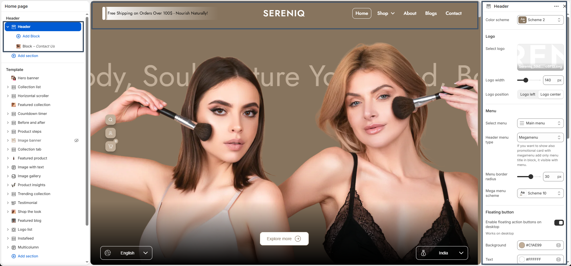
The Noble header includes settings to add a logo image, adjust the logo width, change the logo position

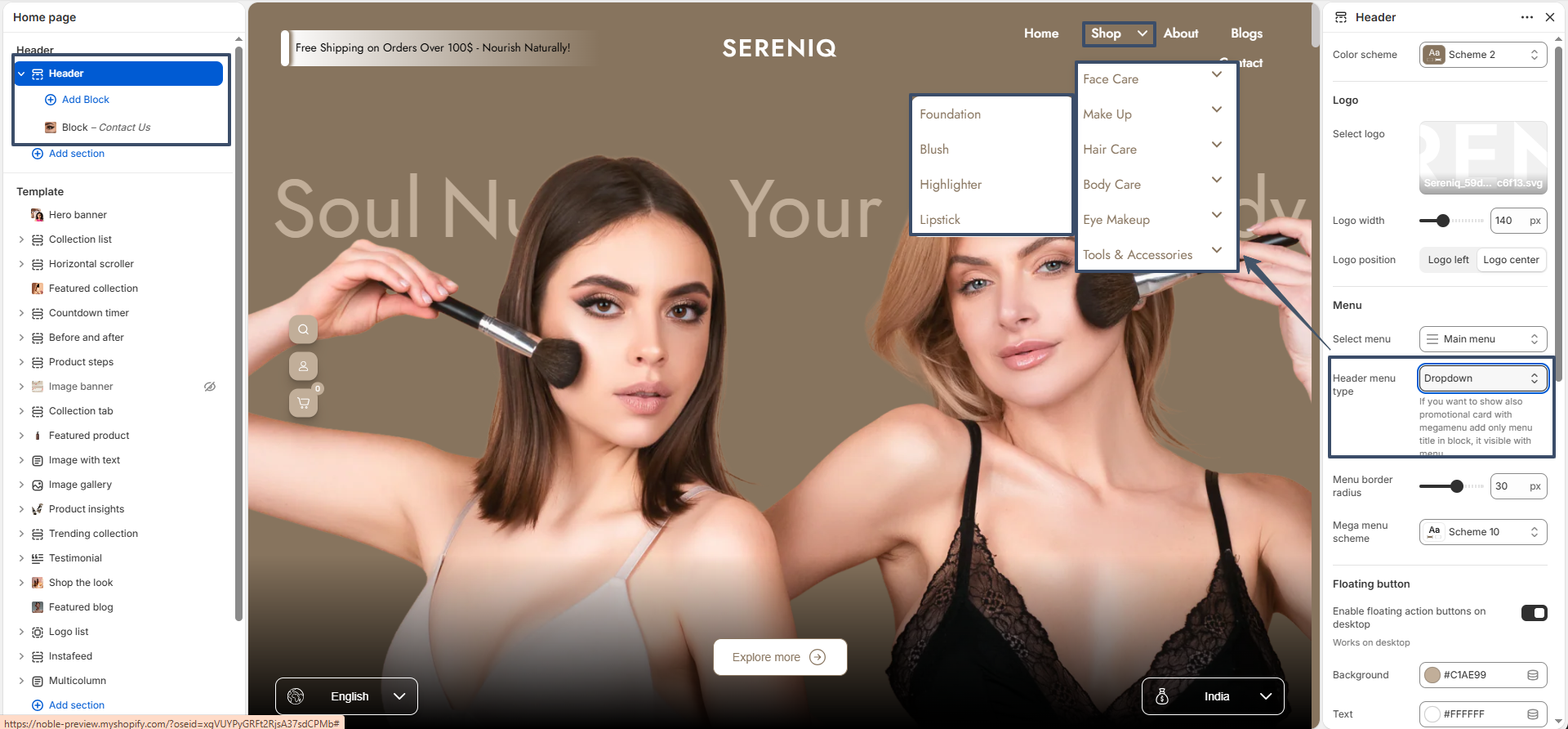
An Noble Dropdown menu is a navigational feature commonly used in Shopify themes to display multiple submenu items under a main menu item. It enhances the user experience by organizing and collapsing large navigation structures into a cleaner and more interactive format. Dropdown menus are often used to categorize products, collections, or other important links in a store, making it easier for customers to browse.

Menu header

Follow these steps to configure your theme Dropdown

Steps

  • Open the Customizer: Navigate to the Header Group, and then open the Header section.
  • Choose Menu: You will see options for the menu.
  • Choose header menu type: You will see options for the menu types suc as dropdown menu or mega menu. select dropdown menu.
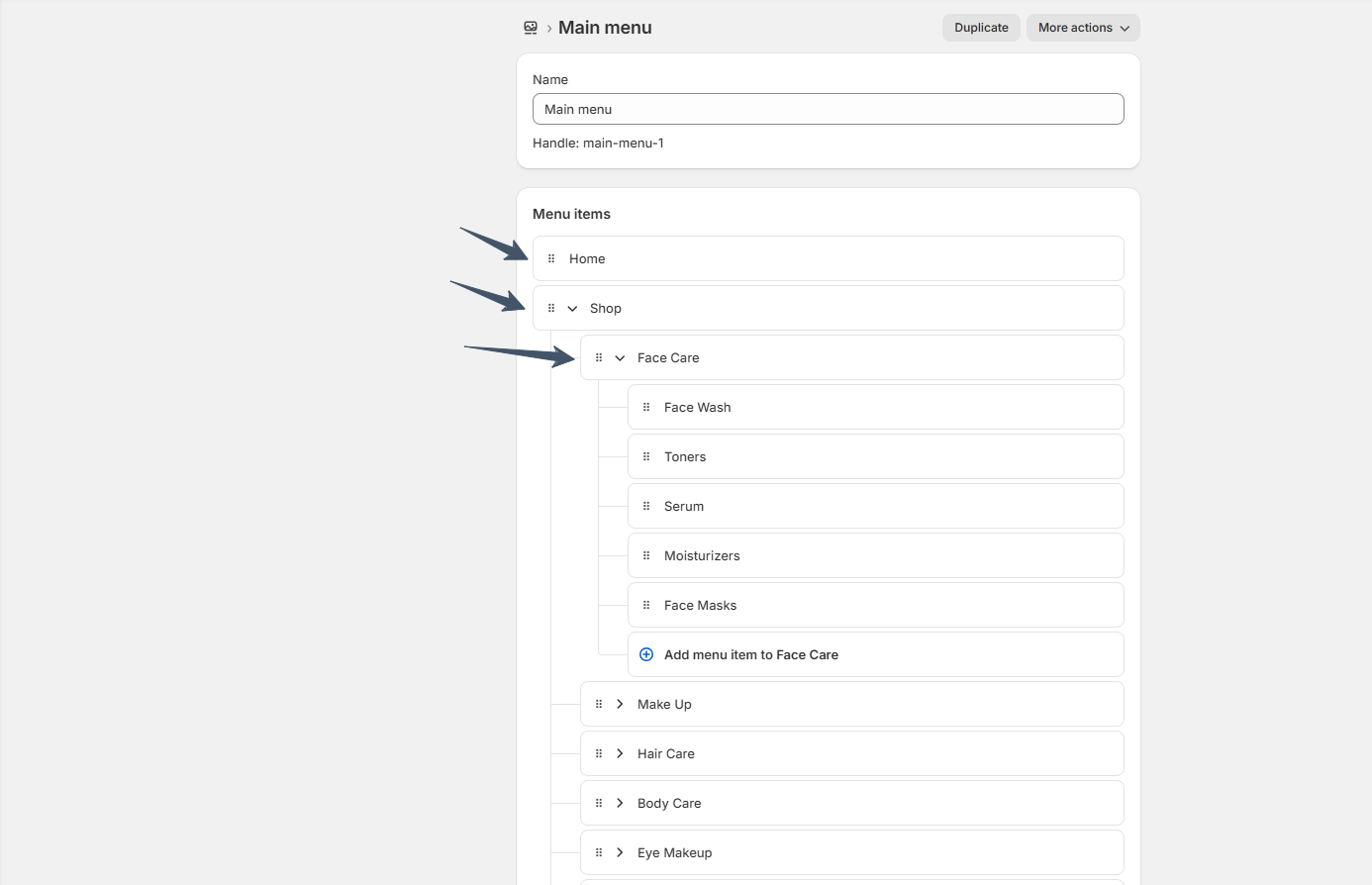
  • Create dropdown menu: Go to Online Store >> Content >> Menus
Menu header
Menu header

Mega Menu

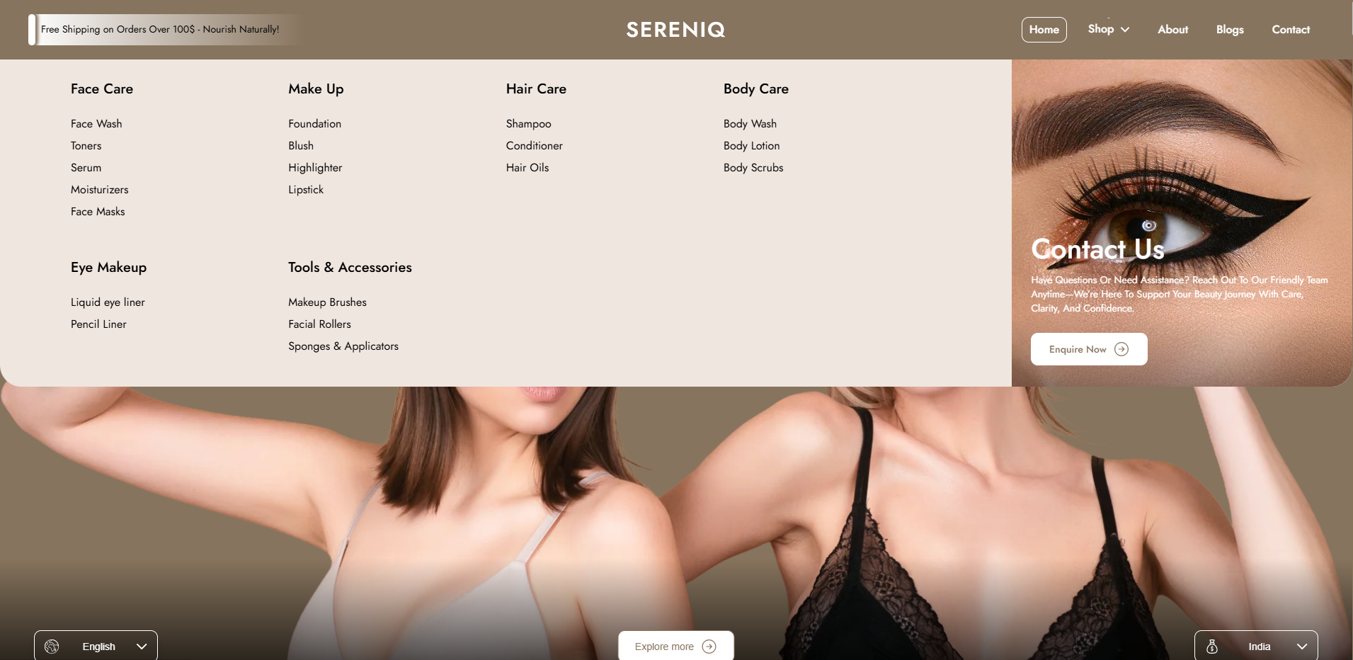
A Mega Menu is an organized, full-width Header that structures multiple links and categories, making it easier for customers to find the products or collections they’re looking for. A clear and accessible menu layout can enhance the shopping experience and improve conversions.

Header Mega Menu

The Noble theme supports a Mega Menu, allowing you to display mega menu target text along with images for a richer navigation experience.

Header Mega Menu

How to set up a mega menu

Steps

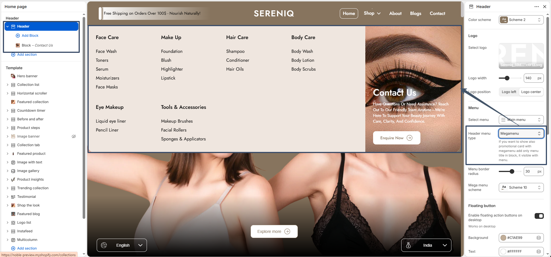
  • Go to Online Store > Themes > Customize.
  • In the customizer, click on the Header section to access its settings.
  • Toggle Menu Type: Look for the setting that lets you toggle between a dropdown and a mega menu. Select Mega menu.
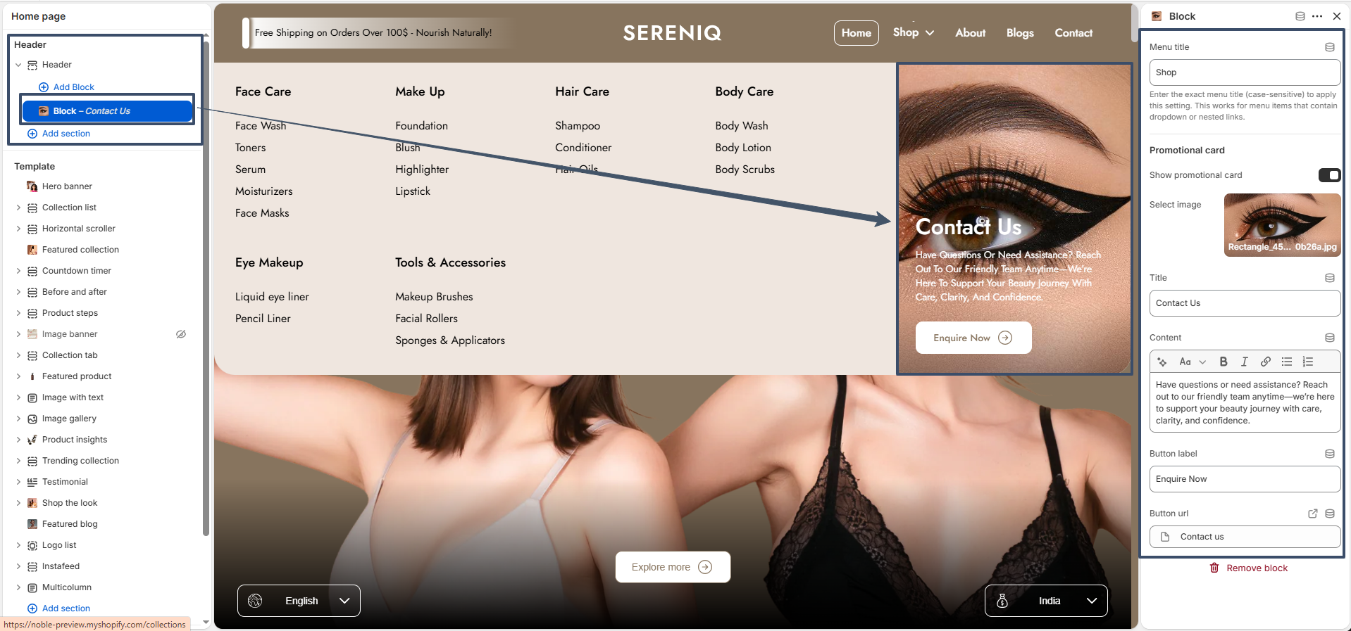
  • Add Promotional Card: Once the Mega menu type is selected, you can add a Promotional card block inside the Header. This unique block only shows when the mega menu is active and lets you display promotional content directly in the navigation.
Header Mega Menu

Header Block - Set Promotional Card Settings

After adding the block to your Header, you can customize it using the following block settings:

  • Menu title: Type the exact name of the menu item (case-sensitive) where this card should appear (e.g., "Shop"). It links the block to that specific mega menu.
  • Show promotional card: A toggle switch to enable or hide the promotional card layout.
  • Select image: Upload a background image for the promotional card.
  • Title: Enter an engaging headline, like "Contact Us" or "Weekend Sale".
  • Content: Provide brief, compelling text to describe your offer or prompt.
  • Button label: Enter the text for your call-to-action button (e.g., "Enquire Now").
  • Button url: Select the link or page where the button should redirect the user.

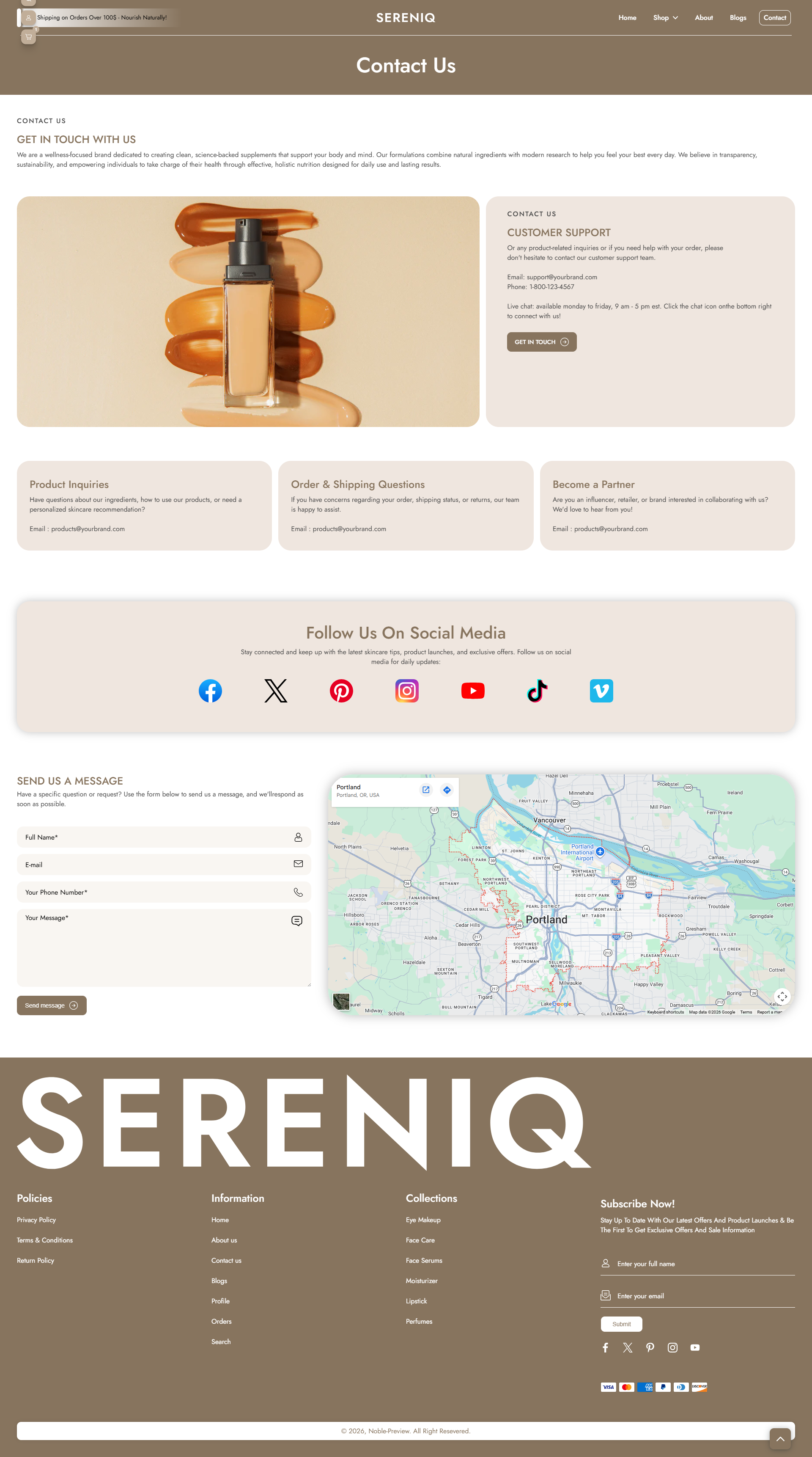
What is the contact page?

The contact page allows customers to send a message directly to you and allows you to engage with your customers and answer their queries.

Contact Us

How to set up the contact page

Steps

  1. Open the Theme Editor.
  2. Select Pages > Contact from the dropdown at the top.
  3. This page comes prebuilt with several blocks, listed in the Template section of the left-hand side of the screen. Select Add block or use the existing blocks available.
  4. The Email input block is required for the contact form to work.
  5. It is important to ensure that all blocks have unique labels.
  6. Click Add section to insert a section either above or below the page content..
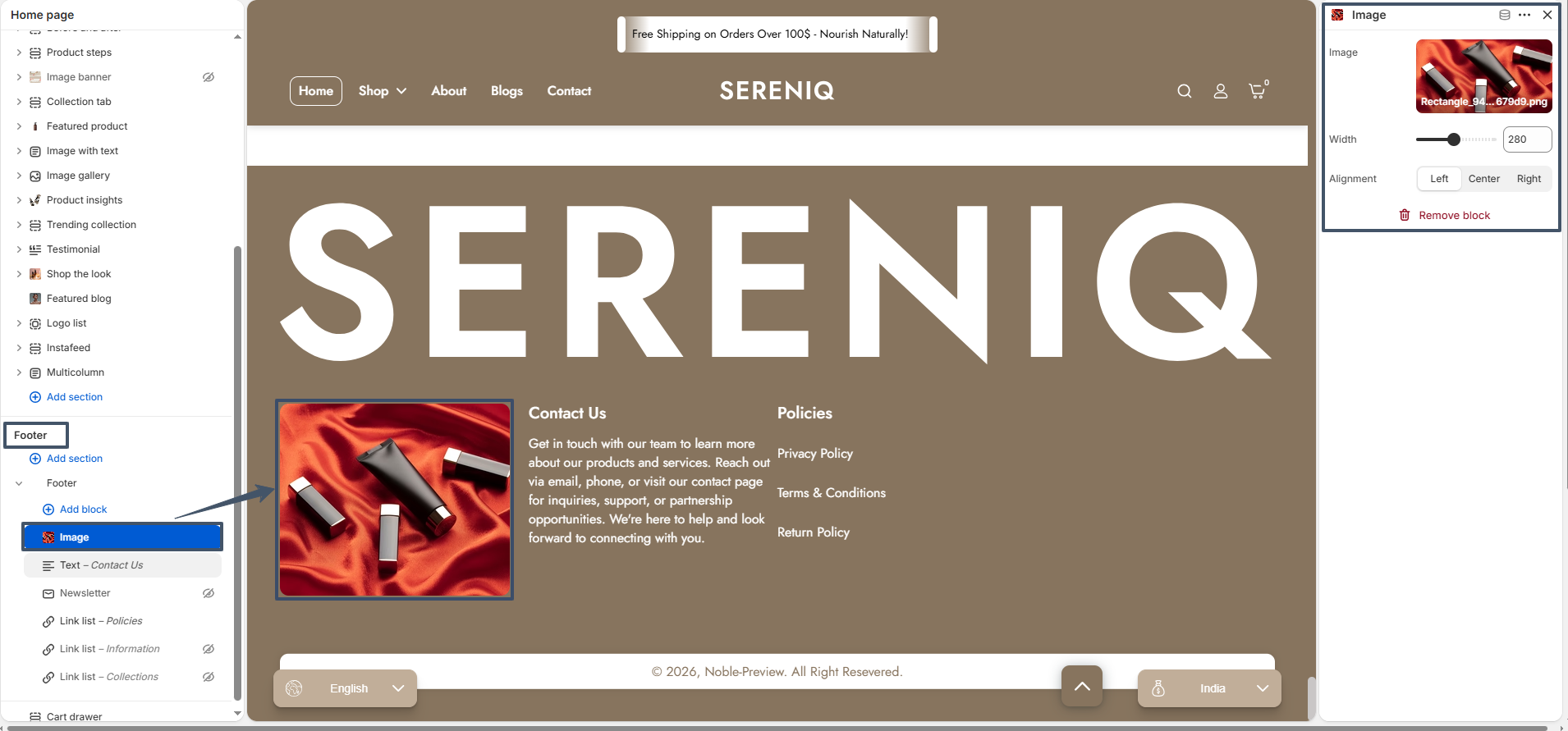
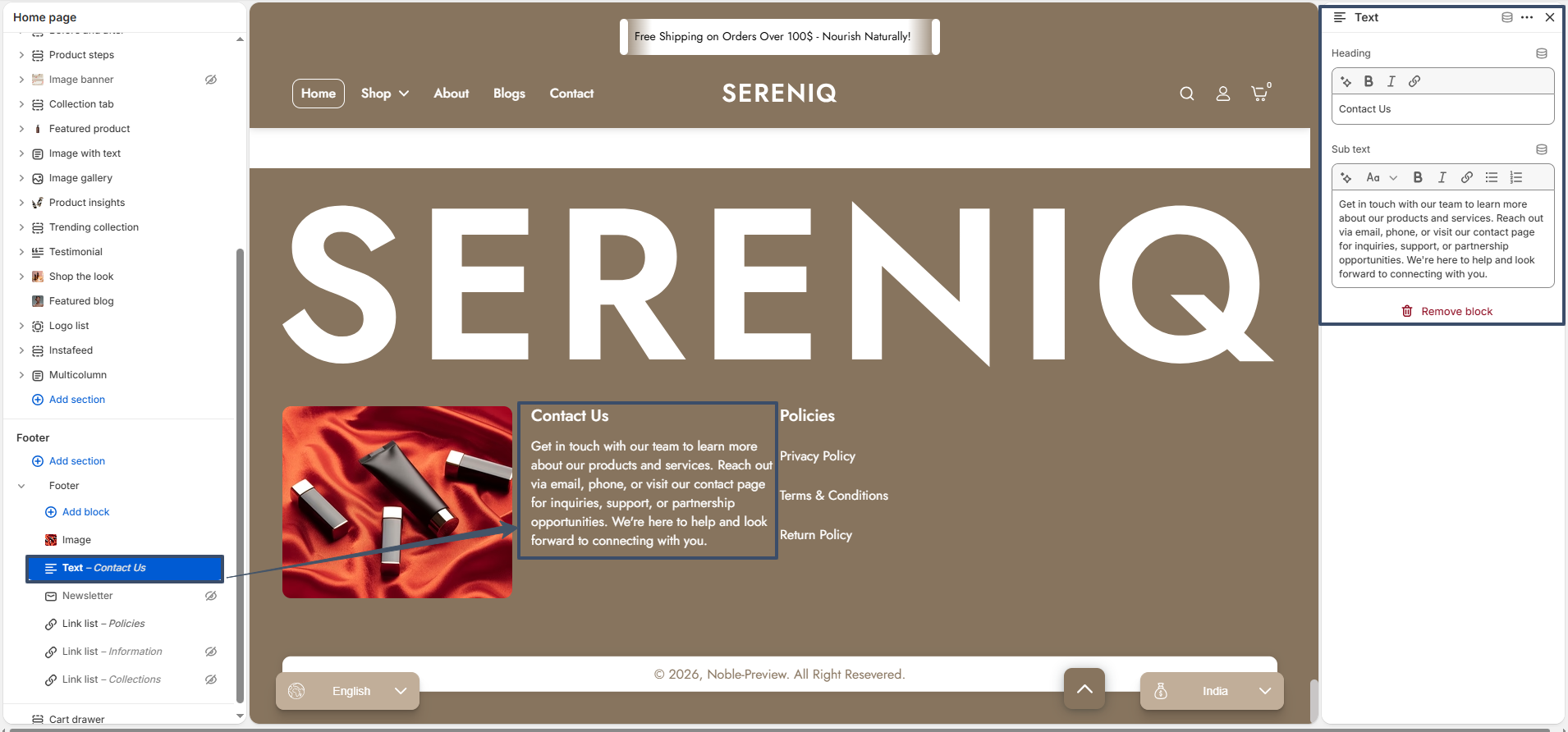
Contact Us
Contact Us

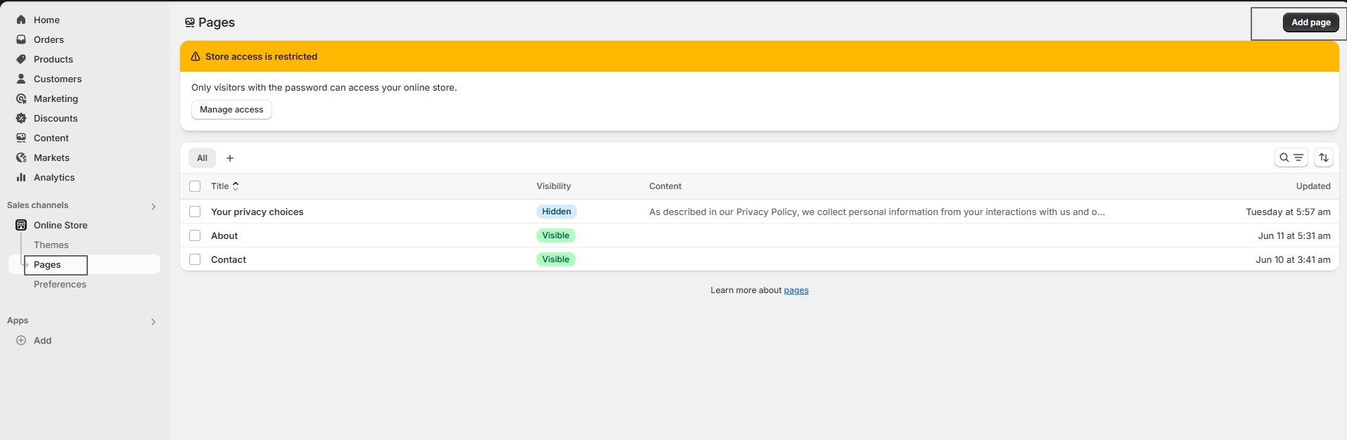
How to Set Up Pages in Shopify

Setting up pages in Shopify is a straightforward process that allows you to add important informational content such as Contact, FAQ, and policy pages to your online store.

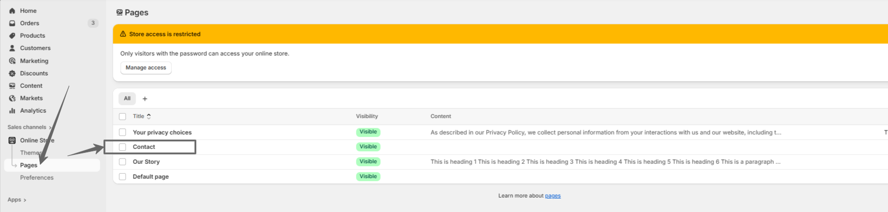
Set Pages

Steps

  • 1. Access Admin Online Store > Pages
  • 2. Add Page Click "Add page"
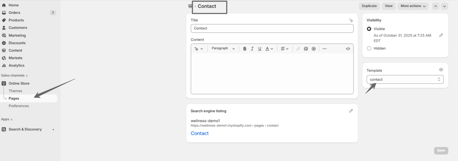
  • 3. Enter Details Title, content, select template (optional)
  • 4. Set Visibility Choose Visible/Hidden, set publish date if desired
  • 5. Save Click "Save"

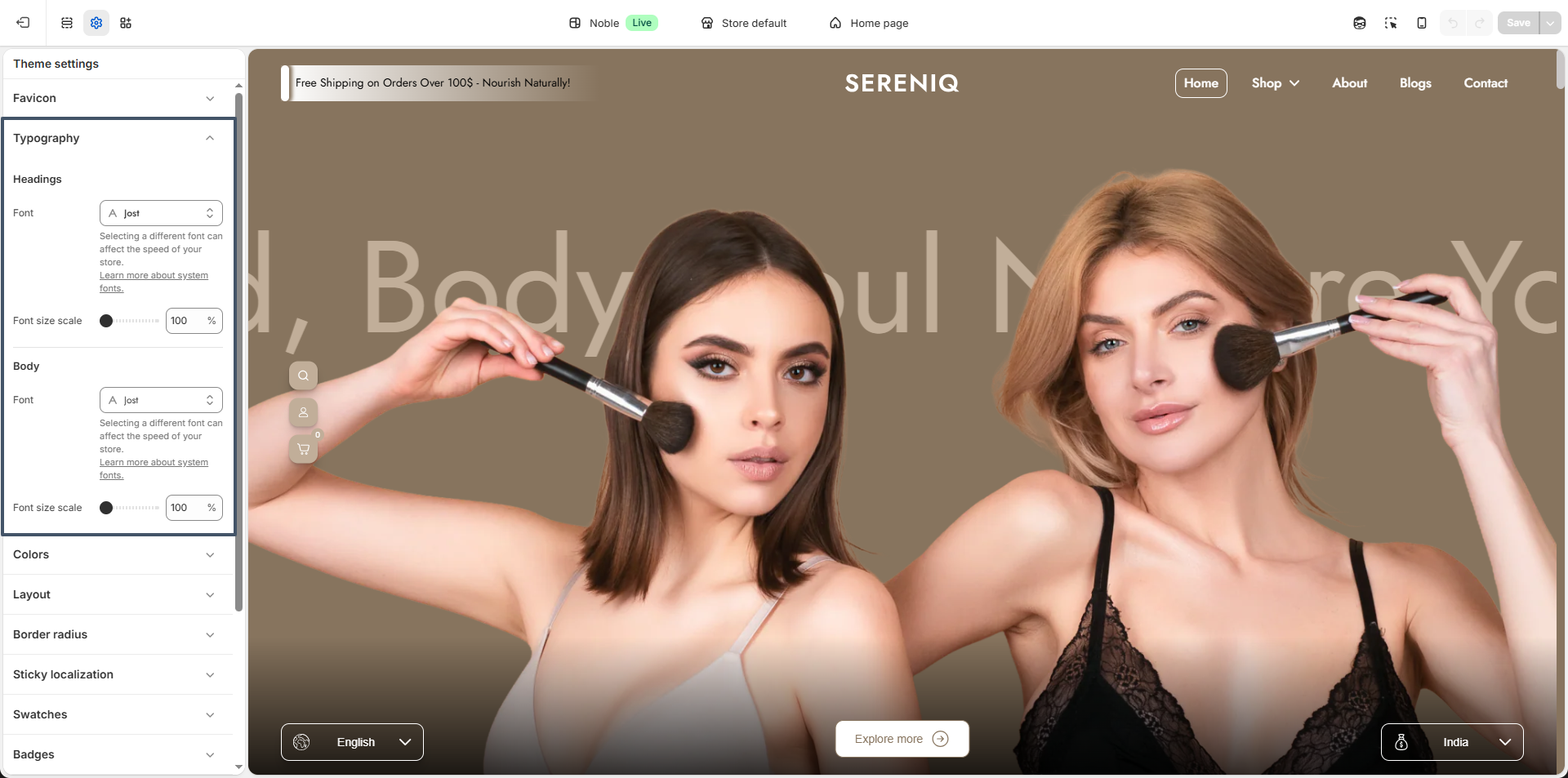
Typography

Your store's typography defines its personality and readability. You can customize both heading and body fonts to create a cohesive and visually appealing look throughout your website.

Headings Font: Choose a bold and distinctive font for your headings to make product titles, section headers, and key messages stand out. This font should reflect your brand’s tone modern, elegant, playful, or classic and ensure strong visual hierarchy across pages.

Body Font: Select a clean, easy-to-read font for your main text, including product descriptions, paragraphs, and buttons. The body font should complement your heading font while maintaining excellent legibility on all devices.

typography setting

Customize Your Typography to Match Your Brand

Steps

  • Open the Customizer.
  • Click on the "Theme Settings" icon.
  • Select the "Typography" option.

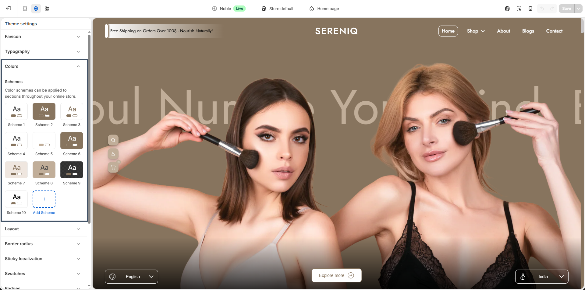
Colors

One of the most important components of designing a visually appealing, functional, and accessible theme is color.
Not only does a well-designed color system reinforce a merchant’s branding, but it also has the power to enhance and improve user experiences.
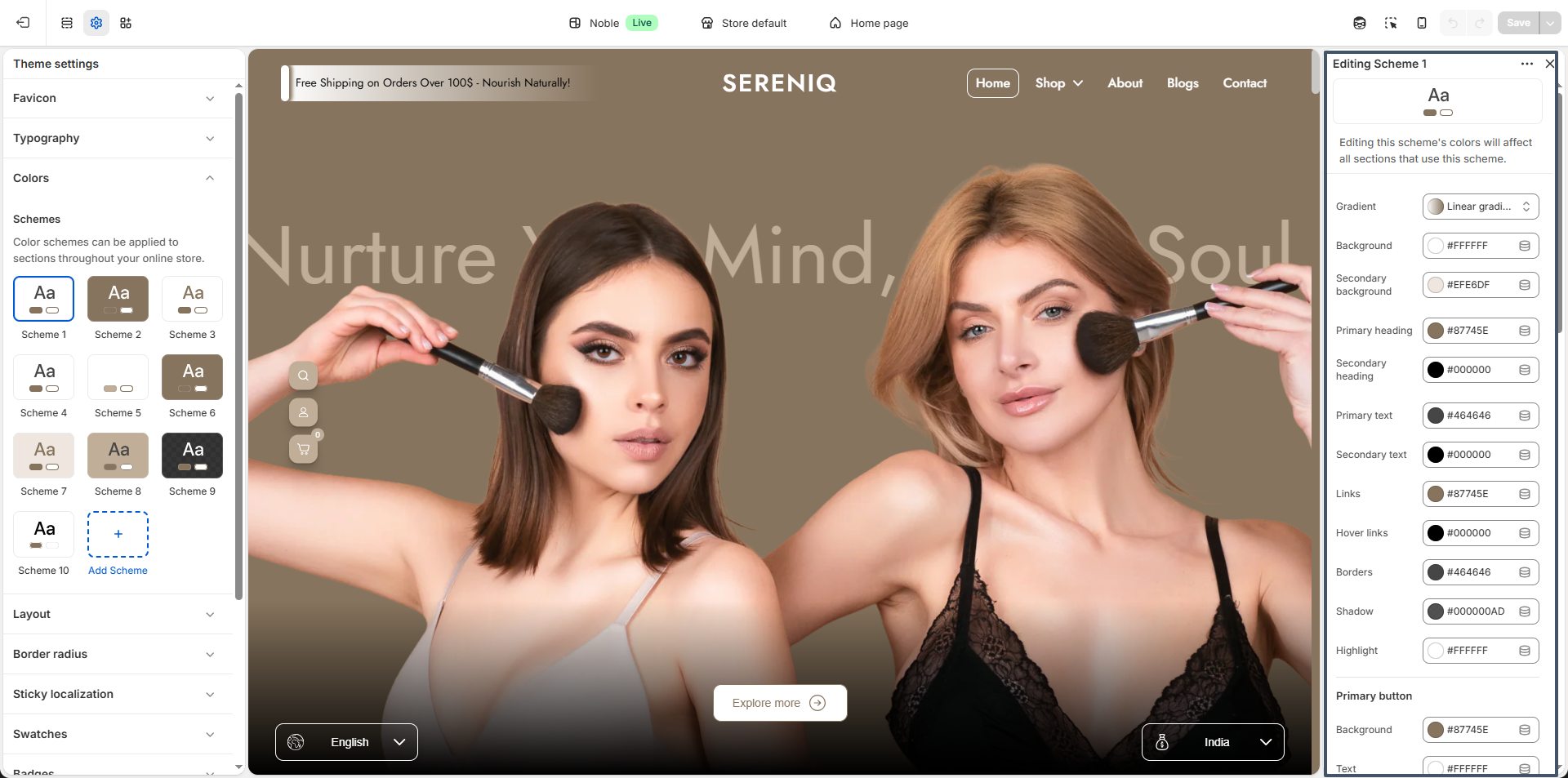
Configure your brand colors in the color settings. These color elements are used in all the general sections, header, and footer.

Color setting
Color setting

Customize Your Colors to Match Your Brand

Personalizing your theme colors is a breeze with Noble! Tailor your site to reflect your brand identity effortlessly.

Steps

  • Open the Customizer.
  • Click on the "Theme Settings".
  • Select the "Colors" option.

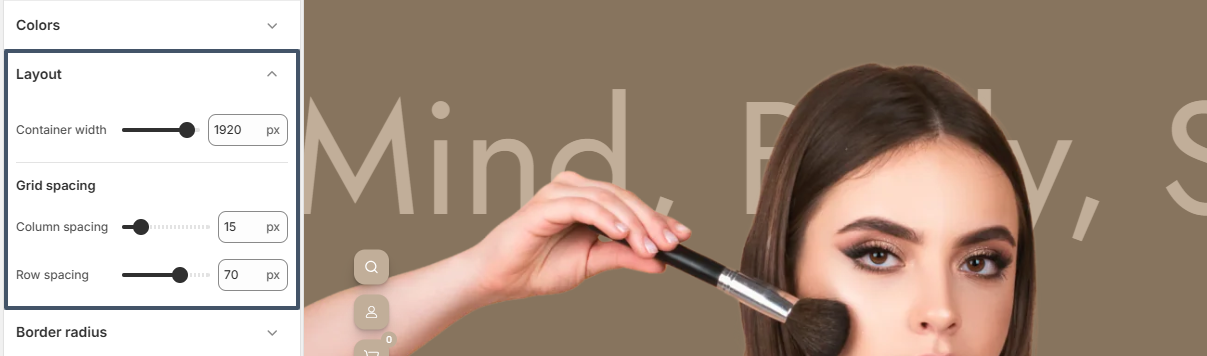
Layout & Border radius

Layout settings

Noble provides flexible layout settings.

layout setting

Steps

  • Page width - adjust the maximum width of the page
  • Horizontal spacing - set spacing between elements side-to-side
  • Vertical spacing - set spacing between elements top and bottom

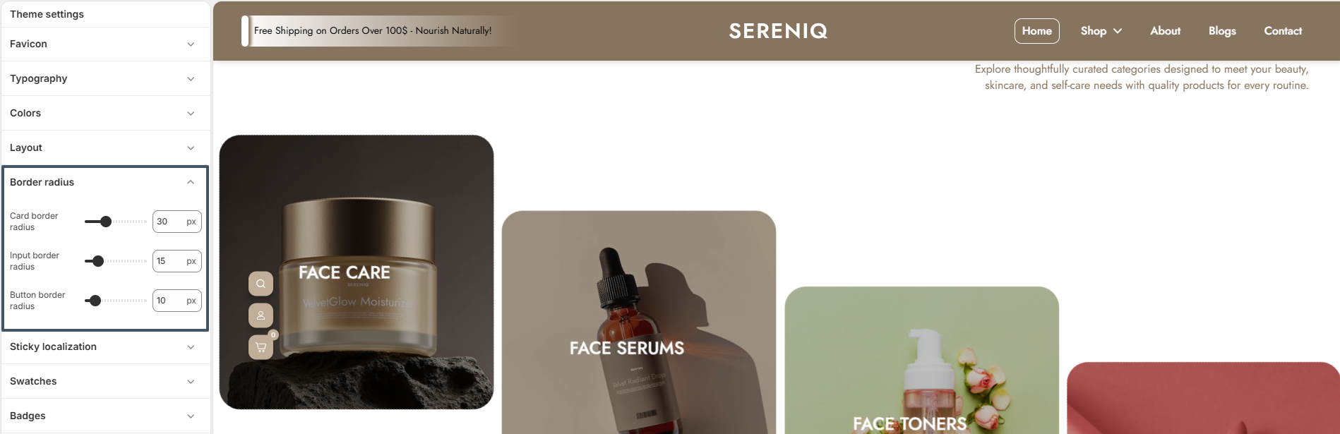
Border radius

Noble includes customizable border-radius settings for : Card,Button, Input fields

border setting

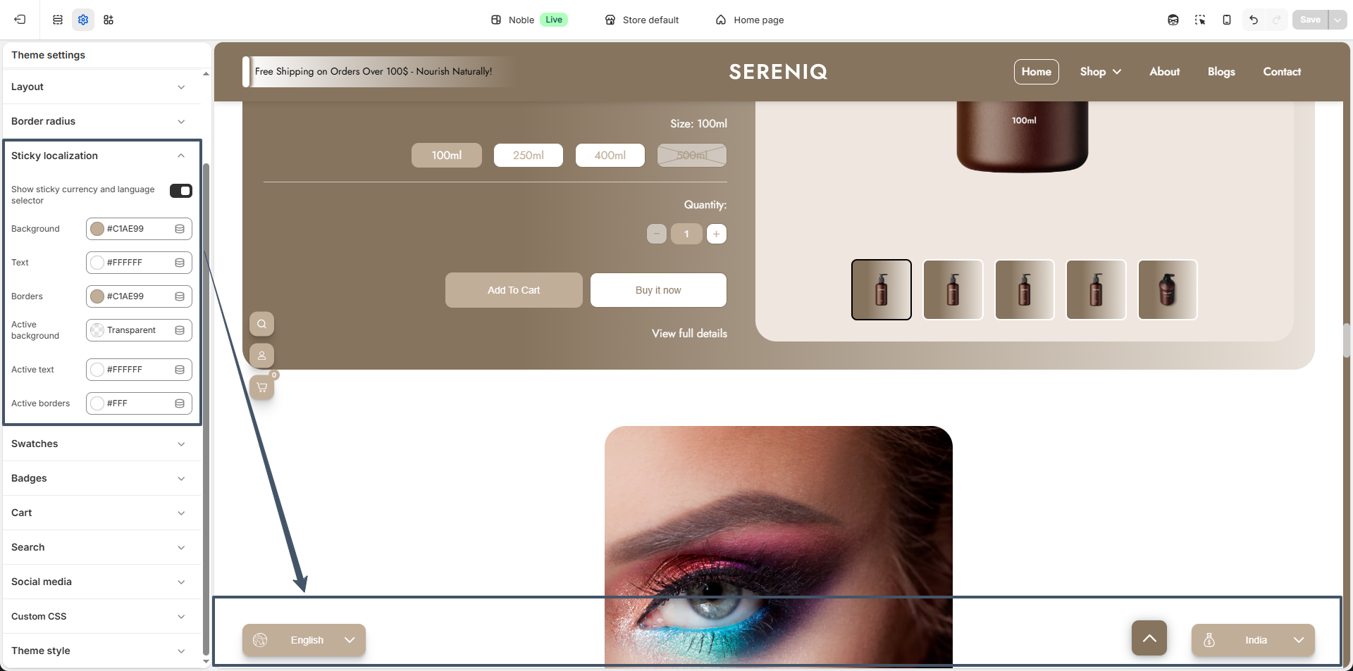
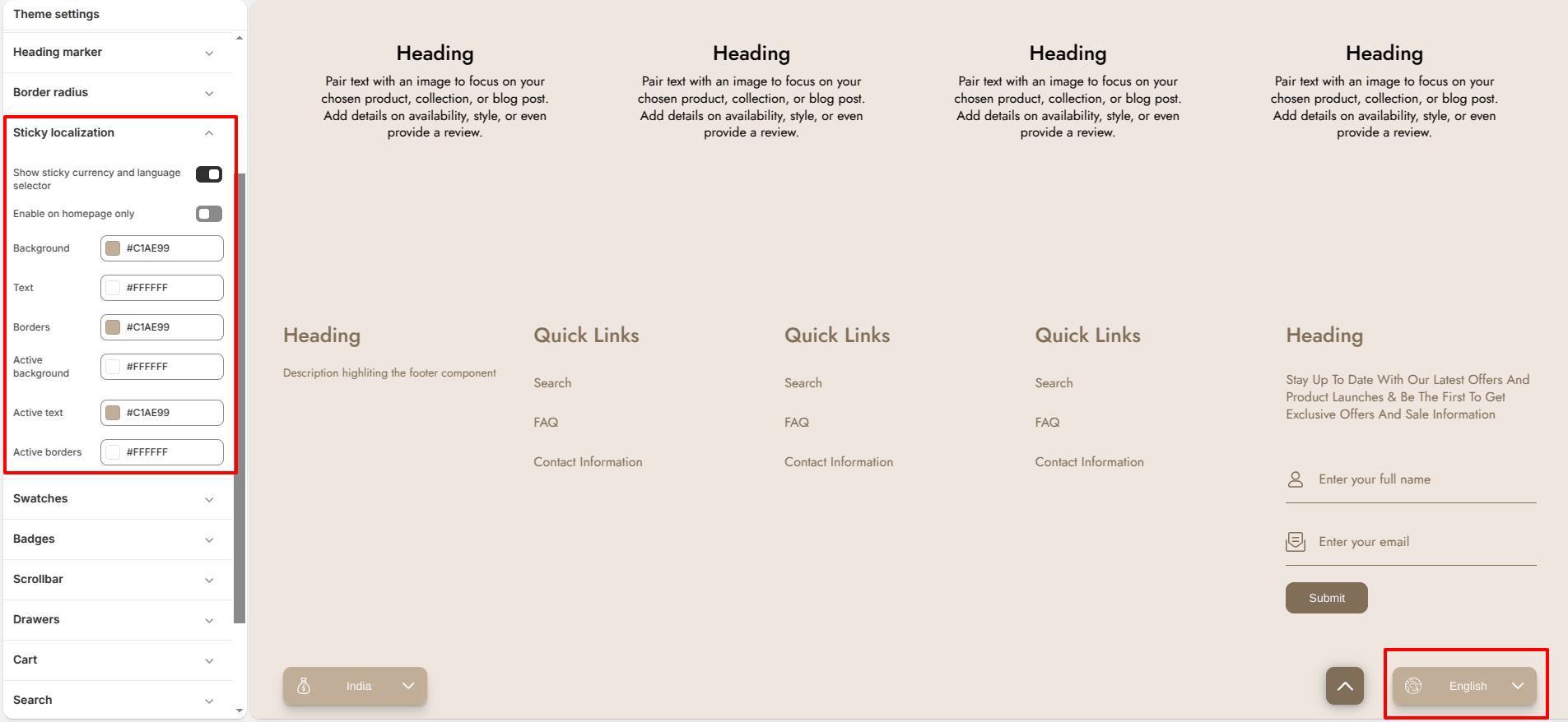
Sticky Localization

Enable the sticky localization feature to display a floating language and country selector on your storefront. This allows customers to quickly switch their language and region from anywhere on the page.

  1. Go to Theme Settings – Open your theme editor and navigate to Theme settings
  2. Open Sticky Localization – Find and click on Sticky localization
  3. Enable Selector – Turn on Show sticky currency and language selector
  4. Customize Appearance
    • Background color
    • Text color
    • Border color
    • Active state colors
  5. Save Changes – Click Save to apply the settings

Once enabled, the selector will appear fixed (sticky) on the screen, usually at the bottom corner, improving accessibility for international users.

sticky localization settings

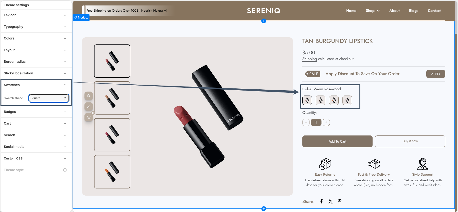
Swatches & Badges

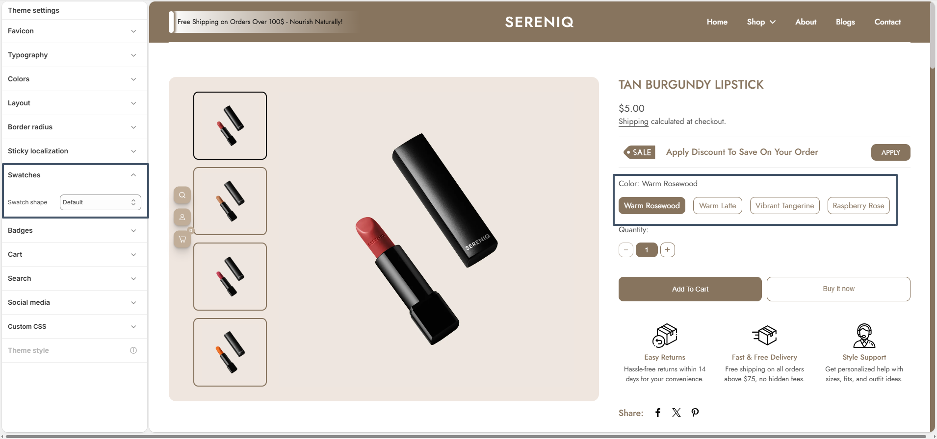
Swatch styles in Noble let you choose product swatches as circles,squares or default.

swatch

How To Showcase Product Color Swatches:
Noble color swatches showcase all available product colors clearly and visually. They improve the shopping experience by making color selection faster and easier.

Step 1: Assign a Product Category
Shopify enables category metafields (e.g., Color, Size) only after a product has an assigned category.

  • From your Shopify admin, go to Products.
  • Click the product you want to edit.
  • In the Category section, click Browse categories.
  • Select a relevant category (e.g., Face Serums).
  • Click Save.

⚠️ Note: Only products with assigned categories can use category metafields.

Step 2: Configure the Color Metafield
Once a category is assigned, you can configure available values for the Color metafield.

  • From your Shopify admin, go to Settings → Custom data → Categories.
  • Click the category you previously assigned.
  • Locate the Color metafield and click Manage entries.
  • Add new color entries:
    • Enter a color name (e.g., Red, Blue).
    • Optionally upload a swatch image or enter a color hex (e.g., #FF0000).
  • Click Save.

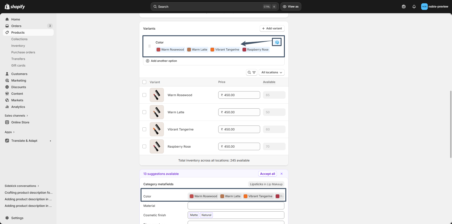
Step 3: Connect the Color Metafield to Variant Options
Link your product's Color option to the metafield you just configured.

  • Open your product in the Products section.
  • Under Variants, click Add options like size or color.
  • In Option name, type Color.
  • Click the dynamic source icon (🔗) next to it.
  • Select the Color category metafield.
  • Assign each variant the appropriate metafield entry (e.g., Red, Blue).
  • Click Done and then Save the product.

Step 4: Set Up Swatch Shape
You can configure the global swatch shape for product swatches across your store.

  • From your Shopify admin, go to Online Store → Themes.
  • Click Customize on the Noble theme.
  • In the Theme Editor, navigate to Theme Settings → Color Swatches Selectors.
  • Select your desired swatch shape from the available options:
    • Circle - Circular swatch.
    • Square - Perfect square swatch.
    • Default - Uses the theme's default swatch styling.
  • Click Save to apply your changes.

Read more about adding color swatches using category metafields

swatches

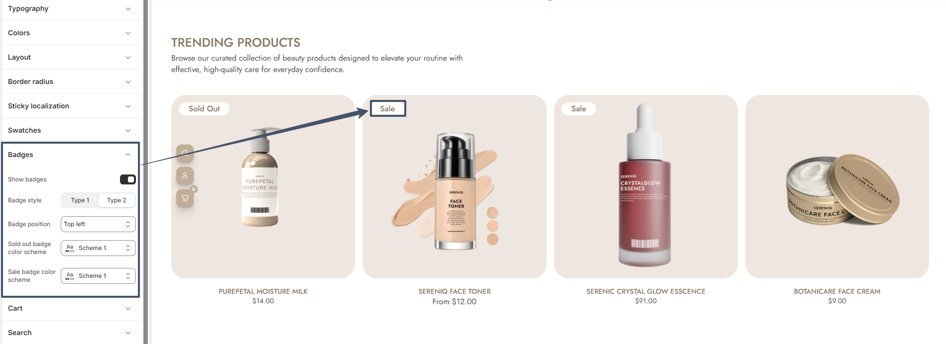
How to Enable Badges

  • From your Shopify admin, go to Online Store → Themes.
  • Click Customize on the Noble theme.
  • In the Theme Editor, open Theme Settings (bottom-left corner).
  • Select the Badges option.
  • Checked the Show badges option.
badges

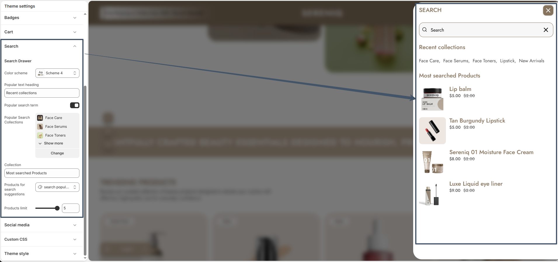
Search Drawer

Noble’s Search Drawer includes settings for color scheme, heading text, and popular search terms. You can also display popular collections or show selected products for quick access.

Search Drawer

Social Media Settings

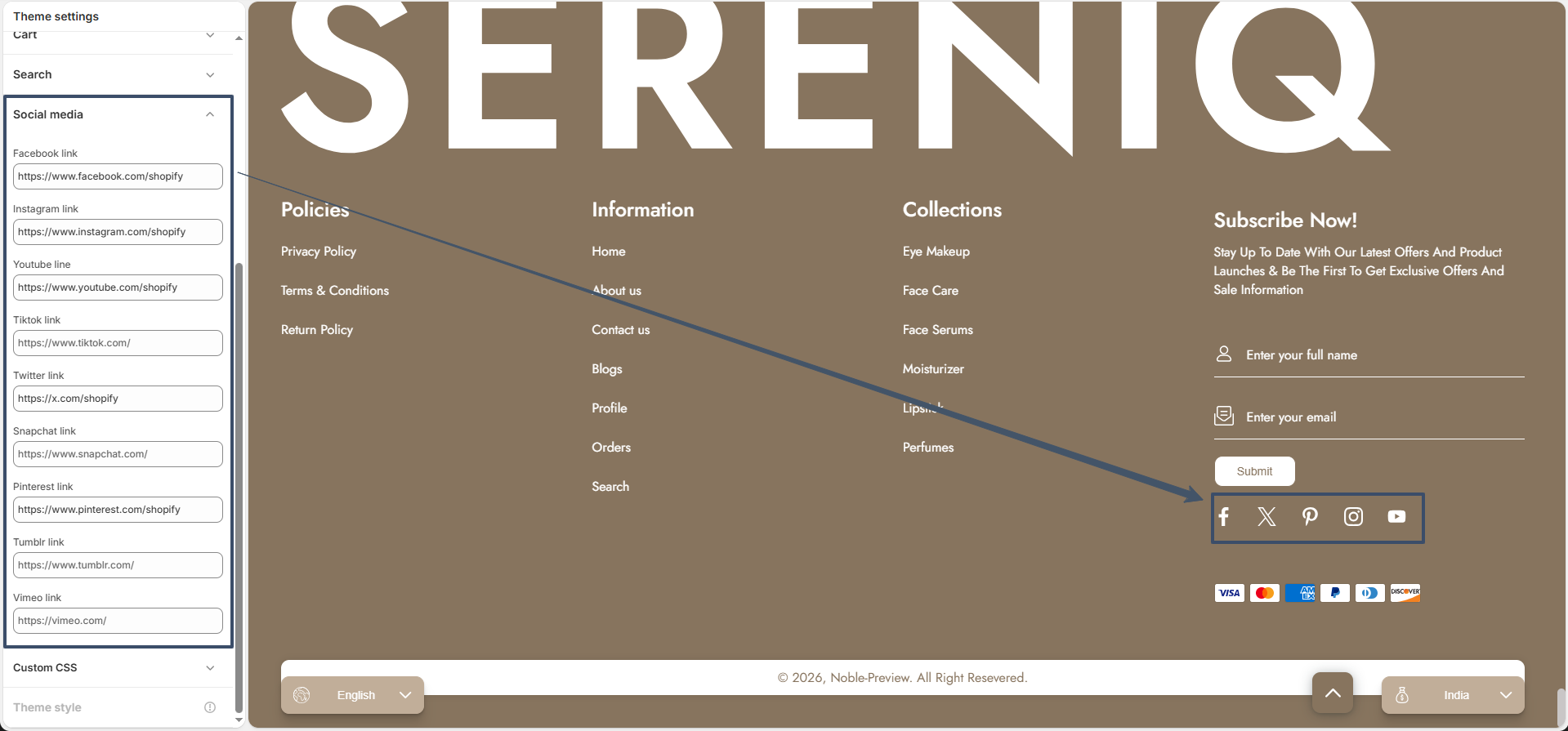
Connect your social media accounts to your store to strengthen your brand presence and allow customers to engage with you across platforms.

Social media settings

How to Configure Social Media Links

Add your social profile links to display clickable icons and enable social integrations across your store.

Steps

  • Open the Theme Customizer.
  • Go to "Theme Settings".
  • Click on "Social Media".
  • Enter your social media profile links.
  • Save your changes.

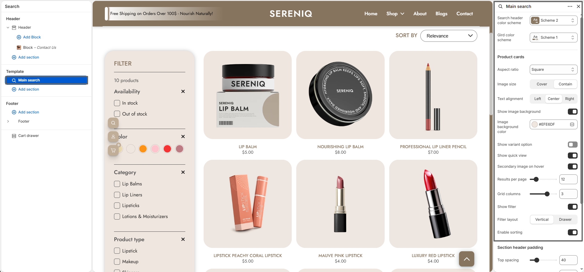
Search Page

Noble’s Search page lets you control the color schemes,number of products per page and the number of products per column.
You can also configure filters, filter layout, product card settings, quick view, and quick view position.

Searchpage

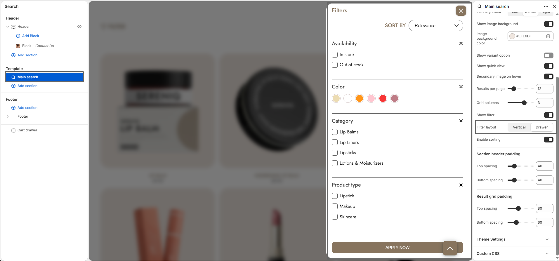
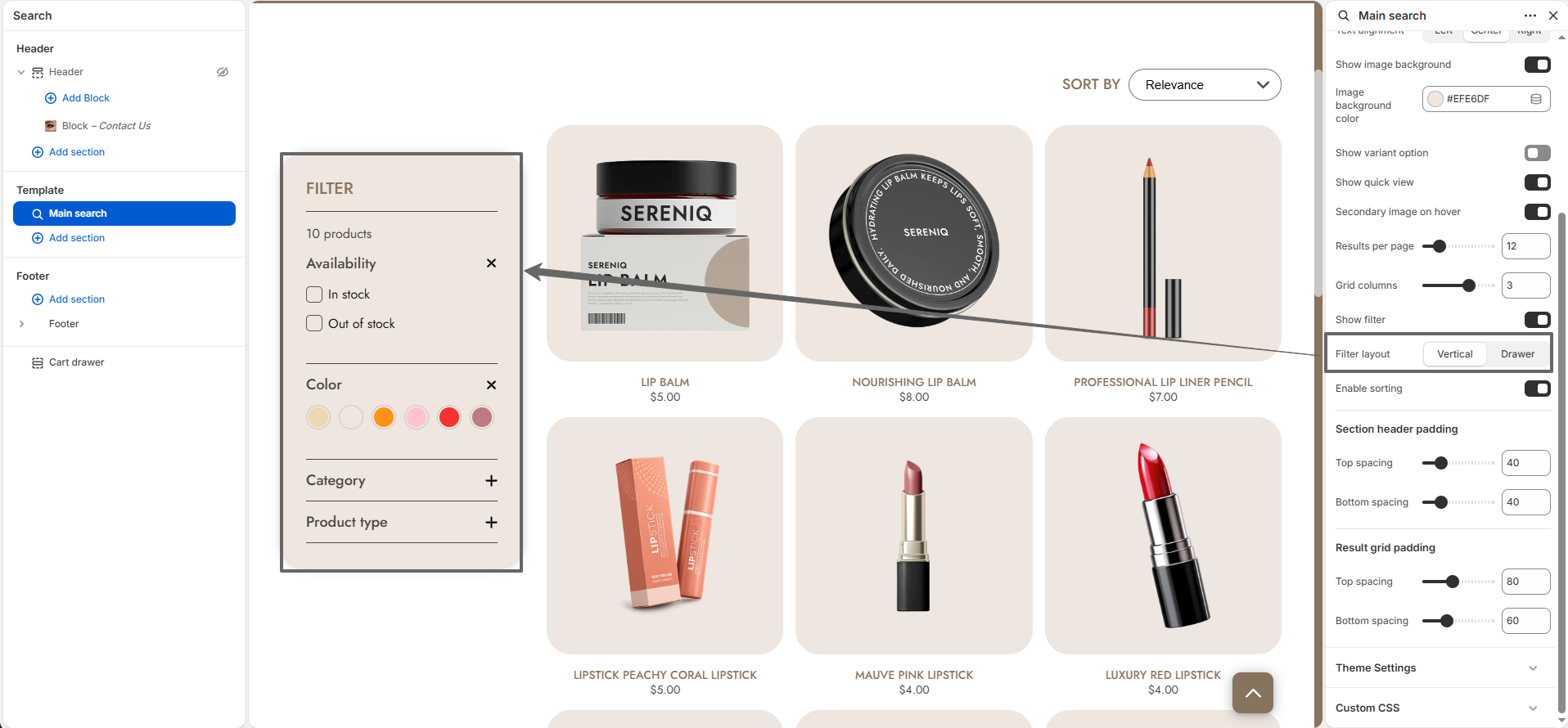
The Filter Layout setting on the search page allows you to adjust the product filter layout. You can set it to vertical or drawer.
Click on the Filter button to open filter drawer

Searchpage

Vertical filter layout

filter vertical

Collection Page

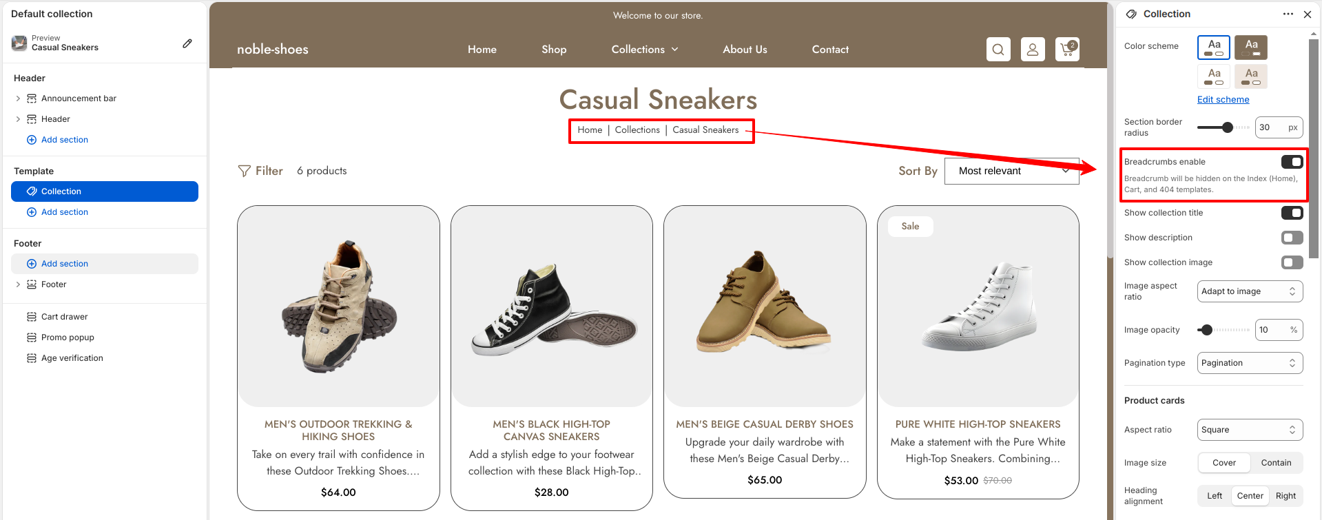
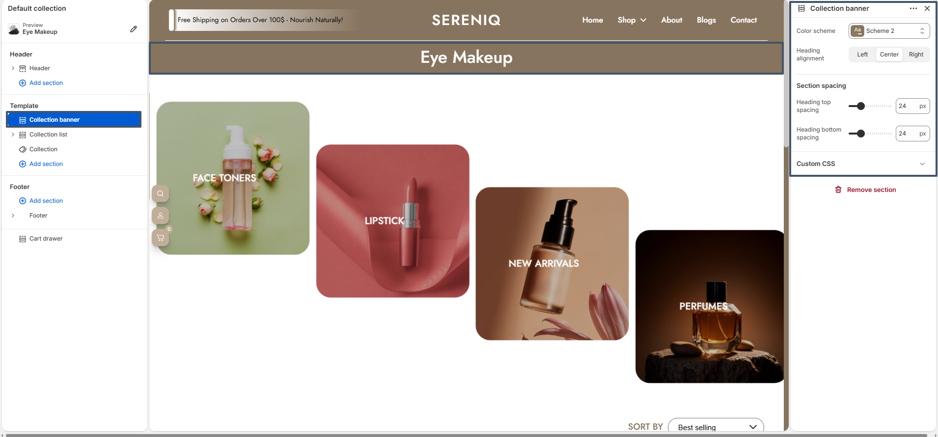
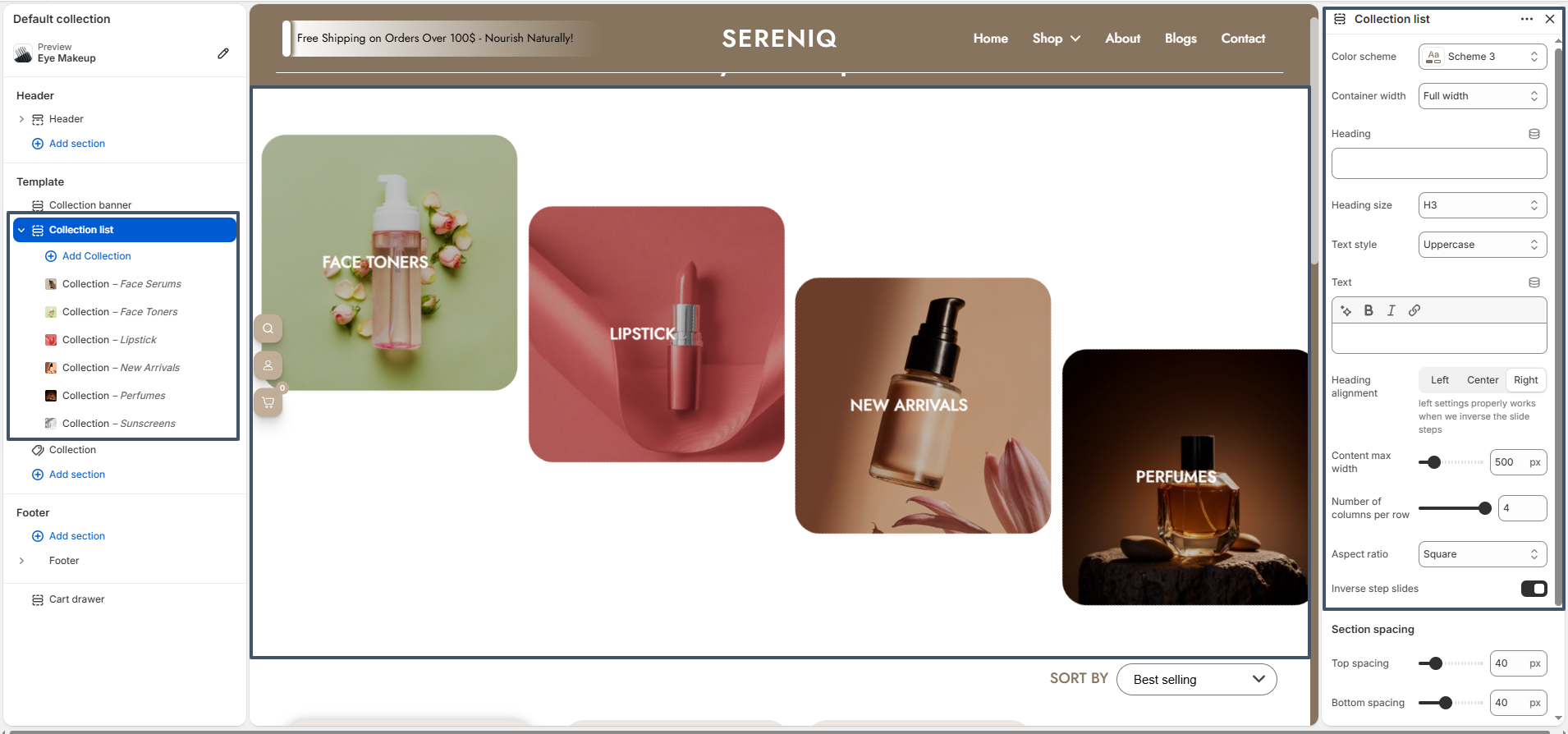
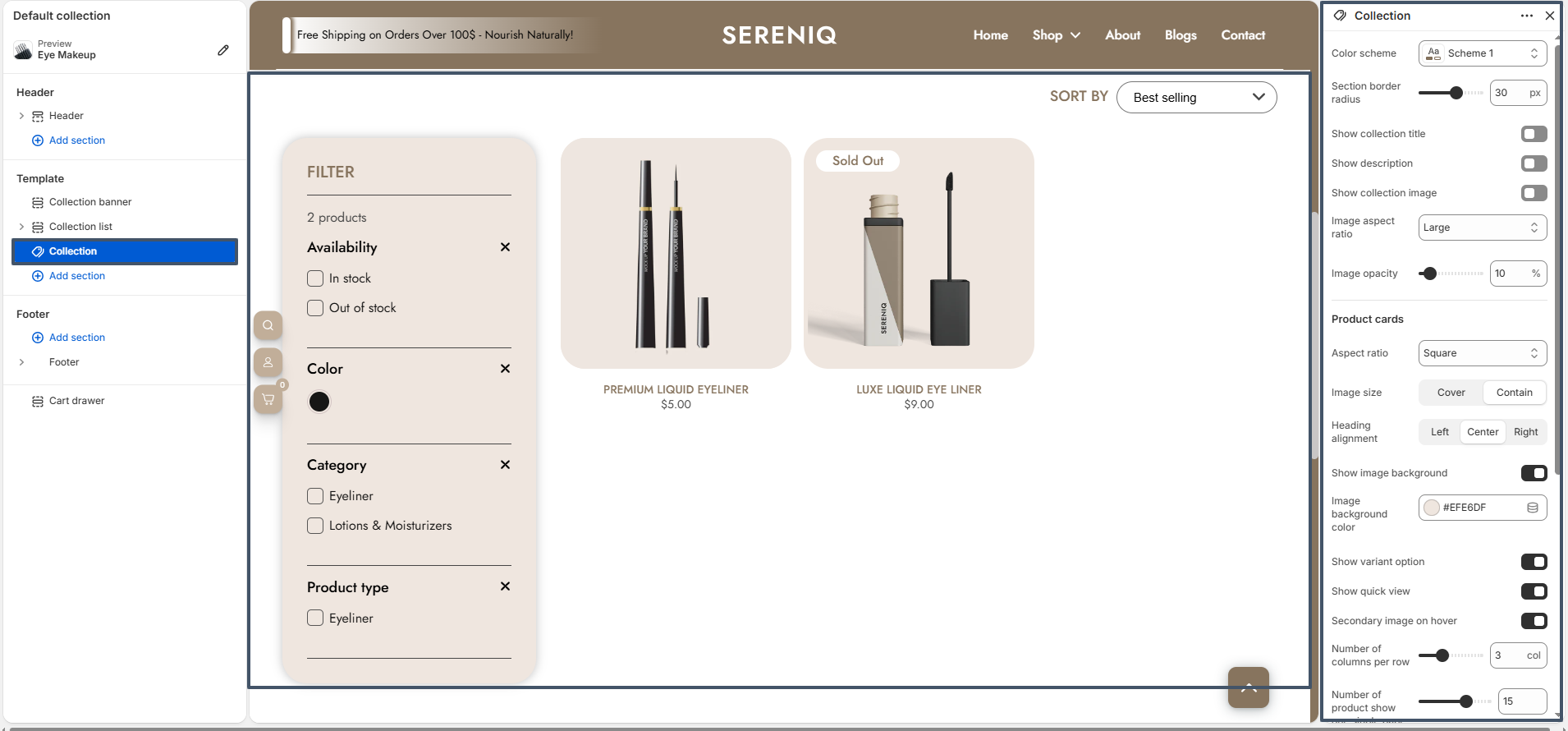
Noble’s Collection page includes three main sections: Collection Banner, Collection List, and Collection, allowing you to create a complete and flexible product browsing experience.

Collection Banner section is used to display the collection title and description. It helps create a strong visual introduction for the collection page.

collection banner

Collection List section includes settings for color scheme, container width, heading, and layout customization. You can control the number of columns, aspect ratio, and showcase featured or trending collections.

collection list

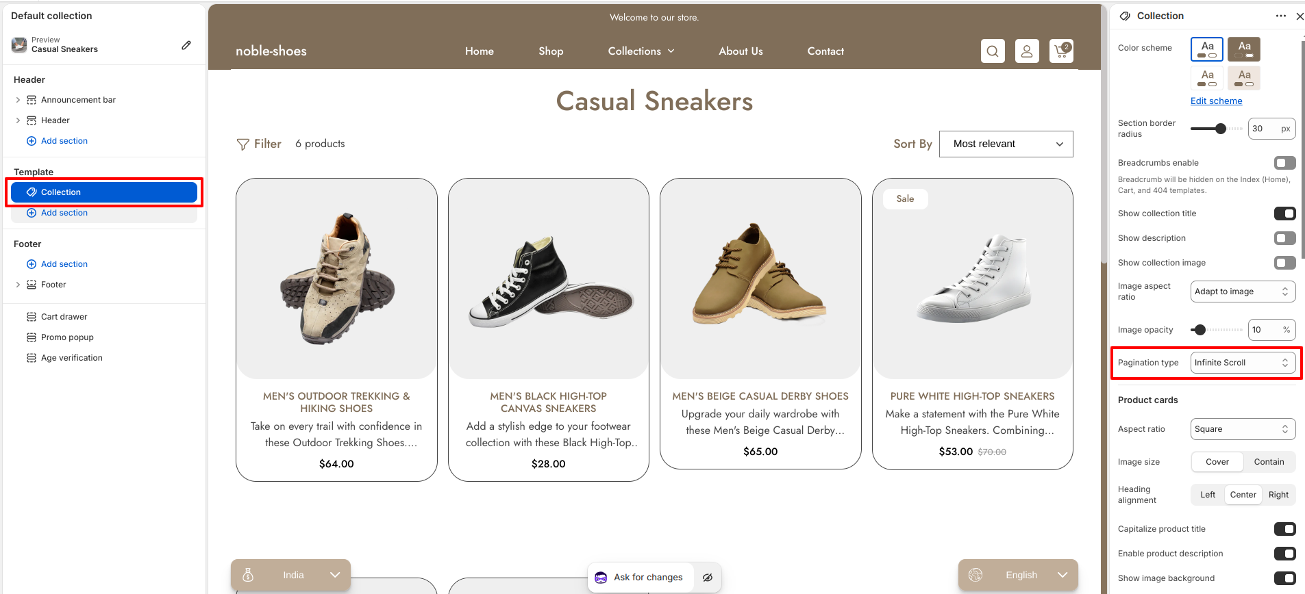
Collection section displays products with filtering and sorting options. It includes settings for product cards, image ratio, quick view, and layout controls to enhance product visibility and usability.

collection products

The collection page also supports filters (such as availability, color, and category) and sorting options like “Best Selling” to help users easily find products.

Product Page

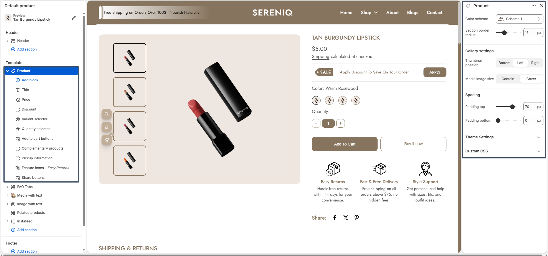
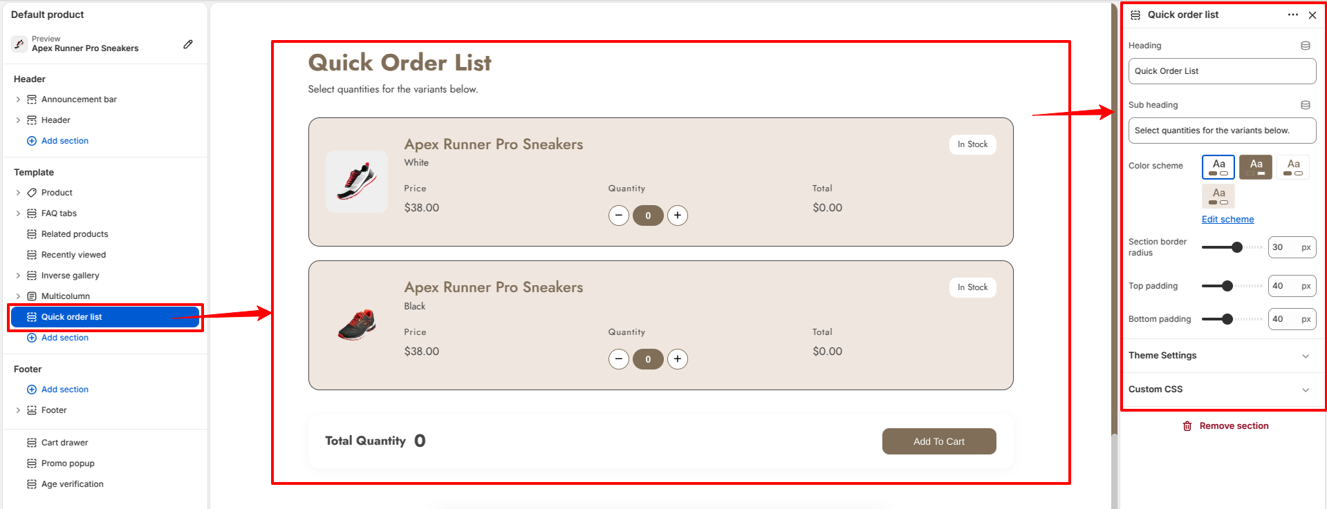
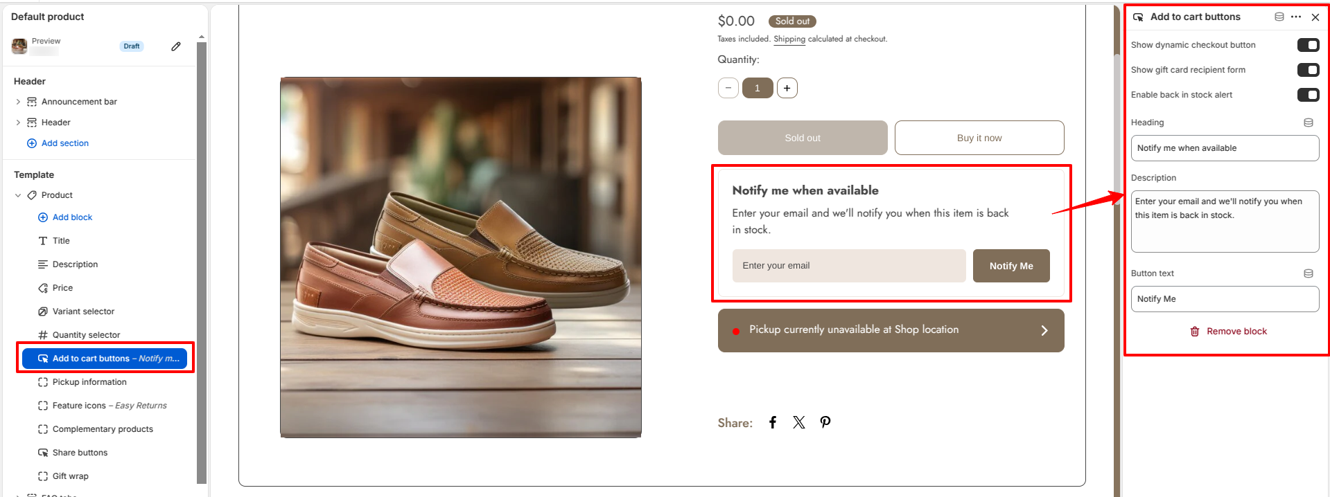
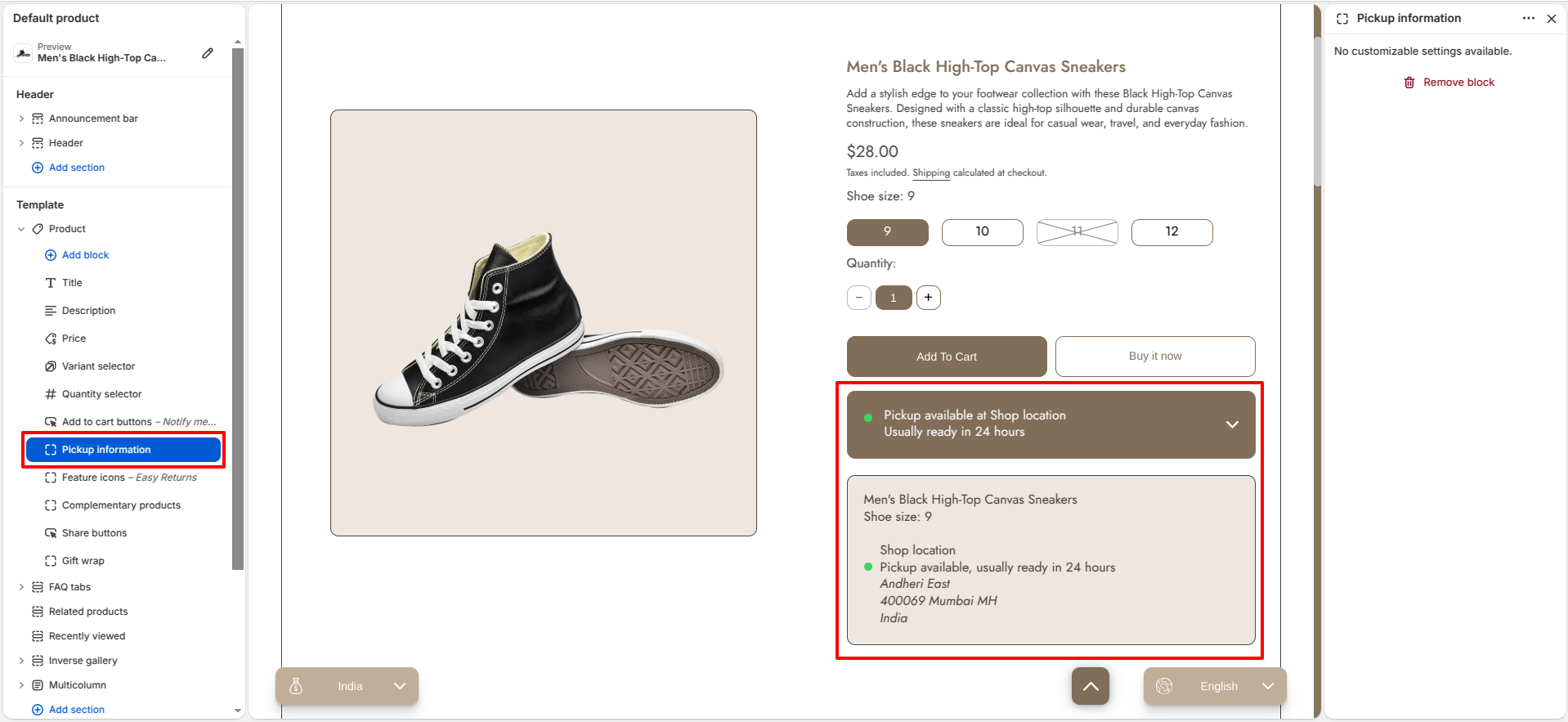
The Nobles product page offers flexible settings for media, spacing, and color schemes, and provides a variety of blocks within section. These blocks include the variant selector, title, price, quantity selector, add-to-cart buttons,discount,complementary products and more. The product page also includes a Recently Viewed section.

Product Page

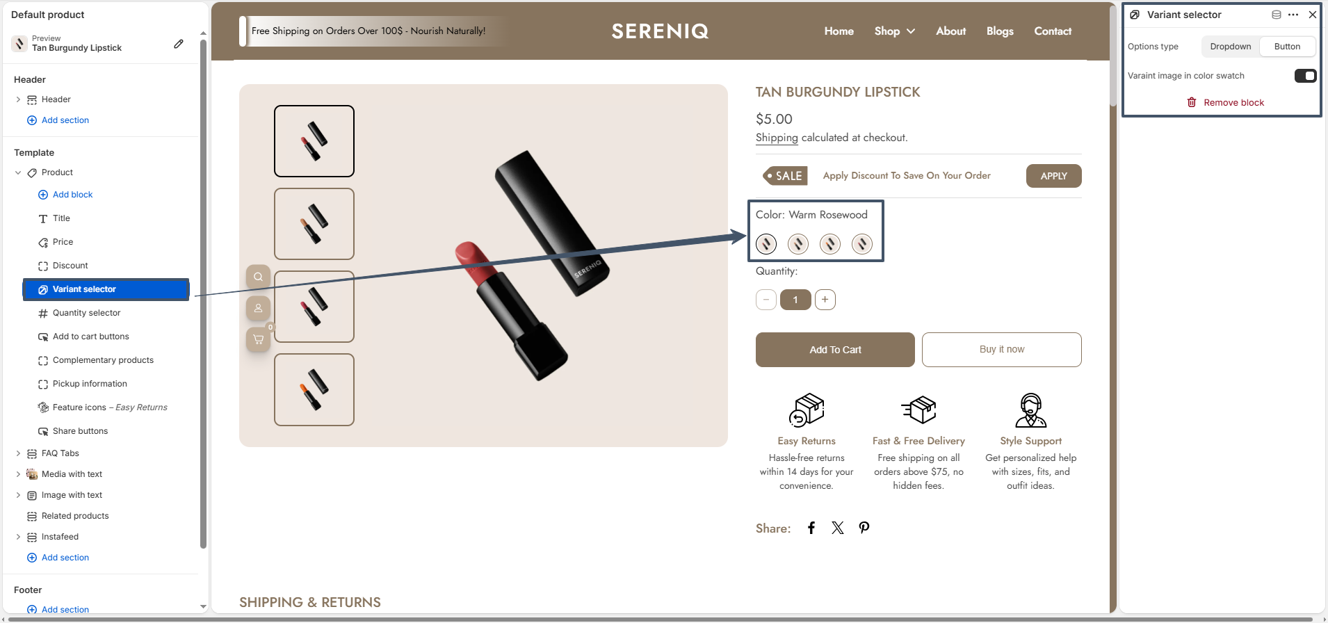
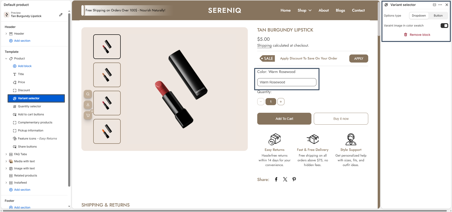
The Variant Selector setting offers two options: Button and Dropdown.

Button

Button

Note: If you want the variant picker to display only as buttons or dropdowns (not swatches), please set the Swatch Shape to Default in the theme settings.

Button 2

Dropdown

Dropdown

How To Showcase Product Color Swatches:
Noble color swatches showcase all available product colors clearly and visually. They improve the shopping experience by making color selection faster and easier.

Step 1: Assign a Product Category
Shopify enables category metafields (e.g., Color, Size) only after a product has an assigned category.

  • From your Shopify admin, go to Products.
  • Click the product you want to edit.
  • In the Category section, click Browse categories.
  • Select a relevant category (e.g., Face Serums).
  • Click Save.

⚠️ Note: Only products with assigned categories can use category metafields.

Step 2: Configure the Color Metafield
Once a category is assigned, you can configure available values for the Color metafield.

  • From your Shopify admin, go to Settings → Custom data → Categories.
  • Click the category you previously assigned.
  • Locate the Color metafield and click Manage entries.
  • Add new color entries:
    • Enter a color name (e.g., Red, Blue).
    • Optionally upload a swatch image or enter a color hex (e.g., #FF0000).
  • Click Save.

Step 3: Connect the Color Metafield to Variant Options
Link your product's Color option to the metafield you just configured.

  • Open your product in the Products section.
  • Under Variants, click Add options like size or color.
  • In Option name, type Color.
  • Click the dynamic source icon (🔗) next to it.
  • Select the Color category metafield.
  • Assign each variant the appropriate metafield entry (e.g., Red, Blue).
  • Click Done and then Save the product.

Step 4: Set Up Swatch Shape
You can configure the global swatch shape for product swatches across your store.

  • From your Shopify admin, go to Online Store → Themes.
  • Click Customize on the Noble theme.
  • In the Theme Editor, navigate to Theme Settings → Color Swatches Selectors.
  • Select your desired swatch shape from the available options:
    • Circle - Circular swatch.
    • Square - Perfect square swatch.
    • Default - Uses the theme's default swatch styling.
  • Click Save to apply your changes.

Read more about adding color swatches using category metafields

swatches

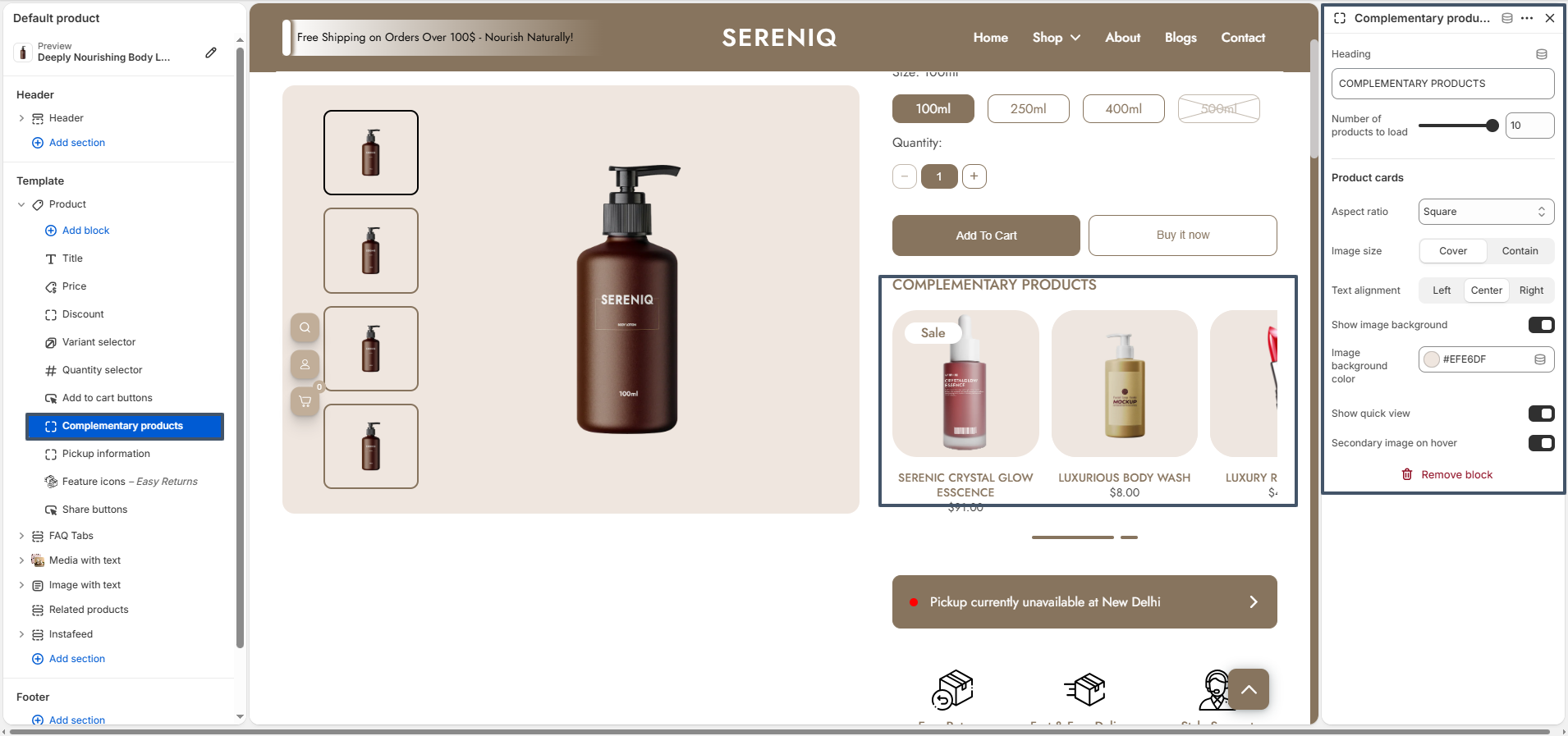
The product page also includes Complementary Products block and Related Products sections which help you recommend additional products to customers. These recommendations improve product discovery and encourage customers to purchase more items from your store.

Complementary Products

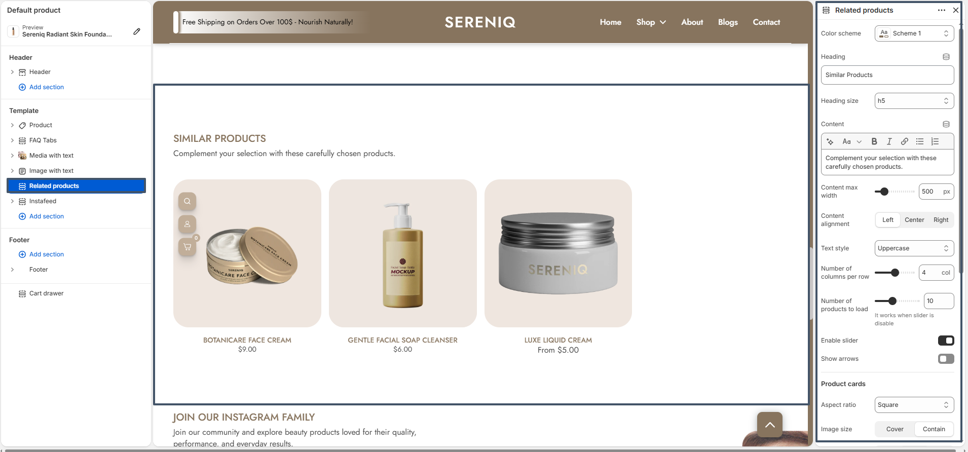
Related Products

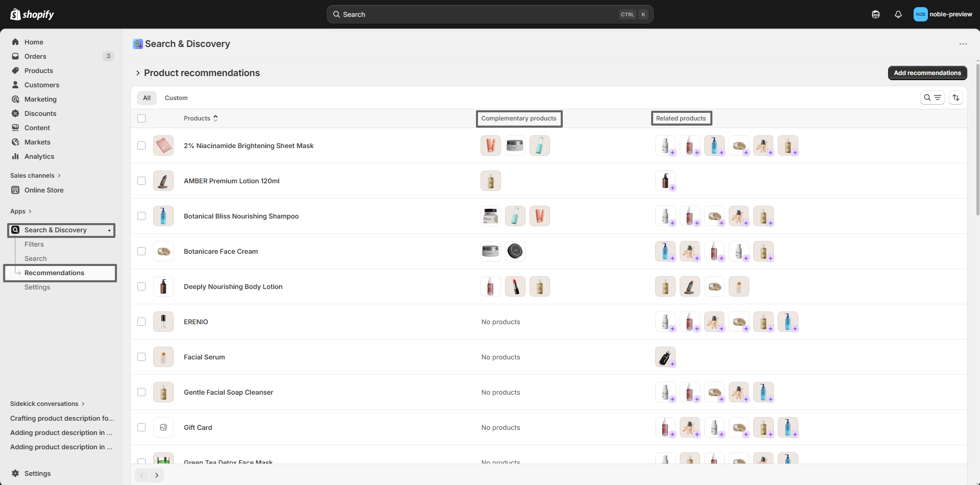
Both Complementary Products and Related Products are managed using the Shopify Search & Discovery App. This free Shopify app allows you to manually control which products appear as recommendations on the product page.

Related Products

Step 1: Install the Shopify Search & Discovery App

To configure product recommendations, you first need to install the Shopify Search & Discovery app from the Shopify App Store.

1. Go to your Shopify Admin.
2. Click on Apps in the left sidebar.
3. Click Shopify App Store.
4. Search for Shopify Search & Discovery.
5. Click Install and add the app to your store.

Step 2: Set Complementary Products

Complementary products are items that pair well with the current product. For example, if a customer is viewing a face cream, you may recommend a cleanser or toner as complementary products.

Follow these steps to add complementary products:

1. Open the Search & Discovery App from your Shopify admin.
2. Click on Product Recommendations.
3. Select the product you want to edit.
4. In the Complementary Products section, click Add products.
5. Choose the products you want to recommend.
6. Save the changes.

These products will now appear in the Complementary Products block on the product page.

Step 3: Set Related Products

Related products show items that are similar to the current product, helping customers explore alternative or similar options.

To configure related products:

1. Open the Search & Discovery App.
2. Navigate to Product Recommendations.
3. Select the product you want to edit.
4. In the Related Products section, choose the products you want to display.
5. Save your changes.

Once configured, these products will appear in the Related Products section on the product page.

Blog Setting

A Blog is a powerful way to share articles, updates, guides, and stories related to your brand or products. It allows you to provide helpful content to your customers while improving your store's visibility in search engines. Blogs can be used for product guides, beauty tips, industry news, brand announcements, and other informative content that keeps customers engaged with your store.

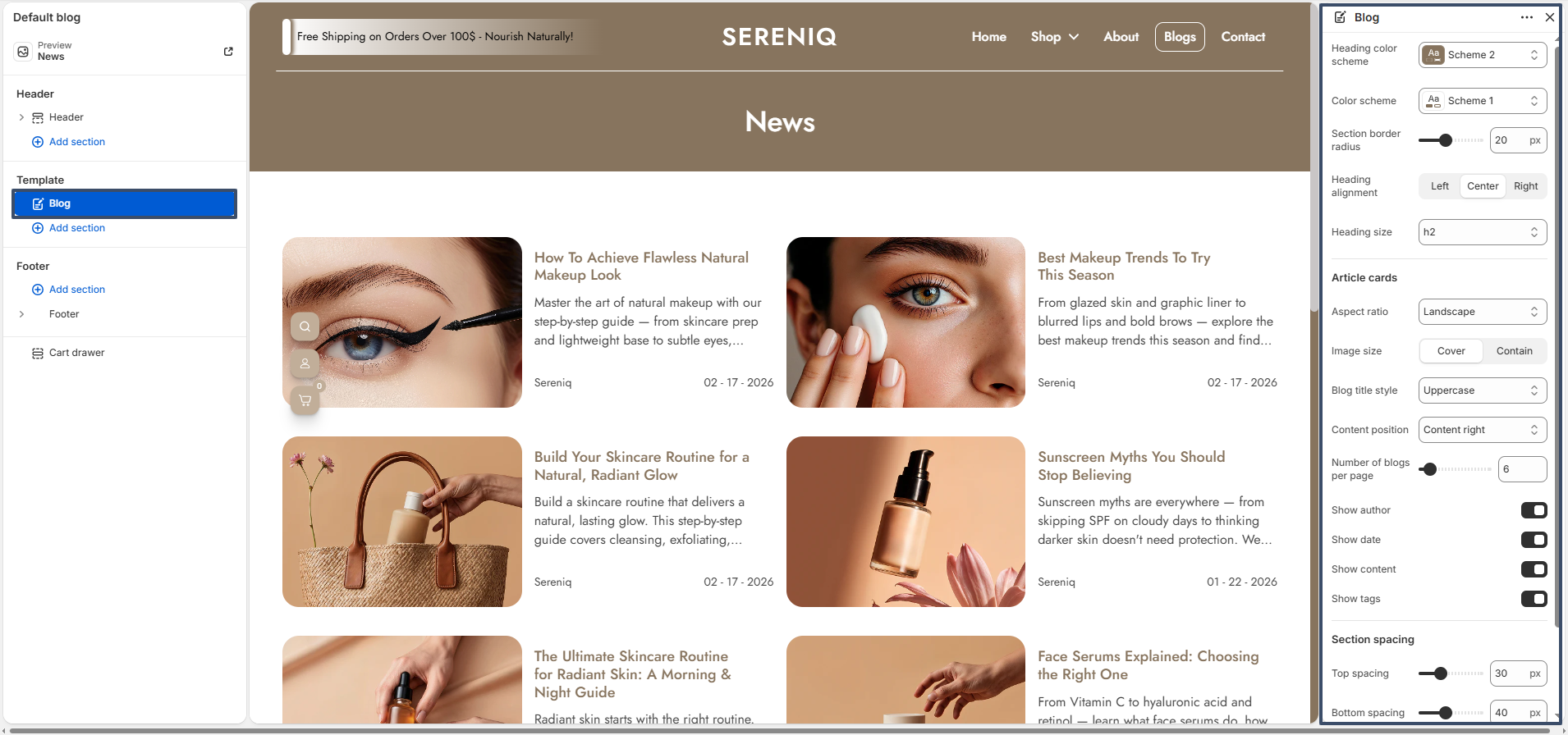
The Nobles theme displays blog posts using visually appealing article cards. Each card includes the featured image, blog title, excerpt, and additional article information. You can customize the appearance of these blog cards using the available section settings.

The blog section includes the following customization settings:

  1. Heading Color Scheme – Allows you to select the color style for the blog page heading.
  2. Color Scheme – Choose the overall color scheme used for the blog section background and content area.
  3. Section Border Radius – Adjust the rounded corners of the blog section container to match your store design.
  4. Heading Alignment – Control the alignment of the blog page heading. Available options include Left, Center, and Right.
  5. Heading Size – Select the size of the blog heading based on your typography preference.

Article Card Settings

  1. Aspect Ratio – Defines the shape of the blog article image (such as Landscape or Square).
  2. Image Size – Controls how the blog image fits inside the article card. The options include Cover or Contain.
  3. Blog Title Style – Allows you to change the typography style used for blog titles.
  4. Content Position – Choose where the article content appears relative to the image. Content can appear on the Right side of the image or at the Bottom below the image.
  5. Number of Blogs Per Page – Control how many blog articles should be displayed on a single page.
  6. Show Author – Enable or disable the display of the blog author name.
  7. Show Date – Displays the publishing date of each blog post.
  8. Show Content – Shows a short excerpt from the blog article within the card.
  9. Show Tags – Displays tags associated with each blog post.

The blog article card includes a Content Position setting, allowing you to place the article content either to the right of the image or below the image depending on your preferred layout style.

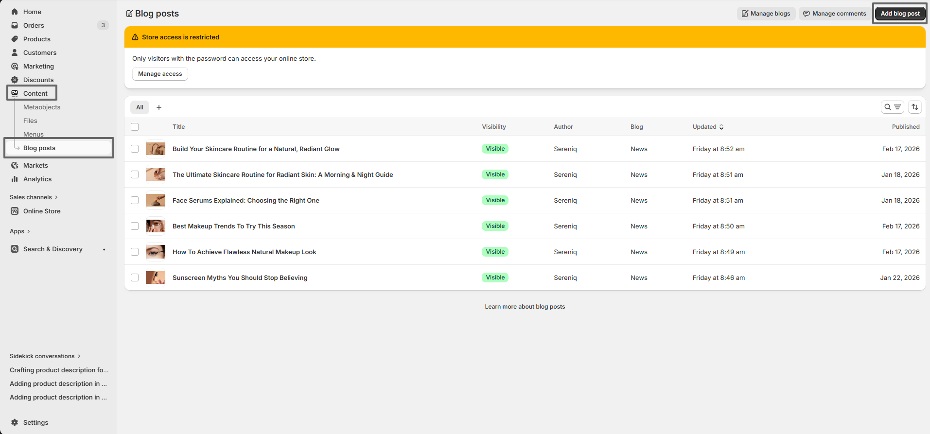
To display blog content on this page, you need to create blog posts from the Shopify admin panel.

How to Create a Blog Post

  1. Go to your Shopify Admin.
  2. Click on Content.
  3. Select Blog posts.
  4. Click Add blog post.
  5. Add the Title and Content for the article.
  6. Upload a Featured Image.
  7. Click Save or Publish.

After creating blog posts, they will automatically appear on the blog page using the selected layout and settings.

Blog

Blog Post

A Blog Post is an individual article published within your store's blog. Each blog post allows you to share valuable content such as tutorials, product insights, beauty tips, industry news, or brand stories. Blog posts help you engage with your audience while improving your store's search engine visibility.

The Nobles theme provides a clean and structured blog article layout that presents your content in a visually appealing way. Each blog post page highlights important elements such as the featured image, article title, author information, publishing date, and social sharing options.

Blog Post

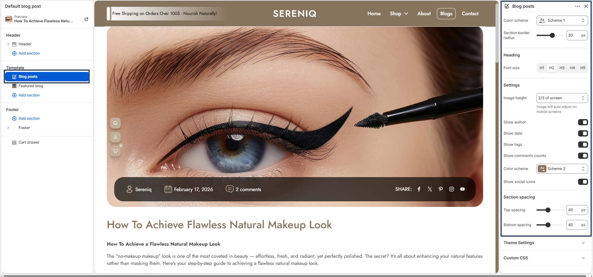
The blog post template includes several settings that allow you to control the appearance of the article page.

Blog Post Settings

  1. Color Scheme – Select the color scheme used for the blog article section.
  2. Section Border Radius – Adjust the rounded corners of the blog post container.
  3. Heading Font Size – Choose the heading size for the blog title (H1, H2, H3, H4, or H5).
  4. Image Height – Control the height of the featured image displayed at the top of the blog post.
  5. Show Author – Enable or disable the display of the blog author name.
  6. Show Date – Display the publishing date of the article.
  7. Show Tags – Show tags associated with the blog post.
  8. Show Comments Count – Display the number of comments on the article.
  9. Show Social Icons – Display social media icons that allow readers to share the blog post.
  10. Section Spacing – Adjust the top and bottom spacing of the blog post section.

How to Create a Blog Post

To display content on the blog page, you first need to create blog posts from the Shopify admin panel.

  1. Go to your Shopify Admin.
  2. Click Content from the left sidebar.
  3. Select Blog Posts.
  4. Click the Add Blog Post button.
  5. Enter the Title of the blog post.
  6. Add the Article Content using the editor.
  7. Upload a Featured Image for the article.
  8. Add Tags if needed for better categorization.
  9. Choose the blog category and click Save or Publish.

After publishing the article, it will automatically appear on the blog page using the layout defined by the blog template settings.

Blog Post

Home Page Layout

A well-designed homepage captures attention, builds trust with visitors, and smoothly guides shoppers to the products or information they need. It reflects your brand identity, highlights key offerings, and helps turn visitors into customers. The homepage generally includes the following sections:

Header & Hero Banner Section

sections 1

Collection list Section

sections 2

Horizontal Scroller Section

sections 3

Featured collection Section

sections 4

Countdown Timer Section

sections 5

Before And After Section

sections 6

Product Step Section

sections 7

Collection Tab Section

sections 8

Featured Product Section

section 9

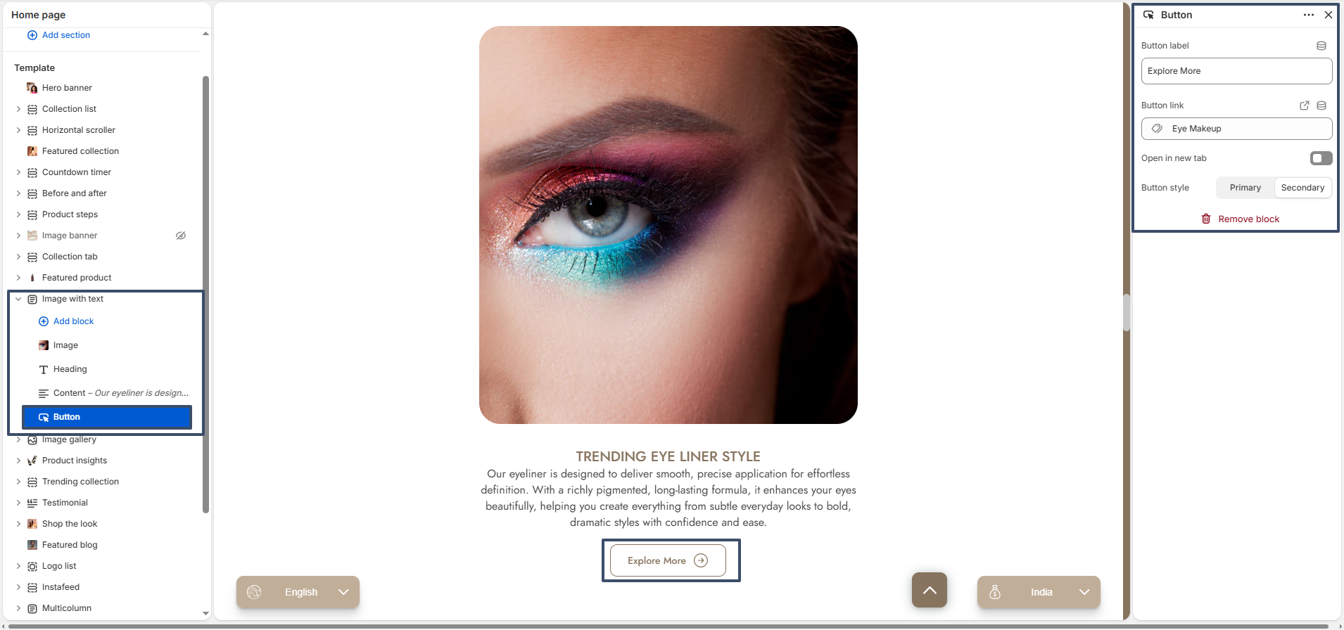
Image With Text Section

section 10

Image Gallery Section

section 11

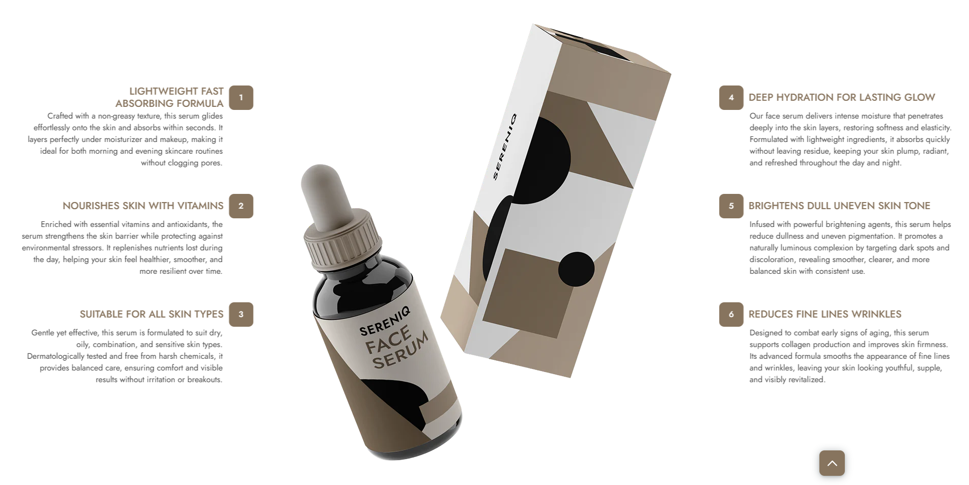
Feature highlights Section

section 12

Trending Collection Section

section 13

Testimonial Section

section 14

Shop The Look Section

section 15

Featured Blog Section

section 16

Logo List Section

section 17

Instafeed Section

section 18

Multicolumn Section

section 19

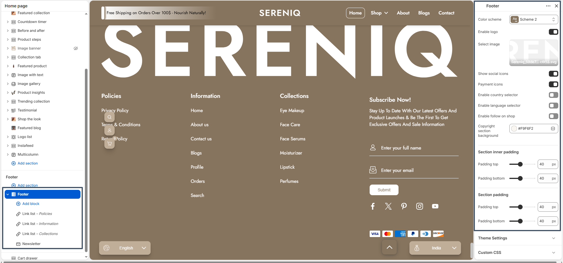
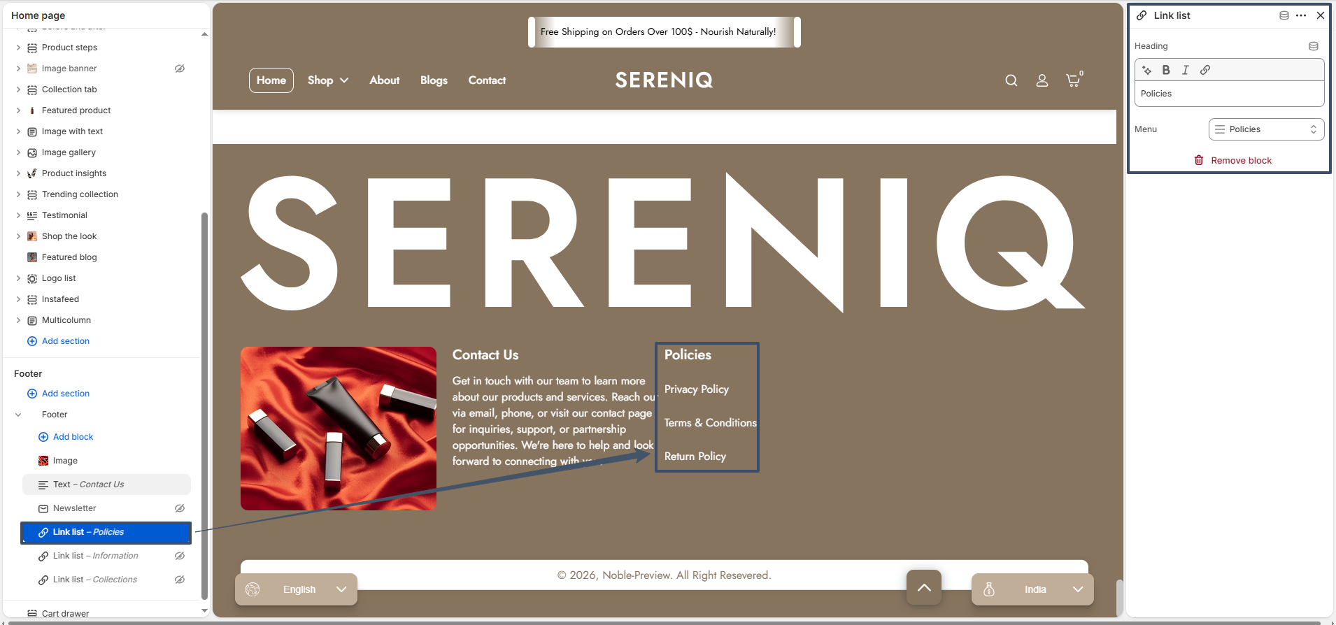
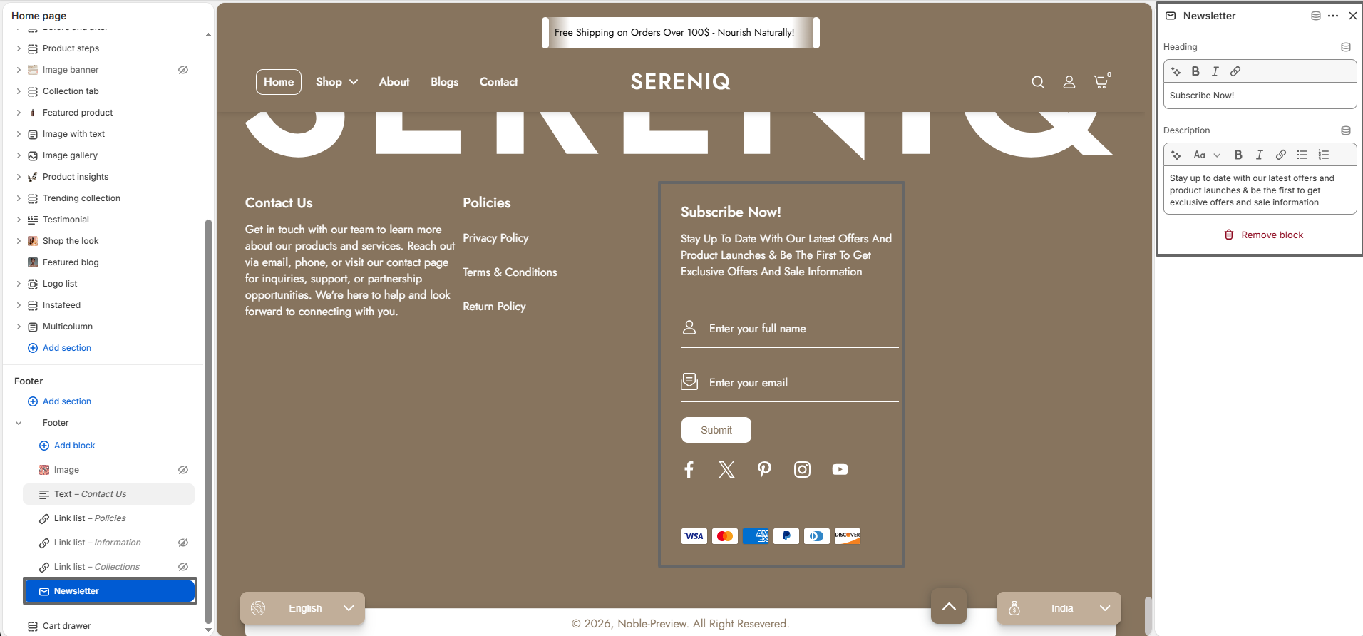
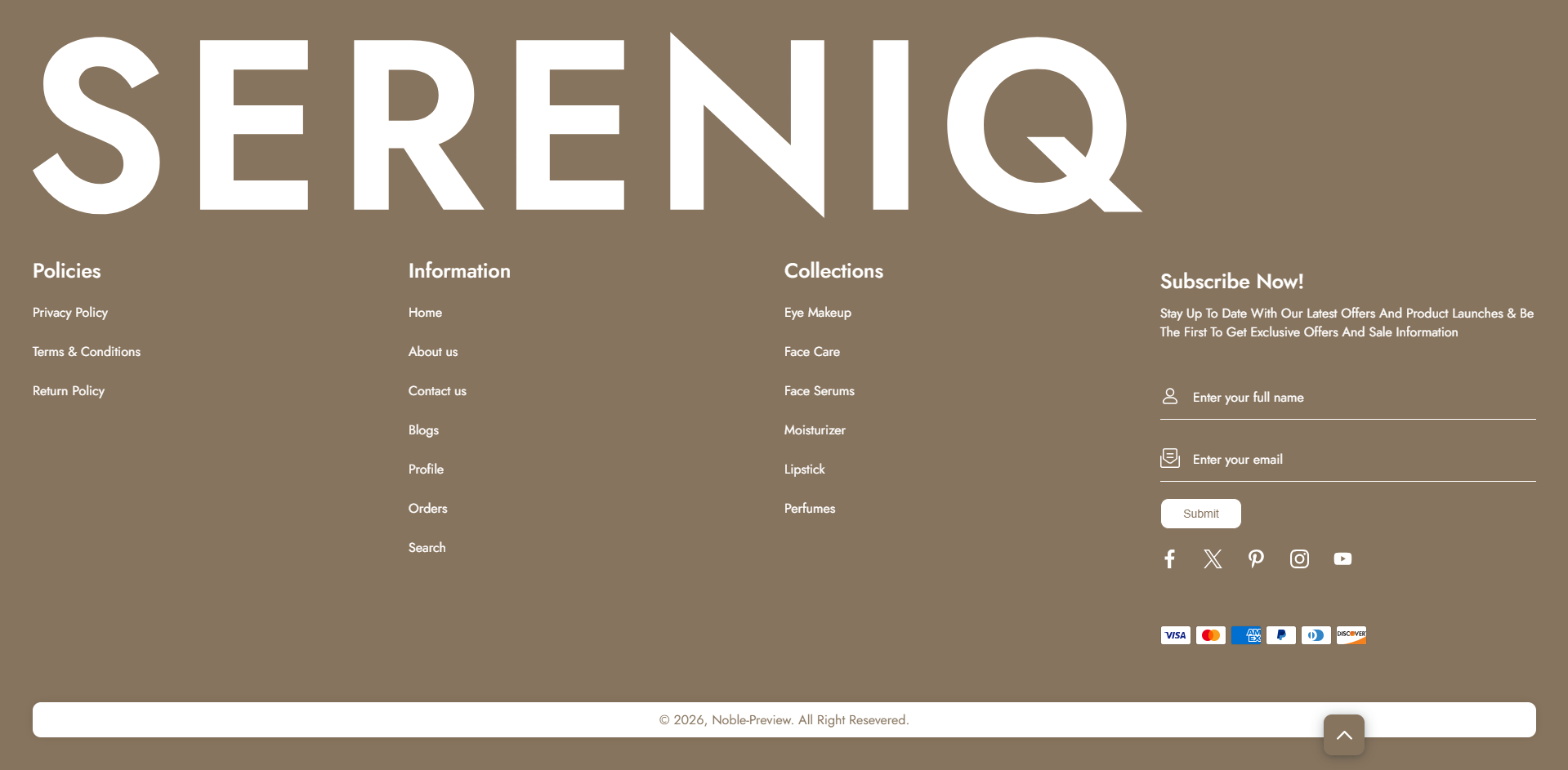
Footer Section

section 20

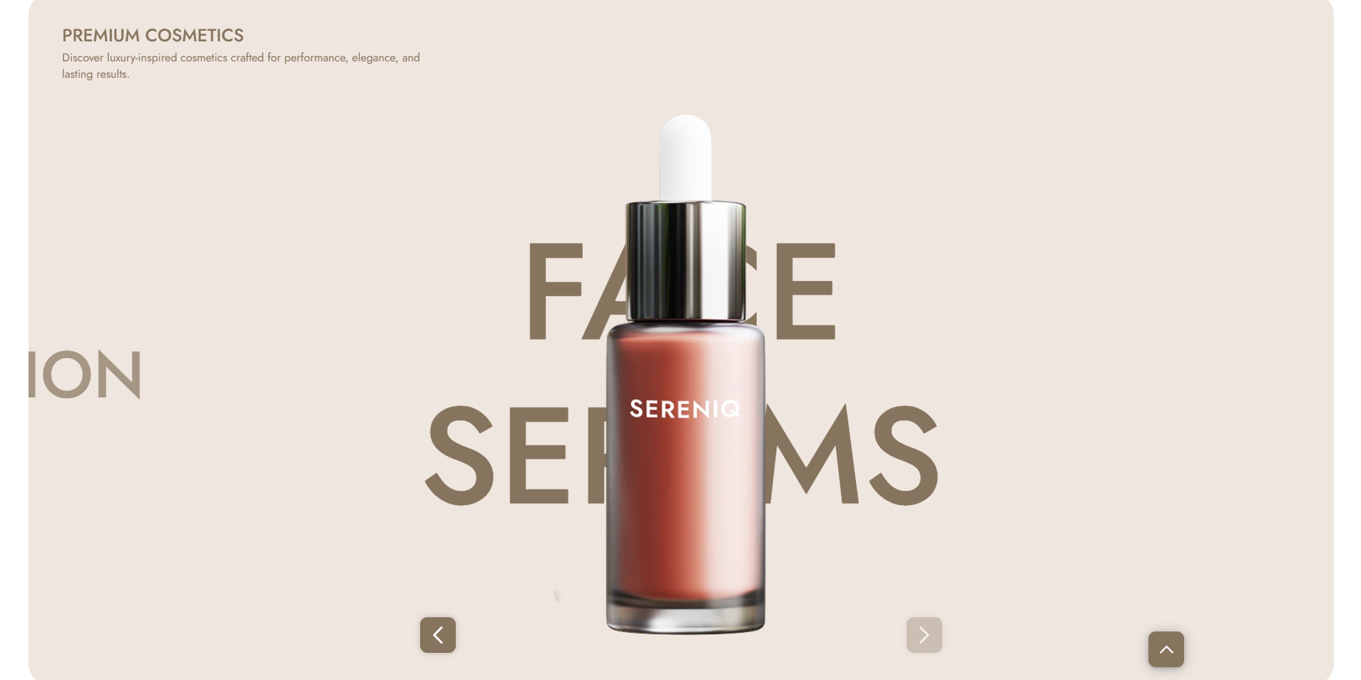
Hero Banner

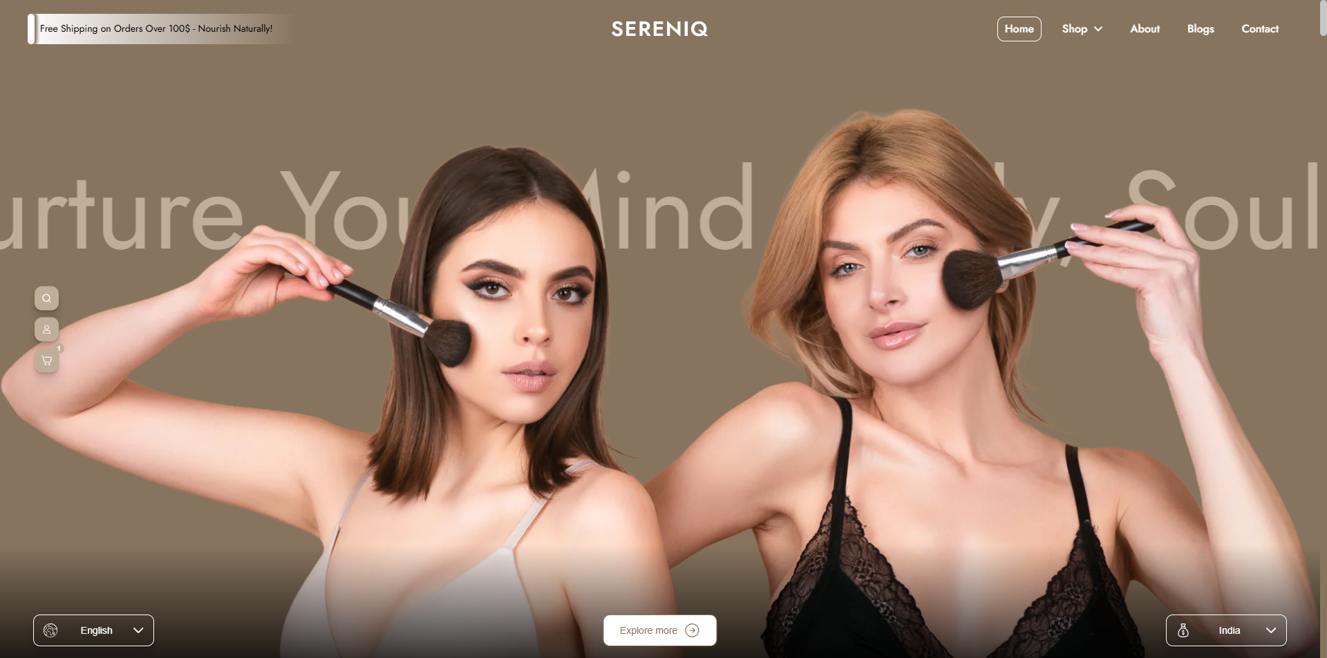
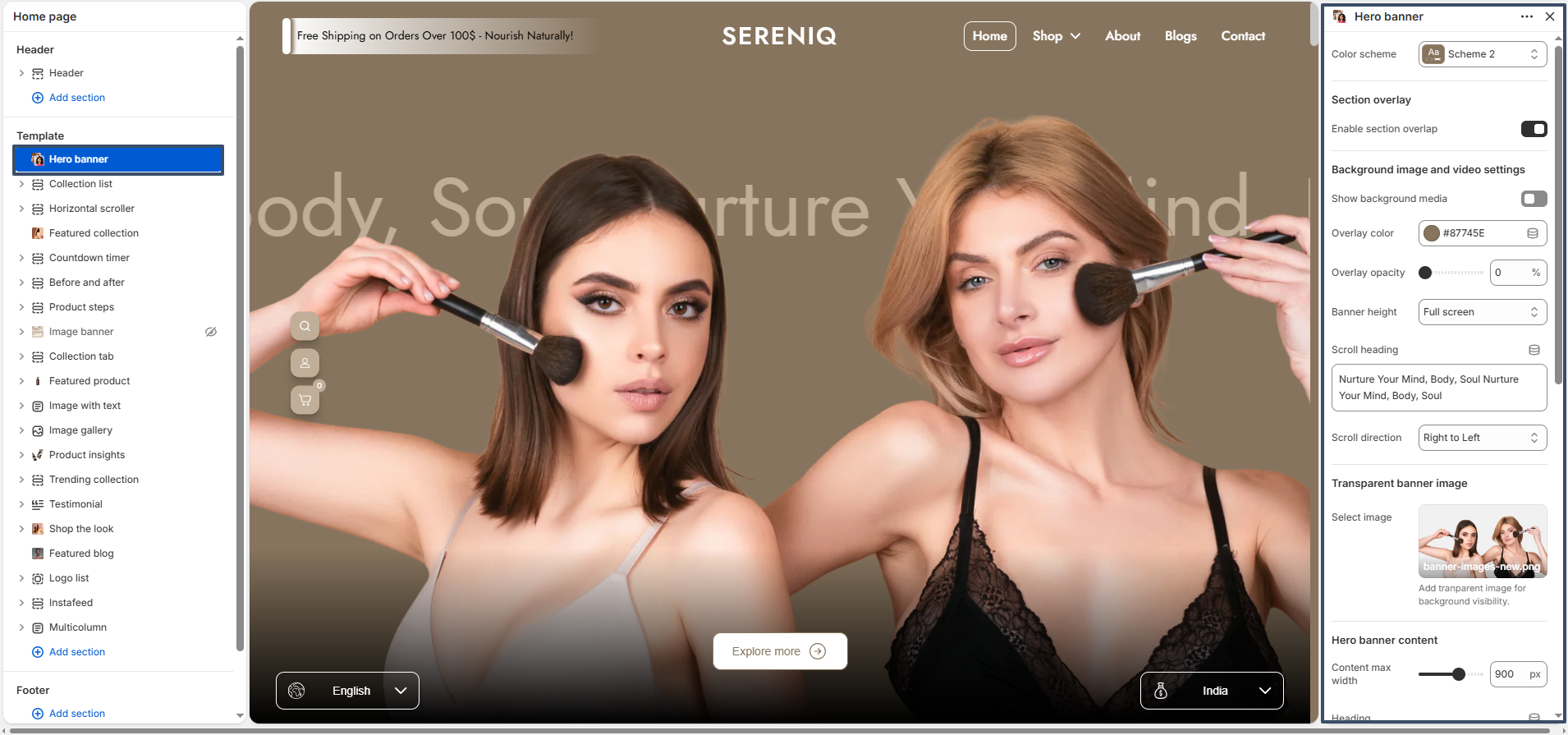
The Hero Banner section helps you create a visually appealing full-width banner for your store. It supports background images or videos, overlay customization, scrolling text, and call-to-action buttons. This section is ideal for highlighting key messages, promotions, or branding elements on your homepage.

hero banner preview

Color Scheme: Allows you to select a predefined theme color scheme for the hero banner content to match your store design.

Section Overlay: Enables an overlay layer on top of the banner to improve text visibility and enhance visual appearance.

Show Background Media: Lets you enable or disable the display of background images or videos in the hero banner.

Overlay Color: Defines the color applied over the background image or video for better contrast.

Overlay Opacity: Controls the transparency level of the overlay color, allowing you to adjust its intensity.

Banner Height: Sets the height of the hero banner. Selecting full screen makes it occupy the entire viewport height.

Scroll Heading: Adds a moving text animation across the banner to highlight key messages.

Scroll Direction: Determines the direction of the scrolling text, such as right to left.

Transparent Banner Image: Allows you to add a foreground image that appears above the background for a layered visual effect.

Content Max Width: Controls the maximum width of the content area within the hero banner.

Heading: Lets you add the main title text displayed on the banner.

Heading Size: Defines the size of the heading, typically ranging from H1 to H6.

Text: Adds supporting description or subtext below the main heading.

Enable Explore More: Activates a button that scrolls to the next section or acts as a call-to-action.

Button Label: Specifies the text displayed on the call-to-action button.

Button Style: Allows you to choose between primary and secondary button styles.

Content Alignment: Sets the position of the banner content, such as bottom center.

Top Spacing: Adjusts the space above the hero banner section.

Bottom Spacing: Adjusts the space below the hero banner section.

Collection List

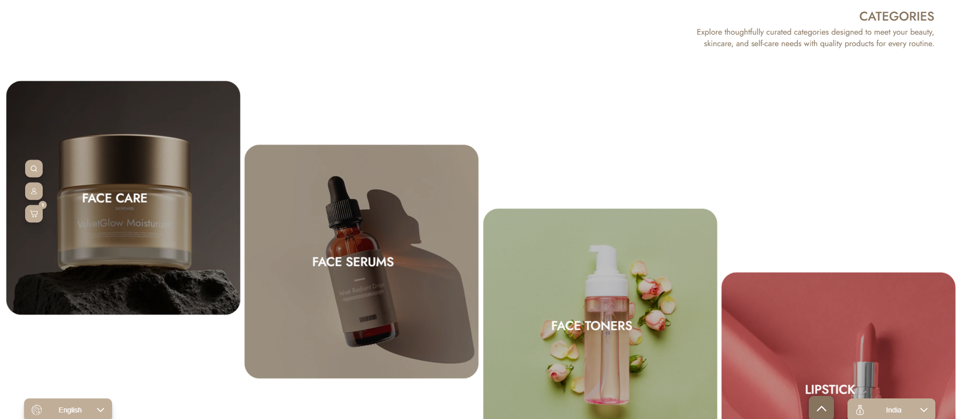
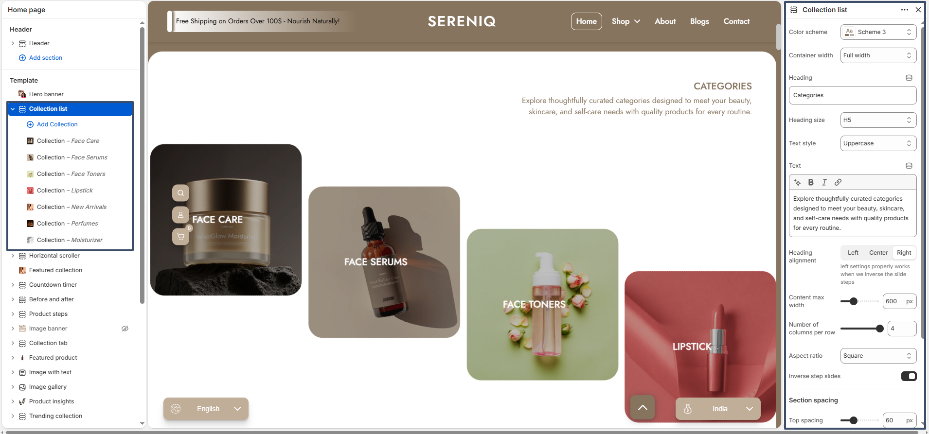
The Collection List section allows you to showcase multiple product collections in a visually appealing layout. It helps users quickly explore different categories such as skincare, makeup, or new arrivals, improving navigation and product discovery.

collection list preview

Color Scheme: Allows you to choose a predefined color scheme to match the overall theme of your store.

Container Width: Sets the layout width of the section, such as full width or boxed.

Heading: Adds a title to the collection list section.

Heading Size: Controls the size of the heading text.

Text Style: Allows you to transform the heading text style, such as uppercase.

Text: Adds a description below the heading to provide more context about the collections.

Heading Alignment: Controls the alignment of the heading and text (left, center, or right).

Content Max Width: Defines the maximum width of the text content area.

Number of Columns per Row: Sets how many collection items are displayed in a single row.
Aspect Ratio: Controls the shape of collection images (e.g., square).
Inverse Step Slides: Adjusts the visual order/layout style of collection cards.

Top Spacing: Adds space above the section.

Bottom Spacing: Adds space below the section.

collection list preview

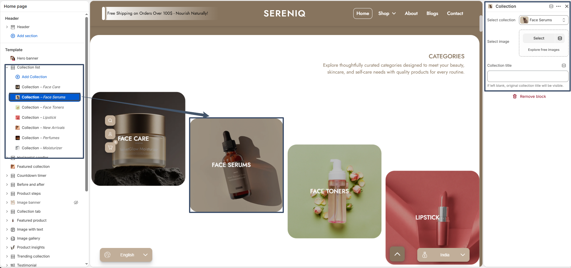
Collection Block: Each block represents an individual collection item displayed in the section.

Select Collection: Allows you to choose a collection to display. The selected collection provides default data like image and title.

Image: Lets you upload a custom image for the collection card. If selected, this image overrides the default collection image.

Title: Allows you to enter a custom title for the collection. This overrides the default collection title.

Fallback Behavior: If both custom image and custom title are not provided, the section will automatically use the default collection image and title.

Horizontal Scroller

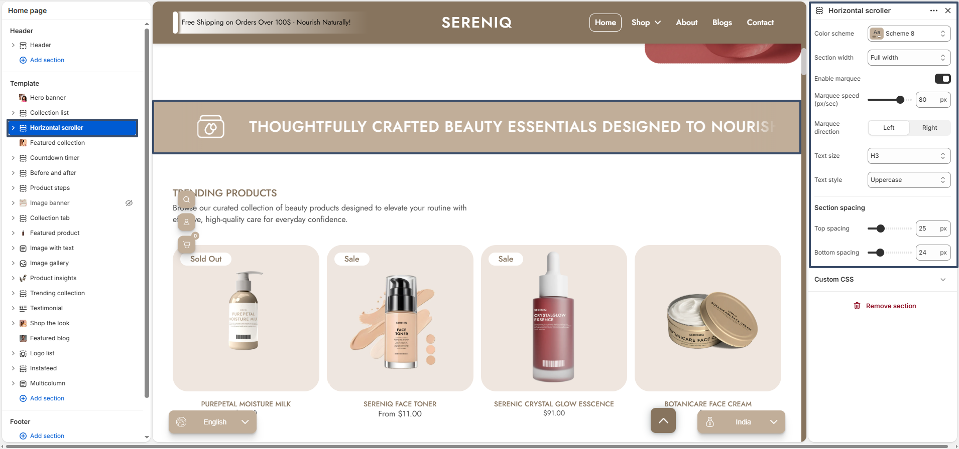
The Horizontal Scroller section allows you to display short text content in a scrolling (marquee-style) layout. It is ideal for highlighting key messages such as promotions, brand statements, or important announcements in a visually engaging way.

horizontal scroller preview

Color Scheme: Allows you to select a predefined color style that matches your store’s branding.

Section Width: Defines whether the section is displayed in full width or within a contained layout.

Enable Marquee: Toggles the scrolling animation effect for the text. When disabled, the text remains static.

Marquee Speed: Controls how fast the text scrolls across the screen.

Marquee Direction: Sets the scrolling direction of the text (left or right).

Text Size: Adjusts the size of the text (e.g., H1, H2, H3).

Text Style: Allows you to modify the appearance of the text, such as uppercase formatting.

Top Spacing: Adds space above the section to control layout separation.

Bottom Spacing: Adds space below the section for better visual balance.

horizontal scroller preview

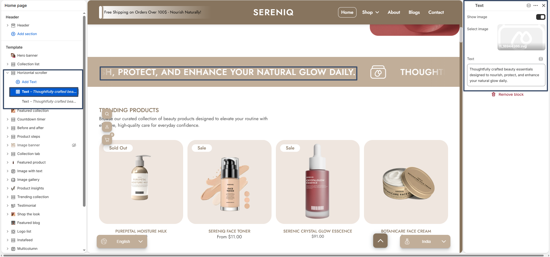
Text Block: Each block represents a single message displayed inside the horizontal scroller.

Text: Allows you to enter the content that will appear in the scrolling area.

Show Image: Enables or disables an optional icon/image alongside the text.

Select Image: Lets you upload or choose an image to display next to the text for better visual emphasis.

Fallback Behavior: If no image is selected, only the text will be displayed in the scroller.

Featured Collection

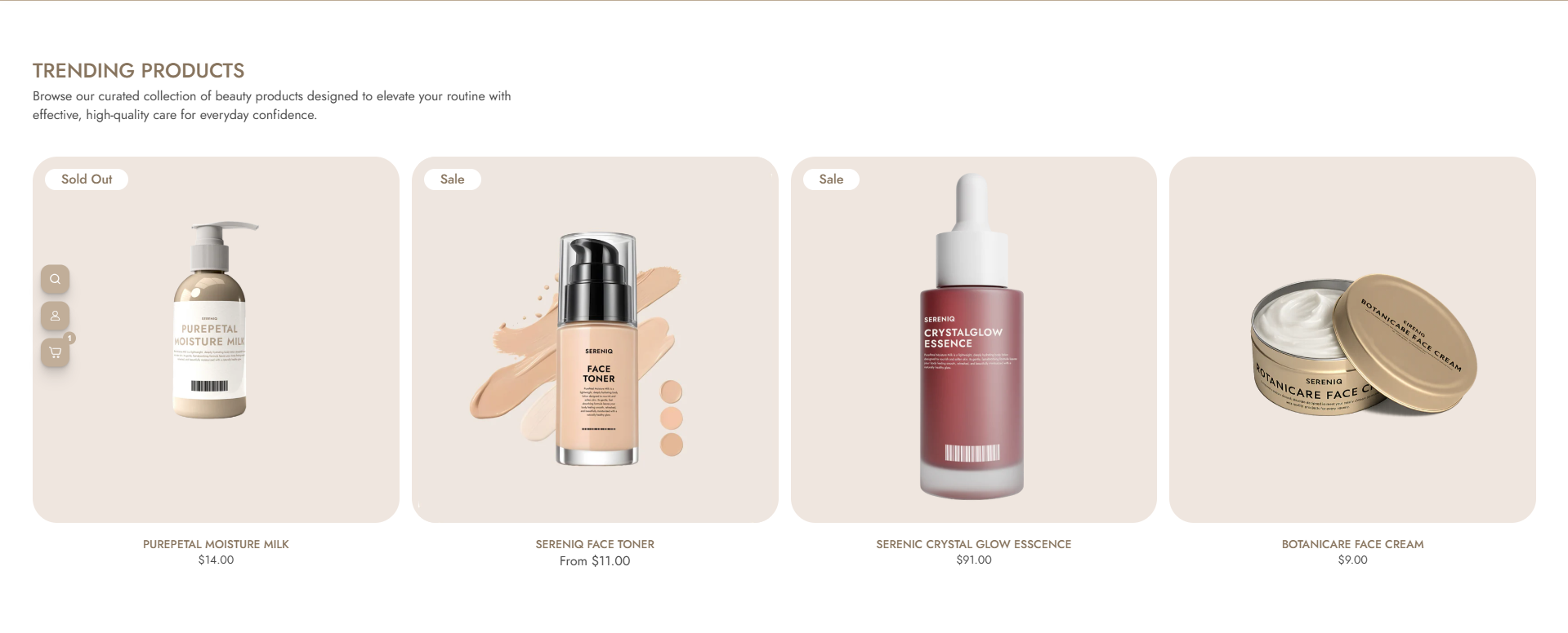
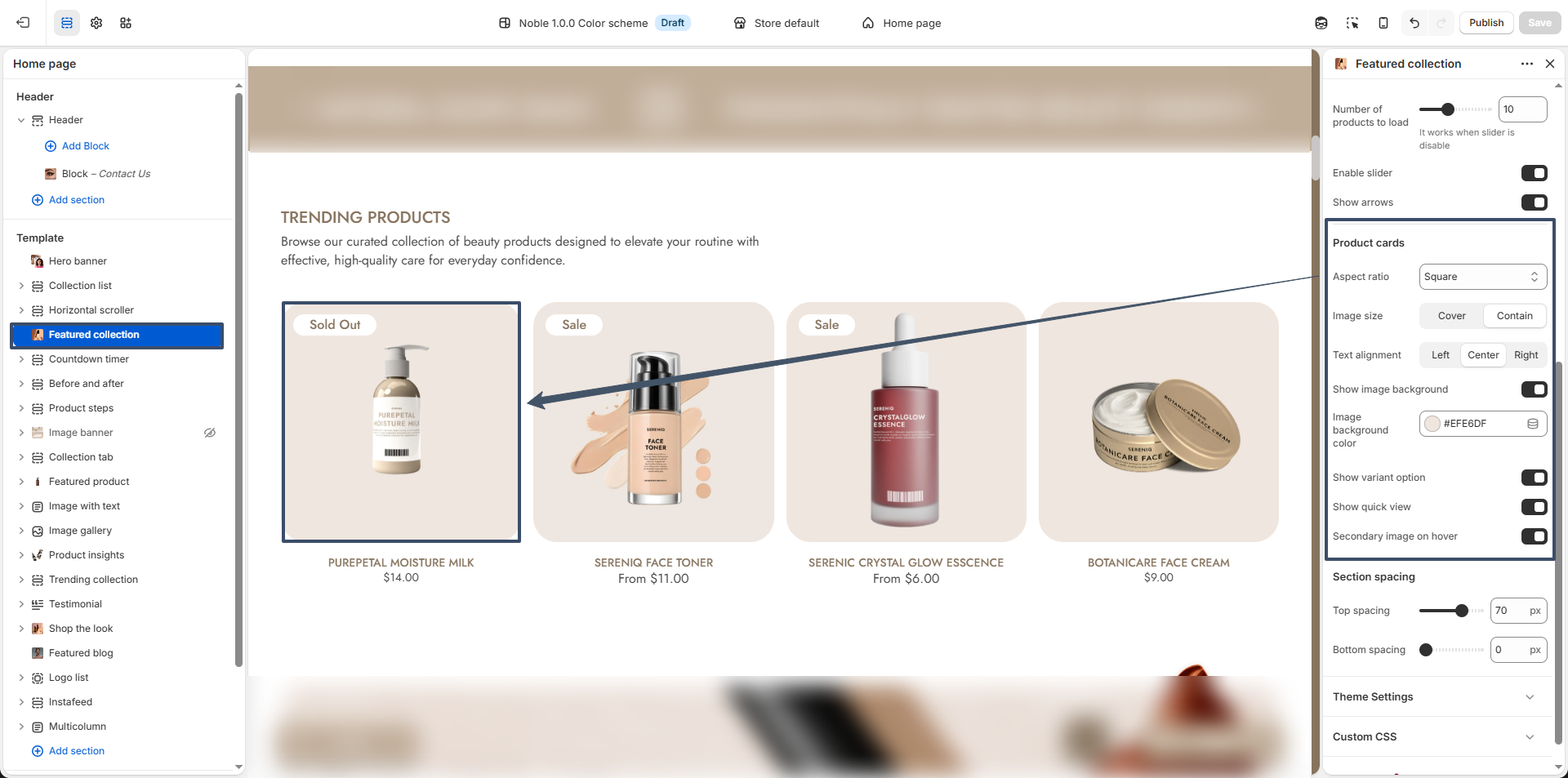
The Featured Collection section allows you to showcase selected products in a clean and visually appealing grid layout. It is ideal for highlighting trending products, new arrivals, or curated collections to attract customer attention and drive conversions.

featured collection preview

Color Scheme: Lets you choose a predefined color style that aligns with your store’s overall branding.

Heading: Allows you to set the title of the section (e.g., “Trending Products”).

Heading Size: Controls the size of the heading (H1–H6) to match your design hierarchy.

Text Style: Enables styling options like uppercase to enhance visual appearance.

Content: Add a short description below the heading to provide context about the products.

Content Max Width: Defines the maximum width of the content area for better readability.

Content Alignment: Adjusts alignment of text (left, center, or right).

Select Collection: Choose which product collection will be displayed in this section.

Number of Columns: Controls how many products are displayed per row.
Number of Products: Sets how many products to show in the section.
Enable Slider: Turns the product grid into a slider for better interaction on smaller screens.

Show Arrows: Displays navigation arrows when the slider is enabled.

featured collection settings

Aspect Ratio: Defines the shape of product images (square, portrait, etc.).

Image Size: Controls how the product image fits within its container (cover or contain).

Text Alignment: Adjusts alignment of product titles and prices.

Show Image Background: Enables a background behind product images for better contrast.

Image Background Color: Allows customization of the background color behind product images.

Show Variant Option: Displays available product variants like size or color.

Show Quick View: Enables a quick preview option for products without leaving the page.

Secondary Image on Hover: Shows an alternate product image when hovered.

Top Spacing: Adds space above the section for layout control.

Bottom Spacing: Adds space below the section to maintain proper visual balance.

Countdown Timer

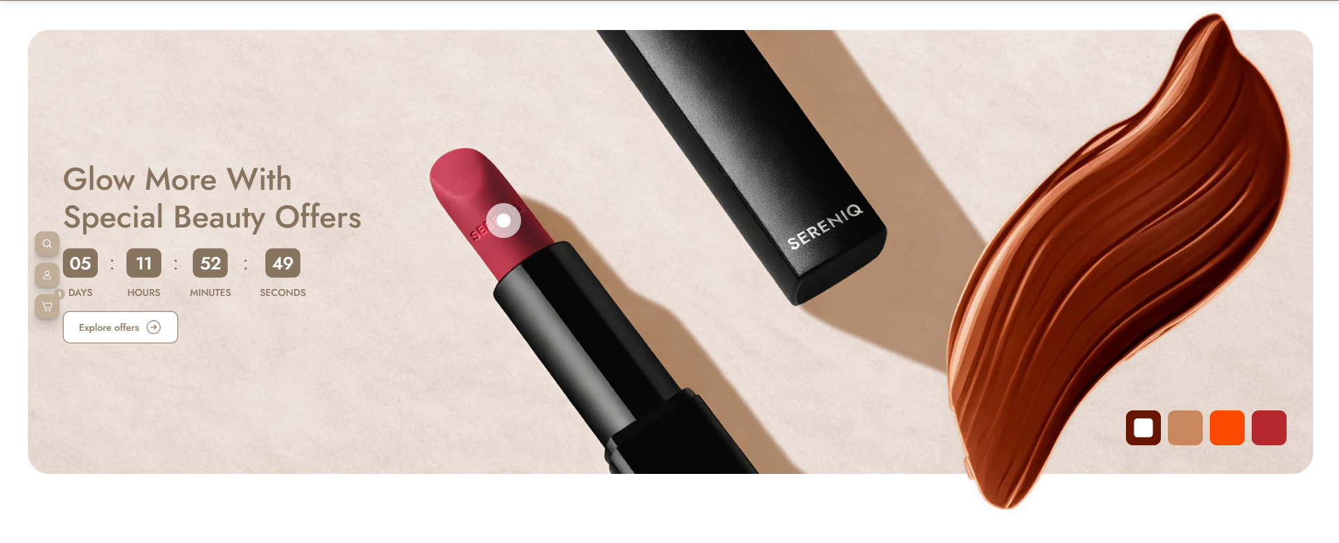
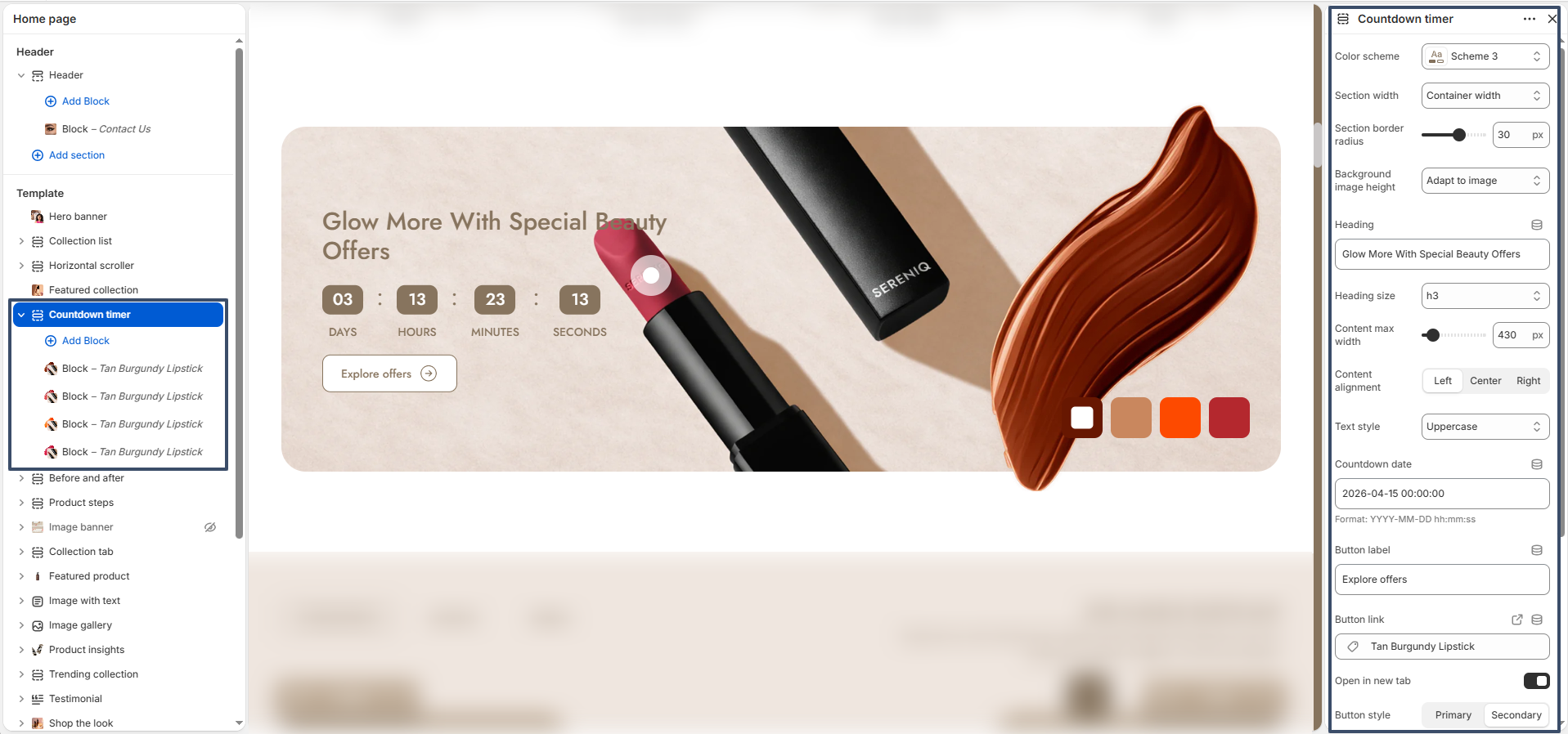
The Countdown Timer section is designed to create urgency and boost conversions by displaying time-sensitive offers. It combines a visually engaging banner with a live countdown and interactive product hotspots, making it ideal for promotions, limited-time deals, and special campaigns.

countdown timer preview

Color Scheme: Select a predefined color style that matches your store’s branding.

Section Width: Choose between full width or container width layout.

Section Border Radius: Controls the roundness of the section corners.

Background Image Height: Adjusts the height of the background image (auto/adapt/custom).

Heading: Set the main promotional heading text.

Heading Size: Define the size of the heading (H1–H6).

Content Max Width: Controls the width of the text content area.

Content Alignment: Align content left, center, or right.

Text Style: Apply styles like uppercase for better visual emphasis.

Countdown Date: Set the target date and time for the countdown timer.

Button Label: Customize the call-to-action button text (e.g., “Explore Offers”).

Button Link: Assign a link to redirect users when the button is clicked.

Open in New Tab: Option to open the link in a new browser tab.

Button Style: Choose between primary or secondary button styles.

Top Spacing: Adds space above the section.

Bottom Spacing: Adds space below the section.

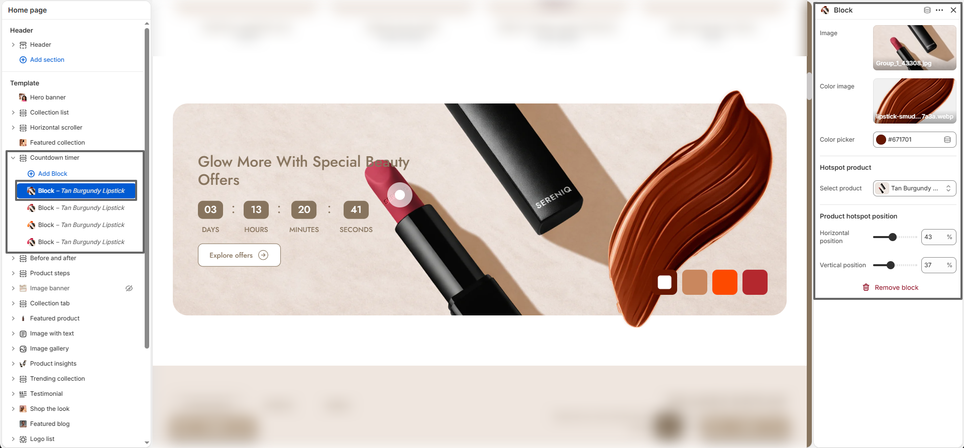
countdown timer block settings

Block (Hotspot Product): Each block represents a product hotspot displayed on the image. These hotspots allow users to interact with specific products directly from the banner.

Image: Upload the main product or visual image used in the hotspot.

Color Image: Add an additional image (e.g., texture or color swatch) for visual variation.

Color Picker: Select a color associated with the product (useful for variants like shades).

Select Product: Link a product to the hotspot for quick access.

Horizontal Position: Adjust the horizontal placement of the hotspot on the image.

Vertical Position: Adjust the vertical placement of the hotspot.

Multiple Blocks: You can add multiple hotspot blocks to highlight different products within the same section.

Before and After

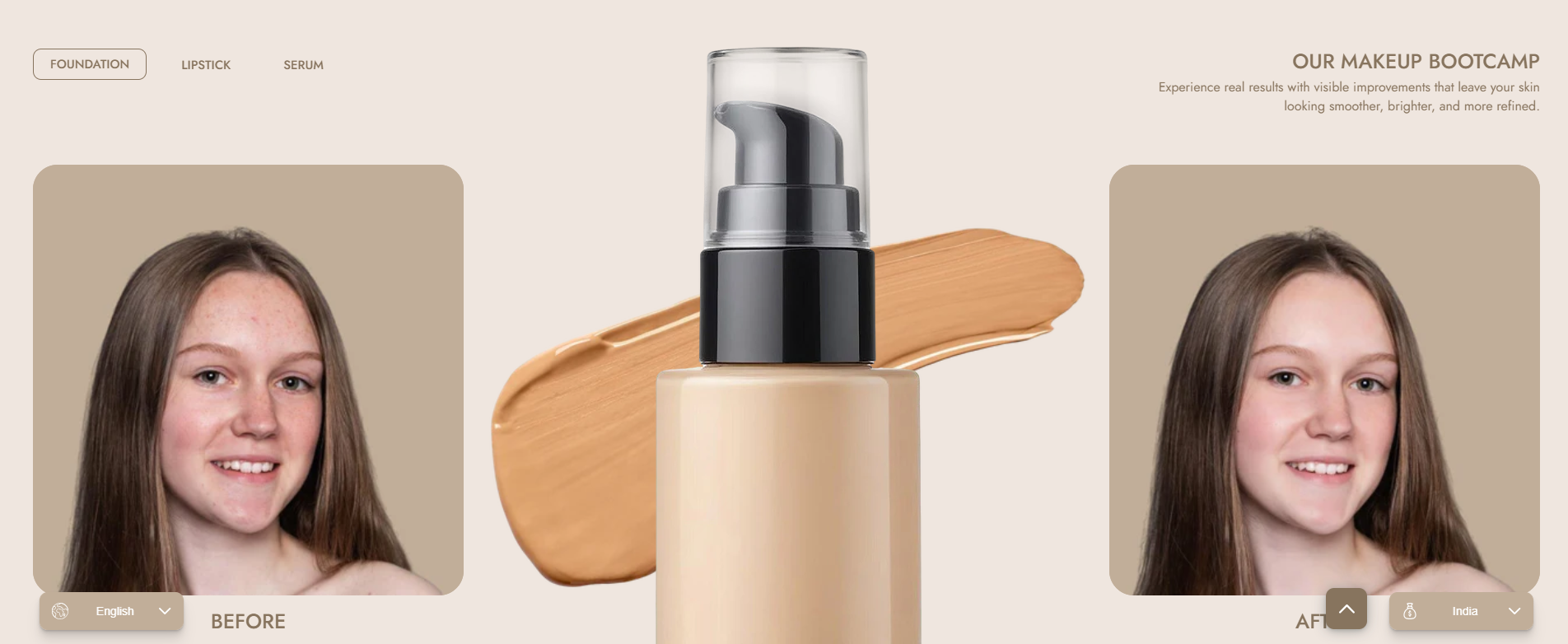
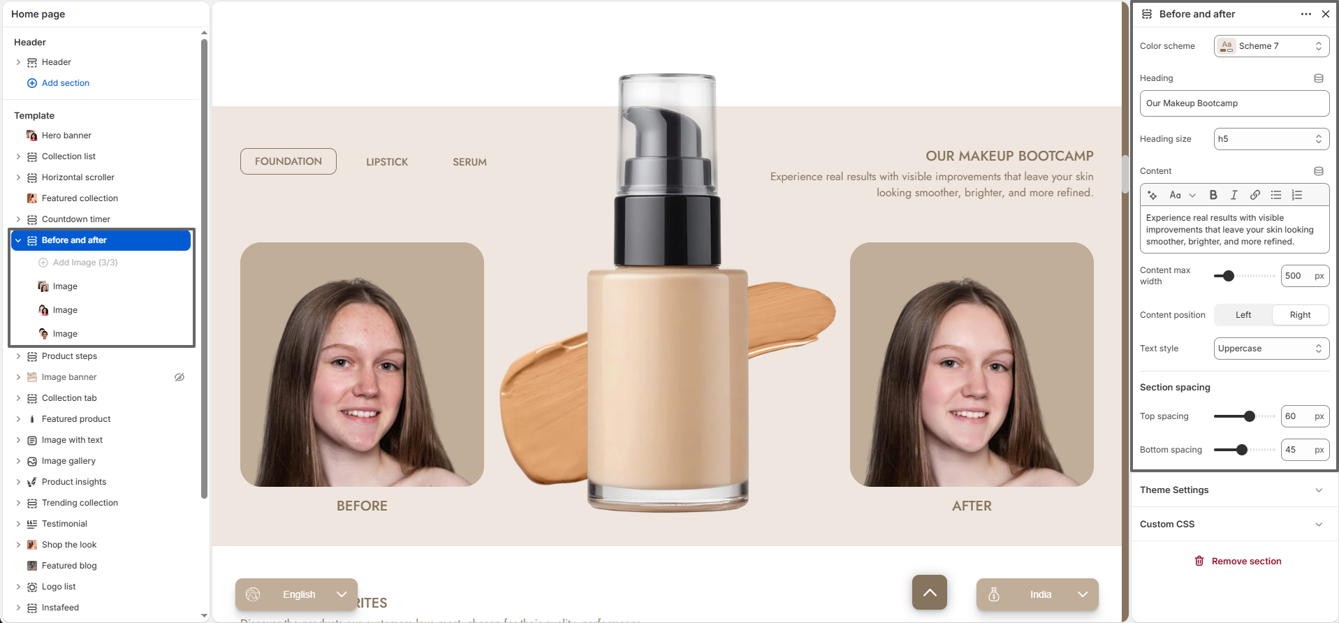
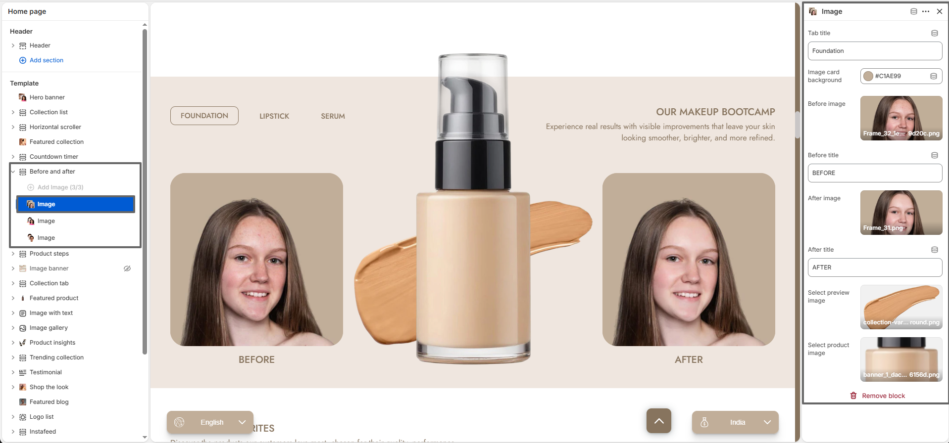
The Before and After section is designed to visually showcase product effectiveness by comparing two images side by side. It is ideal for beauty, skincare, fitness, and transformation-based products, helping build trust and improve conversions through real visual results.

before and after preview

Color Scheme: Choose a predefined color scheme that aligns with your store branding.

Heading: Set the main title for the section (e.g., “Our Makeup Bootcamp”).

Heading Size: Select the heading size from H1 to H6.

Content: Add descriptive text to explain the transformation or product benefits.

Content Max Width: Control the maximum width of the text content area.

Content Position: Align the content to the left or right side of the section.

Text Style: Apply styling such as uppercase for enhanced readability and emphasis.

Top Spacing: Adjust the space above the section.

Bottom Spacing: Adjust the space below the section.

before and after block settings

Block (Image Comparison): Each block represents a before-and-after comparison set. You can add multiple blocks to showcase different transformations or products.

Tab Title: Add a label for the block (e.g., Foundation, Lipstick, Serum) to organize multiple comparisons.

Image Card Background: Select a background color for the image container.

Before Image: Upload the image representing the “before” state.

Before Title: Customize the label for the before image (e.g., “Before”).

After Image: Upload the image representing the “after” result.

After Title: Customize the label for the after image (e.g., “After”).

Select Preview Image: Choose an image that represents the selected tab or variation.

Select Product Image: Add a product image to visually connect the transformation with the product.

Multiple Blocks: Add multiple comparison blocks to highlight different products or results within the same section.

Product Steps

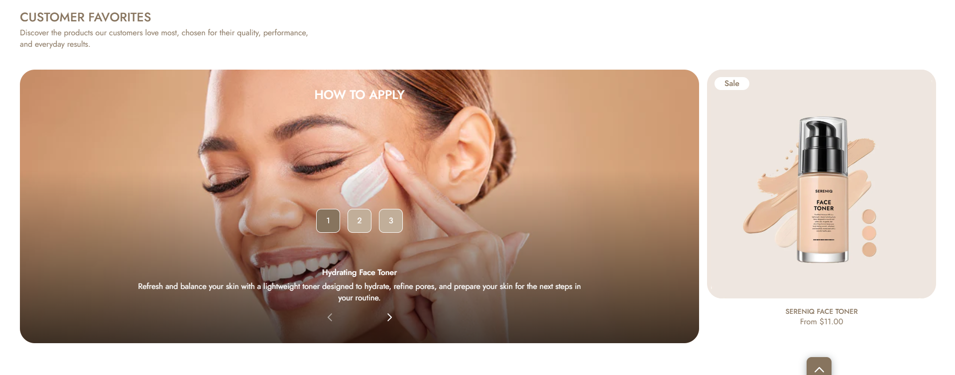
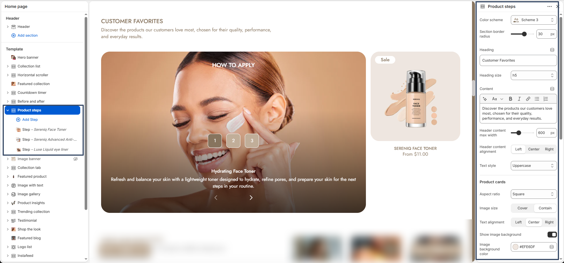
The Product Steps section allows you to showcase a step-by-step routine with interactive visuals and linked products. This section is ideal for beauty, skincare, and guided product usage experiences.

Product steps section preview

Color Scheme: Select a predefined color scheme for the section.

Section Border Radius: Adjust the corner roundness of the section container.

Heading: Add a title such as “How to Apply” or “Customer Favorites”.

Heading Size: Choose heading size from H1 to H6.

Content: Add a short description to introduce the section.

Header Content Width: Control the maximum width of heading and description (e.g., 600px).

Header Alignment: Align the header content (Left, Center, Right).

Text Style: Apply styles such as uppercase formatting.

Product Card Settings

Aspect Ratio: Set product image ratio (e.g., Square).

Image Size: Choose how images fit (Cover or Contain).

Text Alignment: Align product card text (Left, Center, Right).

Show Image Background: Enable or disable background behind product images.

Image Background Color: Select background color for product images.

Show Variant Option: Display product variant options if available.

Show Quick View: Enable quick view popup for products.

Secondary Image on Hover: Show alternate product image on hover.

Banner Settings

Heading Color: Set the text color for banner heading.

Button Background Color: Choose button background color.

Button Text Color: Set button text color.

Button Active Color: Define button background color on hover/active state.

Button Active Text Color: Set text color for active button state.

Banner Text Alignment: Align content inside the banner (Left, Center, Right).

Top Spacing: Adjust space above the section.

Bottom Spacing: Adjust space below the section.

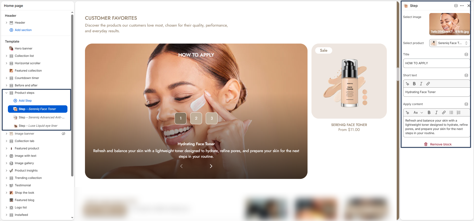
Product steps block settings

Each Step Block represents an individual step in the routine.

Select Image: Upload a lifestyle image for the step.

Select Product: Choose a product to display alongside the step.

Title: Add a step title such as “How to Apply”.

Short Text: Add a short label (e.g., product name).

Apply Content: Provide a detailed explanation of the step.

Step Navigation: Steps are automatically numbered for easy navigation.

Multiple Steps: Add multiple blocks to create a complete routine.

Collection Tab

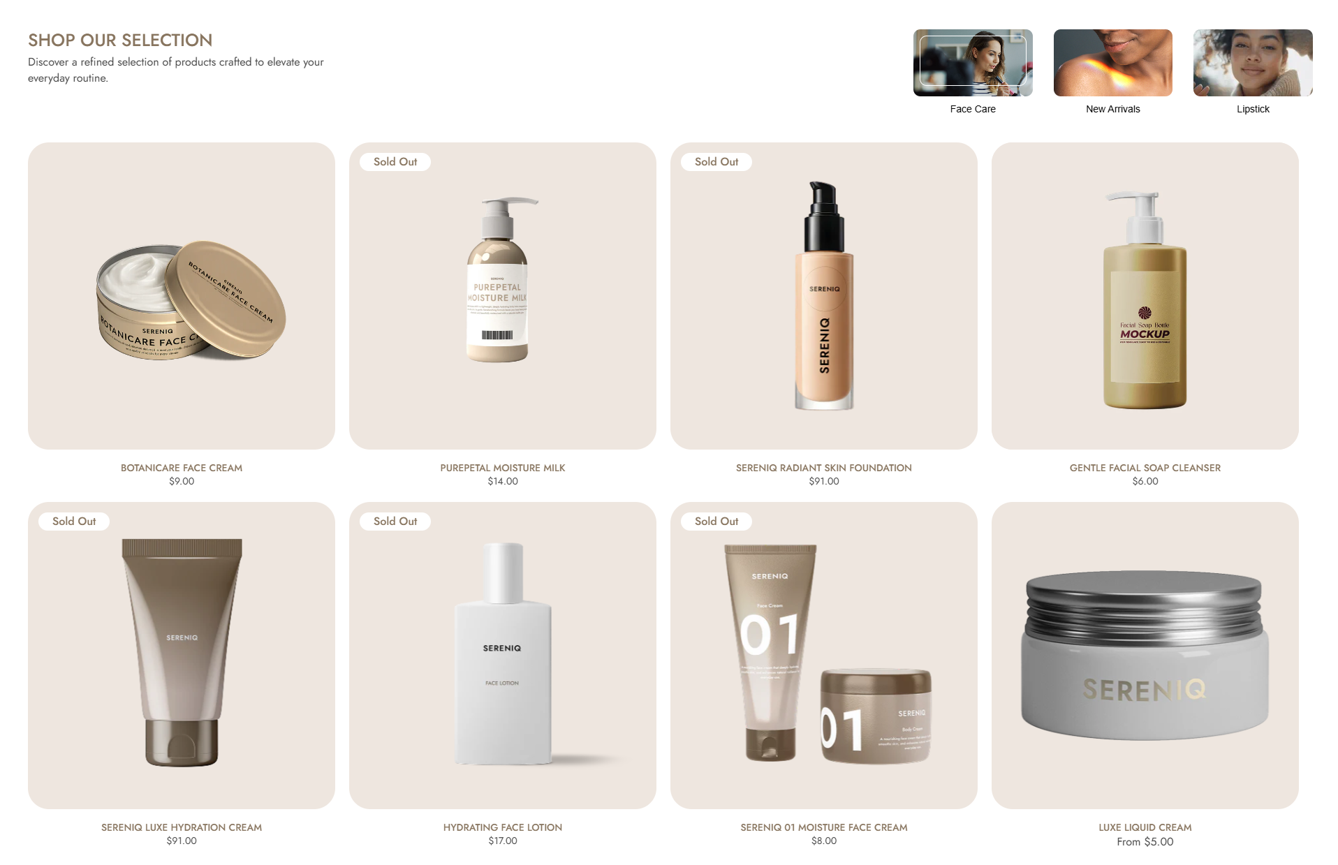
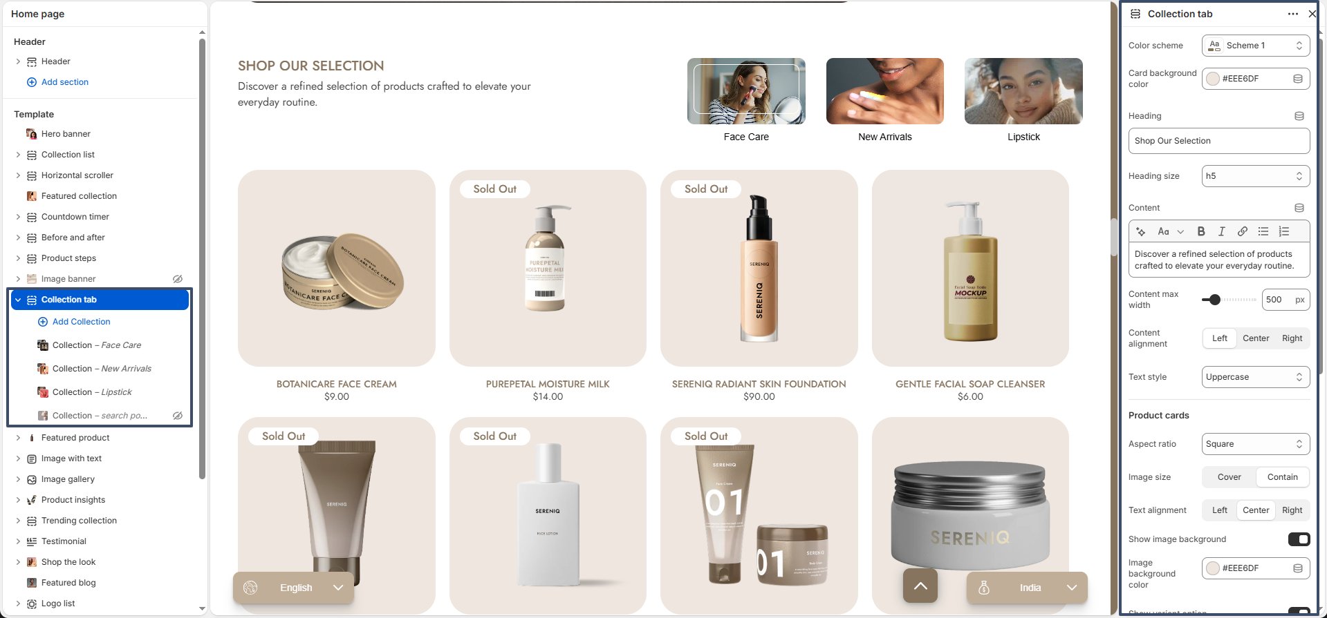
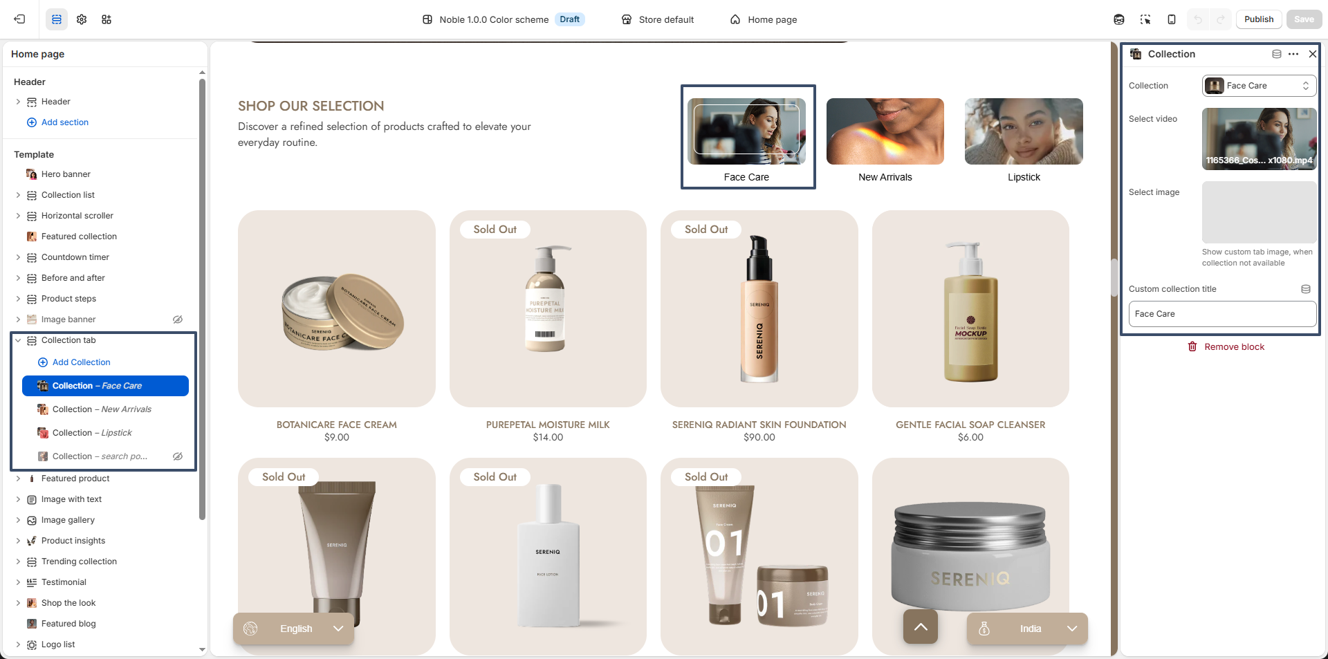
The Collection Tab section allows you to display multiple collections in a tabbed layout, helping customers easily switch between categories and explore products without leaving the page. This is ideal for showcasing featured categories like Face Care, New Arrivals, or Lipstick.

Collection tab section preview

Color Scheme: Choose a color scheme that matches your store branding.

Card Background Color: Set the background color for product cards.

Heading: Add a section title such as “Shop Our Selection”.

Heading Size: Select heading size from H1 to H6.

Content: Add a short description to introduce the collections.

Content Max Width: Control the width of the heading and description (e.g., 500px).

Content Alignment: Align the content (Left, Center, Right).

Text Style: Apply styles such as uppercase formatting.

Aspect Ratio: Set the product image ratio (e.g., Square).

Image Size: Choose how images fit inside the card (Cover or Contain).

Text Alignment: Align product details (Left, Center, Right).

Show Image Background: Enable or disable background behind product images.

Image Background Color: Select a background color for product images.

Show Variant Option: Display product variants if available.

Show Quick View: Enable quick view popup for products.

Secondary Image on Hover: Show alternate product image on hover.

Number of Products to Show: Control how many products are displayed per tab.

Columns per Row: Set number of product columns (e.g., 4 columns).

Enable Slider: Turn on slider mode for horizontal scrolling.

Show Arrows: Display navigation arrows when slider is enabled.

Top Spacing: Adjust space above the section.

Bottom Spacing: Adjust space below the section.

Collection tab block settings

Each Collection Block represents a tab in the section.

Collection: Select a collection to display products from.

Select Video: Upload or choose a video thumbnail for the collection tab.

Select Image: Upload a custom image if no collection image is available.

Custom Collection Title: Override the default collection name if needed.

Dynamic Tabs: Tabs automatically update based on added collection blocks.

Multiple Collections: Add multiple blocks to showcase different categories in tabs.

Featured Product

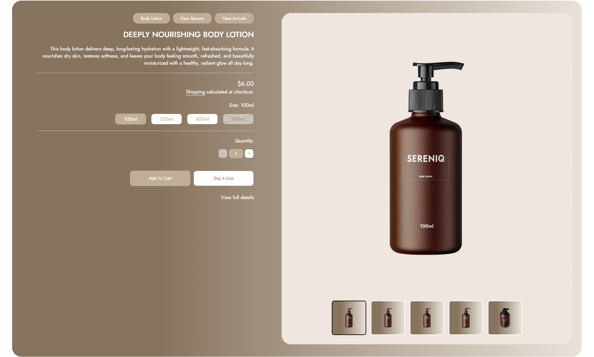
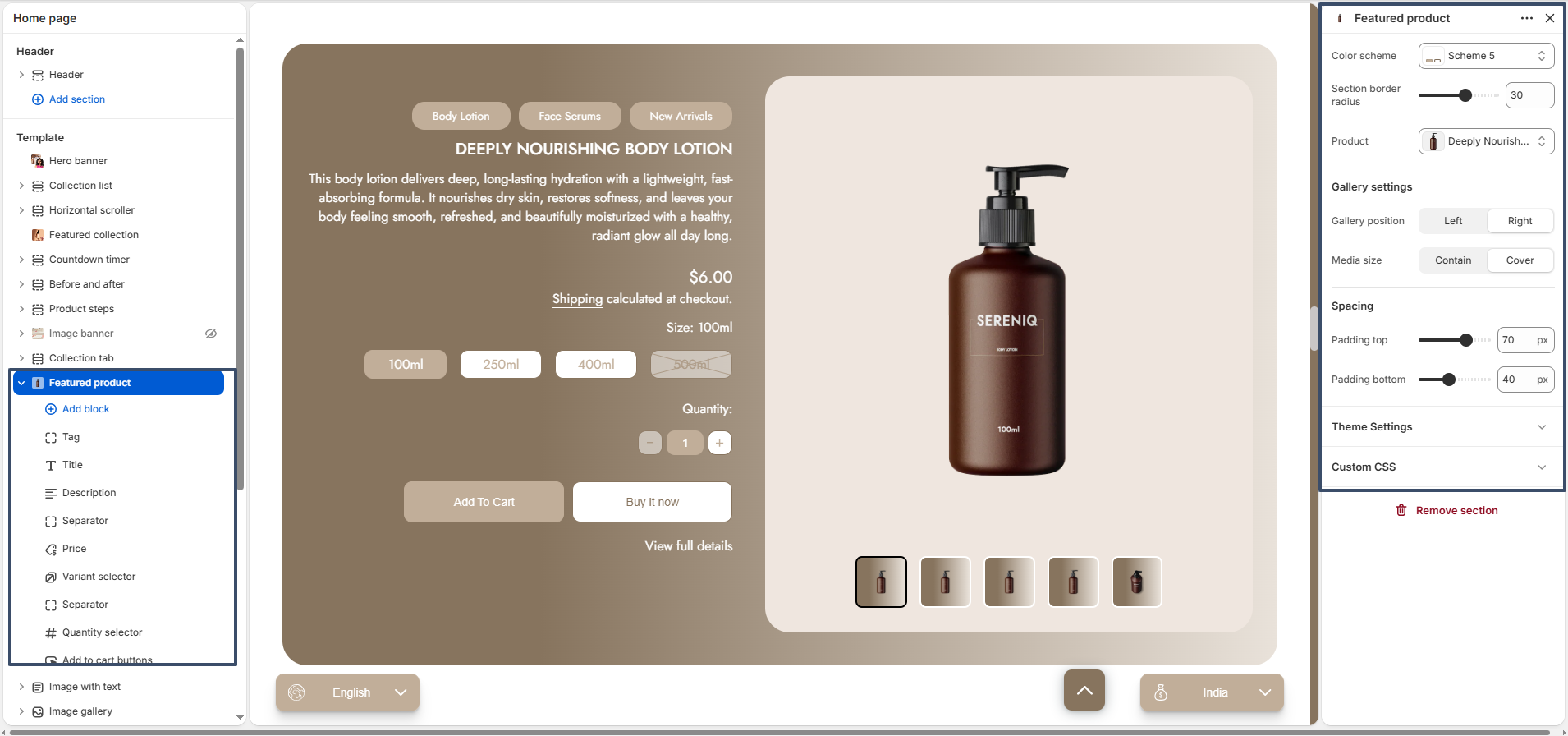
The Featured Product section allows you to highlight a specific product directly on your homepage or any other page. This section helps increase product visibility, drive conversions, and provide customers with quick access to purchase without navigating to the product page.

featured product preview

Color Scheme: Choose a color scheme that matches your store branding.

Section Border Radius: Adjust the corner roundness of the section container for a softer or sharper look.

Product: Select the product you want to feature in this section.

Gallery Position: Set the product image gallery to appear on the left or right side.

Media Size: Choose how the product images are displayed (Contain or Cover).

Padding Top: Adjust the spacing above the section.

Padding Bottom: Adjust the spacing below the section.

Custom CSS: Add custom styles to further personalize the section design.

featured product blocks

Available Blocks

The Featured Product section includes multiple blocks that allow you to control and organize product information. You can add, remove, and rearrange these blocks based on your requirements.

Tag: Displays product tags or custom labels such as “New”, “Sale”, or “Best Seller” to attract attention.

Title: Shows the product name. This is usually the main heading of the product section.

Description: Displays a short product description to inform customers about key features or benefits.

Price: Shows the product price, including any discounts or compare-at pricing.

Variant Selector: Allows customers to select product variants such as size, color, or style.You can also change the variant selector style.

Quantity Selector: Lets customers choose the number of items they want to purchase.

Add to Cart Buttons: Displays buttons like “Add to Cart” and “Buy Now” for quick purchasing actions.

Separator: Adds spacing or a visual divider between blocks for better layout structure.

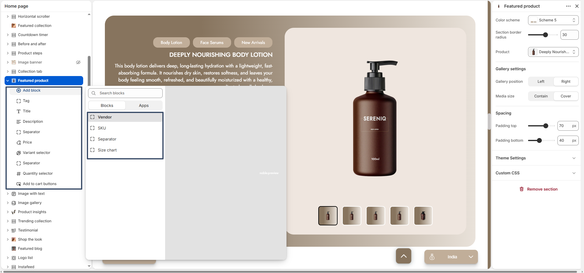
Vendor: Displays the product brand or vendor name.

SKU: Shows the product SKU (Stock Keeping Unit) for inventory or identification purposes.

Size Chart: Provides a size guide to help customers choose the correct variant, improving purchase confidence and reducing returns.

Flexible Layout: You can reorder blocks by dragging them, allowing you to create a layout that best fits your product presentation.

Image With Text

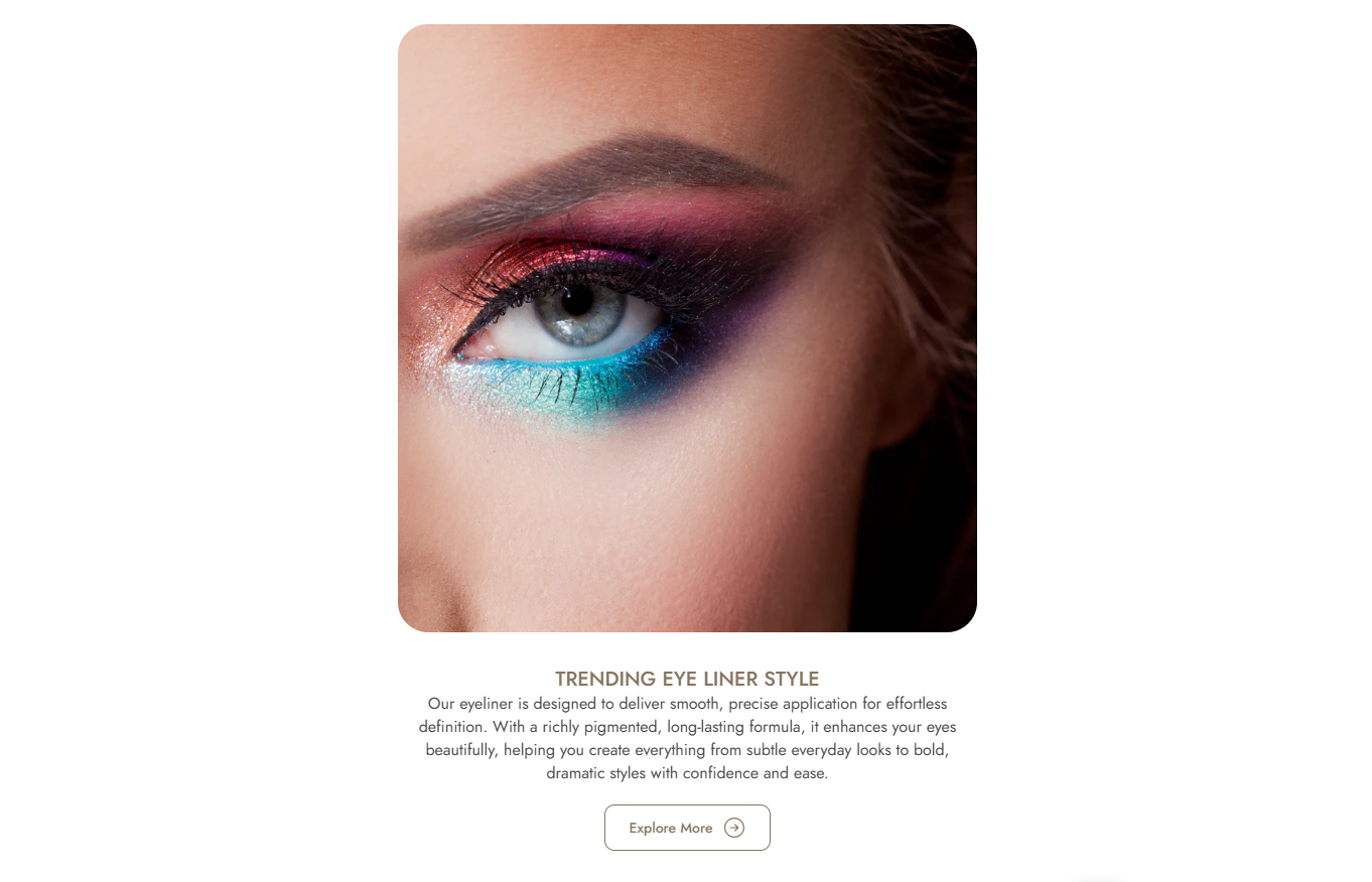
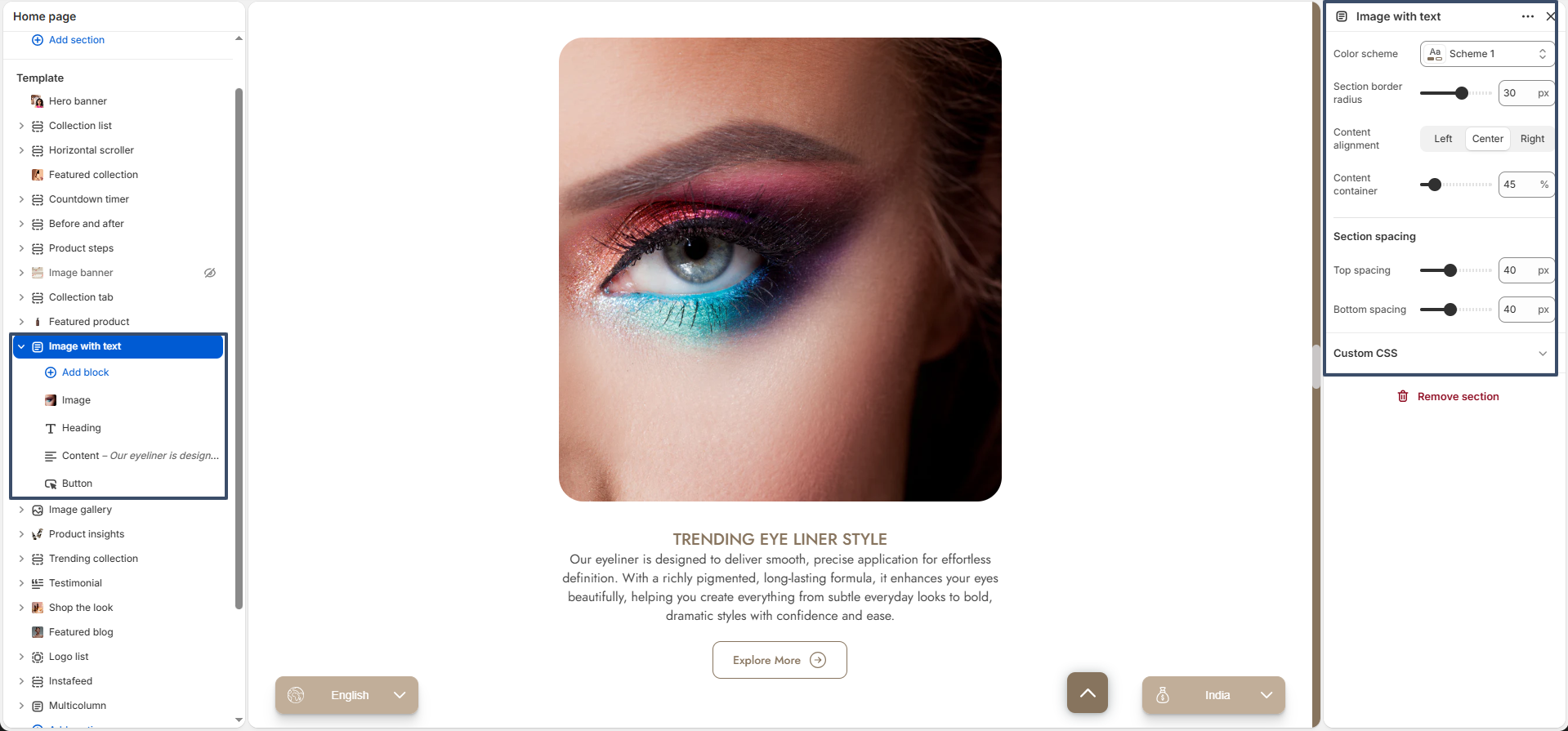
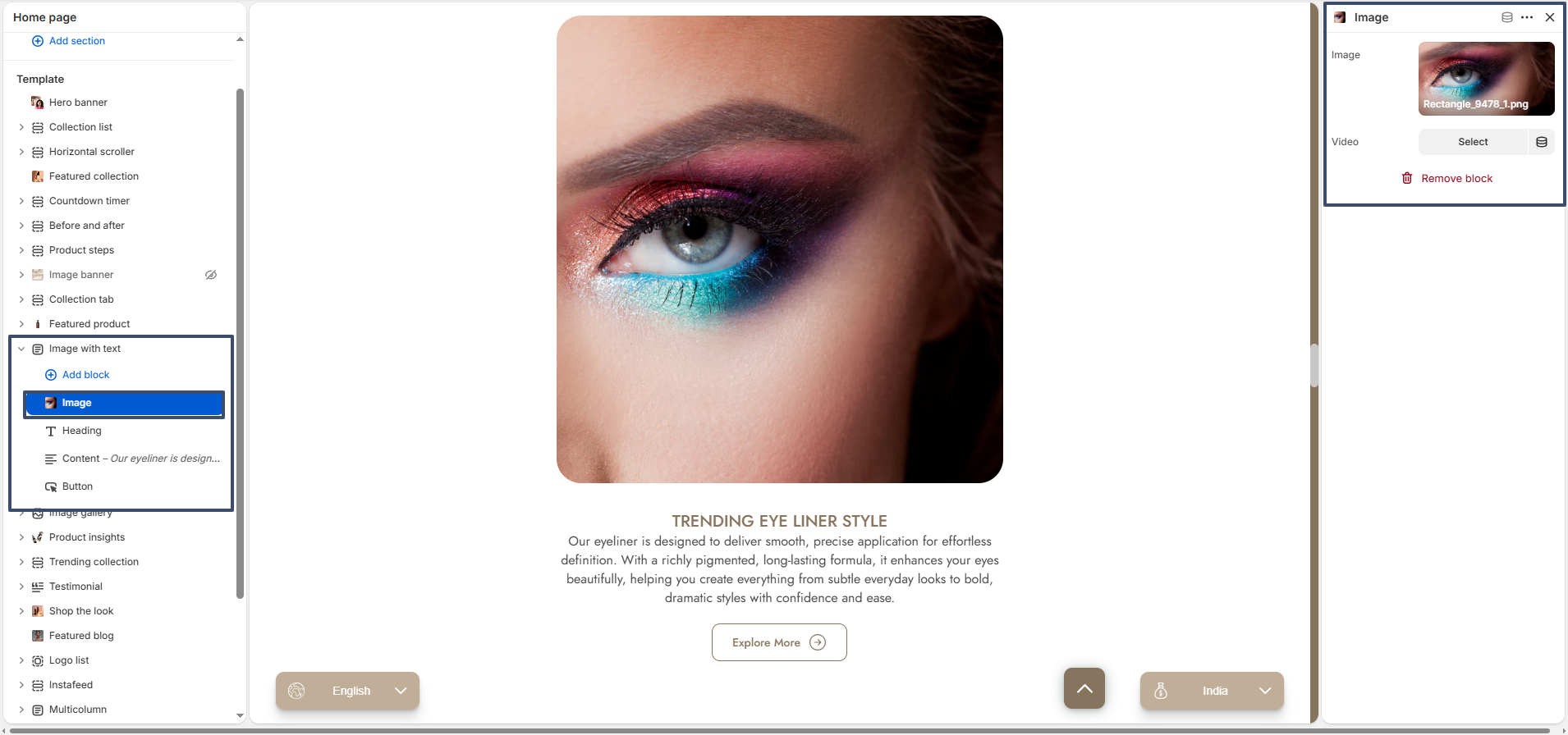
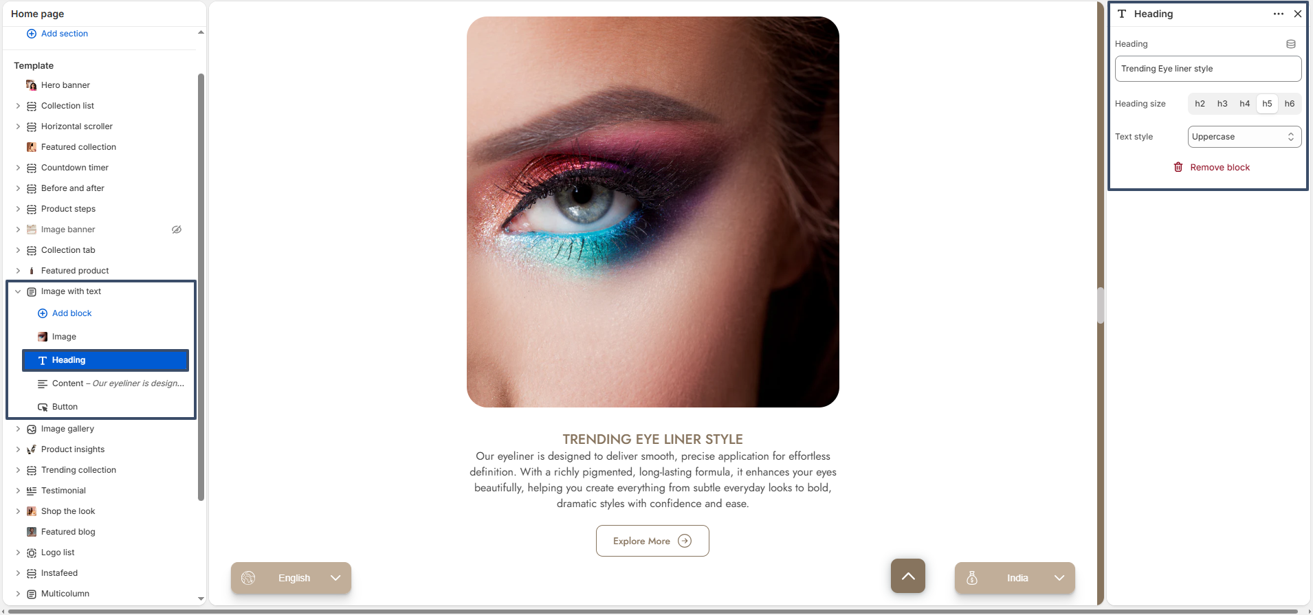
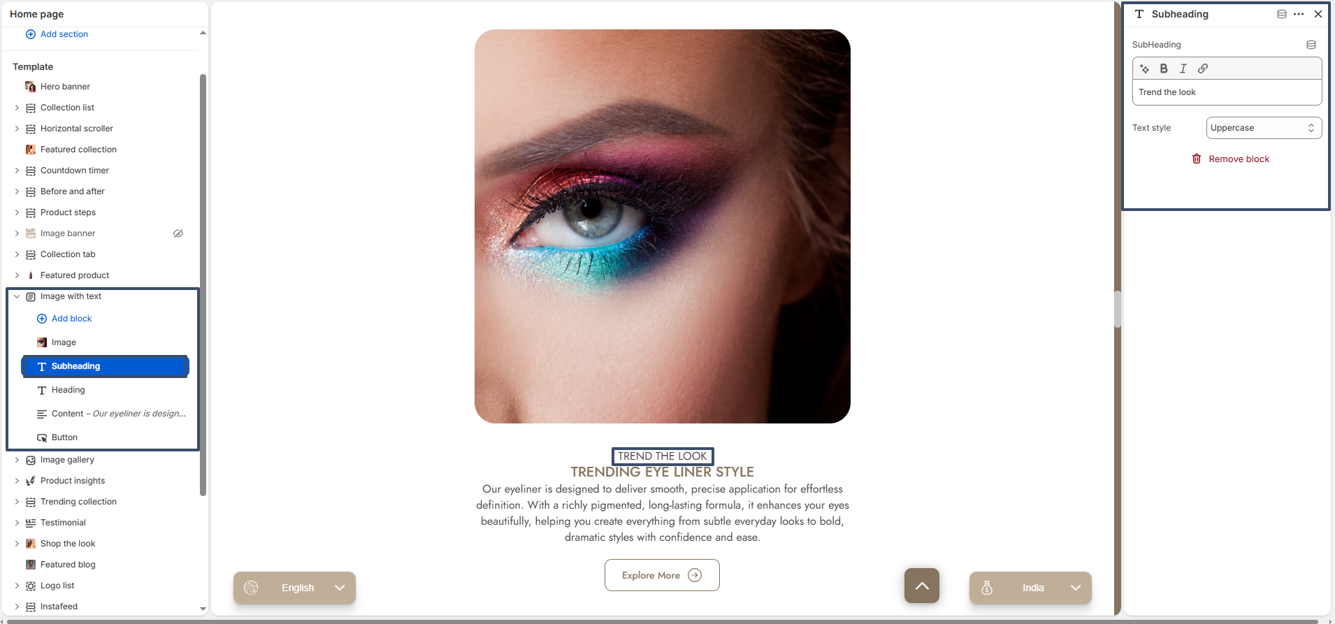
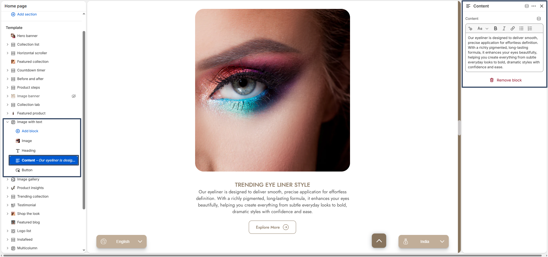
The Image With Text section is a bold, eye-catching element that lets you combine stunning visuals with compelling messaging. It includes flexible block types like Image, Heading, Subheading, Content, and Button to effectively present information.

Image with text preview

Color Scheme: Choose a color scheme that aligns with your brand identity.

Section Border Radius: Adjust the roundness of the section container corners.

Content Alignment: Align the text content to the left, center, or right.

Content Container: Adjust the width percentage of the content container relative to the section layout.

Section Spacing: Control the top and bottom padding of the overall section.


Available Blocks

Image Block: Upload the main image to be featured in the section.

Image with text heading option

Heading Block: Add the primary title for the section. You can customize the heading text, heading size, and text style (e.g., uppercase).

Image with text heading option

Subheading Block: Add a subtitle that appears with the main heading. You can customize the text style.

Image with text subheading option

Content Block: Provide a detailed description using the rich text editor to give context to your image.

Image with text content option

Button Block: Add a call-to-action button. You can customize the button label, link, toggle whether it opens in a new tab, and configure the button style (primary or secondary).

Image with text button option

Image Gallery

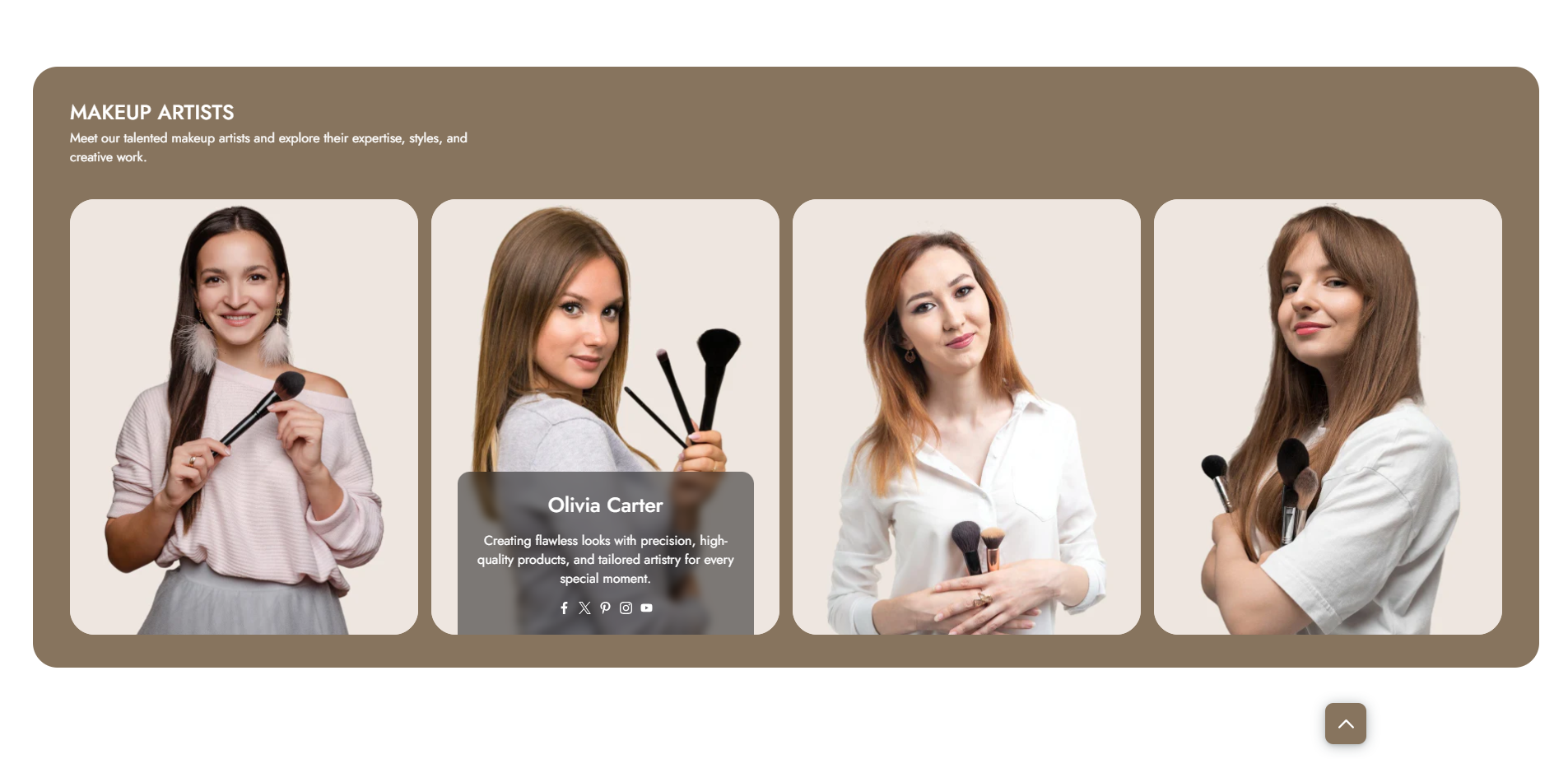
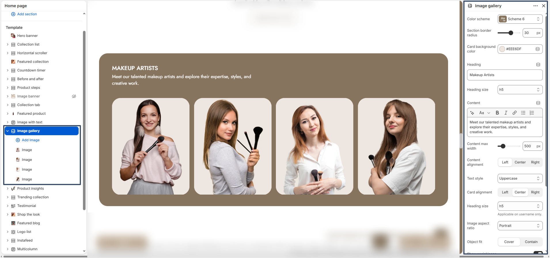
The Image Gallery section allows you to showcase multiple images in a visually appealing layout. It is perfect for highlighting team members, products, portfolios, or brand visuals with optional text and social links.

image gallery preview

Color Scheme: Choose a color scheme that aligns with your brand identity.

Section Border Radius: Adjust the roundness of the section container corners.

Card Background Color: Set the background color for individual image cards.

Heading: Add a title for the section (e.g., “Makeup Artists”).

Heading Size: Select the heading size (H1–H6).

Content: Add a short description to introduce the gallery.

Content Max Width: Control the maximum width of the content area.

Content Alignment: Align the content to left, center, or right.

Text Style: Transform text style (e.g., uppercase, lowercase, capitalize).

Card Alignment: Align content inside each image card.

Image Aspect Ratio: Choose the image ratio such as portrait or square.

Object Fit: Set how images fit inside the container (cover or contain).

Show Social Icons: Enable to display social media links on each image card.

Enable Slider: Turn on to display images in a slider format.

Top Spacing: Adjust spacing above the section.

Bottom Spacing: Adjust spacing below the section.

Custom CSS: Add custom styles for advanced design control.

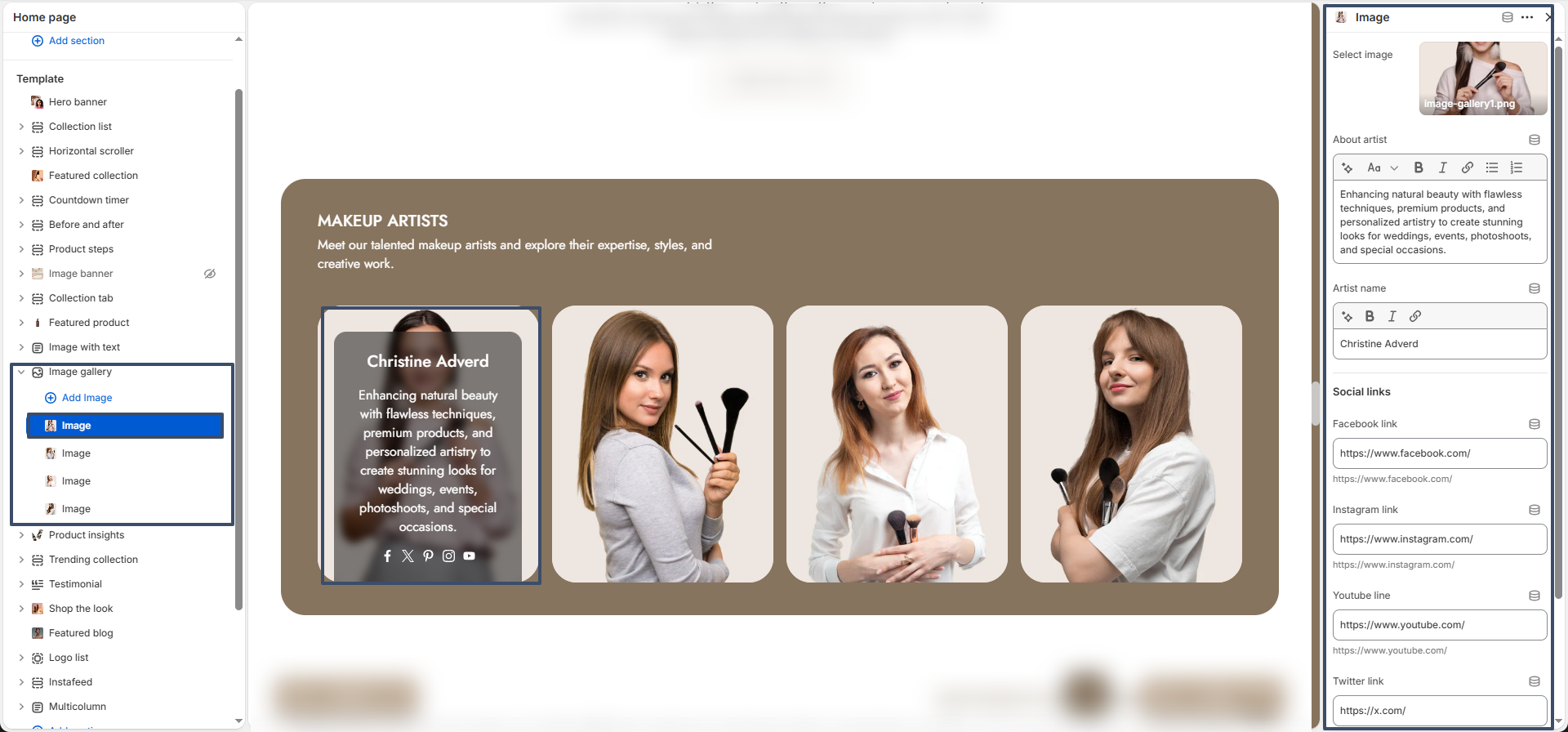
The Image Gallery section is built using image blocks. You can add multiple images and customize each one individually.

image gallery image block

Image Block: Each block represents a single gallery item.

Image: Upload the image to display in the gallery.

Artist Name: Add a title or name for the image (e.g., team member name).

About Artist: Provide a short description or additional details.

Social Links: Add social media links such as Facebook, Instagram, YouTube, Twitter, and Pinterest.

Flexible Layout: You can reorder image blocks by dragging them to create a customized gallery layout that fits your design needs.

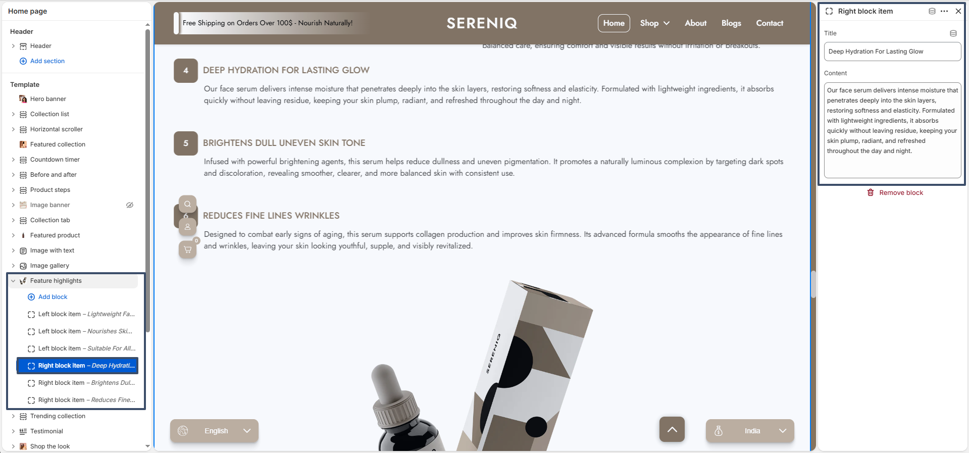
Feature highlights

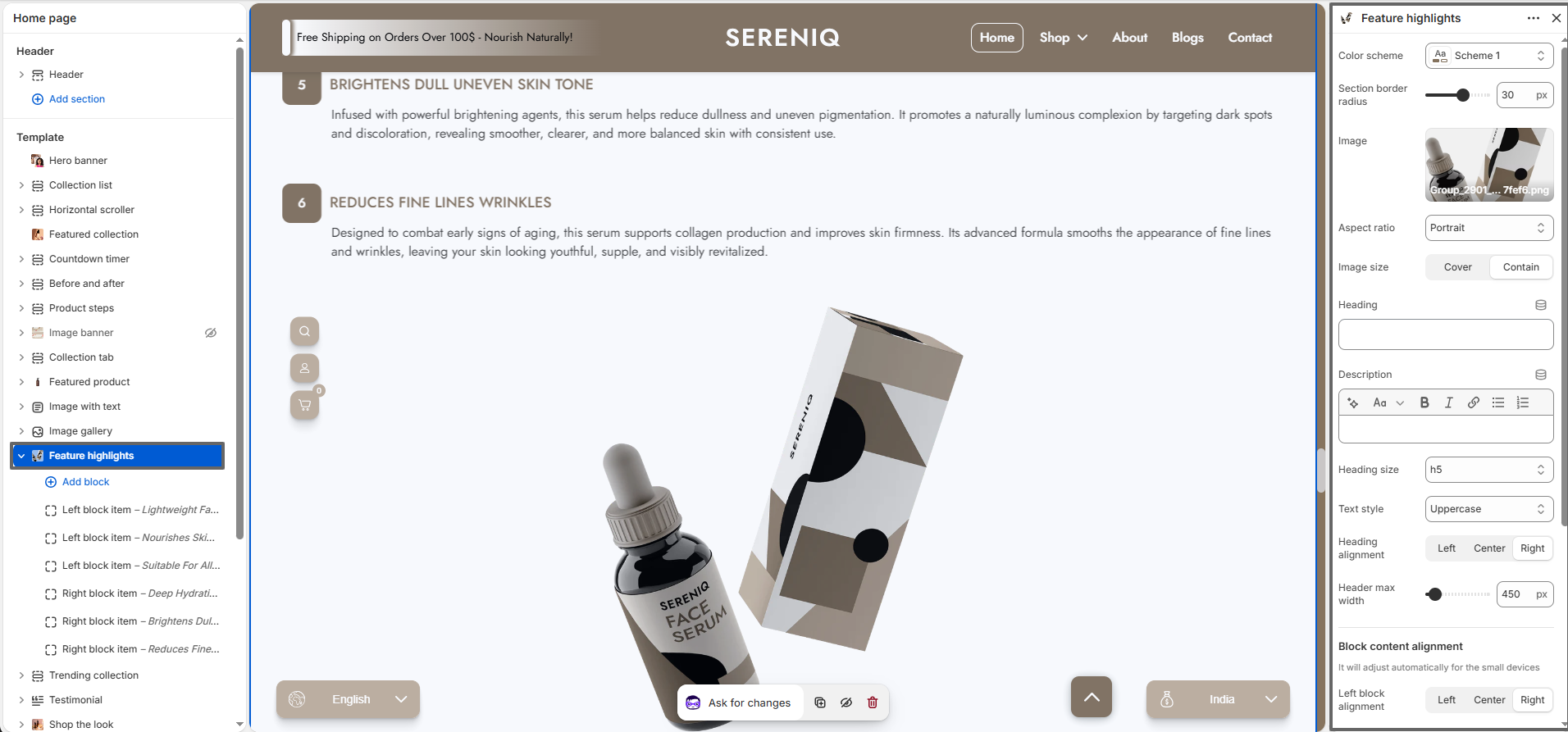
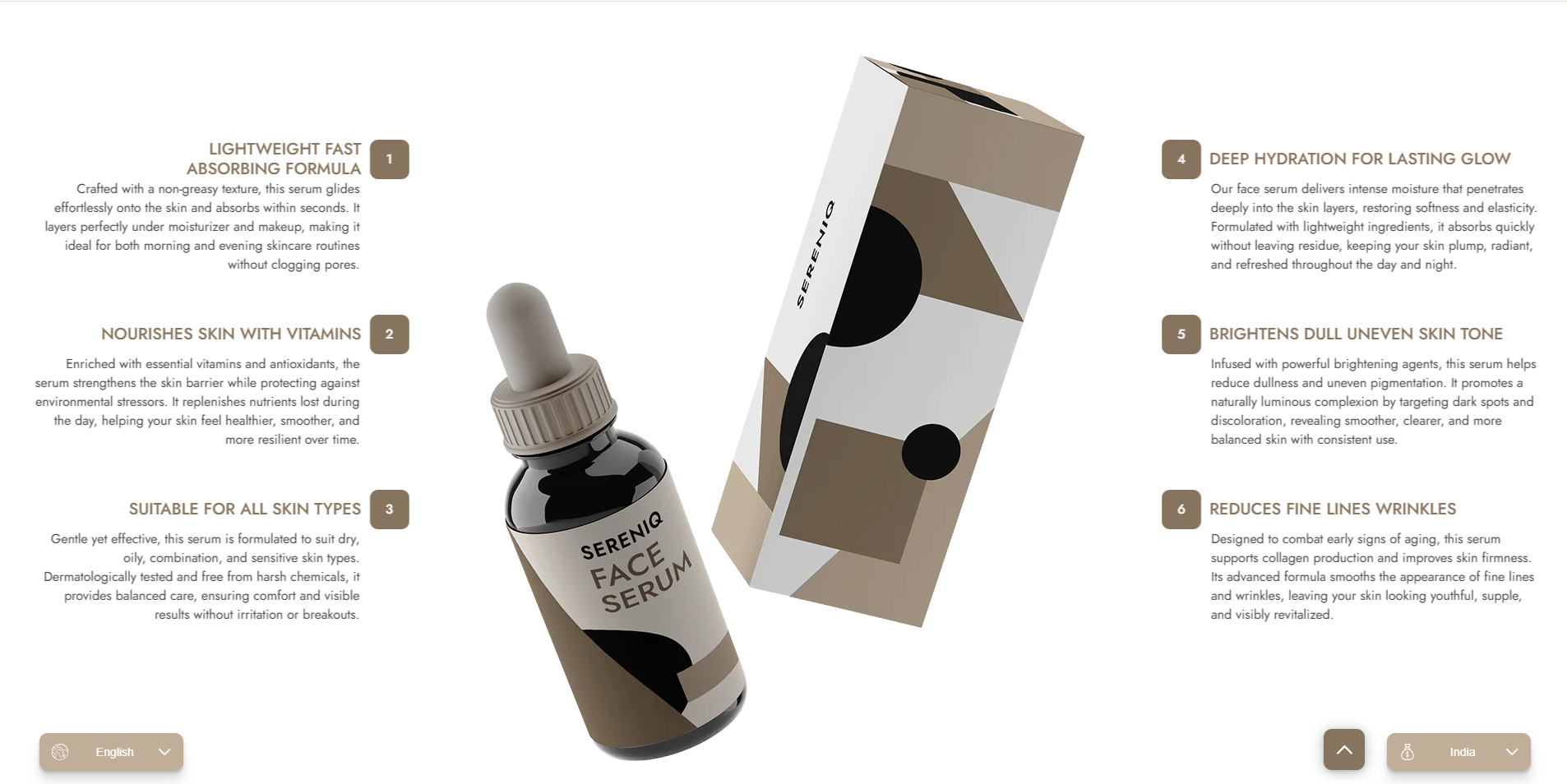
The Feature highlights section helps you highlight key features, benefits, or unique selling points of your product in a structured and visually engaging way. It is ideal for showcasing detailed product information alongside an image.

feature highlights preview


feature highlights preview

Color Scheme: Select a color scheme that matches your store branding.

Section Border Radius: Adjust the corner roundness of the section container.

Image: Upload the main product image displayed in the section.

Aspect Ratio: Choose the image ratio (e.g., portrait).

Image Size: Select how the image fits (cover or contain).

Heading: Add a main section title.

Description: Provide a short introduction or summary for the section.

Heading Size: Choose the heading size (H1–H6).

Text Style: Apply text transformation such as uppercase, lowercase, or capitalize.

Heading Alignment: Align the heading to left, center, or right.

Header Max Width: Control the maximum width of the heading area.

Left Block Alignment: Set alignment for left-side content blocks.

Right Block Alignment: Set alignment for right-side content blocks.

Show Count: Enable to display numbering for each insight item.

Top Spacing: Adjust spacing above the section.

Bottom Spacing: Adjust spacing below the section.

Available Blocks

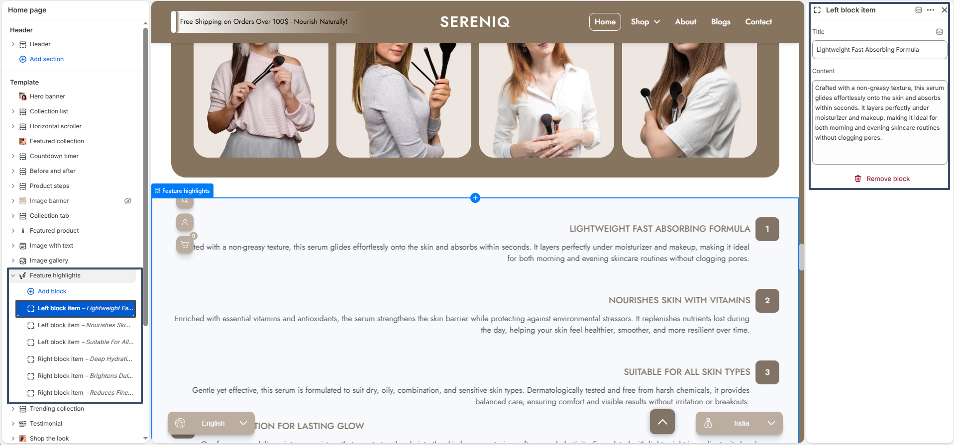
The Feature highlights section includes two types of blocks: Left Block Item and Right Block Item. These blocks allow you to organize content on both sides of the central image.

left block item

Left Block Item: Displays content on the left side of the image.

Title: Enter the heading for the insight item.

Content: Add descriptive text explaining the feature or benefit.

right block item

Right Block Item: Displays content on the right side of the image.

Title: Enter the heading for the insight item.

Content: Add descriptive text explaining the feature or benefit.

Flexible Layout: You can add, remove, and reorder both left and right blocks to create a balanced and visually appealing layout based on your content needs.

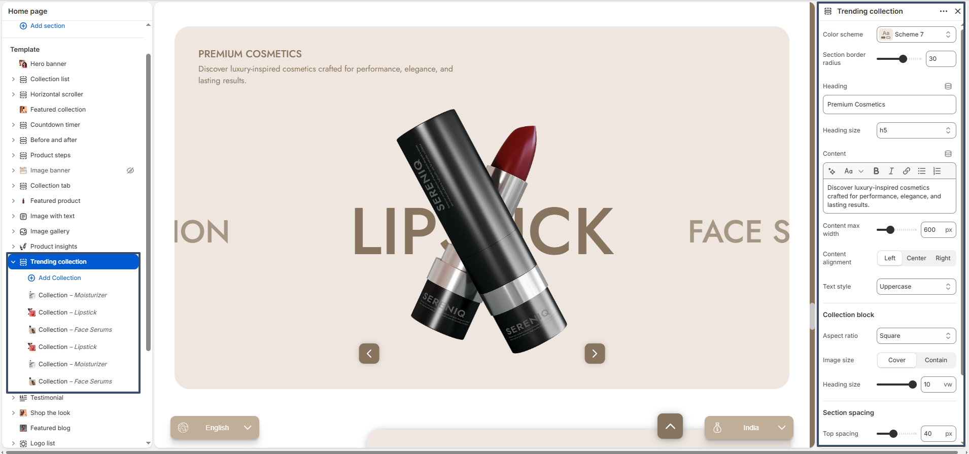
Trending Collection

The Trending Collection section allows you to showcase multiple product collections in an interactive and visually appealing slider layout. It is perfect for highlighting popular, featured, or seasonal collections on your homepage.

trending collection settings

Color Scheme: Choose a color scheme that matches your store’s branding.

Section Border Radius: Adjust the roundness of the section container corners.

Heading: Add a title for the section to introduce your collections.

Heading Size: Select the heading size (H1–H6) based on your design preference.

Content: Add a short description to provide context or highlight your collections.

Content Max Width: Control the maximum width of the content area.

Content Alignment: Align the text to left, center, or right.

Text Style: Apply text transformations such as uppercase, lowercase, or capitalize.

Aspect Ratio: Choose the image ratio for collection images (e.g., square).

Image Size: Select how images are displayed (cover or contain).

Heading Size (Collection): Adjust the size of the collection title displayed on each item.

Top Spacing: Adjust the space above the section.

Bottom Spacing: Adjust the space below the section.

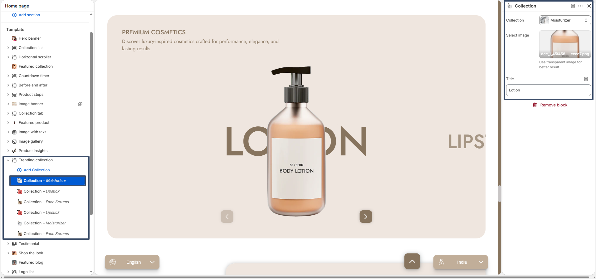
Collection Block: The Trending Collection section allows you to add multiple collection blocks. Each block represents a single collection item displayed in the slider.

collection block settings

Collection: Select a Shopify collection to display.

Image: Upload or select a custom image for the collection. Using a transparent image is recommended for better design results.

Title: Enter a custom title for the collection (optional).

Remove Block: Remove the selected collection block if not needed.

Flexible Usage: You can add, remove, and reorder collection blocks to control how collections appear in the slider. This allows you to highlight specific categories based on trends, promotions, or seasons.

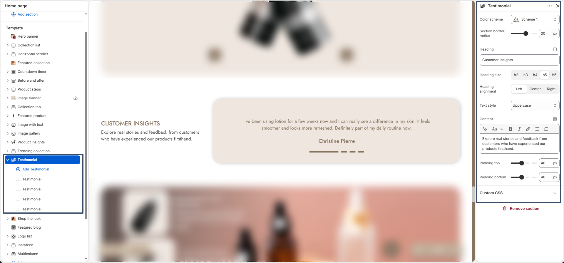
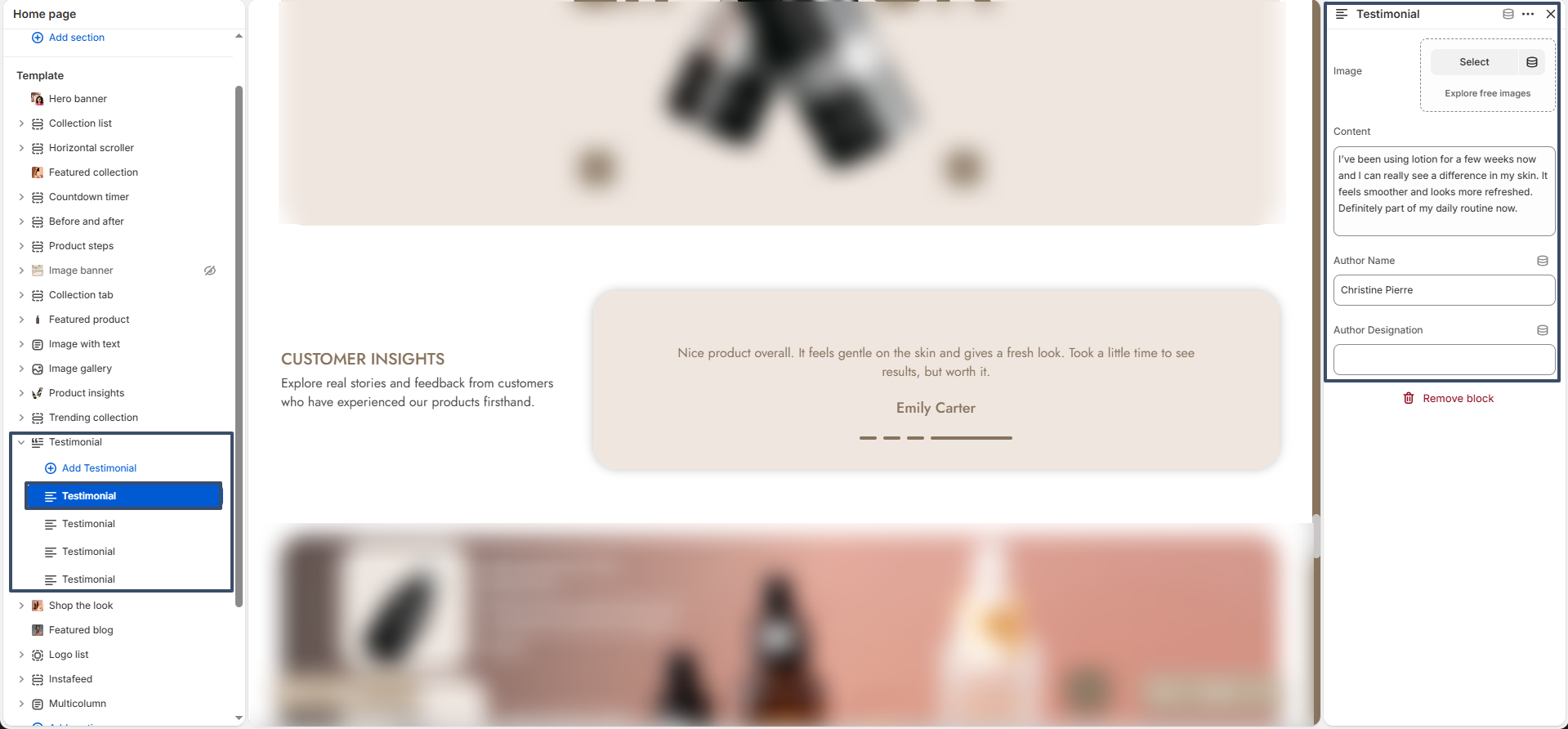
Testimonial

The Testimonial section allows you to showcase customer feedback in a clean and engaging layout. It helps build trust by highlighting real experiences and reviews from your customers.

testimonial settings

Color Scheme: Select a color scheme that aligns with your store branding.

Section Border Radius: Adjust the roundness of the testimonial container.

Heading: Add a title for the testimonial section (e.g., Customer Insights).

Heading Size: Choose the heading size (H1–H6).

Heading Alignment: Align the heading to left, center, or right.

Text Style: Apply text transformation such as uppercase, lowercase, or capitalize.

Content: Add a short description to introduce the testimonials.

Padding Top: Adjust the spacing above the section.

Padding Bottom: Adjust the spacing below the section.

Testimonial Block: The Testimonial section includes a Testimonial block that allows you to add individual customer reviews. You can add multiple testimonial blocks to display a slider or list of feedback.

testimonial block settings

Image: Upload a customer image or avatar to visually represent the reviewer.

Content: Add the customer’s feedback or review text.

Author Name: Enter the name of the customer.

Author Designation: Add additional details such as the customer’s role, location, or title.

Flexible Usage: You can add, remove, and reorder testimonial blocks to control how reviews are displayed. This helps you highlight your best customer feedback effectively.

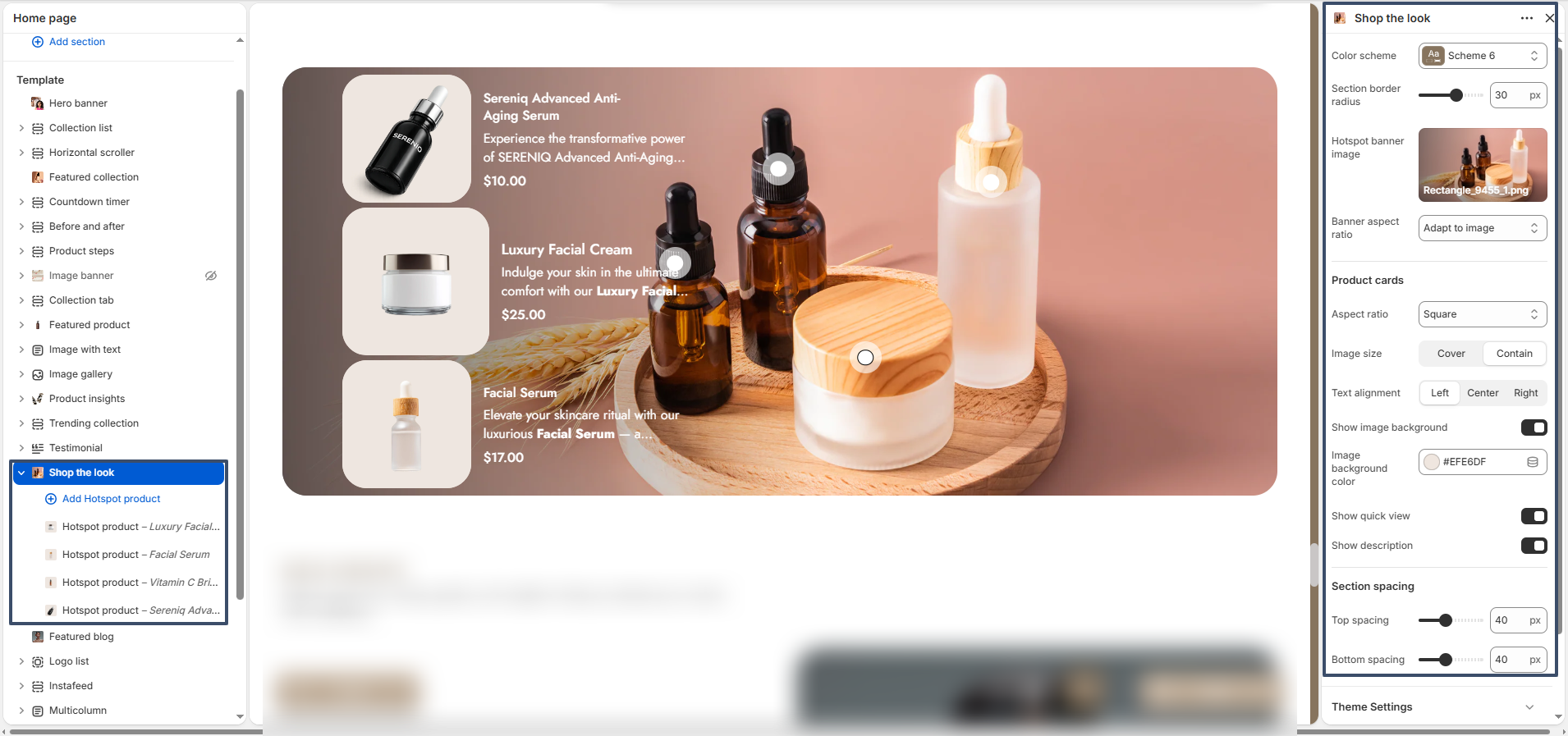
Shop the Look

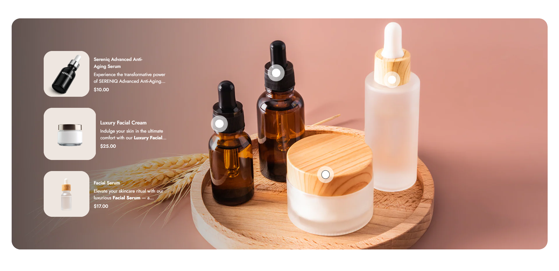
The Shop the Look section allows you to showcase products interactively using hotspot markers on an image. This section helps customers easily explore and shop products directly from a styled visual layout.

shop the look settings

Color Scheme: Choose a color scheme that matches your store branding.

Section Border Radius: Adjust the roundness of the section container for a softer or sharper look.

Hotspot Banner Image: Upload the main image where hotspot products will be displayed.

Banner Aspect Ratio: Set how the banner image scales (e.g., adapt to image).

Product Card Aspect Ratio: Choose the shape of product cards (e.g., square).

Image Size: Select how product images fit within cards (cover or contain).

Text Alignment: Align product text to left, center, or right.

Show Image Background: Enable or disable background behind product images.

Image Background Color: Choose a background color for product images if enabled.

Show Quick View: Enable quick view option for products.

Show Description: Toggle product description visibility in product cards.

Top Spacing: Adjust the spacing above the section.

Bottom Spacing: Adjust the spacing below the section.

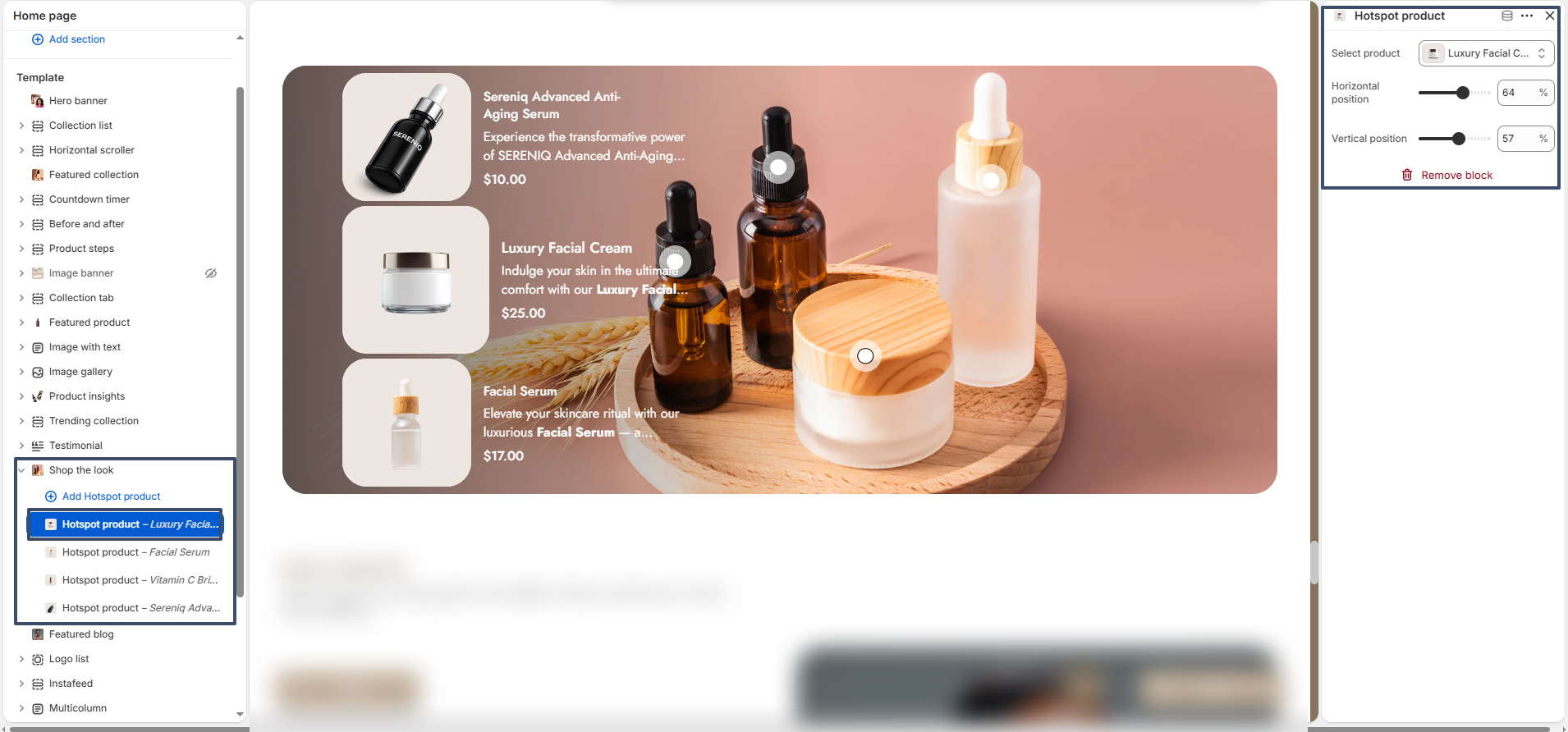
Hotspot Product Block: The Shop the Look section includes Hotspot Product blocks that allow you to place clickable markers on the image. Each hotspot represents a product and can be positioned precisely.

shop the look block settings

Select Product: Choose the product you want to display in the hotspot.

Horizontal Position: Adjust the horizontal placement of the hotspot on the image.

Vertical Position: Adjust the vertical placement of the hotspot on the image.

Flexible Usage: You can add multiple hotspot products, reposition them, or remove them as needed. This flexibility allows you to create engaging, shoppable visuals that highlight multiple products in a single image.

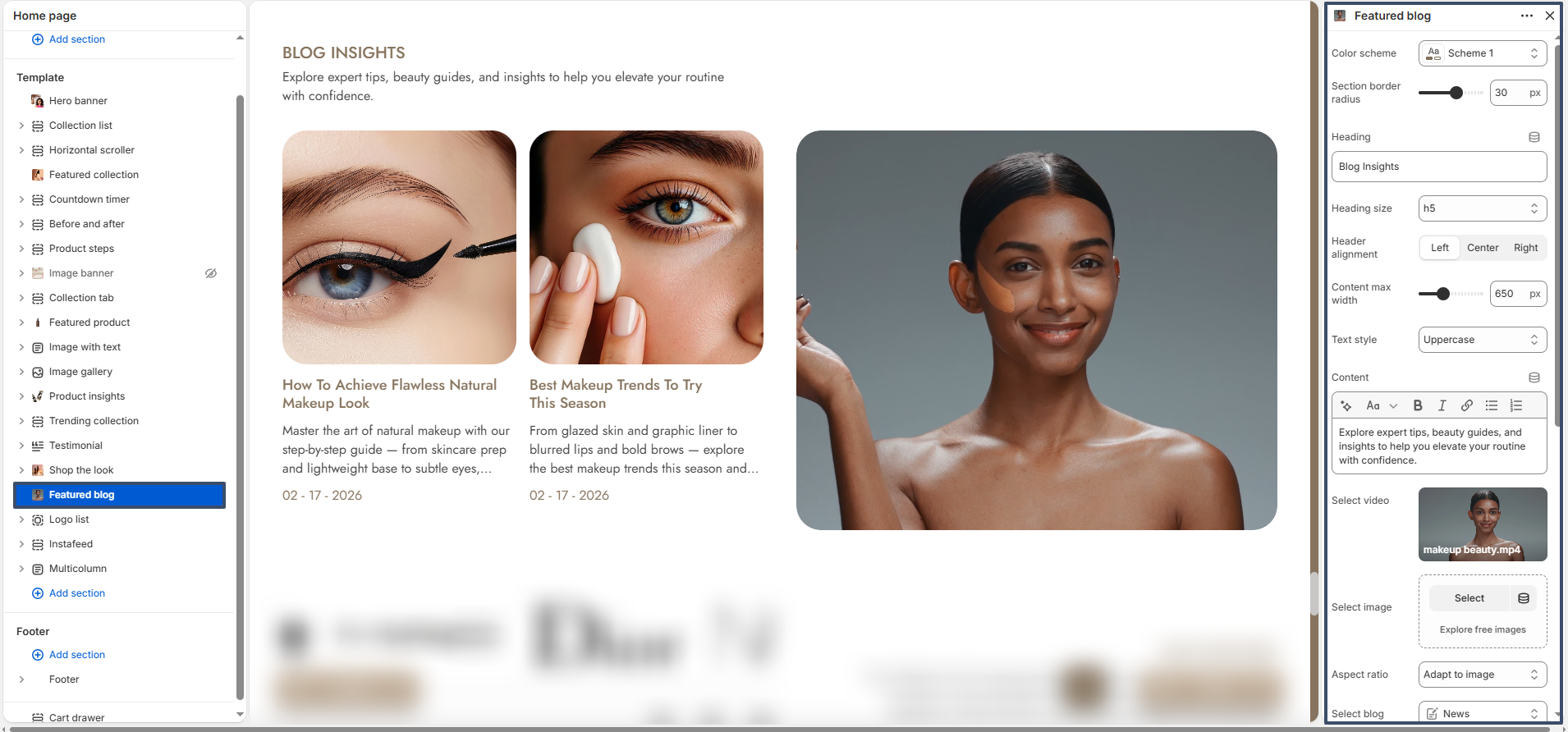
Featured Blog

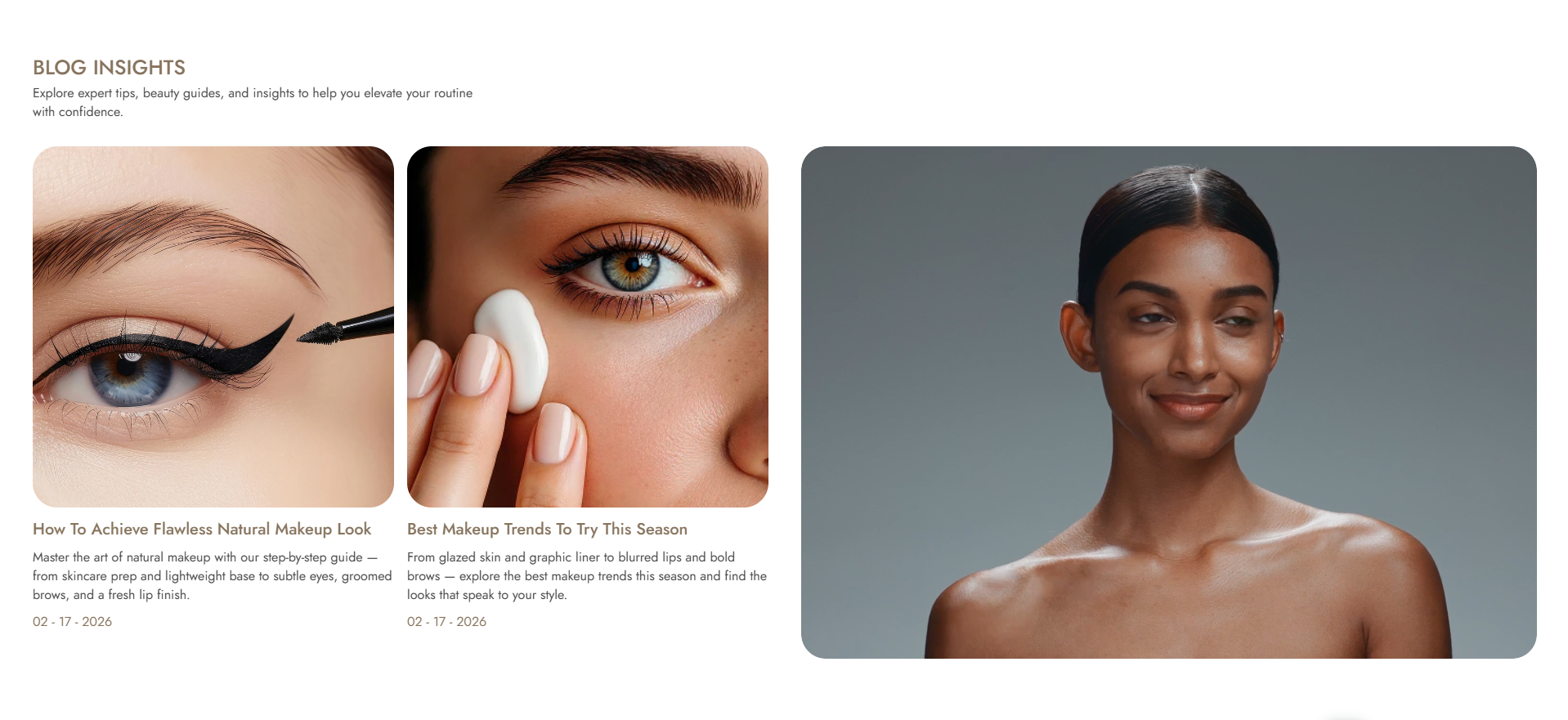
The Featured Blog section allows you to display recent or selected blog posts from your store. It helps you engage customers by sharing articles, beauty tips, guides, or news in a visually appealing layout.

featured blog settings

Color Scheme: Select a color scheme that matches your store branding.

Section Border Radius: Adjust the roundness of the section container.

Heading: Enter a title for the section (e.g., Blog Insights).

Heading Size: Choose the heading size (H1–H6).

Header Alignment: Align the heading to left, center, or right.

Content Max Width: Control the maximum width of the section content.

Text Style: Apply text transformation such as uppercase, lowercase, or capitalize.

Content: Add a short description to introduce your blog section.

Select Video: Upload or select a video to display alongside blog posts.

Select Image: Upload an image if you prefer to display a static visual instead of a video.

Aspect Ratio: Choose how the media (image/video) is displayed (e.g., adapt to image).

Select Blog: Choose which blog to display posts from.

Blog Layout Alignment: Align blog content to left, center, or right.

Post Aspect Ratio: Set the shape of blog post images (e.g., square).

Image Size: Control how images fit within blog cards (cover or contain).

Number of Posts to Show: Select how many blog posts will be displayed in the section.

Show Author: Enable to display the author name for each post.

Show Date: Enable to display the publishing date.

Show Content: Toggle to show a short excerpt from the blog post.

Show Tags: Enable to display blog tags.

Top Spacing: Adjust the spacing above the section.

Bottom Spacing: Adjust the spacing below the section.

Flexible Usage: This section automatically pulls blog posts based on your selection. You can control layout, visibility, and content display options to match your store design and storytelling needs.

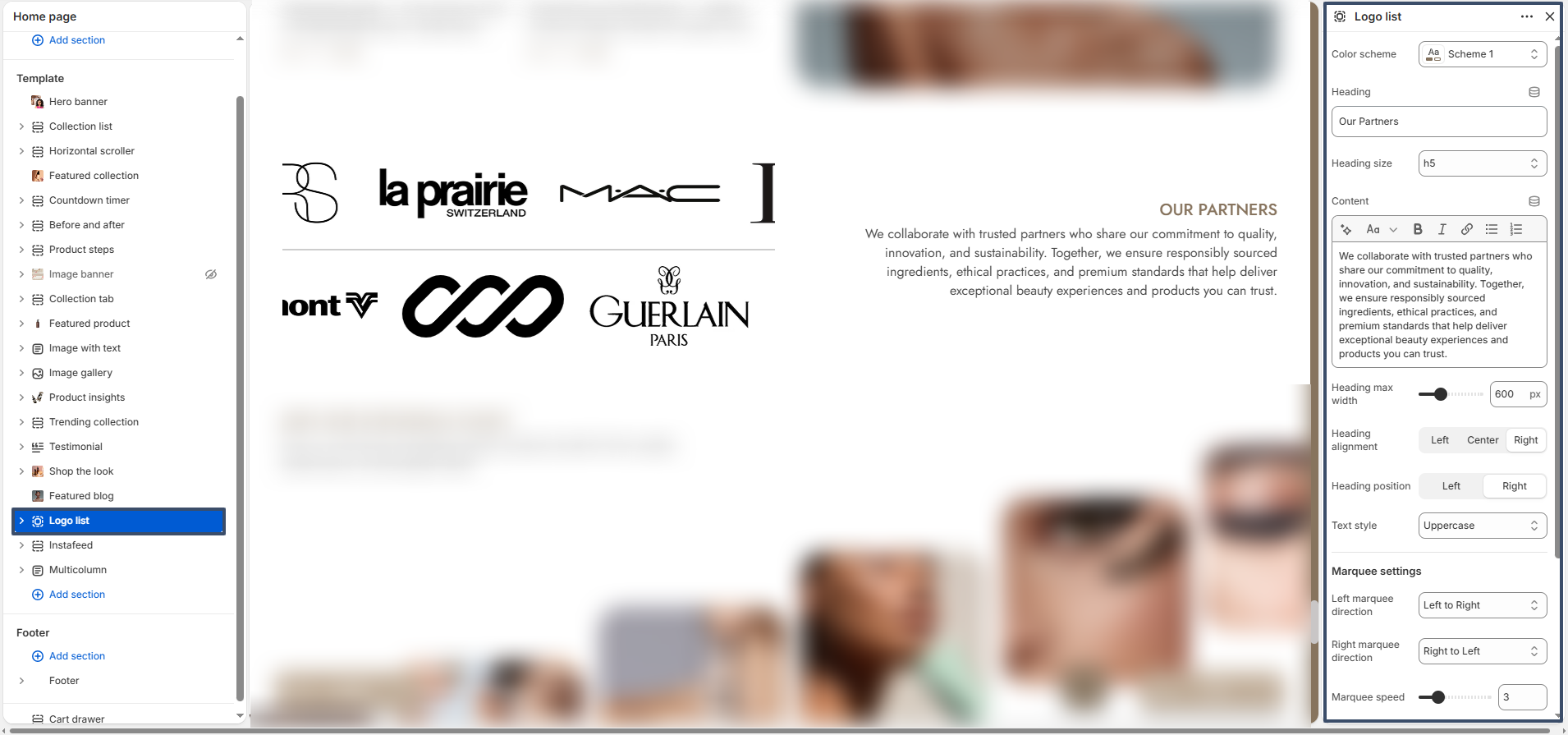
Logo List

The Logo List section allows you to showcase brand logos, partners, or affiliations in a clean and visually appealing layout. It is ideal for building trust by displaying well-known brands or collaborators associated with your store.

logo list section settings

Color Scheme: Select a color scheme that matches your store design and branding.

Heading: Add a title for the section (e.g., “Our Partners”).

Heading Size: Choose the size of the heading text.

Content: Add a short description to provide context about the logos or partners displayed.

Heading Max Width: Control the maximum width of the heading area for better readability.

Heading Alignment: Align the heading text to left, center, or right.

Heading Position: Adjust the placement of the heading relative to the logo list.

Text Style: Customize the heading style (e.g., uppercase).

Marquee Settings: Enable scrolling animation for logos to create a dynamic effect.

Left Marquee Direction: Set the scrolling direction for logos moving from left to right.

Right Marquee Direction: Set the scrolling direction for logos moving from right to left.

Marquee Speed: Adjust the speed of the scrolling animation.

Top Spacing: Control the spacing above the section.

Bottom Spacing: Control the spacing below the section.

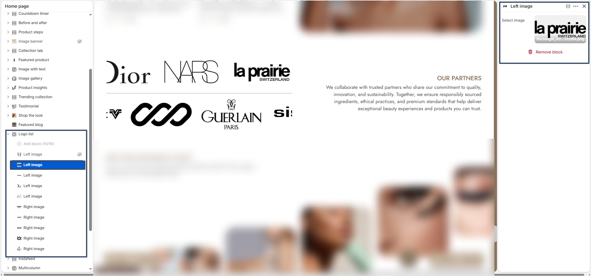
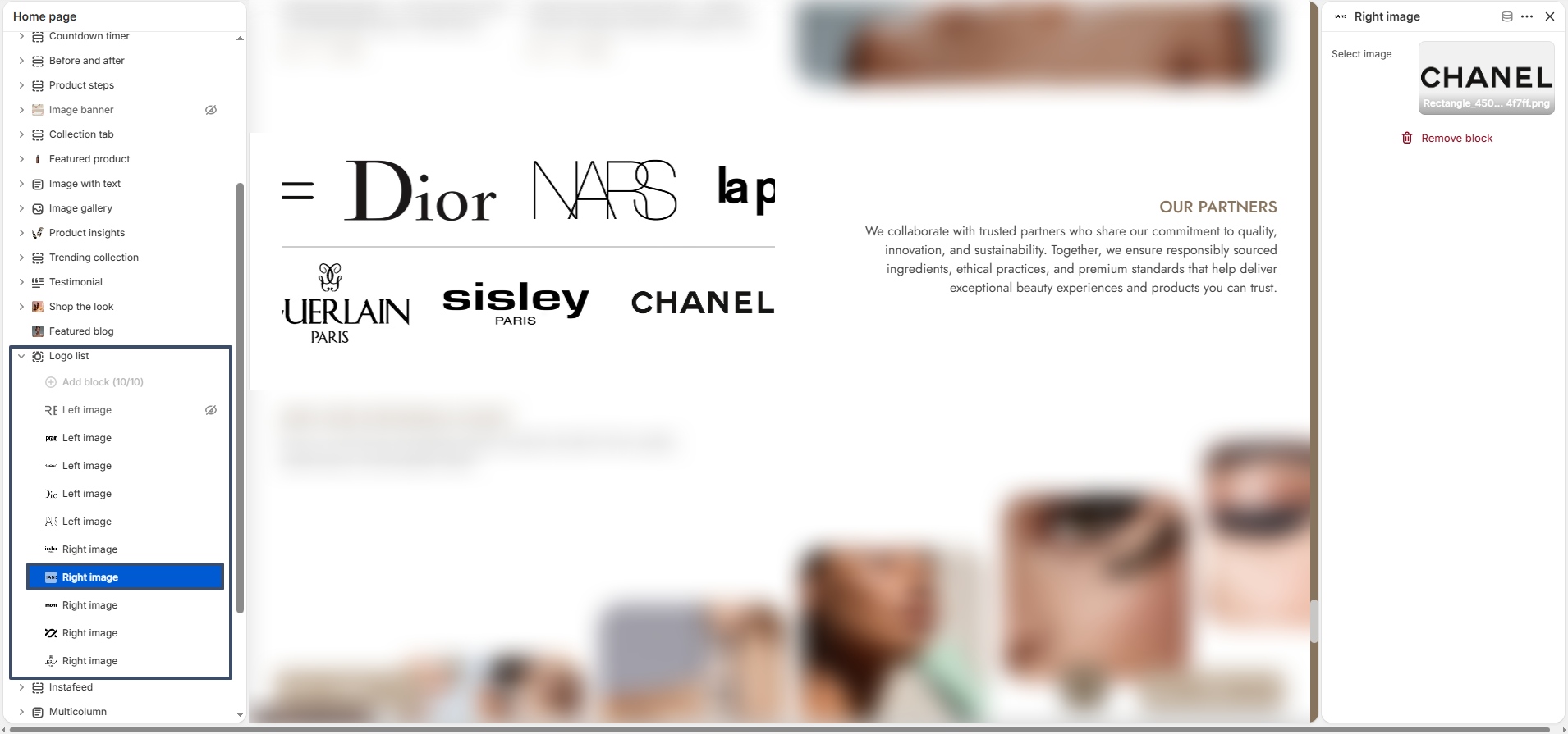
Logo Blocks: The Logo List section includes image blocks that allow you to upload and display multiple logos.

logo list  left block settings

Left Image Block: Upload logos that will appear in the left scrolling group.

logo list right block settings

Right Image Block: Upload logos that will appear in the right scrolling group.

Flexible Usage: You can add, remove, or reorder logo blocks as needed. This flexibility allows you to highlight key partners and create a strong visual brand presence.

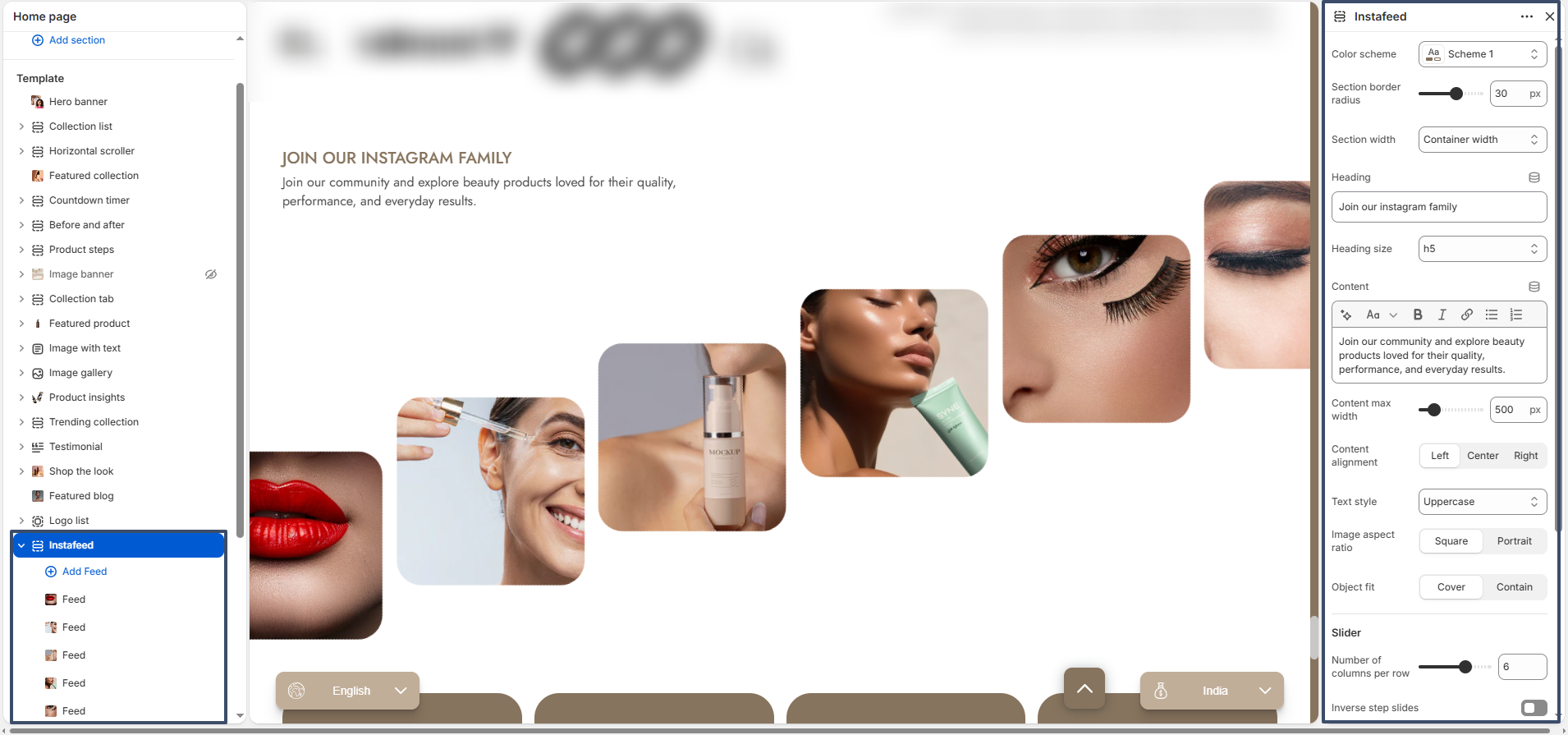
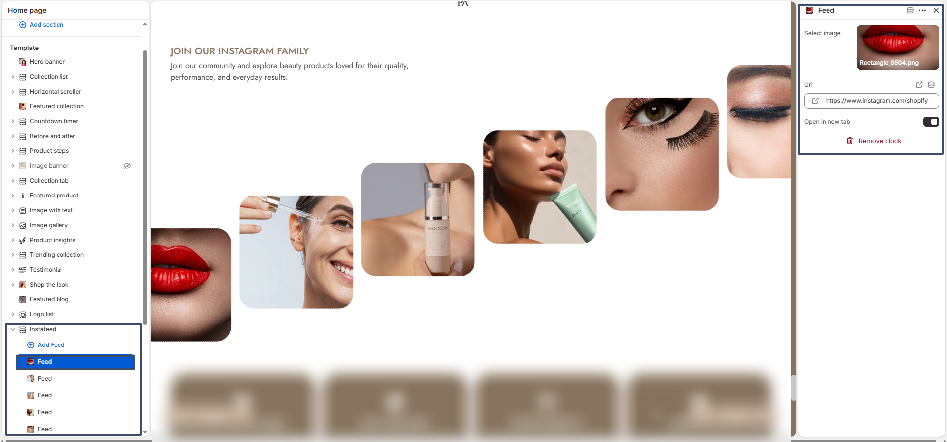
Instafeed

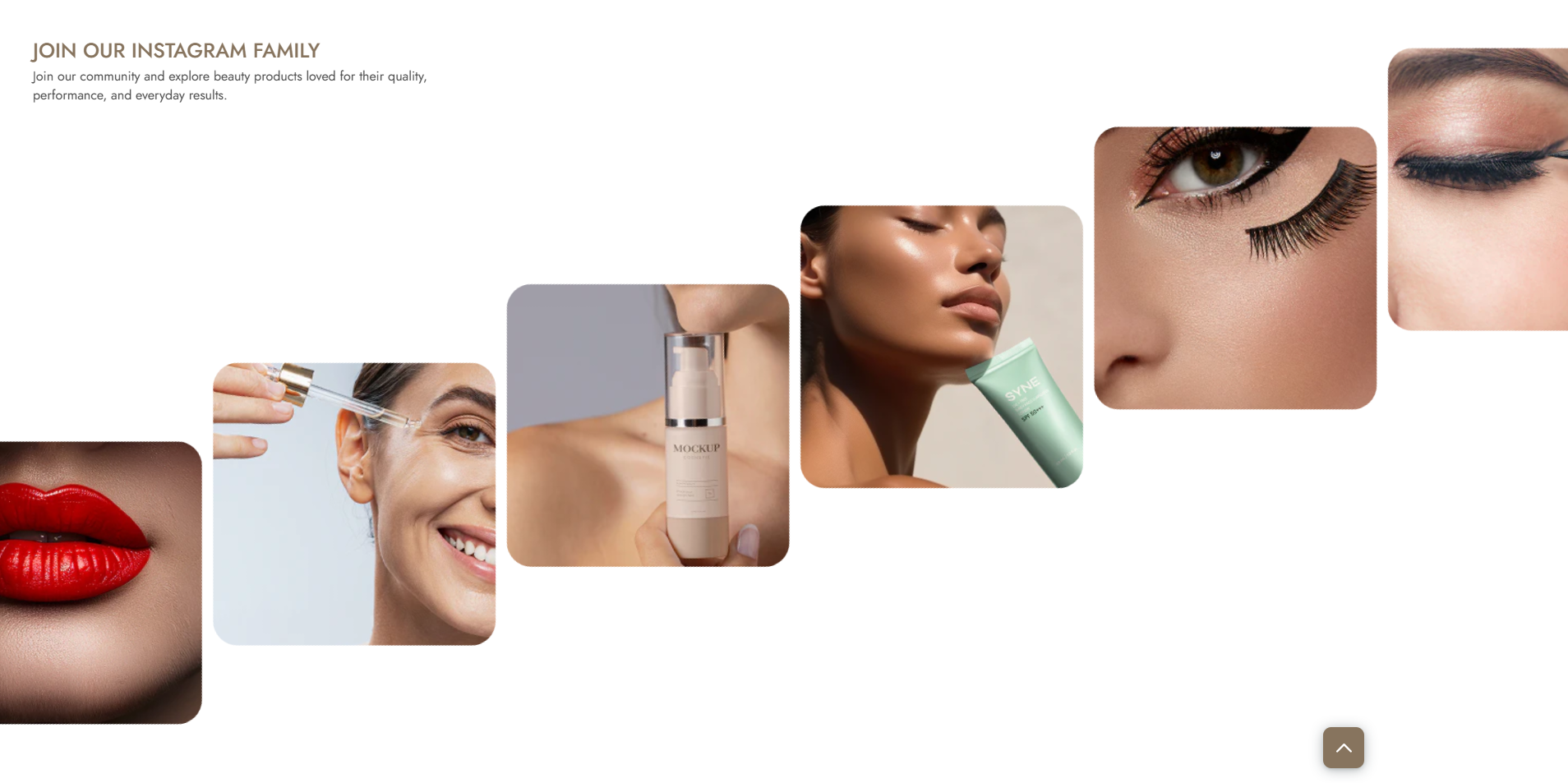
The Instafeed section allows you to display Instagram-style images in a modern and engaging layout. It helps showcase your brand’s social presence and encourages users to connect with your store on Instagram.

instafeed section settings

Color Scheme: Choose a color scheme that matches your store branding.

Section Border Radius: Adjust the roundness of the section corners for a modern look.

Section Width: Select between full width or container width layout.

Heading: Add a title for the section (e.g., “Join our Instagram family”).

Heading Size: Control the size of the heading text.

Content: Add a short description to engage users and describe your Instagram presence.

Content Max Width: Adjust the width of the content area for better readability.

Content Alignment: Align the text to left, center, or right.

Text Style: Customize the text style (e.g., uppercase).

Image Aspect Ratio: Choose between square or portrait image formats.

Object Fit: Set how images fit within their containers (cover or contain).

Number of Columns: Define how many images appear in a row.

Inverse Step Slides: Enable or disable reverse sliding animation effect.

Top Spacing: Adjust spacing above the section.

Bottom Spacing: Adjust spacing below the section.

Feed Blocks: The Instafeed section includes multiple image blocks where you can add Instagram images.

instafeed block settings

Select Image: Upload or choose an image to display in the feed.

URL: Add a link to your Instagram post or profile.

Open in New Tab: Enable this option to open links in a new browser tab.

Flexible Usage: You can add, remove, or reorder feed blocks to create a visually appealing Instagram gallery. This helps increase engagement and build trust with your audience.

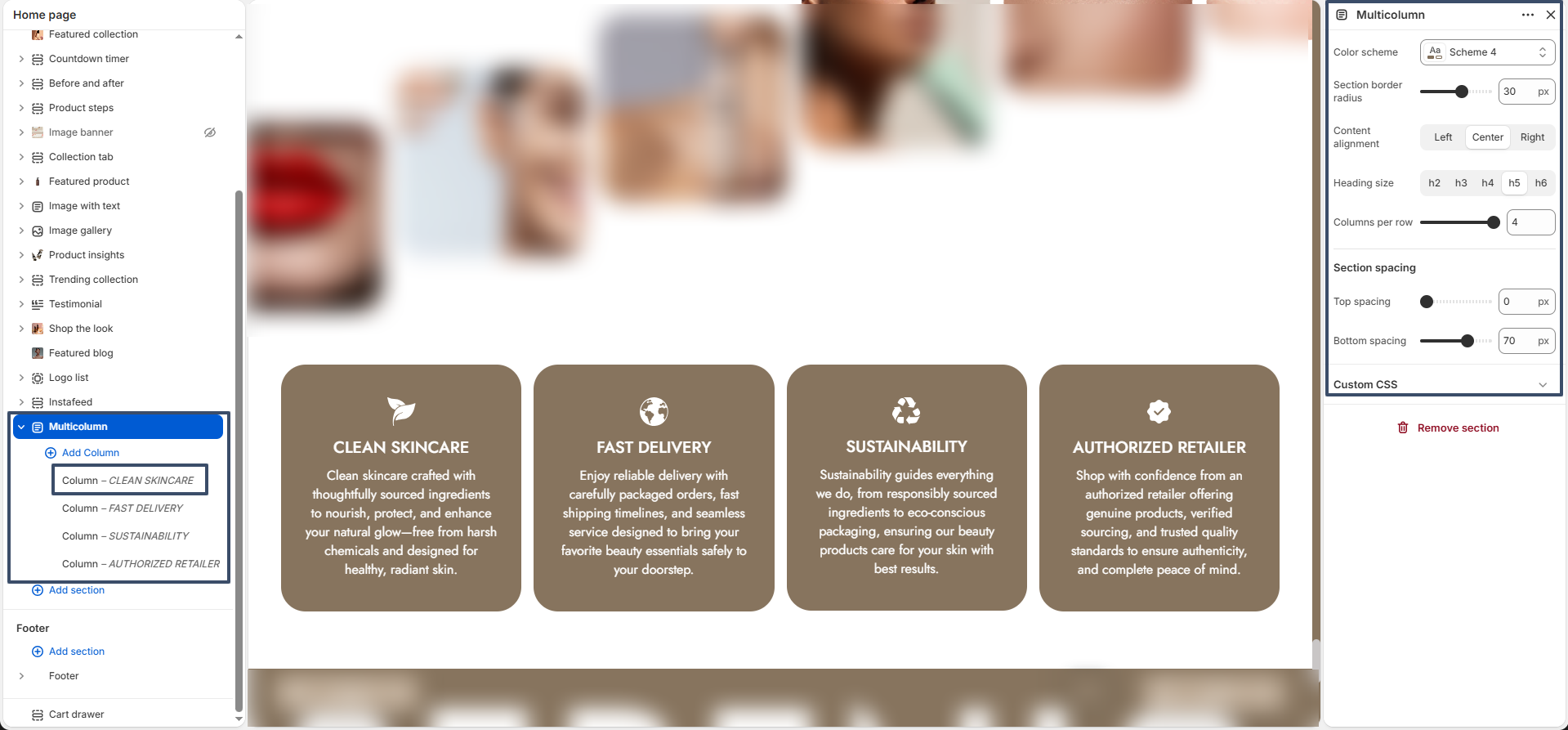
Multicolumn

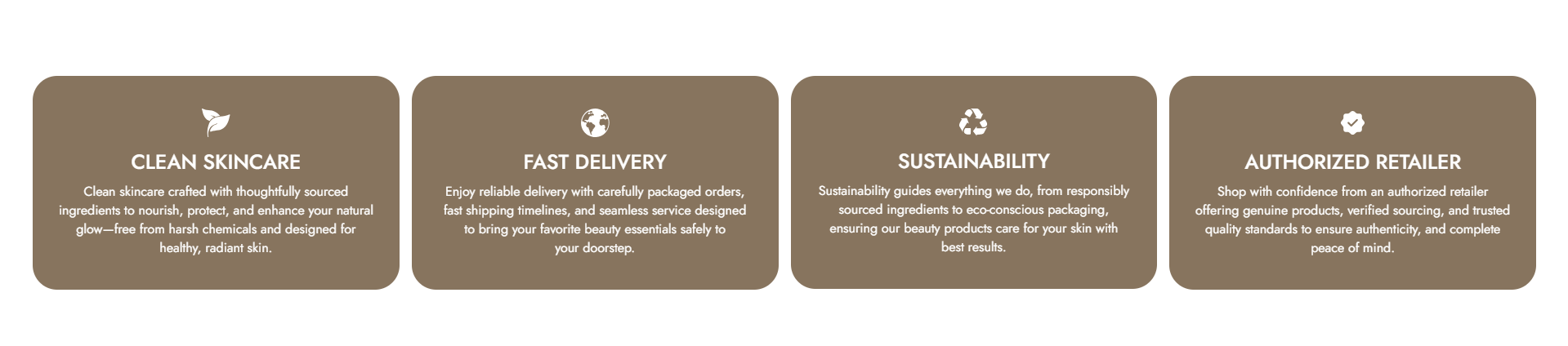
The Multicolumn section allows you to display multiple content blocks in a structured column layout. It is ideal for highlighting key features, services, or store benefits such as product quality, delivery, and brand values.

multicolumn section settings

Color Scheme: Choose a color scheme that aligns with your store branding.

Section Border Radius: Adjust the roundness of the section corners for a softer or sharper look.

Content Alignment: Set the alignment of the content inside each column (left, center, or right).

Heading Size: Select the size of the column headings (H2–H6).

Columns per Row: Control how many columns are displayed in a single row.

Top Spacing: Adjust the spacing above the section.

Bottom Spacing: Adjust the spacing below the section.

Custom CSS: Add custom styles to further personalize the section appearance.

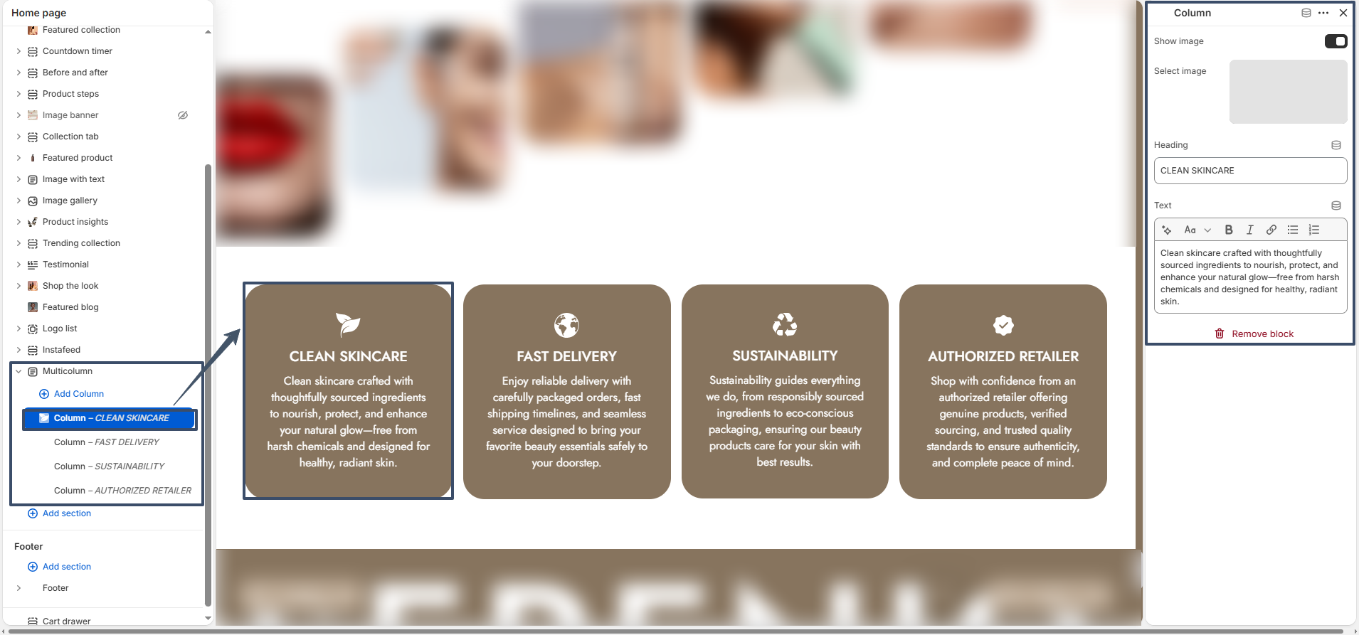
Column Blocks: Each column represents a block where you can add an image, heading, and descriptive text.

multicolumn block settings

Show Image: Enable or disable the image display for the column.

Select Image: Upload or choose an image to visually represent the column content.

Heading: Add a title for the column (e.g., “Clean Skincare”, “Fast Delivery”).

Text: Provide a short description to explain the feature or benefit.

Flexible Usage: You can add, remove, and reorder columns to fit your content needs. This makes the Multicolumn section perfect for showcasing store highlights in a clean and organized way.

Theme Update

What is a Theme Update?

A theme update involves upgrading your Shopify store’s theme to its latest version. Updates for the Noble theme are released regularly to introduce new features, enhance performance, and improve overall functionality and design.

How to Update the Theme

At Noble, we frequently release updates to introduce new features, boost performance, and enhance the functionality and design of your store. To ensure a smooth update process, we recommend reviewing the Shopify guide on updating themes. This guide provides step-by-step instructions to help you effortlessly integrate the latest improvements and keep your online store running at its best with the newest enhancements.