


Theme Installation
Follow the steps below to install the theme on your Online Store
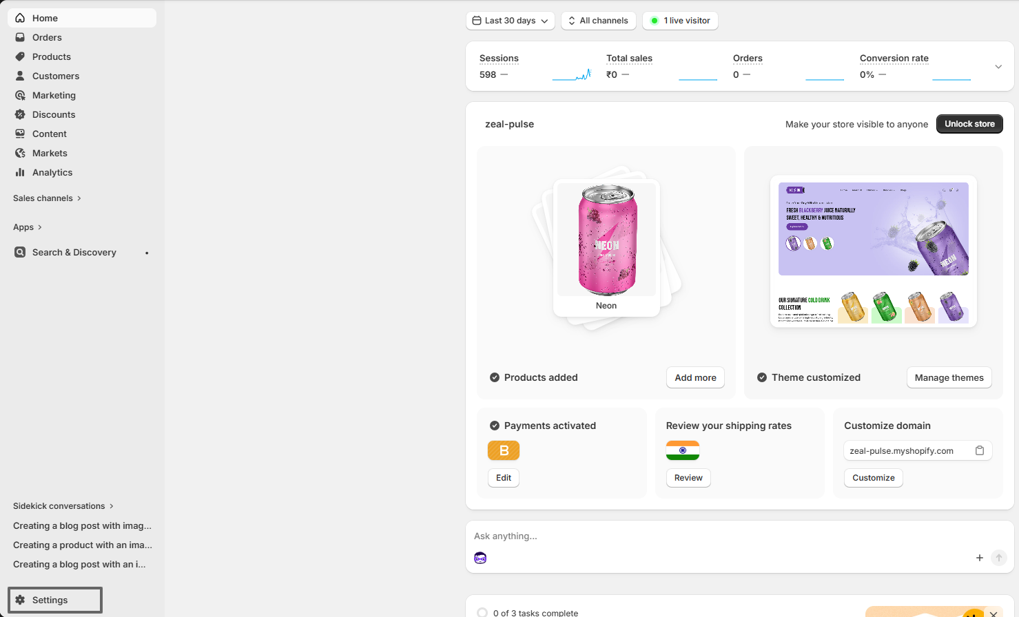
- Log in to your Shopify admin.
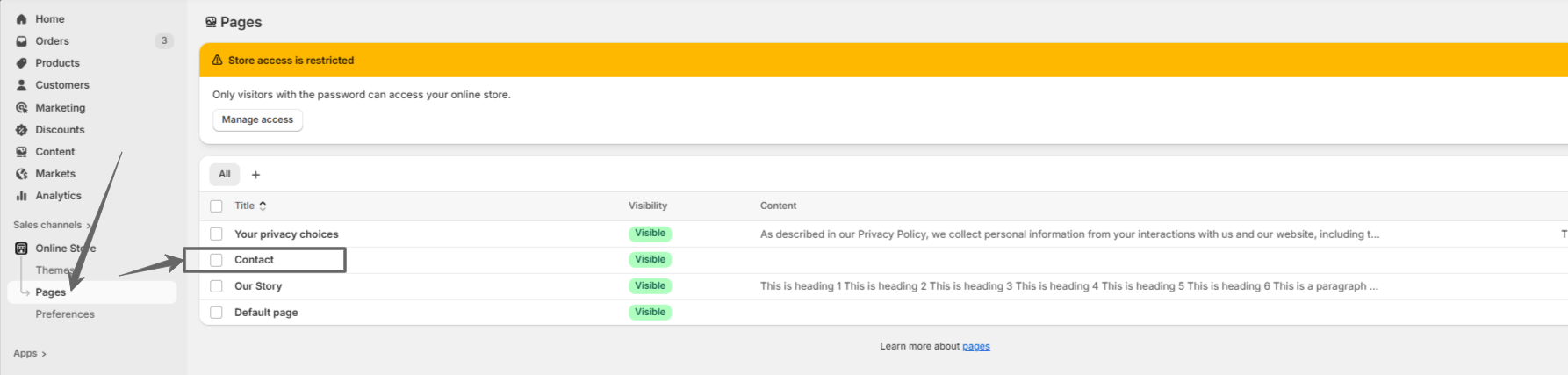
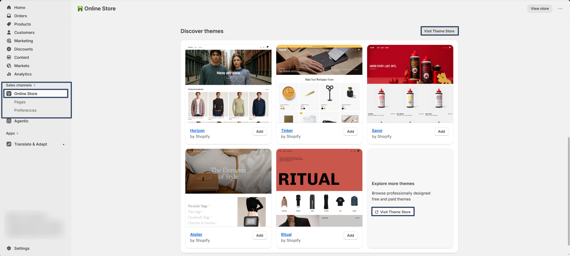
- Go to Online Store from the left sidebar.
- Scroll down to the Discover Themes section.
- Click on Visit Theme Store.
- In the Shopify Theme Store, search for Zeal theme.
- Open the theme and click Try theme to add it to your store.
- The theme will be added to your store.
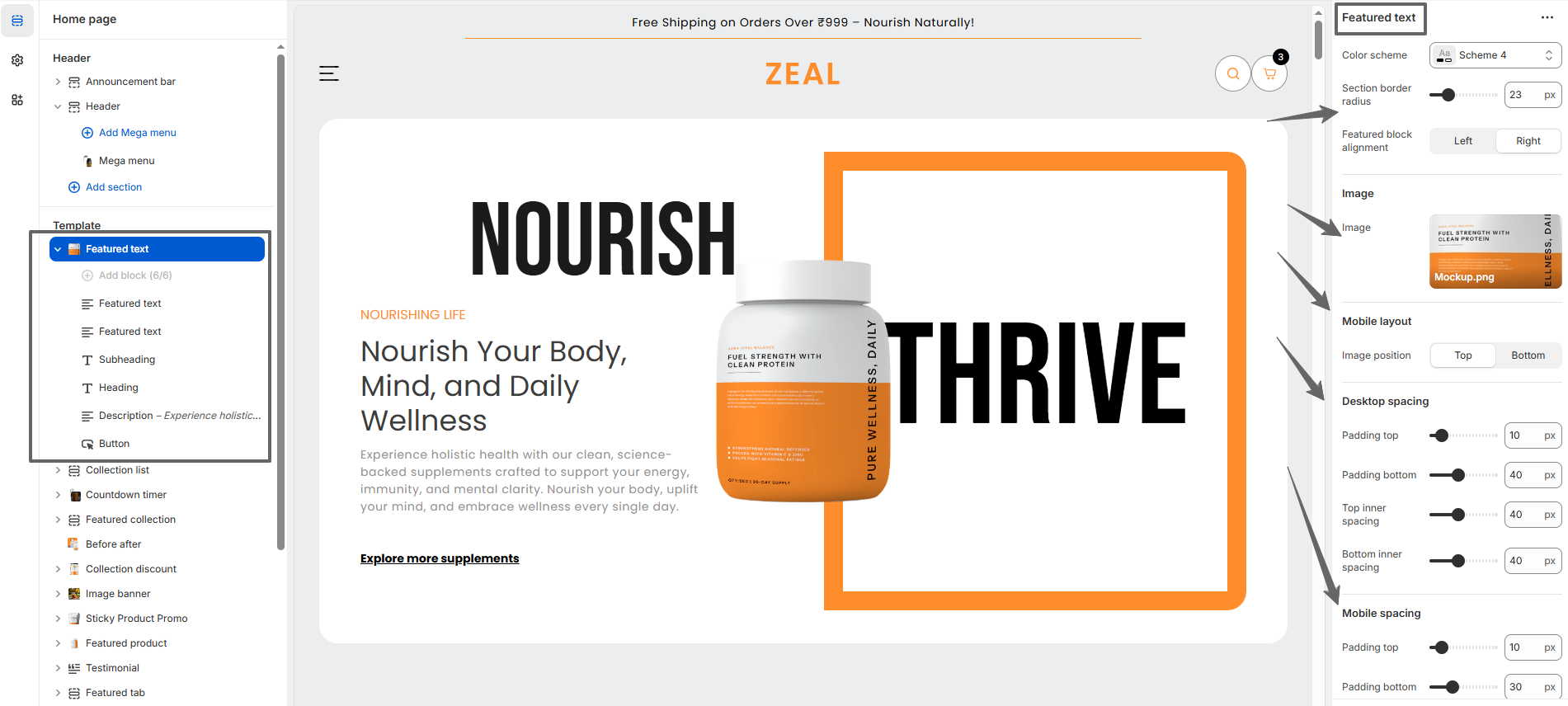
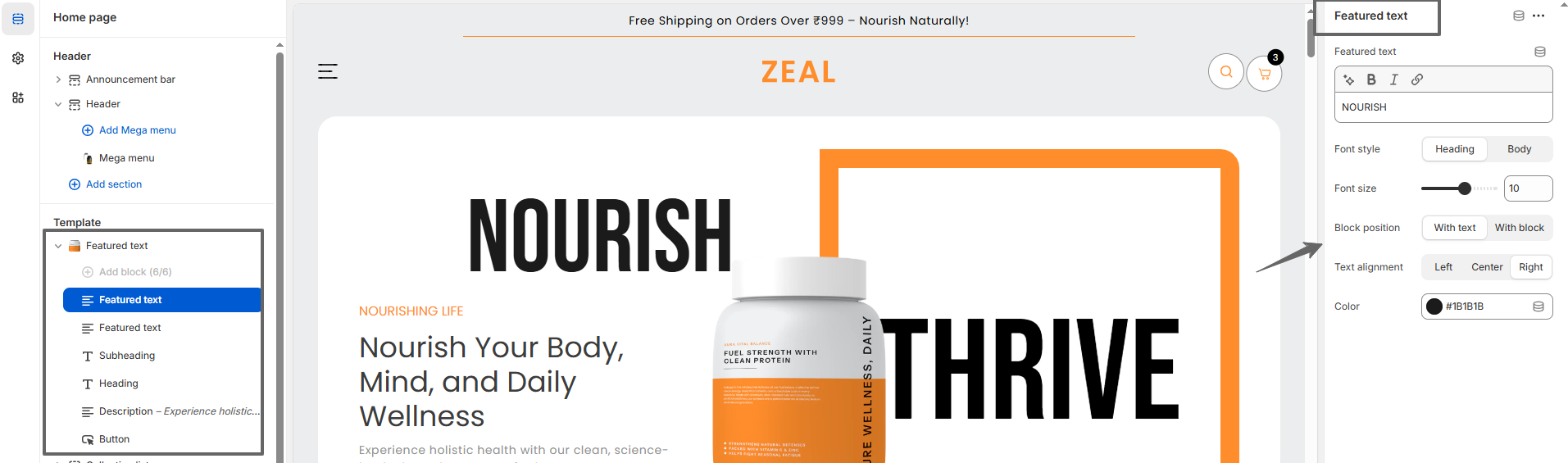
- Click Customize to start editing and setting up your store design.
Try Zeal for free from the Shopify Theme Store
Zeal, like all premium themes in the Shopify Theme Store, offers a trial period, allowing you to explore its user-friendly design and quick setup features. During the trial, you can fully customize and configure the theme to create your ideal storefront. When you're ready to launch, purchase the theme to activate it on your live store., like all premium themes in the Shopify Theme Store, offers an trial period, allowing you to explore its user-friendly design and quick setup features. During the trial, you can fully customize and configure the theme to create your ideal storefront. When you're ready to launch, purchase the theme to activate it on your live store.
Steps
- Visit the Shopify Theme Store and choose Zeal.
- Click Try theme to add the theme to your online store.
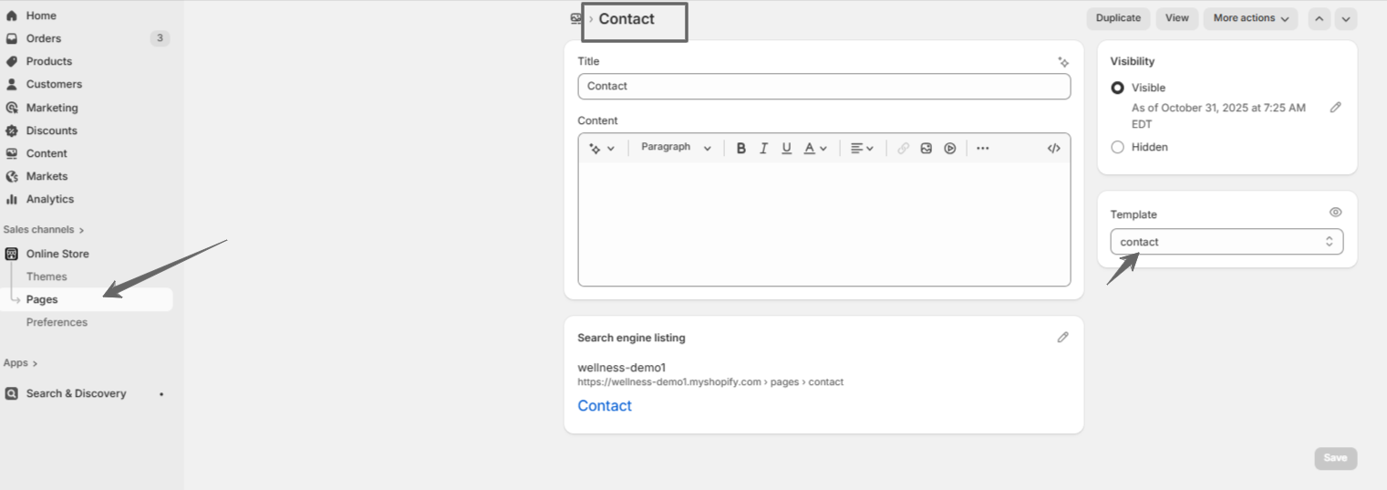
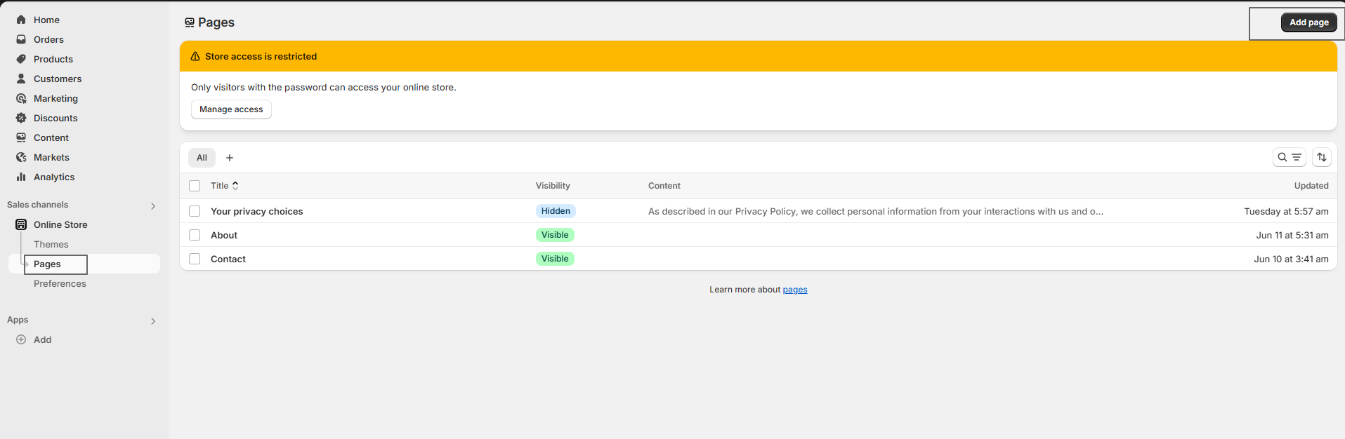
- In your Shopify admin, go to Online Store > Themes.
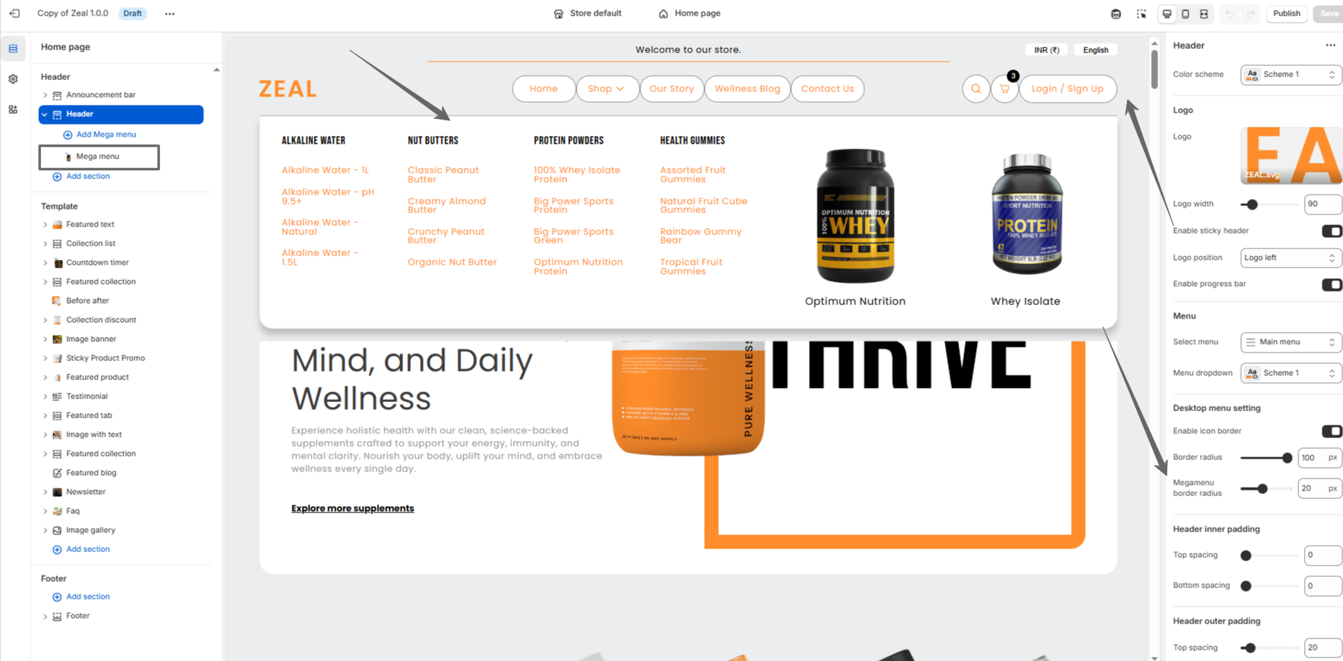
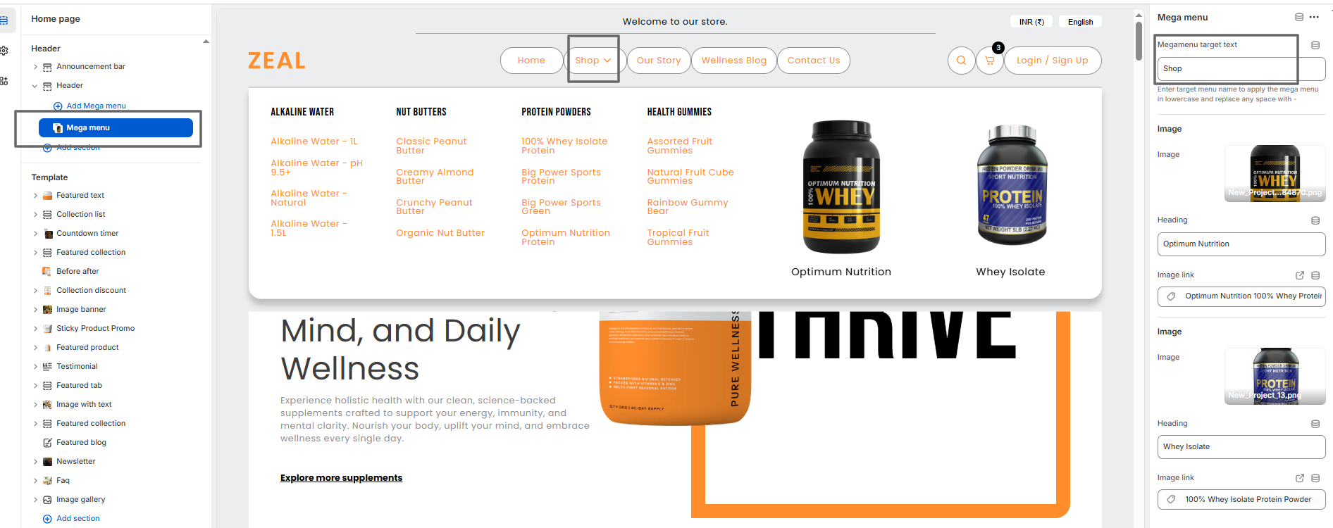
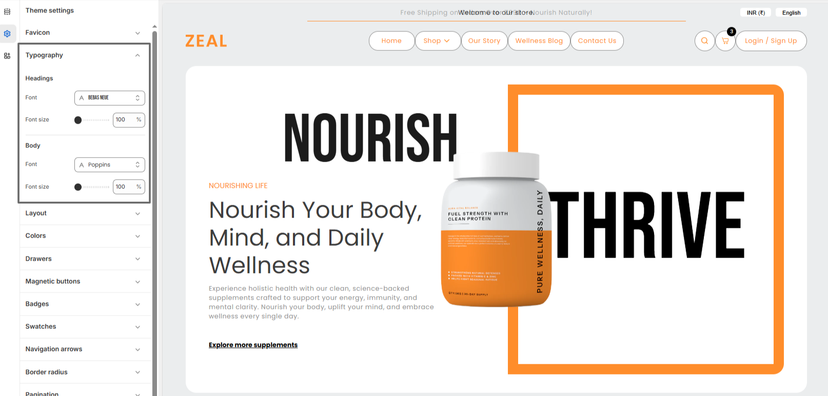
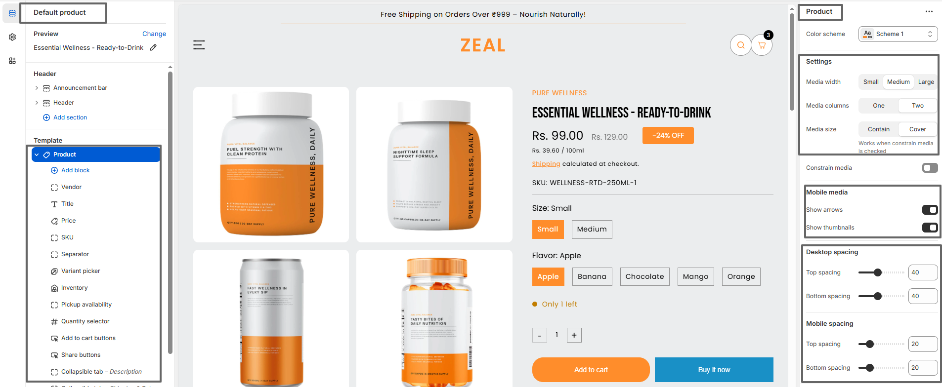
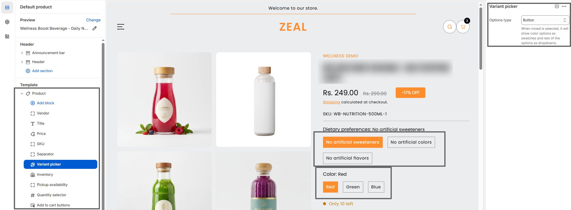
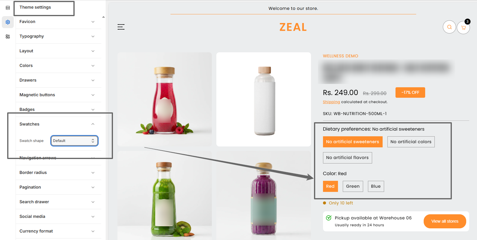
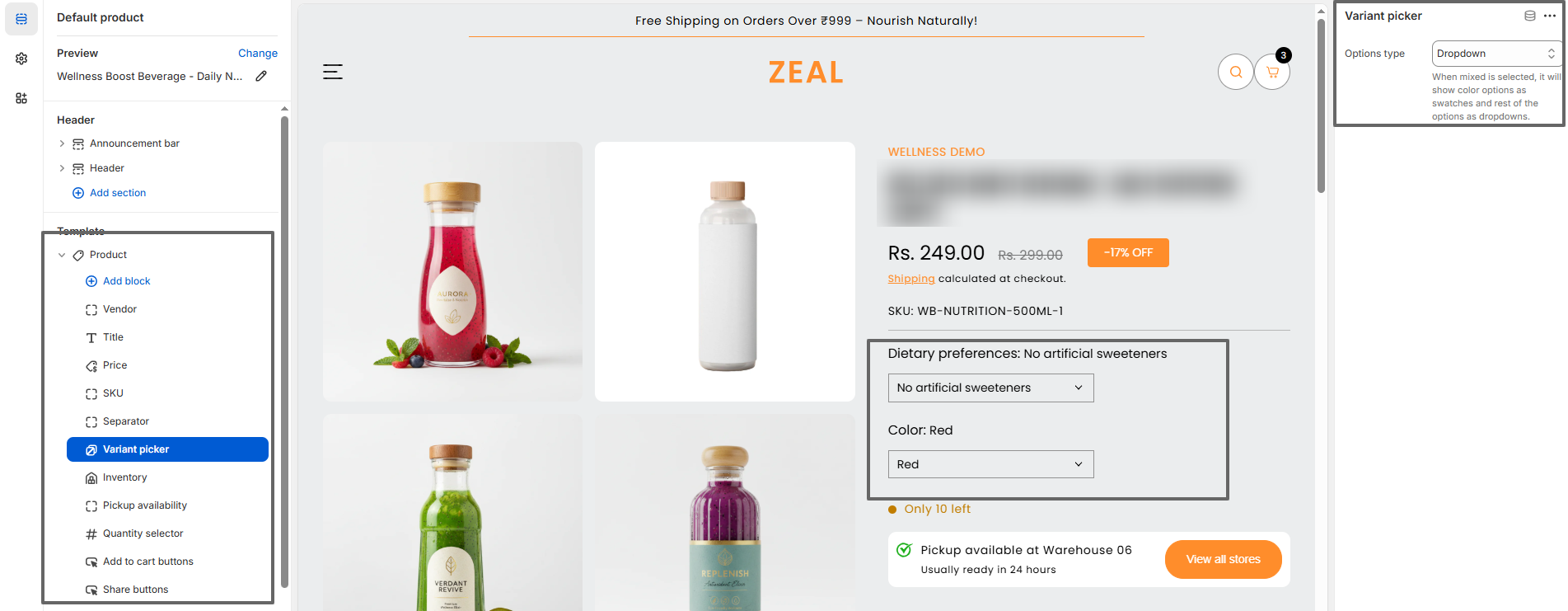
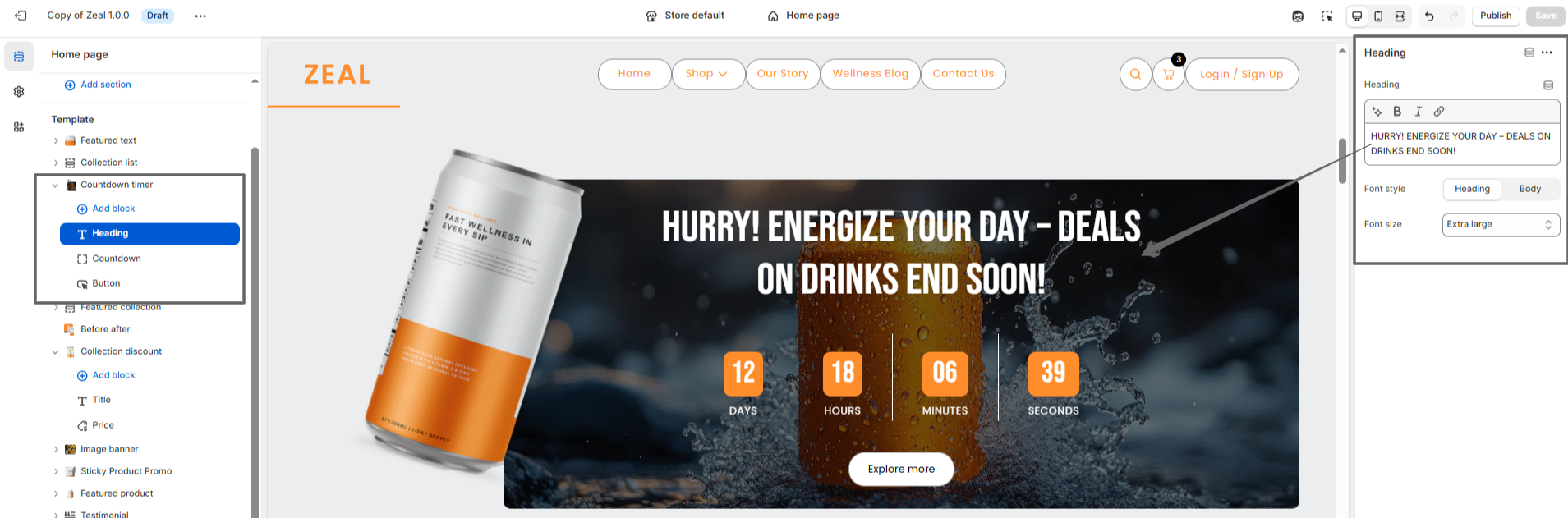
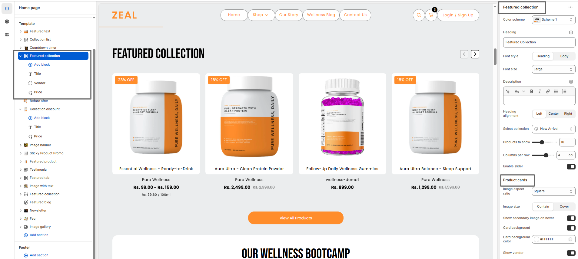
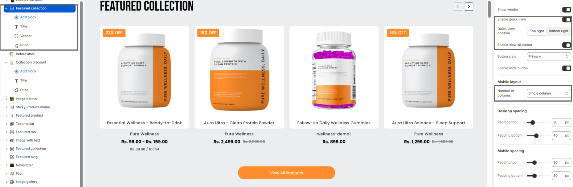
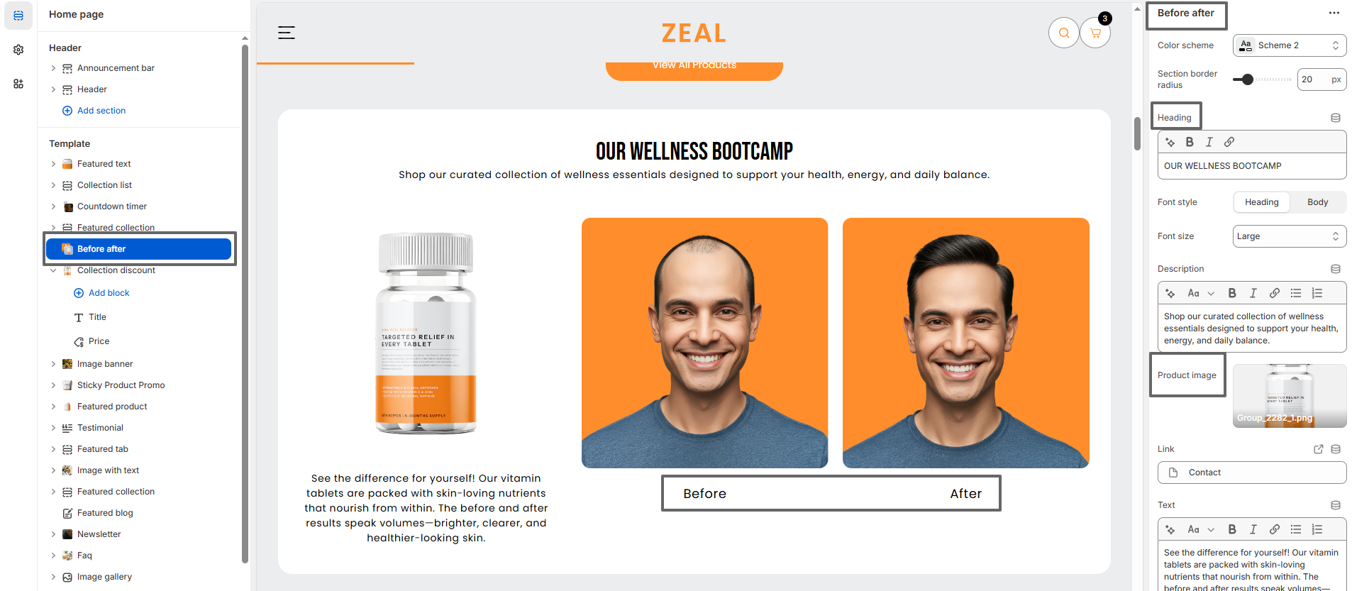
- In the Theme library section, click the Customize button to open the theme editor or, to preview, use the ... button to open the actions menu, then click Preview.